Enhance design of Help page
Is your enhancement related to a problem? Please describe
It could use tiles to better use the space available
suggested by https://github.com/containers/podman-desktop/pull/247#issuecomment-1171254458
Describe the solution you'd like

Describe alternatives you've considered
No response
Additional context
No response
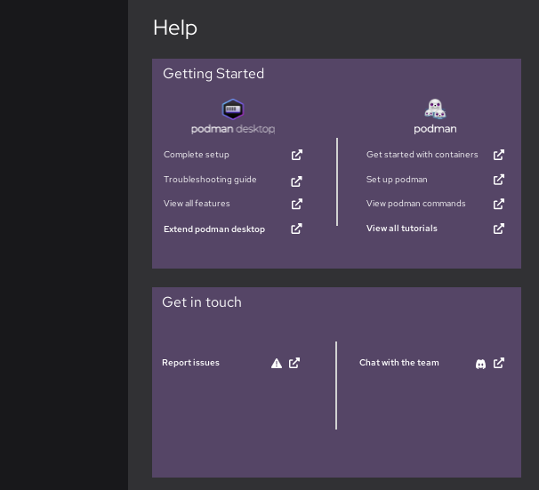
I worked on the help page, perhaps you could consider designing it this way.
Mairin and I thought that the "share feedback" should be visible across all sections of the application.
During the Podman SWAT meeting, the following issues were raised -
- There is a need to create a user flow that can help guide users to troubleshoot common issues, for example, why is my container not working? The current design directs users to documentation, a more straightforward approach is needed
- How can we support users who need help with the extensions they are using? Do we provide support at all? Will it make the page too cumbersome?
I think to create a design for a user troubleshooting workflow, we will need a list of common issues / troubleshooting steps.
This looks like the most current/up-to-date podman upstream troubleshooting guide: https://github.com/containers/podman/blob/main/troubleshooting.md
However it doesn't appear to mention cross-platform issues like Windows setup or OS X.
This guide on podman for windows written by Jason Greene has a troubleshooting section at the end: https://github.com/containers/podman/blob/main/docs/tutorials/podman-for-windows.md
This is a pretty comprehensive container troubleshooting guide Dan Walsh wrote last year: https://www.redhat.com/sysadmin/container-permission-denied-errors
This is from Jan and has some Mac OSX specific troubleshooting hints: https://www.redhat.com/sysadmin/replace-docker-podman-macos
For Podman Desktop here is the current troubleshooting guide: https://podman-desktop.io/docs/troubleshooting
You could consider designing the help page this way. The design allows for users to address 2 to 3 common issues faced by podman users. And it directs them to the website if they need to address more issues.
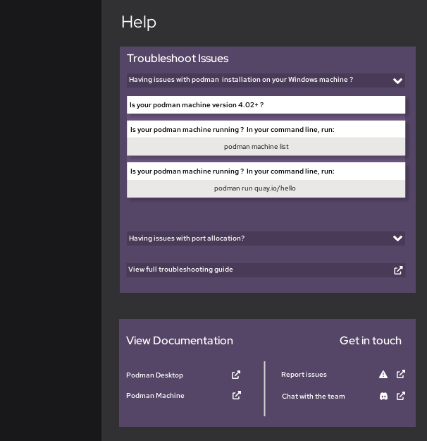
During the podman swat meeting, the team mentioned that the purple colour should be changed and that the colour of the text for the troubleshooting does not match dark mode.
Moreover, the team decided that the users should just be directed to the website for the troubleshooting feature. In addition, they discussed having a new feature introduced in the future, this is a diagnostics tool. This tool will help users figure out the issue they are having and provide appropriate solutions.
The team seems content with moving on with the older design. However, they wondered if it would be visible to open the website within the application.
With reference to colours, the team intends to create a UI styling guide to unify the colours in the application.
Based on the above comments, the design could look like the following:
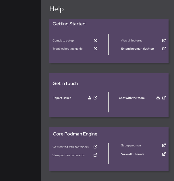
A troubleshooting guide linked in the "getting started" section, directs users to the podman desktop website
The "Get in touch" section provides users with an opportunity to speak with the team
Finally, the users have a chance to view the podman engine documentation. This is listed last because the team mentioned not wanting the documentation for podman desktop to have the same level of importance as the podman engine documentation. They felt that this might confuse some users.
In addition, as discussed with Mairin, some users may not use the podman engine, they may use the docker engine in the podman desktop application. Therefore, they do not need immediate knowledge of podman engine