Scene elements don't respect responsive designs
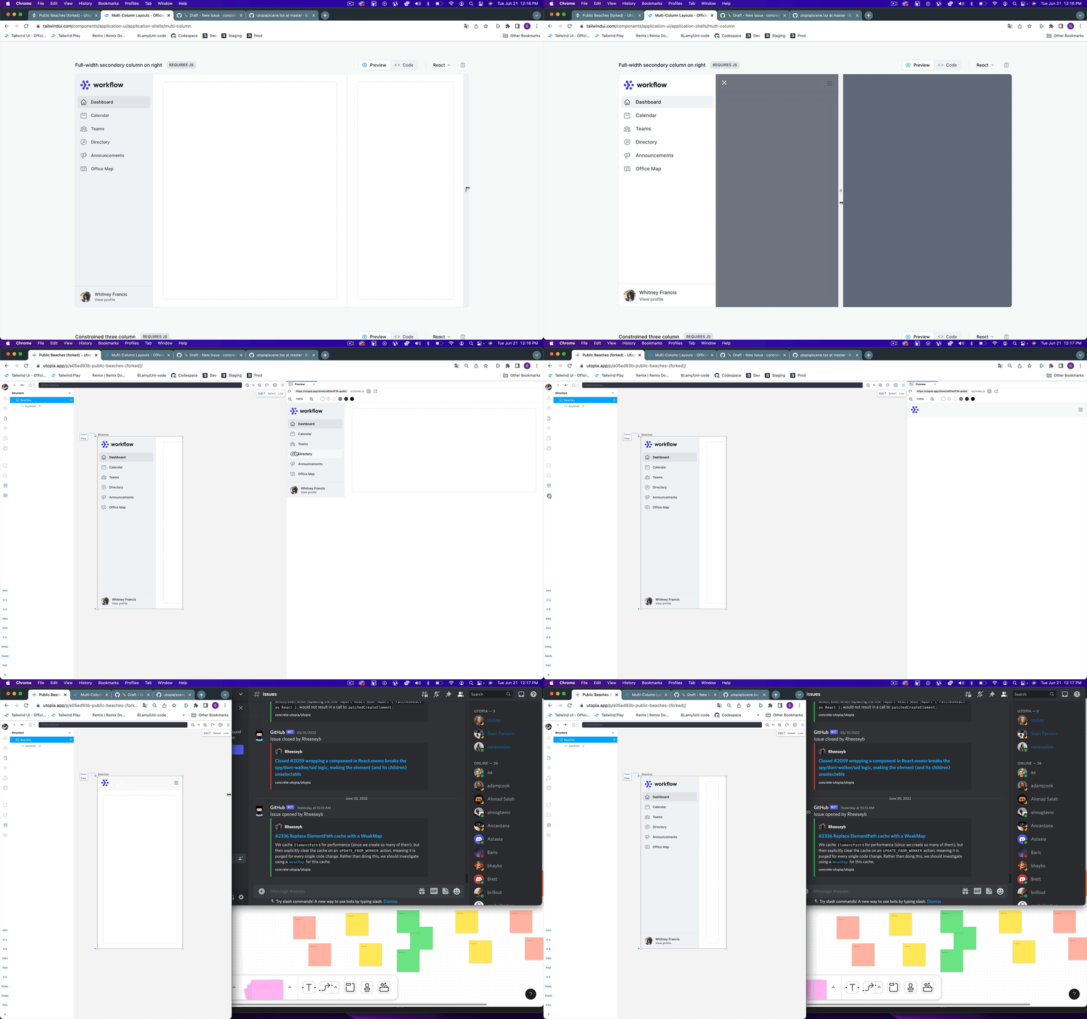
Describe the bug When you are creating responsive designs you would expect the width of a scene to be the width of media query internally. However, the breakpoints are triggered by the overall width of the browser instead of just the size of the scene.
Possible Solution Each Scene should be an iframe to scope the css: https://github.com/ryanseddon/react-frame-component
To Reproduce Steps to reproduce the behavior. For canvas tasks, take care to note down all relevant key holds, keys typed, selected state etc. E.g:
- Create a design with responsive CSS
- Preview it in the canvas editor
Result: The canvas editor renders the responsive UI that is relative to your current browser window not the scene
Expected behaviour The Scene should scope the css media queries inside of them.
Screenshots

Sample Code
      <div className='sm:bg-red-500 lg:bg-green-500'>
        asdf
      </div>
Hey, thanks for taking the time to report this! Responsive design is definitely high up on our roadmap, and we have a few ideas of how we could solve it using Scenes like you mention.
We looked into using an iframe per Scene, but that becomes quite complex and expensive when it comes to capturing and communicating metadata about the rendered model and providing canvas controls for those. We have also been keeping an eye on the upcoming CSS container queries as a possible approach to solving this problem, but those are still quite a way off being released.
It seems like the best option here is to add a layer in for capturing which media queries have matched, and then providing the corresponding CSS for those scoped against the Scene (we actually do some CSS scope adjustment along similar lines in order to support Tailwind)