ONE CLICK CHECK-IN
@sman591 Should we still have this issue open? Not sure if we really want it since we need to verify their information
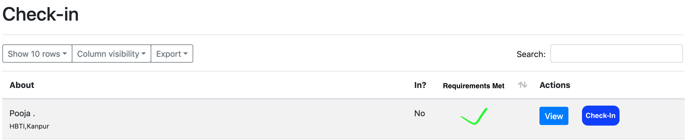
@peterkos I've thought a lot about this and while I see its usefulness, we need to provide critical information to the volunteers checking-in attendees (dietary restrictions, special needs, etc) that I don't believe can be accurately presented with a one-click check-in solution. We could make the table rows longer but I fear a volunteer might accidentally look away and check-in the wrong attendee as there's a lot happening in the moment. I think our efforts are probably better spent by simplifying the check-in page.
How about a pop up modal that has a form only for the important info? We could also throw in an "are you sure" guard on top of that modal, or have the user's name in a large font in the modal. (Kinda hacky from a usability point)
Oh that may work, I wanted to ping design to see if we can super simplify this design of this modal/page in any way.