BrainStorming: 1. 'normal' vs null ?? & 2. Active Features GUI
-
[ ] All negation words (hide hidden remove disable block force off deny disallow) are a optional too. And could be replaced too and/or the toggle could be trashbin for them 🗑️.
- [ ] (and the filled 🗑️ will be a sub-set of the active features list)
-
[ ] "active features" is so relevant. it should appear on our front screen. As 🪣 title="my active features" (or 🧰 or 🧺 or 🛒 or 📝⚙️?)
In our UI architecture, 'normal' (in our dropdowns) doesn't really have use. (Synonyms: 'default' 'disabled' 'don't change' 'auto' 'home' 'on all videos'. ) (It is not automatically set in storage, thus indicating somebody switched on and off, but we'd hardly made use of that)
-
[ ] once a user resets any feature, then we can delete the value from storage(?) #2262
-
if null & default will be the same, then consequently active-features.js can be shortened...
- ( active-features.js should also show our features enabled by default but doesn't ("buttons below the player", "24 hours") )
-
if null & default will be the same, then consequently active-features.js can be shortened...
-
[ ] For UX simplification the default option strings need not exist visually either? Dropdown's empty value can be visually represented with? 🔽 ⛛. Here: https://github.com/code-charity/youtube/blob/3c3e013d47e957b7b72486b8a174ab7435ecd910/menu/satus.js#1533 + Once an option is set, then we can:
- [ ] add a Reset-button ↩️ or ❌☒ ? and visually replace the top/empty option with the word UNDO?
- [ ] css: an activated drop down option can shine in the same color as an activated toggle. (while also the whole item's height can be less when, just like for the toggles and activation can add some background color.)
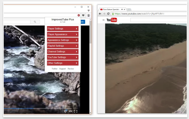
- the red buttons on the front screen could be smaller / darker, with words inside (closer to our original v0.7
hi! @raszpl https://github.com/code-charity/youtube/commit/3cd0c66143c14494d715bd8b38fa3f4001c6d3d7