glossary
 glossary copied to clipboard
Website updates: Tags
@cjyabraham, as discussed over Slack, ideally, we'd want three different tag styles:
- Fundamentals or advanced
- Tech/concept/property
- The rest
Each tag type tells us a little bit about that word. We could use the style we have now + a lighter version of the same pink + a ghost button style. Generally, it would go from bold to ghost but I feel that the latter category tag should be the full-colored one. Maybe you can ask your UX expert what the best approach is.
Also, it'd be great to have all tags at the top so people could filter by category (e.g., I want to see all architecture-related terms"). Here again, a UX perspective might be valuable. Should there be three lines?
- Fundamentals, advanced tags on top
- Tech/concept/property tags in the middle
- Other tags at the bottom?
I can ask for UX advice if no one is available on your end.
hi @CathPag, We've put our heads together over here and come up with the following as a possible design for listing these various tags. Let us know your thoughts:

Not a big fan, sorry 🙈 Takes up too much space and ends up being distracting. One narrow, subtle line with one "ghost-style" tag for level in one pink tone, another "ghost-style" tag for category in another pink tone, and then the full colored tags the rest. There will probably only be one full-colored tag per term, so each term would have only three tags.
Also, on top, we'll want to have the filters at all times. I suggest something like this but pretty (this is a Google Slides based mockup)

Hi @CathPag, we considered what you are suggesting here but feel it can be misunderstood as "Architecture" being selected while the other two tags are not. Also, the "Fundamental" and "Technology" tags seem ambiguous without any context. We thought the "Level:" and "Category:" helped make what they were referring to more clear. We can look for an alternate solution if you think our solution takes up too much space.
Regarding the dropdowns, I will split that into a new issue here so we can tackle that separately. From your mockup where you have the dropdowns at the top of the article, I'm not sure quite how you want them to work. Can you explain? The Kubernetes search UI made more sense to me.
True. If we color code the dropdown like the tags, it would make that clear. Thoughts?
@CathPag are you asking whether styling the dropdowns to be the same style as the respective tags would help provide context to the tags themselves? I think that would help that particular problem, however, we're still confused why there are dropdowns on the page itself and what they do. Are those to filter the list of terms in the sidebar? Would it help to have a call to discuss?
We want people to be able to filter terms. People may want to see all fundamental terms if they are just getting started and read those first. E.g,. abstraction, cluster, container, nodes. You need to understand those concepts before reading the rest...we may need an intermediate category for this to be really useful.
Same thing for the tags. Maybe I want to learn about architecture and read all related terms to that to get a better sense of it.
For technology, concept, property there is no strong case. It would rather be for consistency. But for level and tags, it does make a lot of sense.
Here's another design we considered for fitting in the 3 taxonomies. We do prefer the first one I presented, since it gives the tags appropriate context, however, this one has the advantage that it would take up less space if that's a priority:

I really like the Kubernetes example and the tag filter behavior discussed in #1188. How would that be compatible with this?
My thought was that under the search input we have "Advanced Search..." which takes people to the Kubernetes-like power-user mode. We can also have each tag link to that page with the appropriate tag selected in the filter.
We just had our maintainer meeting and thought it might be best if we simplify it. Let's mimic what Kubernetes does (all tags selectable at the top, not hidden under advanced). We'll add fundamental and property to the tags from the third category and remove advanced, concept, and technology. What do you think?
Ok. Can you share a design of how you want this to look and work? I'm having trouble envisioning how the Kubernetes UI will integrate with our current design without being overwhelming.
How about something like this?

You can then select the tags, and it will show a list with terms below.
When you click on a term, you still see the tags on top, and you filter by tags again.

What do you think?
...I didn't do that in the mockup, but tags should probably be in alphabetical order.
So when you click on a tag filter, does it generate a new list of terms below it or does it filter the list of terms on the left pane? And do you see these filters showing up so prominently on every page of the site? I saw this feature as more just for power users so not something you'd want to be front and center...
The selection would mimic the k8s docs behavior:
- "ghost" tags on top
- selected tabs full color
- List of terms meeting that criteria below (left nav bar doesn't change)
You click on the term you want to read, which automatically deselects all tags. The user can now start a new filter. To keep the selected list, users would have to right-click and open a new tab.
How does that sound?
I see. I did not see this use-case to be important enough to warrant these filters present on every page of the site. Also, as you add more filters in the future, it will continue to take up more real estate. I saw these filters more as something you'd want on an "Advanced Search" page or something.
If your team is united, though, on the interface you've described, then I can implement it that way.
I had a few more thoughts on my alternative proposal for consideration. The proposed filter-by-tag screen would be similar to that on the Kubernetes site and would allow for permalinking with tags in the querystring, like https://kubernetes.io/docs/reference/glossary/?fundamental=true.
People would access that page either by clicking on a tag (which would then load the page with that tag set to filter) or by clicking "Advanced search..." below the search bar in the left column. This might alternatively be labeled "Filter by tag..."
This would give people multiple obvious ways to access the tool without needing it to take up space on every page.

Hmm...I wouldn't hide it in advanced search. It's always visible in the Kubernetes glossary, and that's great. People don't have to figure out that they can filter by tags, they see it right on the screen.
I really see it as two ways to navigate the page:
- per term (left nav bar)
- per category ( top tags)
@CathPag @cjyabraham I have no strong opinion here. Having it as close to the Kubernetes page as possible makes most sense for me.
- K8s glossary page:
- the page lists the terms with a short description of each term.
- there is no dedicated pages for each term.
- selecting and deselecting tags updates the list of terms in responsive way.
- CNCF Glossary website:
- each page is for showing term definition or some information (e.g. home page, how to contribute, contributor ladder, style guide).
Considering above, @CathPag could you draw another design proposal figure for the case:
from this,
when a user clicks one of the tags above?
@CathPag while we're waiting on this, would you like me to proceed with the second part of this issue, that is, listing all tags equally below the title of the term, instead of having "Technology", "Concept", and "Property" above it?
So sorry, @cjyabraham! We had our meeting last week (or the previous one), but I totally blanked. We would like to proceed with the mockup above with one slight change. The deselected tags are gray and become pink if selected by staying above. So, no tags below the term. Instead, the two active tags are pink above, while the rest is gray.

When people select the tags initially, a list of all available terms with those tags will be listed below. Just like in the Kubernetes glossary. Do you know what I mean?
@CathPag can you respond to @jihoon-seo comment above? It'd be good to see the mockup he's requesting as I'm still having trouble envisioning the workflow. As he has outlined, there are significant differences to the k8s glossary and our site so simply copying over the same UX for this search-by-tag workflow would likely not work.
Could you also differentiate between a tag that is selected due to the article below it being tagged with it, a tag that is selected for the purposes of listing all terms tagged with it, and a tag that is unselected?
Ooff...I don't have any of the mockups anymore. That means I have to recreate them. Really busy this week. I'll need more time.
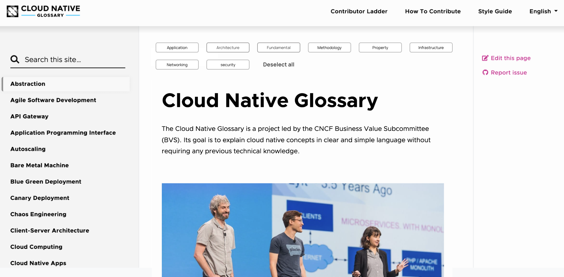
Ok, here you go:
Homepage with deselected tags:
Selected tags and list of options:

Individual term with tags highlighted that correspond to this term

What do you think?
I don't like how the filter buttons also do double-service as a way to indicate which tags a term has been tagged with. I don't think this would be clear to me if I was a user of the site.
@jihoon-seo do these screenshots help you evaluate the proposal against this other option here which maintains the current tagging UI on term pages and offers a filtering-by-tag interface on the regular terms-of-tag page?