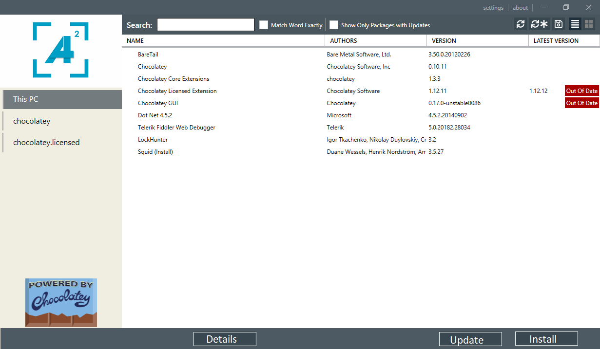
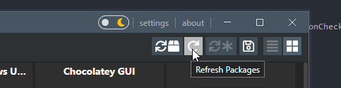
Refresh button and Update all button use the same icon
For some reason the refresh button and the update all buttons in chocolateygui 0.17.3 are the exact same rounded arrows (only differentiated with an asterisk).
This immediately looks like update and update all buttons. The update button should be much more visually different from the update buttons.

Hi @gep13
no personal preference, the fastest fix would probably be to change the update button to look less rounded
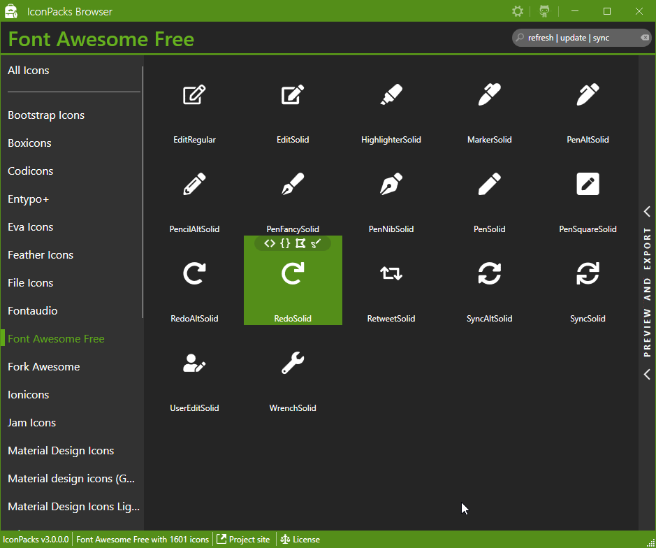
if i google image search an example, maybe something like this ?
I'm not a graphics artist but concept
 or wider arrows

We can use a single arrow to make it more clear what's the difference. IMO a Redo is similar to an Update.
Using the gui more recently leads me to think that a tweak in how the buttons are displayed in the gui should be considered. There's no install button, and it's pretty unintuitive that you need to either right click an app or double click an app in order to get an install option. Why not have a bar at the bottom of the screen with install/upgade/details (ie: package specific or action buttons). and keep the refresh, view, sort display-type buttons at the top where they are.