 cengage
New Component: Toggle Button
Purpose: Create a new Toggle Button component one or more buttons that can be toggled on and off.
Figma: https://www.figma.com/file/VoWYiiOKKppcYm5QLgPyDC/Components---Inputs?node-id=75%3A10654

AC
1.0 The component uses the "Subtle" button styles, which can't be changed.
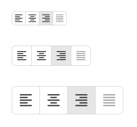
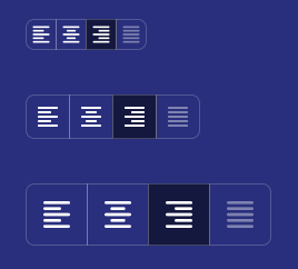
2.0 The component can consist of a single button on its own, or as a group of buttons. Styling of the buttons (space between, border-radius) needs to update automatically.

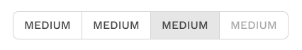
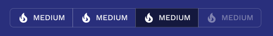
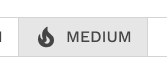
3.0 Buttons may contain text only, icon only, or text + icon
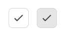
4.0 Each button within the component needs to turn on and off via click/tap
5.0 Button states
-- 5.1 When the button is "on", it uses the styling of the "pressed/active" Secondary button.
-- 5.2 Regardless of whether the button is currently on or off, it gets the hover and pressed styling when triggered
-- 5.3 A button can be disabled, but when it is in this component, the border styling needs to be consistent with the rest of the buttons.
6.0 With exclusive selection set, selecting one option deselects any other.
7.0 With multiple selection set, multiple buttons can be on at the same time.
8.0 You can set any button to be turned on by default.
9.0 You can enforce that at least one button in the group must be on.
10.0 You can set the size small, medium (default), and large.
11.0 Accessibility
-- 11.1 Some good accessibility rules can be found here: https://mui.com/material-ui/react-toggle-button/#accessibility
-- 11.2 Keyboard - Toggle buttons are in DOM order. Navigate between them with the tab key. The button behavior follows standard keyboard semantics.