 cengage
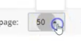
The displayed option in 'Rows per page' is not highlighted in the drop down list
Describe the bug The displayed option in 'Rows per page' is not highlighted in the drop down list
To Reproduce
- Go to 'https://storybook-preview-319--upbeat-sinoussi-f675aa.netlify.app/?path=/story/fileuploader--csv'
- Click on 'Browse Files'
- Upload file
- Click on 'Rows per page' drop down
- Select any option ( eg:100)
- Verify the selected option is displayed
- Click on the drop down
- Notice that the displayed option (100) is not selected but option '10' is
Expected behavior The displayed option in 'Rows per page' is not highlighted in the drop down list
Screenshots https://screencast-o-matic.com/watch/cr6XrIVXOWd
Desktop (please complete the following information): OS: [Win 10] Browser [chrome,] Version [Version 94.0.4606.81 (64-bit)]
Additional context gradebookExport (4).csv
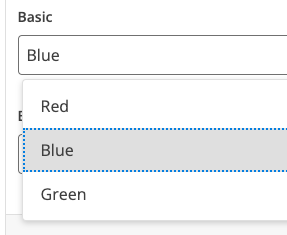
I'm gonna tag @orion-cengage and @rcgillet here so they hopefully see this... this falls into accessibility where when the dropdown opens, the first item gets focused for screen readers... the example is just using the Datagrid component which uses TablePagination which uses Dropdown ... perhaps it's the intention of Dropdown to not show the current state which would make sense for something like a menu... I guess the design docs for DropDown state that we can add a checkmark next to the currently selected one... maybe that should be added to TablePagination ... hopefully someone is more opinionated than me :D
Yeah, based on what I'm seeing there, this should really be using the Select component instead of the Dropdown component.
I think it might have been recently switched to dropdown because there was a problem where the select could open off the page so it wasn't selectable at all and the design docs say:
Select vs. Dropdown While the Select and Dropdown components can look similar, they have different functions.
Use the Select component inside a form where users are selecting from a list of options and submitting data. Use the Dropdown component to display menus and filter or sort content on a page.
So it felt like the dropdown was more correct since we're not submitting data in a form?
I definitely hear what you're saying, and the design docs might need to be updated as a result. So let's figure this out.
I might argue that we're actually showing the selected value just fine because we're updating the label of the button itself?
But is that good enough? What is semantically the best option here? Does it matter?
Carbon is using a Select: https://www.carbondesignsystem.com/components/pagination/usage
Still forces a bit of mental processing ... we'd probably be fine if we added a checkmark to the current selection like the design docs say to
Not sure I agree with that. The select highlights and sends focus right away to the currently selected choice. How does it get simpler than that?
We also have a ticket out there to update all the components with "dropdown menus" like this to use popper to detect the edge of the browser so we don't have that problem anymore.
We could also just use the native select component and just let the OS handle it for us. I don't really care about a fancy custom dropdown of options in this scenario.
The issue was when the dropdown opens, the focus was on the first item and not the selected item... at that moment I have to think if the focus item or the one in the button is the actual value.
A checkmark (like the design docs say to do) prevents that mental work and ambiguity.
Dropdowns don't have any state themselves since they are just a list of buttons. Select has state since it's a form component. As it stands now in the TablePagination we're going "here is a button to switch to pages of 10 items"
But we can update labels in buttons outside of the dropdown component since TablePagination knows how many items should be in a page.
There's also the option of removing the focus ring when we're not using keyboard navigation...
I can't say I understand everything you're saying, but if you're OK with using the dropdown in this component, then go for it. Let's turn on the "selected" state in this instance as you recommended.
The issue is still reproducible. See Screen-cast : https://www.screenpresso.com/=n4pAe Hence, Reopening the ticket. Thanks!
Please test on most recent version of storybook:
https://storybook-preview-632--upbeat-sinoussi-f675aa.netlify.app/?path=/story/dropzone--csv
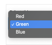
Note on the Dropdown button: According to the documentation with the use of activeItem prop:
The activeIndex prop can be used to set an item within the dropdown as active. When another item is selected, that item will become active and the menu will remain open, rather than closing as usual.
We Verified the issue and Notice that the displayed option (100) is selected but option '10' is still highlighted in the drop down list. It is desired? See Screen-cast : https://www.screenpresso.com/=uV1rf Hence, Reopening the ticket. Thanks!
Notes for testing:
- Verify that Tables with pagination use a native select (instead of the dropdown component)
- Confirm the focus issue noted above is resolved
the issue no longer exists http://somup.com/c0n1Y2x5hZ https://storybook-preview-dev--upbeat-sinoussi-f675aa.netlify.app/?path=/story/table--controlled-pagination