 cengage
react-magma-docs: (2) New Secondary Page Layout
This ticket is only for the new version 3 of the React Magma docs.
We are combining the API and Design doc pages for components into single pages. This ticket will only address the updates to the page itself, and not the resulting impact of the main navigation. That will be handled in a separate ticket.
inVision: https://cengage.invisionapp.com/share/Z3RH81FTNMC
AC's
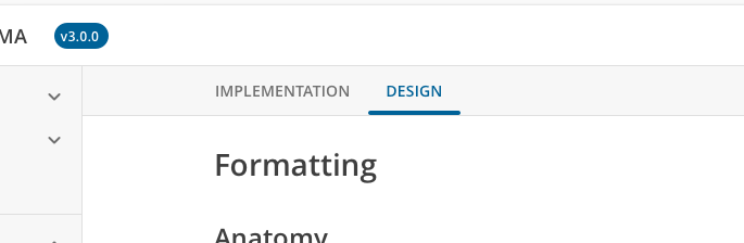
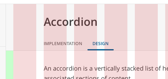
Page Header
- Verify the page title/component title is the first thing on the page.
- If the page is for a component with both API documentation and Design Guidelines, these are separated onto different tabs below the page title

-- The tab order is: Implementation and then Design.
-- Verify the appropriate documentation appears under the corresponding tab.
-- When you scroll down the page, the tabbed area/bar should become pinned when it hits the bottom of the main site header, preventing it from scrolling out of view
- If the page is for a non-component and only has one type of documentation, then there aren't any tabs and the title area is shorter.

Subnav
- The H2's on the page will still serve as a subnav for the page, but instead this will appear in its own component to the right of the page content.
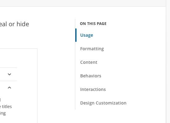
-- Clicking on these items will take you down to that part of the page. --- Clicking on one of these nav items makes it the current section, and the styling of the nav link changes to reflect that. -- Scrolling down the page should also change which section is displayed as active. -- This sub nav component should pin in place so it doesn't scroll with the page. -- If the sub nav is longer than the height of the browser window, then it should scroll within itself so the links lower in the list can still be accessed.
Layout There are screens in inVision that show the layout columns to help with spacing and layout. They follow the rules set forth in the Layout documentation: https://react-magma.cengage.com/version/2.4.0/design-intro/layout/.
It's possible that actual implementation will differ from exactly what you see in design, and that's fine as long as the end result is the same.
Responsive Behavior
- Around 1200px wide, we'll probably need to hide the subnav and let the main content of the page take over.
- If we're using the Heading component properly, then the section headings (H1-H6) should reduce in size automatically at 600px wide and below. If we're not using the Heading component then we'll have to do it manually.