ibm-products
 ibm-products copied to clipboard
 carbon-design-system
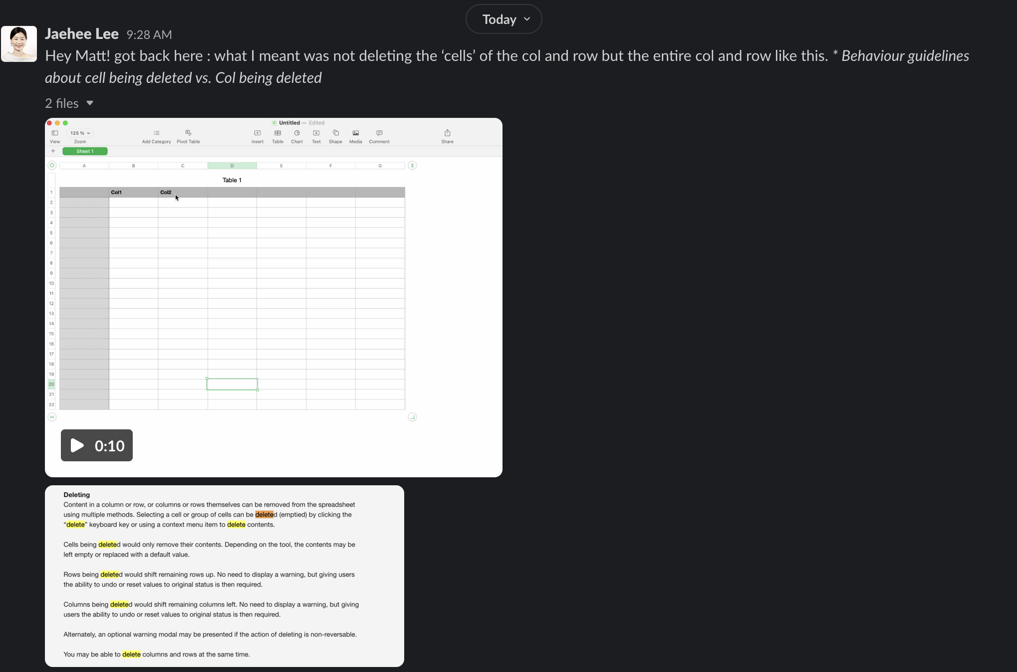
DataSpreadsheet: design release review
Design review
FYI @mitchellbernstein
Component epic #1653
Standards
- [ ] All pattern updates/changes/iterations have been discussed with the component developer
- [ ] Patterns have been approved by either DSAG or another approving entity
Pattern and behavior
- [ ] The component behaves according to the guidelines set by the pattern maintainer
- [ ] The component’s UI matches the pattern specifications set by the pattern maintainer
- [ ] The component’s motion matches the specifications set by the pattern maintainer(s)
- [ ] The UI produced is responsive, cross-browser, and responds to the currently set Carbon theme.
- [ ] Colors, themes, sizes and additional props are true and correct, aligning with Carbon set tokens (unless otherwise specified by the pattern)
- [ ] Paddings/margins/spacings are true and correct, in both desktop and mobile views
Storybook
- [x] A functioning component renders in Storybook
- [x] The Storybook displays multiple scenarios that show how the component can be used
- [x] Changing props in the Storybook updates the component
Items discussed during latest design review:
- [ ] Resizable columns
- [ ] Reordering rows
- [x] Cell header border color
- [ ] Cell contents on top of selection area
- [ ] Command + Click in safari doesn’t work
- [x] Selected header cell background color issue when using keyboard
- [x] Variable column size / many columns layout issues
- [x] Active cell position issues after changing
cellSize - [x] Column reordering does not work correctly with horizontal scrolling spreadsheets
- [x] Reorder multiple columns
Design review
1. (Visual) The font color of the selected status should follow the visual specification.
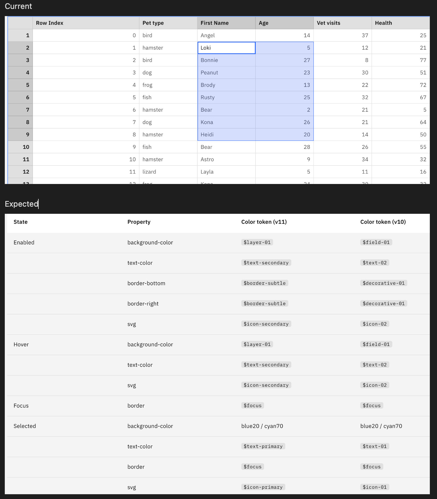
2. (Visual) When the rows are multi-selcted, there shouldn't be the inner lines.
3. (Visual) The selected status in the Gray 100 theme should follow the visual spec.
Design review
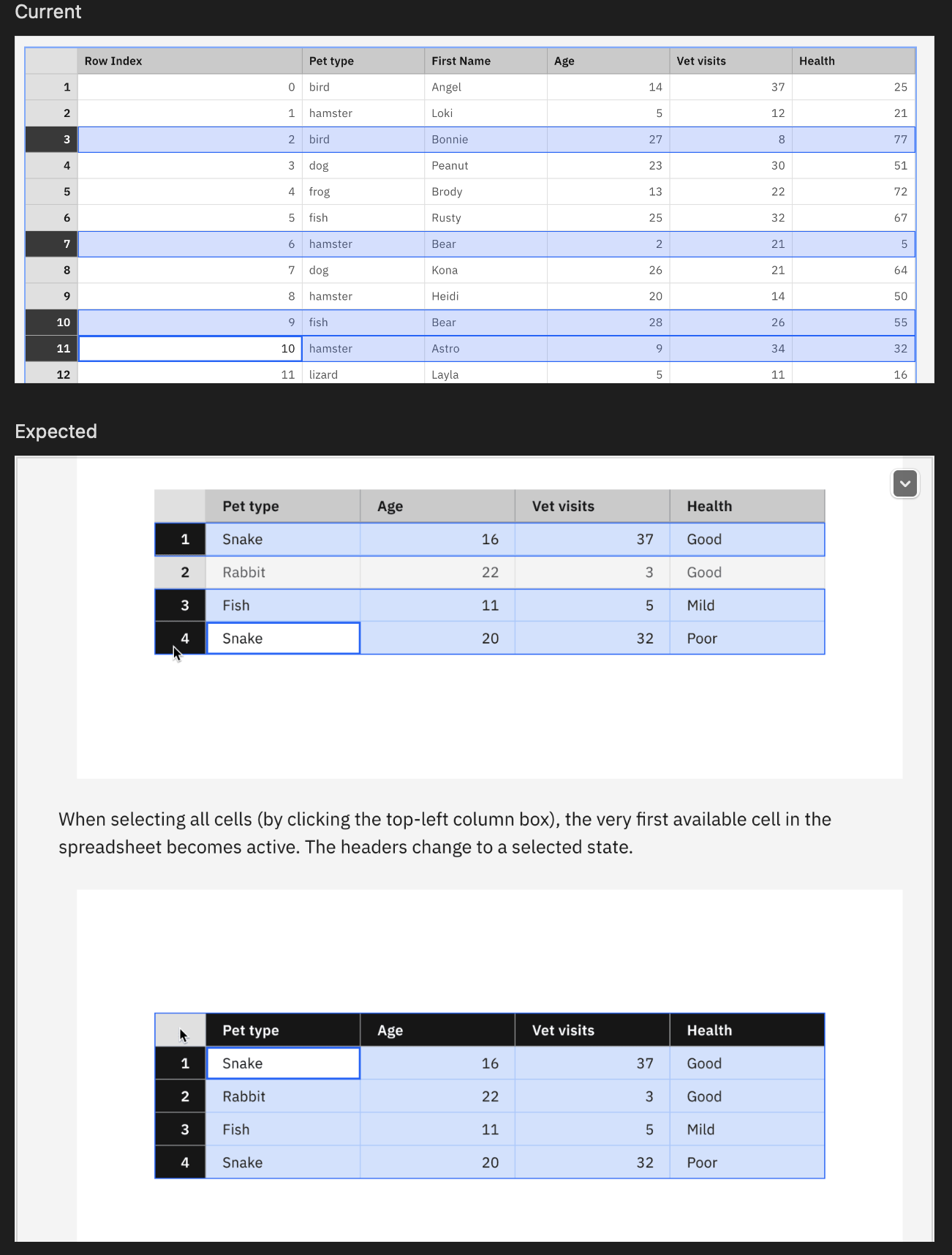
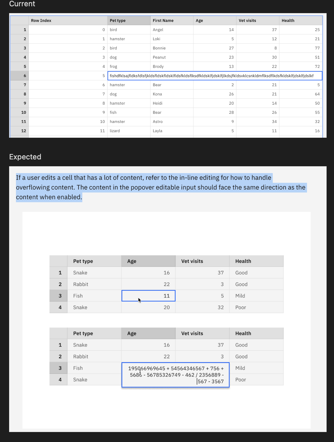
4. (Behaviour) When there is long content in the edit mode, it should not cover the whole row, yet should be treated like the specification below.
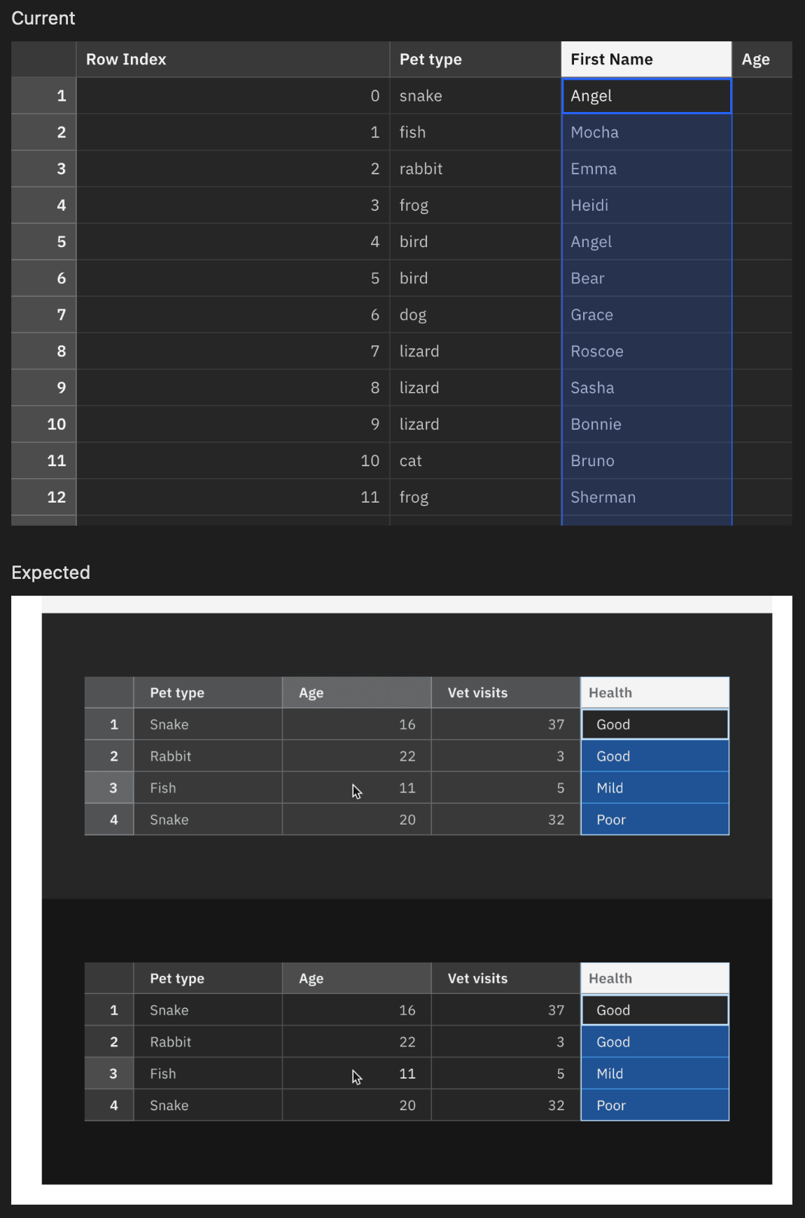
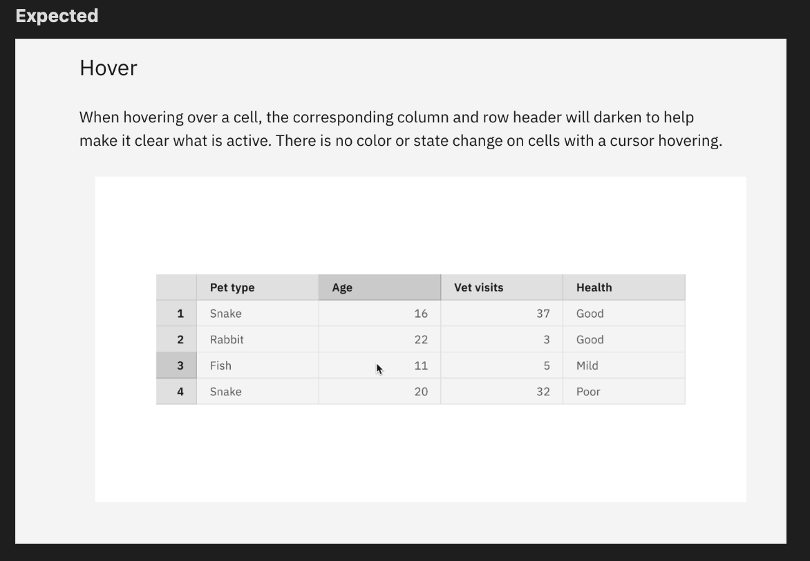
5. (Behaviour) Currently, there is no hover effect applied. The headers should be highlighted as below.
6. (Behaviour) Multi-row selection is not possible with the Shift key.
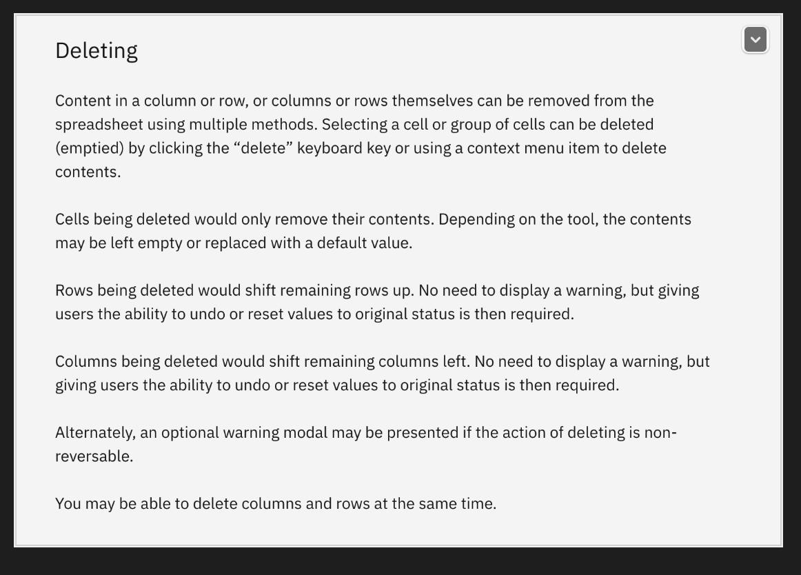
7. (Behaviour) Overall delete behavior is not supported
8. Not sure if it's in our scope but optional examples like the context menu /panel options are not supported.
This is great! Just a few things I noticed:
-
Since you'll always need to provide an ID for
aria-labelledby, there must be no#in front of the labelling element's ID. https://github.com/carbon-design-system/ibm-cloud-cognitive/blob/3f3588f5521d23e8bd74fb5fdd56101ea2952e34/packages/cloud-cognitive/src/components/DataSpreadsheet/DataSpreadsheet.js#L907 -
Shortcut CtrlHome is missing Focus first cell in first row
-
Shortcut CtrlEnd is missing Focus last cell in last row
-
When using the VoiceOver cursor to navigate through the spreadsheet and "clicking" on a cell to edit, the relationship is broken and when the user tries to navigate with the VoiceOver cursor without submitting the changes, they land back on the first cell in the first row. You could try setting
aria-ownson the gridcell to the id of the textarea. -
The deadzone button in the top left is missing a label (can be invisible).
-
The entire grid needs to have a programmatically determinable name. Should this be enforced somehow by the component (e.g. requiring an
aria-labelprop) or should this be handled exclusively by the implementing team?
![allcontributors[bot] avatar](https://avatars.githubusercontent.com/in/23186?v=4 "Published by a pub.dev verified publisher")
Thank you @chloeleekjh and @janhassel for both of your feedback here. I have first gone through Jan's feedback, I was able to address most of the items.
For 2 and 3, this works based on the resource key (control for windows and command on mac). I added labels for items 1, 5, and 6. Would you be able to provide a screen recording of the VoiceOver issue. I don't think I'm fully understanding the problem there.
Hi @chloeleekjh, I've had a chance to address some of the items you mentioned above. I have some notes that I'll leave below:
- Updated active cell text color to use
text-secondary/text-02 - I think this is the intended behavior because the rows are separate selection areas. For example, if you use shift + click or shift + arrow keys you can change the size of the current selection area which will update the selection area without the inner lines. For example, see below:
- I've made updates to use cyan in dark mode
- In terms of the width of the cell when it is being edited, we tried to follow behavior similar to google sheets and excel where the editing cell increases by increments of the cell's width until it reaches the outer container at which point it begins to wrap.
- When reviewing the hover guidance, we found that neither google sheets or excel support this interaction. Can we review this interaction?
- Multi row selection is still left to be completed, I'll try to address it this week
- Cell deletion has been added with this PR
Hi @chloeleekjh and @janhassel 👋 would you be able to review the updates here. Mitchell and I had discussed about adding multi row selection (with shift key) after the initial release of this component. Is that something that still sounds ok?
Hi @matthewgallo Thank you for the updates. I had time to review everything here below:
- This looks great.
- I agree with the distinction between the selected 'area' vs. multiple selected 'lines'. So update is needed.
- This looks great.
- I am okay with that.
- I'd say this is a very additional feature that can be aborted right now.
- Thank you.
- Couldn't check the progress of the row and column deletion which requires a context menu. The cell deletion works very well.
Additional point: I found that currently there is no guideline about the 'resizing columns' which is a quite crucial point for the users..Not sure how it was communicated by Mitchell before but this should be the next important item to work on for both design guidelines and implementation.
Additional point: I found that currently there is no guideline about the 'resizing columns' which is a quite crucial point for the users..Not sure how it was communicated by Mitchell before but this should be the next important item to work on for both design guidelines and implementation.
We’re heading to the Accessibility Guild today to discuss columns resizing for Datagrid today, and we’ve asked some of the designers from Datagrid to attend as well. It might be a bit late for you, but we can share an update since I expect we’ll want the resize behavior to be similar.
@elycheea Sounds great! please share the update here in this thread so we could track it! @matthewgallo Putting our Slack discussion here so we do not miss these later. Just in case.
@chloeleejh Hi! Forgot to follow up on this but this is the prototype of the behavior we’re pursuing. https://deploy-preview-2464--carbon-for-ibm-products.netlify.app/?path=/story/ibm-products-components-datagrid-datagrid-canary--basic-usage
Is this still relevant? If so, what is blocking it? Is there anything you can do to help move it forward?
This issue has been automatically marked as stale because it has not had recent activity. It will be closed if no further activity occurs.
![stale[bot] avatar](https://avatars.githubusercontent.com/in/1724?v=4 "Published by a pub.dev verified publisher")