ibm-products
 ibm-products copied to clipboard
 carbon-design-system
Data table: Implement inline editing
Data table extension: Inline editing
Description
WKC data table does not include any of the features and behaviors of the PAL Inline editing pattern: https://pages.github.ibm.com/cdai-design/pal/components/data-table/inline-editing/usage
There is an initial prototype of some of the edit behaviors in this storybook: https://pages.github.ibm.com/Jan-Hassel/spss-prototype-components/?path=/story/components-variableview--default
Additional details from #1616
Details
Design Maintainer(s)
- Marion Brülls
- Virginia Nicholson
- Mitchell Bernstein
Tasks
Before starting work on this epic, please review and complete the following.
- [ ] Initial review of design/existing code
Working in Carbon for IBM Products package
- [ ] Have you reviewed our contribution guidelines?
- [ ] Have you noted our code guidelines?
- [ ] Did you use the CLI to scaffold your new component?
I've been implementing the standalone InlineEdit component (described here: https://carbon-for-ibm-products.netlify.app/?path=/story/ibm-products-patterns-edit-and-update-inlineedit--inline-edit), and I have a found a few issues that I hope this DataTable extension implementation will resolve.
1st issue: Using InlineEdit, i found that when first active the InlineEdit (becomes focus to start typing but have not actually entered new data).. during this time, the cancel button is visible and the save button is invisible. The problem here is, even though the save button is invisible, it's actually pushed to the right side of the InlineEdit.
So if the InlineEdit is near the right side of the page, or 100% width or something, it will cause horizontal scrollbar to appear. Or, if you have content to the right, the save button will appear on top of the right-side contents and show a not-allowed cursor.
 Note that there is already a PR to fix this in the InlineEdit component (https://github.com/carbon-design-system/ibm-cloud-cognitive/pull/2104), just want to make sure the fix is carried forward
2nd issue: I hope that this Data Table Inline Ediiting extension will be componentized so that I will be able to use it when I manually build Carbon Component's Data Tables. Example, Data Tables offer you to build manually by:
import { DataTable } from "carbon-components-react";

const {
  Table,
  TableRow,
  TableHead,
  TableHeader,
  TableBody,
  TableCell,
} = DataTable;

...
<Table>
  <TableHead>
    <TableRow><TableHeader ..></TableRow>
  </TableHead>
  ..
</Table>
so hopefully I can also manually use this component
3rd issue: I have found that the placeholder text doesnt load properly, when InlineEdit is loaded in a different React cycle. I have opened a ticket here: https://github.com/carbon-design-system/ibm-cloud-cognitive/issues/2107
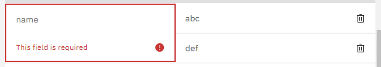
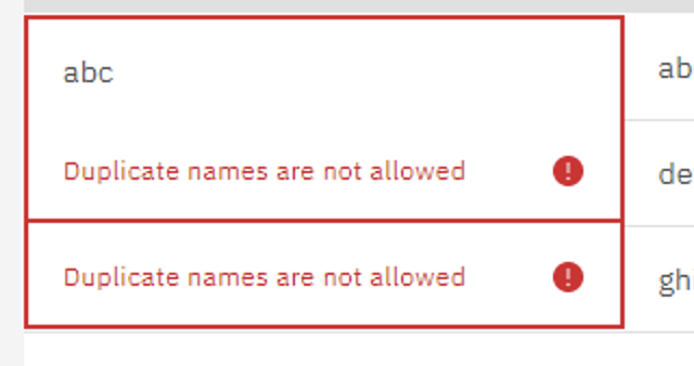
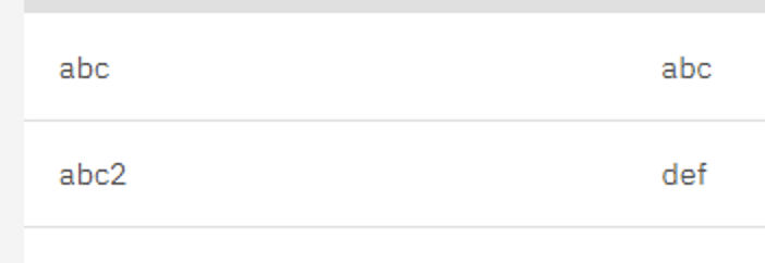
4th issue: As described here https://pages.github.ibm.com/cdai-design/pal/components/data-table/inline-editing/usage/#cell-validation, I was manually implementing some css styling for the invalid text to match the documentation.. Specifically, when invalid text appears, it overlaps the cell in the next row. But i wonder if the design considered invalid text on multiple lines?
Example: Single line error
 Example: Multi line error
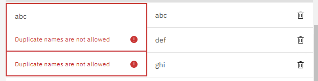 In multi-line error, a user might want to resolve the 2nd one first, and resolve the 1st one later (or afterwards)..
Or, in my case.. we dont want duplicates so I throw the invalid text on all the cells that have the duplicate field. Then it's up to the user to fix either one or the other. It looks better or make sense when spread out, like this:
In multi-line error, a user might want to resolve the 2nd one first, and resolve the 1st one later (or afterwards)..
Or, in my case.. we dont want duplicates so I throw the invalid text on all the cells that have the duplicate field. Then it's up to the user to fix either one or the other. It looks better or make sense when spread out, like this:
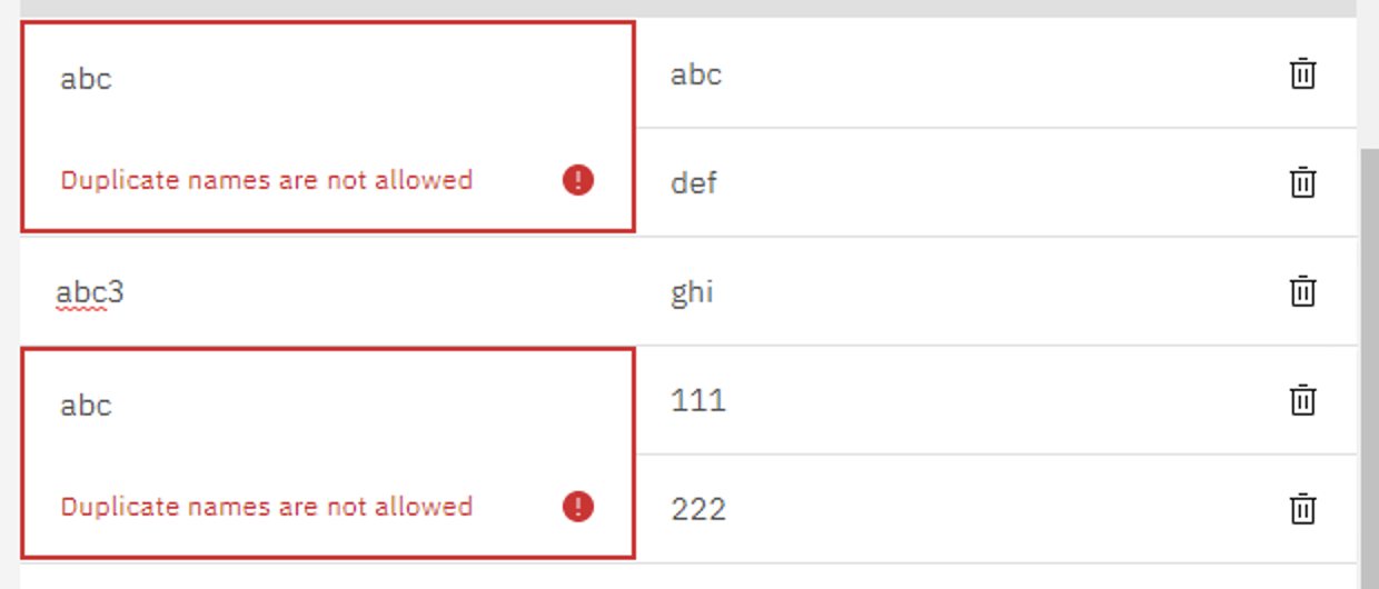 But when they're on top of each other, it almost seems like the user can't resolve the errors underneath first..
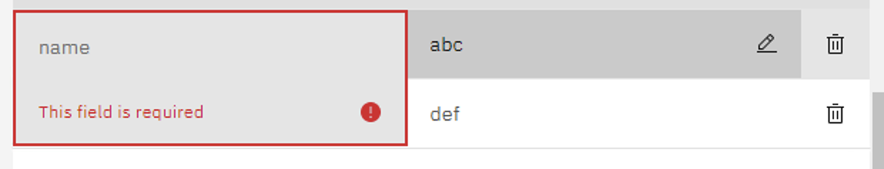
I kind of have a workaround, but i'm not sure if designers approve or maybe they had something else in mind. My workaround is to increase the z-index on hover and while in editing mode. So for example:
Initial state of multi-line invalid text
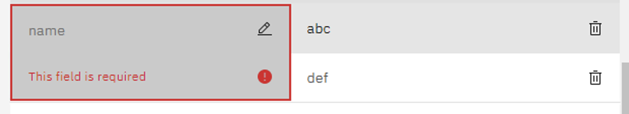
 Hover on InlineEdit cell in 2nd row brings it on top
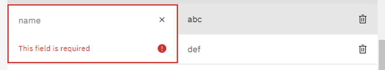
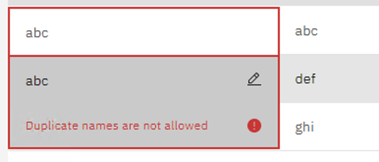 Click on InlineEdit cell in 2nd row to resolve this first
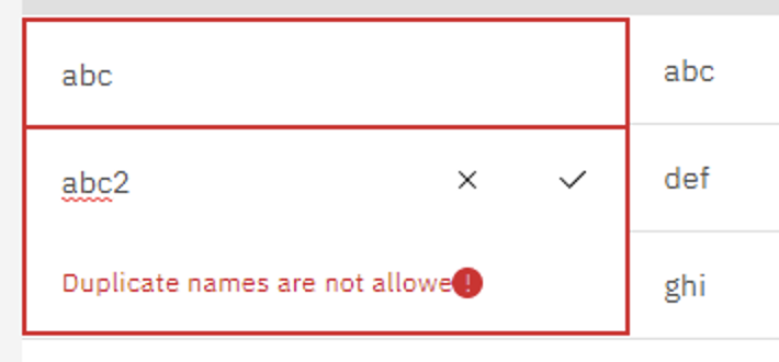
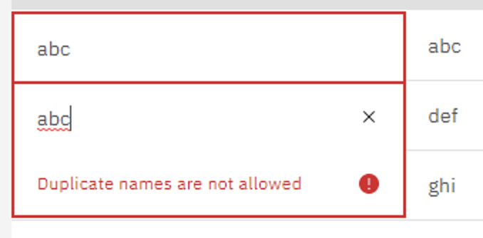 Make change and save
 (I have changed the css for the invalid icon to be positioned next to the invalid text, but i have a problem where when the save button appears, it pushes cancel button AND the invalid icon to the left by one button size.. could not figure out how to resolve.. possibly you guys will just write new elements instead of modifying the existing ones)
Other things i'm unsure of was the background color on of the invalid text field.. so i made it match the row.. like this:
Hover on row (like a the table cell in a different column)
 Hover on the specific InlineEdit, darker gray to invalid text bg to match InlineEdit (using
 $hover-selected-ui in Gray10)
 InlineEdit in editing mode, white background to invalid text bg to match InlineEdit (specifically using
 $ui-01 in Gray10)
5th issue: InlineEdit offers onChange() but it doesnt work as expected like the other carbon components.. Ticket is here https://github.com/carbon-design-system/ibm-cloud-cognitive/issues/2112
So i've manually implemented using the InlineEdit, found quite a few issues and I hope you guys resolve them. Once your implementation here is ready, I hope I can just replace my current InlineEdit component with this
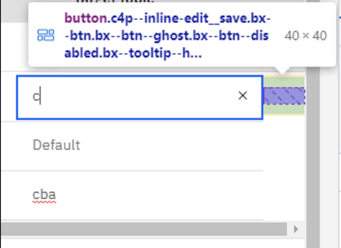
@matthewgallo design review based on PR #2269 deploy preview:
| # | Screenshot | Description |
|---|---|---|
| 1 | 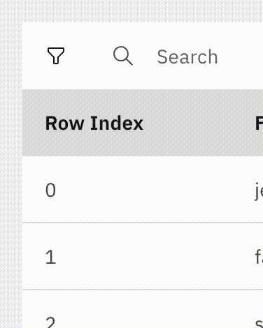 |
The region focus indicator (lightblue) influences the grid's dimensions (@matthewgallo reviewing) |
| 2 | 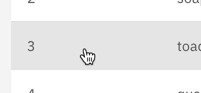 |
The cursor changed to pointer even for cells that don't support editing. Should be default (@matthewgallo reviewing) |
| 3 | 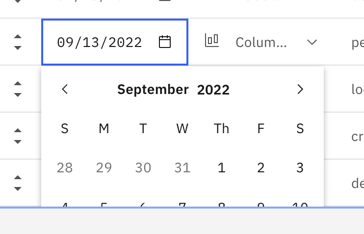 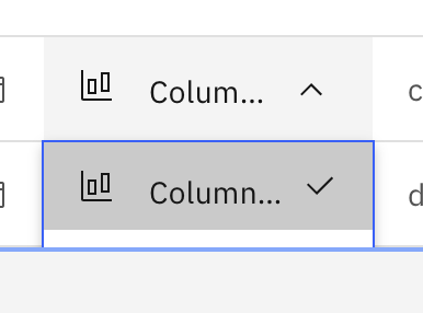 |
Overflow controls like date picker and dropdown are truncated near the end of the grid |
| 4 | 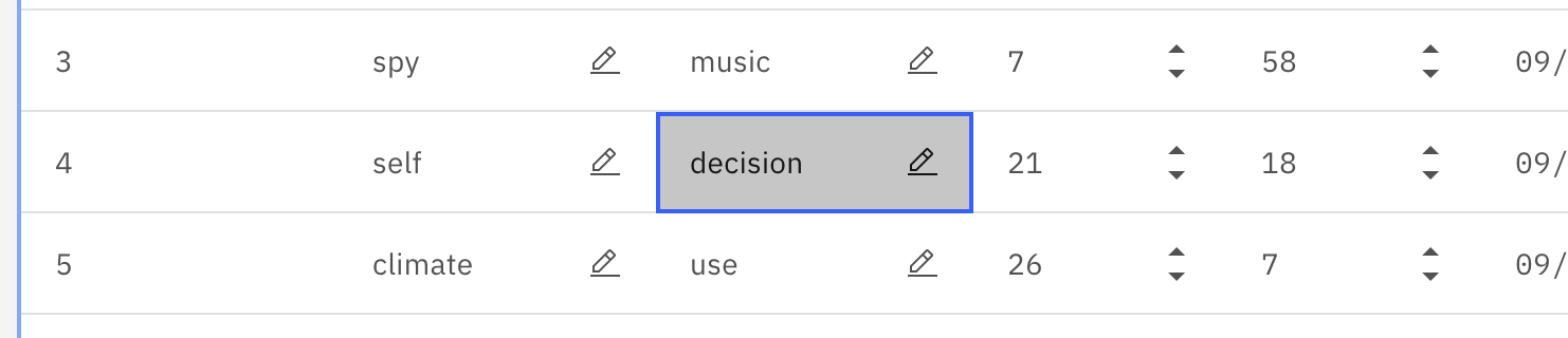 |
The row should also receive its hover effect (light gray background) when using keyboard navigation (@Ratheeshrajan reviewing) |
| 5 | 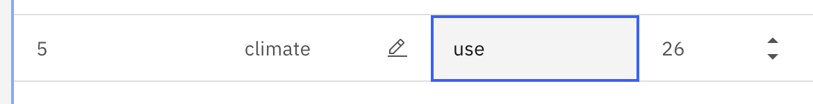 |
The row should still have its hover effect (light gray background) when a cell is in editing mode (@Ratheeshrajan reviewing) |
| 6 | 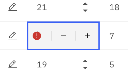 |
Validation state is not up to spec (/ not implement yet?), (@Ratheeshrajan is currently working on this piece) |
| 7 |  |
The dropdown icons are baseline-aligned, should be center-aligned (@Ratheeshrajan reviewing) |
For furher review, could you please...
- ... add a story (or a control) to see how it looks with the standard behaviour of the icons only shwoing on focus and hover?
- ... add a few disabled cells in the story?
- ... add a control to change the grid's row size / height?
Thanks for the review @janhassel! I've fixed numbers 1 and 2 on the list. @Ratheeshrajan is working on 4-7. Number 3 is a bit more complex and looks like Carbon has some issues open around similar issues of dropdowns/floating menus inside of scrolling containers. For example, here.
In terms of the stories, we're in the midst of cleaning up the Datagrid stories this week and next week, so I will make sure that your suggestions are added for the inline editing story/stories.
Will open a separate issue to address 3 from Jan since this affects some other extensions such as filtering as well.
Datagrid inline editing support has been added.
https://carbon-for-ibm-products.netlify.app/?path=/story/ibm-products-components-datagrid-datagrid-canary-extensions-inlineedit--inline-edit-usage-story