carbon-addons-iot-react
 carbon-addons-iot-react copied to clipboard
Published
20 hours ago •
 carbon-design-system
carbon-design-system
[PAL Component] Color Picker
trafficstars
What package is this for?
- [x] React
- [ ] Angular
Summary
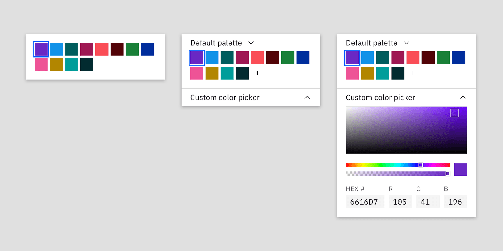
Color pickers help users immediately style visual elements such as categorization tags, data visualizations, and white-labeling without abandoning the user interface. Products can choose the level of customization that they need based on their individual use cases.
There are three variations that are all built from a base component (left to right in the image)
- Simple color picker
- Custom color picker
- Color palette picker
- Color picker usage guidance
- Color picker styles
- Mural board with the different existing variations out there today for a reference
Specific timeline issues / requests
Not sure on the timeline. This evolved from an original contribution from TRIRIGA a while back that never got much traction, and more recently other teams have mentioned that they will have a need for one
- Maximo (Monitor)
- ELM
- TRIRIGA
Specs
States
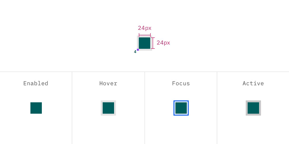
| Property | Token |
|---|---|
| hover | $hover-ui |
| focus | $focus |
| active | $active-ui |
Structure
Simple color picker
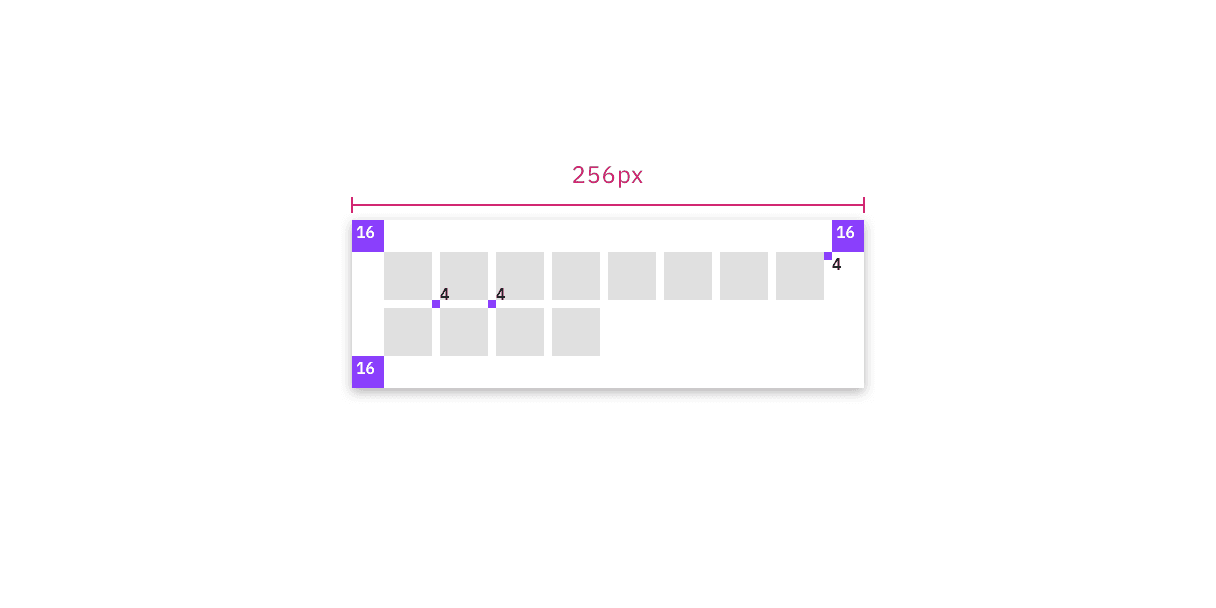
Color palette picker
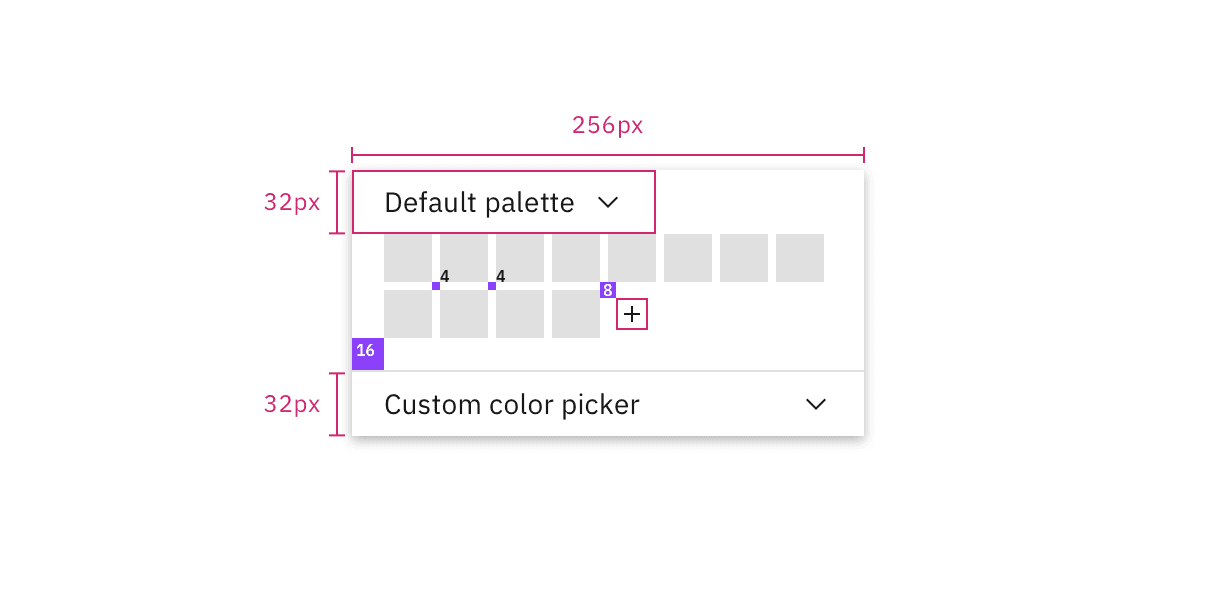
Custom color picker
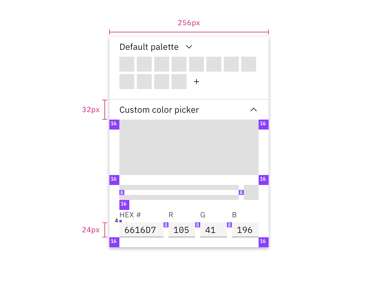
| Element | Component | Size (px) |
|---|---|---|
| Color palette picker | inline dropdown | 32 |
| Custom color picker | accordion | 32 |
| Custom color text inputs | x-small text input (custom) | 24 |