carbon-addons-iot-react
 carbon-addons-iot-react copied to clipboard
 carbon-design-system
[Tabs] Design specs
What package is this for?
- [x] React
- [ ] Angular
Available extra resources
Component guidance reference: https://pages.github.ibm.com/ai-applications/design/components/tabs/usage
@dianatran18 @Najil-K We consume Carbon's tab groups (here and here) entirely as-is. I think any enhancements we need to match parity with this pattern (which as far as I can tell, is only this menu below) should be done in the Carbon repo, not as an extension in PAL React.
Available extra resources Related: https://github.ibm.com/ai-applications/pal/issues/469 Angular issue: #1656
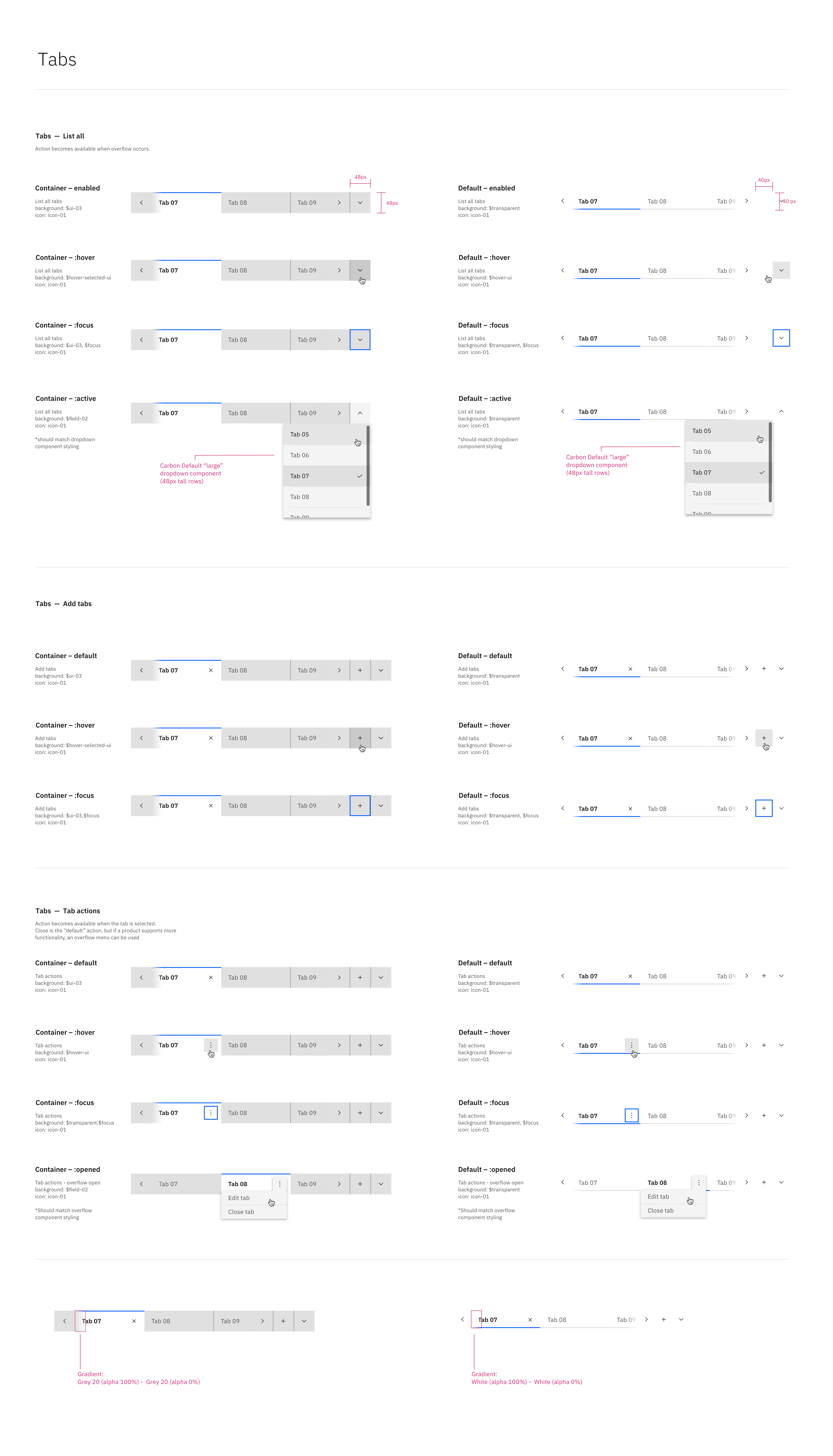
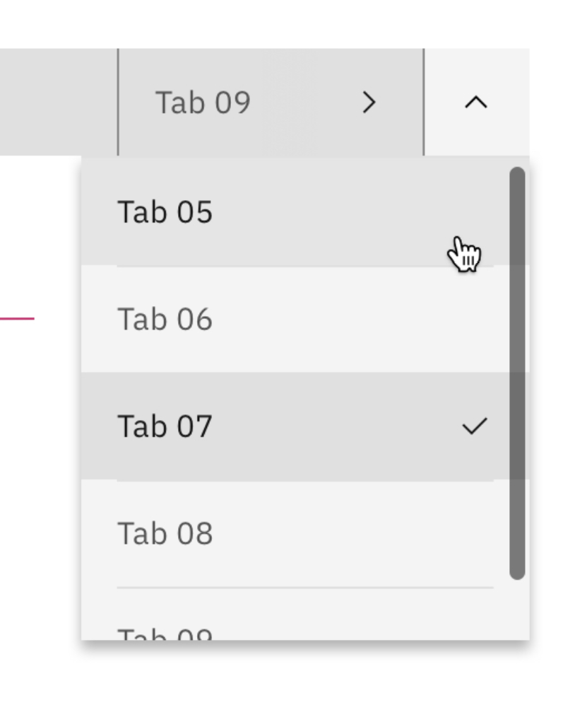
Design specs
Tab actions Can be a close action, or if the product supports more then it can be an overflow menu Add tabs Upon adding tab, the new tab gets selected, added to the end of the list, and the tab bar scrolls to display it. Just like firefox's behavior List all selected tab should show up in the middle of the dropdown display area if possible. Keyboard controls