 canonical
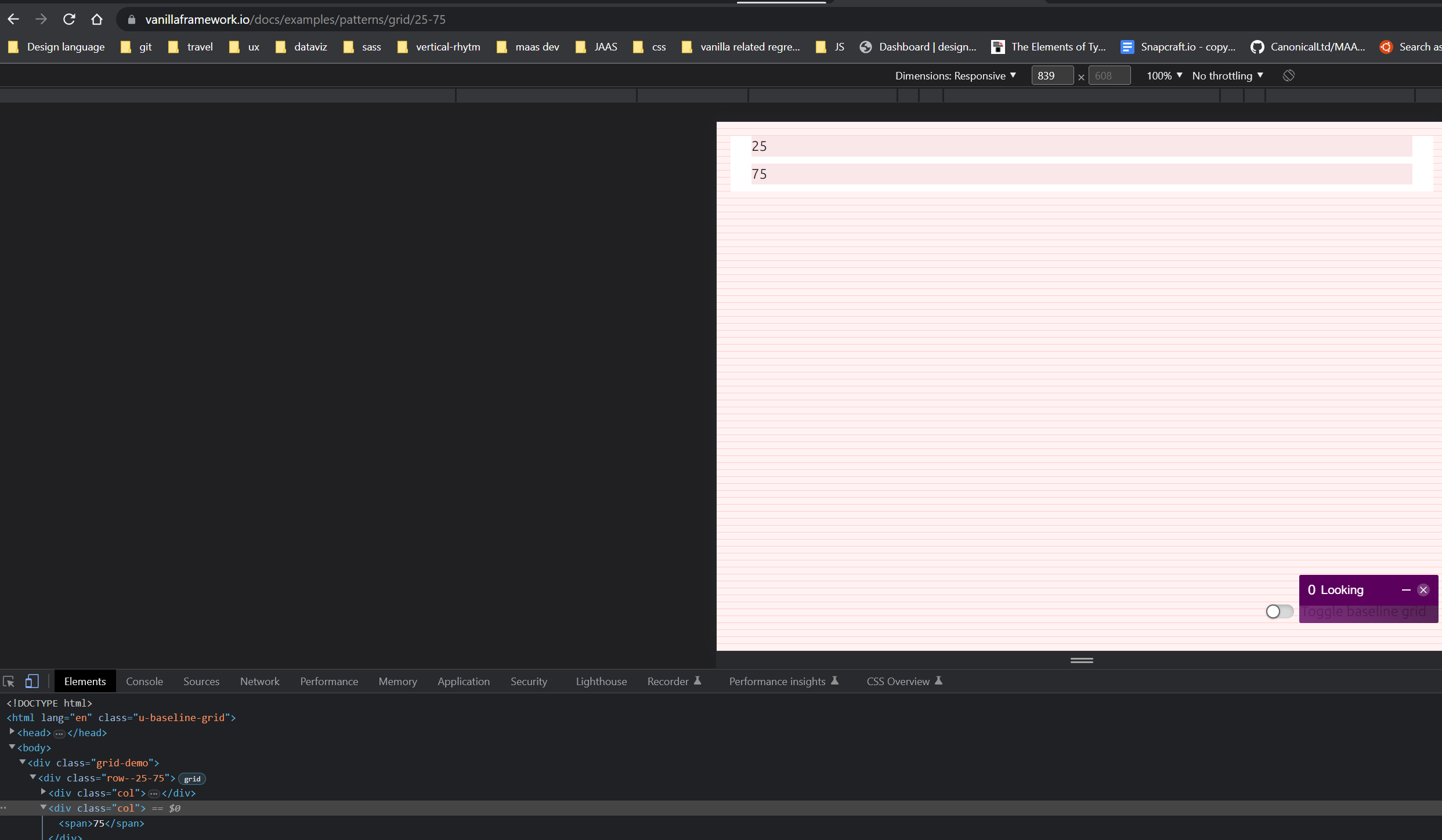
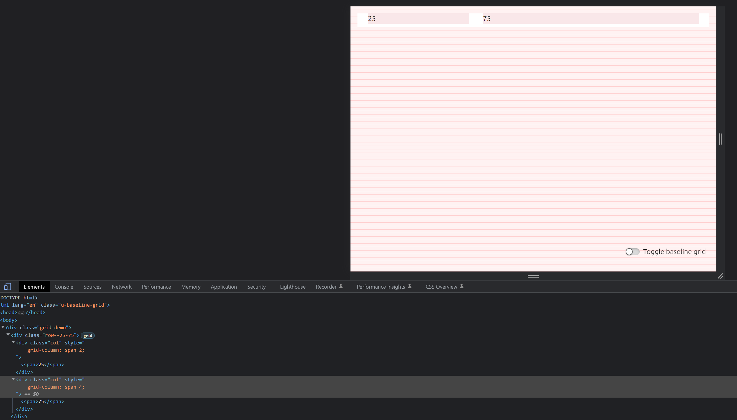
25/75 layout needs a tablet version
As far as I remember we decided to do it as 100/100, because there is no 25% on tablet. Tablet has 6 columns, how are we supposed to use 6 columns to create 25%/75% split?
If we want to introduce a new grid to tablet (12 column one?) it's gonna be a big change.
or should we divide 6 columns as 2 + 4 columns? But this will not follow the 25 split anymore…
or should we divide 6 columns as 2 + 4 columns? But this will not follow the 25 split anymore…
the left-most 25% is usually a small heading, this can go above the rest, then the remaining two should maintain as close a layout on medium screens as possible. this is usually 2+4 columns