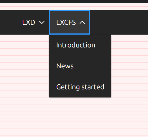
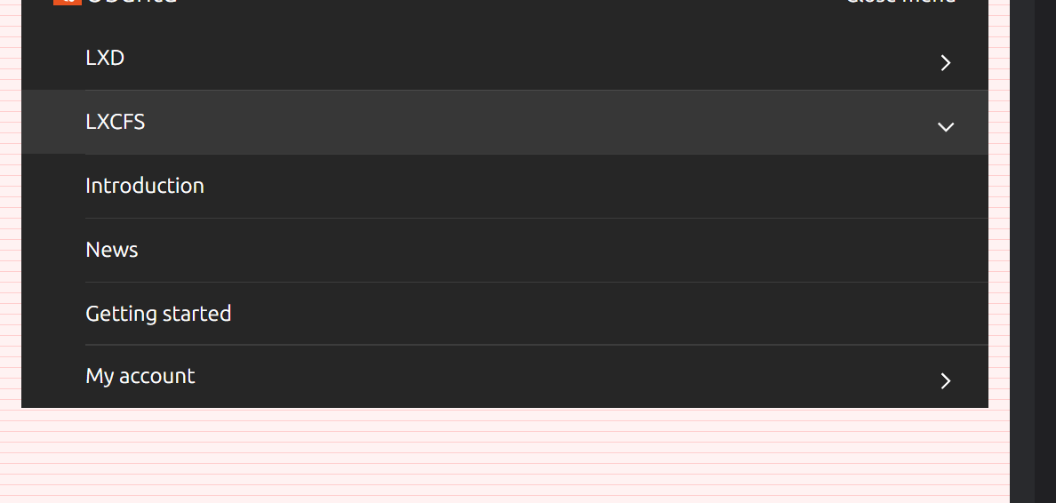
Navigation with dropdowns: separators between menu items missing on desktop

The separatorsa visibile here should persist on desktop too IMO:

I don't think they were ever there on desktop before. But I guess it's good to have them better aligned visually.
@lyubomir-popov can you provide a design how it is supposed to look like on desktop (with dropdowns having different spacing than on mobile)? Where the line should start and end between the items?
Triage: effort high, impact low/medium. To be considered when migrating navigation to new architecture.
Thank you for reporting us your feedback!
The internal ticket has been created: https://warthogs.atlassian.net/browse/WD-15223.
This message was autogenerated