 canonical
p-divider__block doesn't handle responsive columns.
Describe the bug
When using p-divider__block with responsive columns (e.g. col-medium-...) the dividers move to horizontal before the columns.
To Reproduce
Steps to reproduce the behavior:
- Go to https://codepen.io/huwshimi/pen/VwyJjVY
- Resize your window down to medium size.
- See that the columns are still horizontal but the borders move to the top.
- Resize down to mobile and the columns and borders are back to looking correct.
Expected behavior
The borders should stay horizontal.
Screenshots
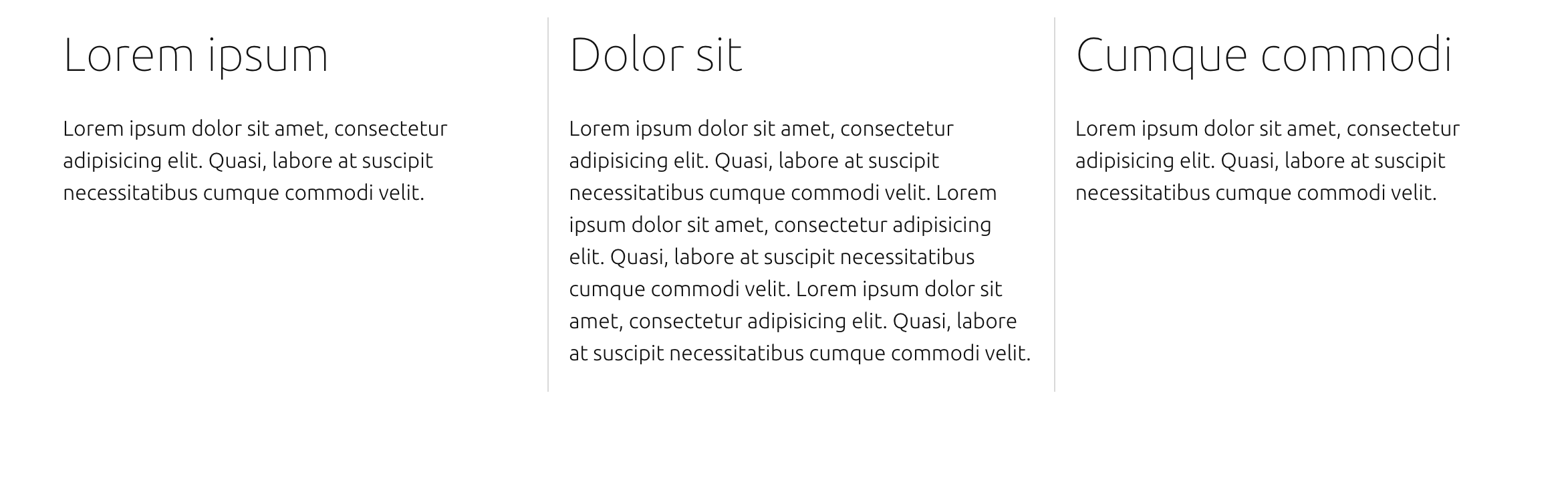
The border is correct at large size:
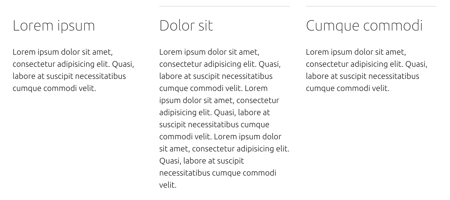
Changing to medium the borders move to the top but because of the col-medium-... classes the columns stay where they were:
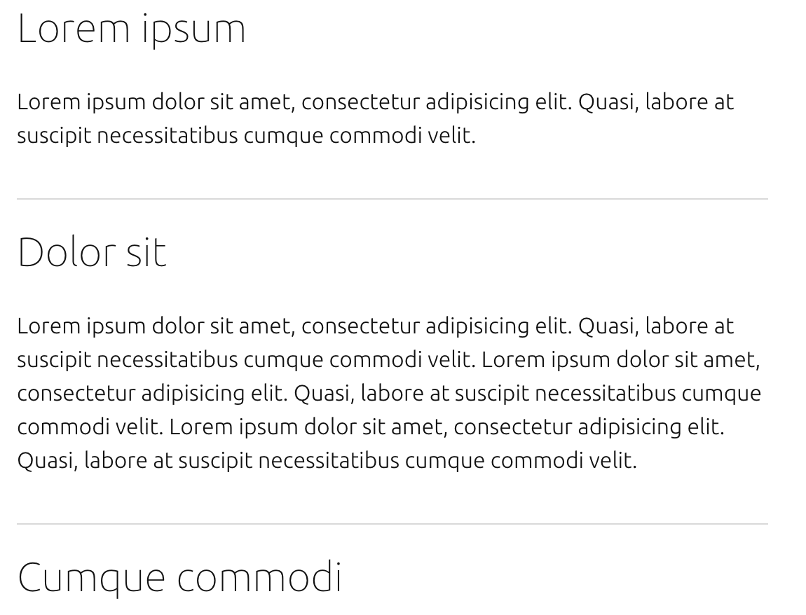
At mobile size all's right in the world again:
Additional context
This might require additional classes to correctly set the borders at each size, but at the moment (as far as I can see) there isn't a way to fix this without a custom implementation of p-divider__block.
I don't think it was intended to support mobile columns, just a predefined layout.
But I agree that the fact that it uses grid class names directly suggest any other grid class names can be used (including responsive). We need to take a look if that's something we can fix (make it work with any grid columns), or we have to limit it to one predefined layout.