react-native-paper
 react-native-paper copied to clipboard
 callstack
feat: customize top padding of a flat TextInput
Summary
A paddingTop value in a TextInput's style now controls the spacing
between the top of a flat TextInput and the top of its minimized label,
which defaults to 12.
Previously this was hardcoded to 12, even when setting dense to true, which makes it difficult to style flat TextInputs so that they take up minimal vertical space. Dense could be used and a small height given, but 12 pixels would always be frustratingly reserved above the minimized label. Now the paddingTop can be set to smaller value to get a more pleasing vertically compact view.
The use of the style's paddingTop feels appropriate given the effect of value and the use of other style properties to control the internal layout of TextInputFlat, but I'm open to suggestions of alternative approaches to exposing this.
The individual commits may be helpful to understand how the changes came about.
Partially addresses #2700.
Test plan
-
I ran the tests to ensure no snapshots changed.
-
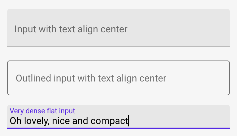
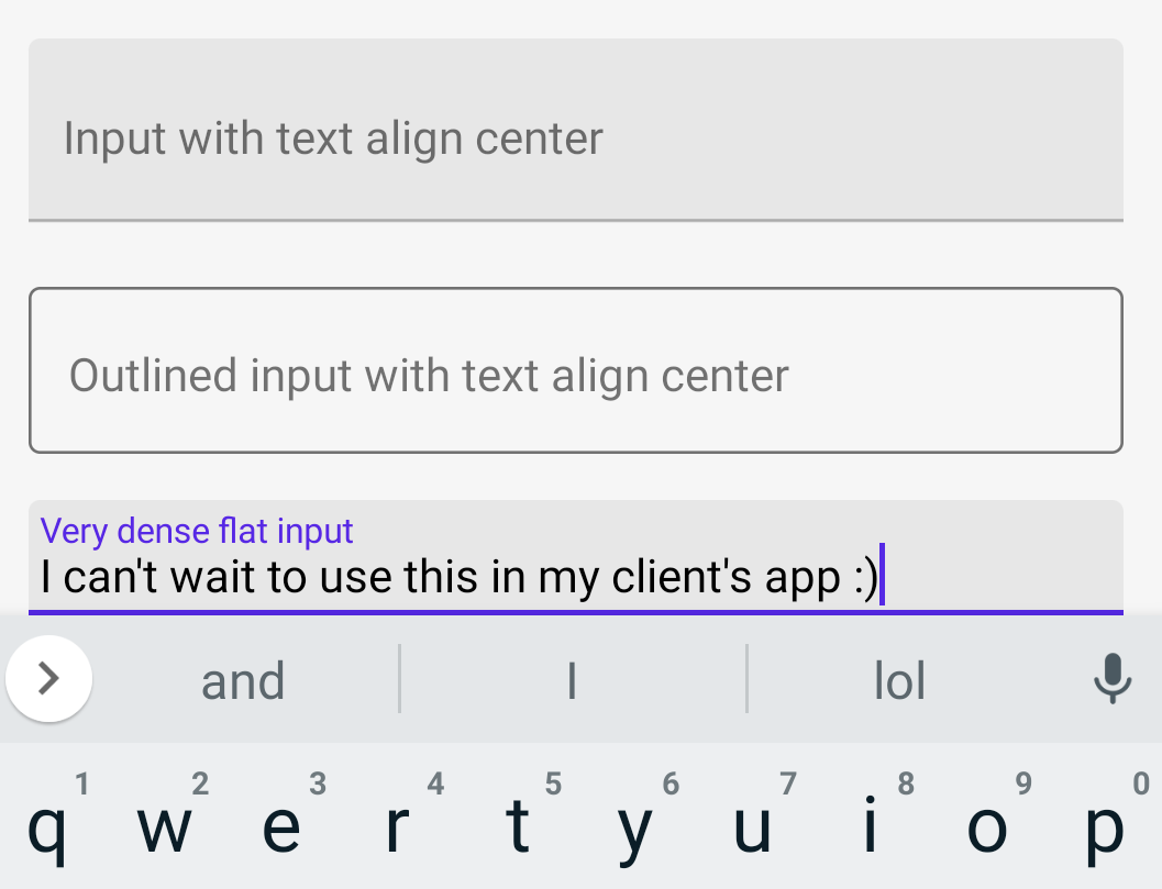
I added a "Very dense flat input" example to the bottom of TextInputExample and verified it (and the existing examples) renders correctly:
- In Chrome on MacOS:
- In the iOS Simulator:
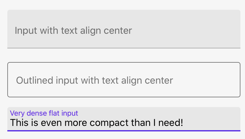
- In the Android emulator:
-
I ran the tests to ensure there are no regressions.
-
I added a test for this use case to capture future regressions.
Hey @barnardb, thank you for your pull request 🤗. The documentation from this branch can be viewed here.
Hello 👋, this pull request has been open for more than 2 months with no activity on it. If you think this is still necessary with the latest version, please comment and ping a maintainer to get this reviewed, otherwise it will be closed automatically in 7 days.
![github-actions[bot] avatar](https://avatars.githubusercontent.com/in/15368?v=4 "Published by a pub.dev verified publisher")