cal.com
 cal.com copied to clipboard
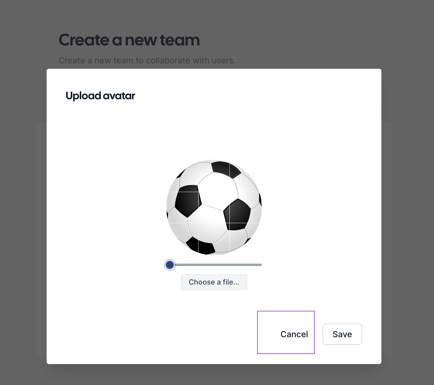
Cancel button does not have border like SAVE button - in changing avatar dialog
Issue Summary
Cancel button does not have border like SAVE button – in changing avatar dialog
Steps to Reproduce
- Go to cal.com
- Go to Settings
- Press on CHANGE AVATAR button
- Observe the Cancel button
Actual Result
Cancel button does not have border like SAVE button
Expected Result
Cancel button should have same border like SAVE button
Technical details
OS: MacOS Ventura 13.3.1 (a) Browser: Chrome 113.0.5672.63
Attachment
@mMARUF I think this is how it is supposed to be. @JeroenReumkens @sean-brydon can you please confirm this?
It does look good from an aesthetic standpoint, but wouldn't it be good if all the elements (or buttons) follow a consistent guideline?
I think , It's not a bug This cancel button was created in this particular way.
And If not , Can Someone assign this issue to me , As it seems a easy fix to me and I'm new to this Open-source community
Any Kind of help would be appreciated.

Follow the figma design guidline if it's in there with border with both button then you may consider it as a bug other wise i don't think it's a bug 🐛 design.cal.com
@mMARUF I think this is how it is supposed to be. @JeroenReumkens @sean-brydon can you please confirm this?
It is indeed how it's supposed to be. The save action is the primary action, and the cancel is secondary. That's why they look different, to also distinguish this visually. Thanks a lot for creating to issue @mMARUF, I am however gonna close this now because it looks the way it should be 😁