react-native-custom-picker
 react-native-custom-picker copied to clipboard
 budiadiono
Hide Modal (or at least the cancel "X")
Hi! Thanks for an excellent component!
I've looked, but don't see existing functionality that would hide the component entirely per #7 until activated by another control (basically hiding the modal I think) or at least removing the cancel "X" and underline when the modal is visible.
There are so many more subtle props present that I think I may be overlooking something obvious.
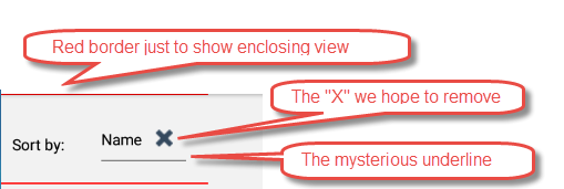
The ideal use case is to have the component be invisible until driven by action on another button or touchable - very much like the response to #7 but without having the picker control always visibly present.
The less ideal is to make the control friendlier to combine with a label, per the picture below.
Tried a couple things:
- Thought display='none' might be inherited, but no such luck
- Played with just letting it be visible and adding a text element in a row flexed view, but it's pretty ugly:
Just hiding the control and rendering it by a touchable would be a lot easier.
Am I missing something obvious here?
Also ... sooner or later is that #10 unsafe component going to be fixed? It'll blow up any minute I think, and there's a PR out there -- did it look good?
Turns out the styling magic to hide the component until activated by a button or opacity is:
style={{ opacity: 0,height: 0 }}
Works fine on the picker component itself, as well as any enclosing nested view.
I'll leave this open awhile in case there are other illuminating comments, but if not, this seems to be the way to go.