browserpass-extension
 browserpass-extension copied to clipboard
Add Ability to Manage New & Existing Passwords
This will extend functionality of the browserpass-extension to save, edit, and remove new and existing passwords for each of a user's configured password stores.
Closes #61
Nice work, huge thanks, it's very not trivial task you picked, so we and the rest of the community are very grateful!
Some initial comments from me just testing it from a user perspective:
- Add credentials -> focus "Secret" -> type "ab" -> press Backspace twice ==> it cannot remove "a", one char incorrectly remains
- Generate secret button always overwrites the first line, does not account for
password:line or the likes (applies for both "Add credentials" and "Edit", try to edit the following existing entry and use "Generate button" to update the password):
user: superman
password: batman
recovery phrase: kryptonite
phone: 1234567
The same applies to what content the "Secret" field displays while editing the contents of textarea, if I type the above from scratch, as soon as I type password: in the textarea, the "Secret" value should update from user: superman to empty.
A few other "big" ones for me:
- I don't like the fact that our fields and textareas have exactly the same colors when they are readonly (after pressing
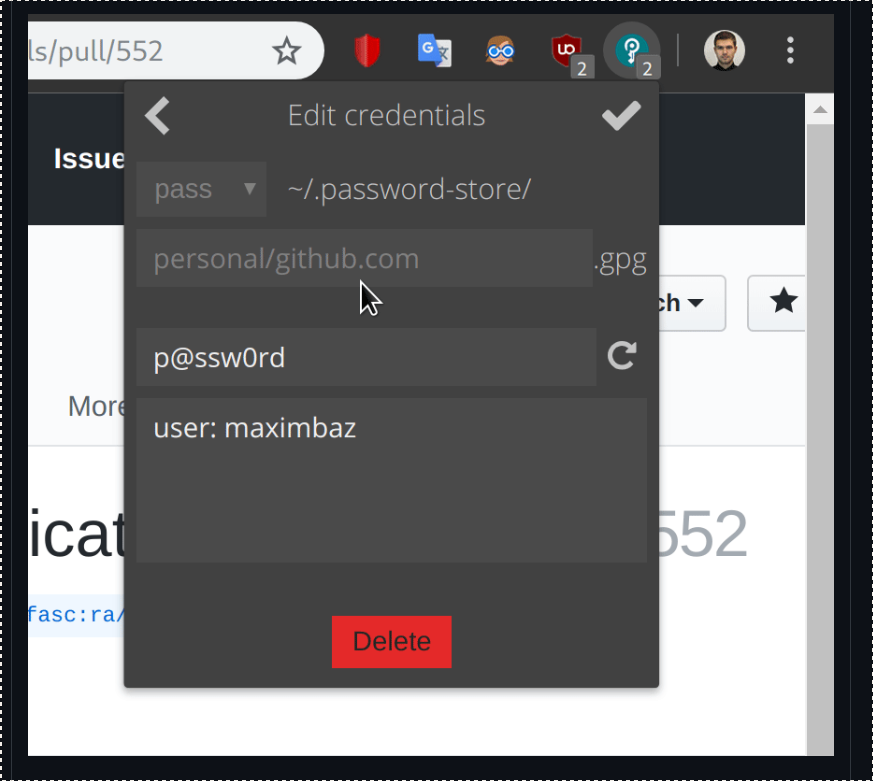
>) and when they are writeable (when going into "Edit" mode), as a user I can't easily tell if a field is mutable or not without clicking into it - I feel like we need a bit different colors for the "Edit" mode, to make it clearer perhaps? - Tiny "Save" icon button hidden in the corner and a huge orange "Delete" button right underneath the form make a wrong impression of what is the primary form action, some people for sure will hit the wrong one 🙂 I'd just swap them, have the "Save" big and bright in the bottom, and keep "remove" as a trash icon in the top where it doesn't attract much attention. Other ideas are also welcome 🙂
- My Yubikey is setup to require a touch to decrypt an entry, I quite don't like seeing the empty form during that period after pressing
>, Browserpass feels a bit broken, can we perhaps have some "Loading..." instead of the unfilled form in this case? This applies to all cases whengpgoperation is slow, yubikey does not necessarily have to be involved 🙂

And some which are maybe considered minor:
-
We are decrypting the entry twice (once when we click
>button, and once more when we click "Edit" button), which requires touching Yubikey twice, and which I believe in earlier erayd's prototype wasn't the case - is it possible to avoid re-decrypting the entry? Or maybe you have some good arguments against this idea?- I can also see that when I hit "Delete" button, after confirmation there is yet another attempt to decrypt an entry, which shouldn't be the case?
-
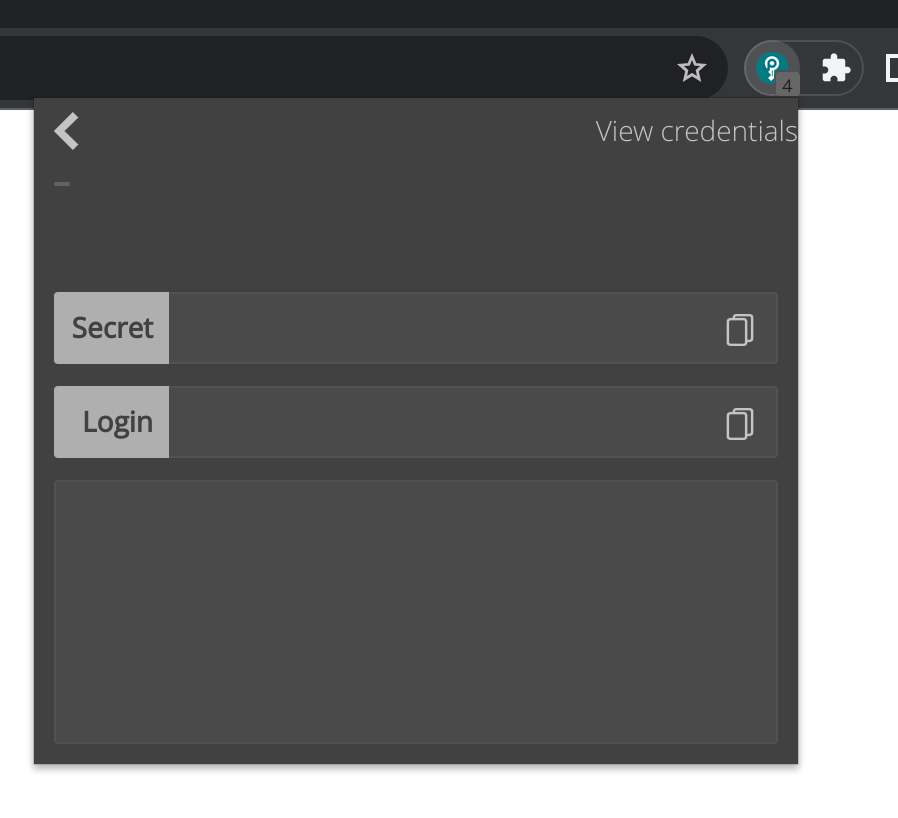
It was counter-intuitive for me to see "Secret" and "Login" fields above textarea when I pressed
>, but after clicking "Edit" the "Login" disappears, and only "Secret" field remains - what was the rationale behind that? 🙂 -
"Length" number input has buttons
^andvand I can go into negative numbers using them, the value should be bound with1as minimum.
@maximbaz regarding #4 from your last comment block, I don't completely disagree; but I think there is a problem with the part about putting the Delete action / icon in the top right. That is, will be, the exact same location of the Edit button on the previous Details page and some double click happy users may accidentally hit it. I think you make a good point. Perhaps the Save should be a bigger button bottom left, and put the Delete bottom right (or vice versa) so they're more obvious but not next to each other? Kind of like on other sites where the save and delete type actions are at the bottom but the destructive actions are clearly separated from the save actions? How does that sound?

I agree with the argument, lets try and see how it looks! 🙂
Hey @maximbaz, just responding to your overview.
- Add credentials -> focus "Secret" -> type "ab" -> press Backspace twice ==> it cannot remove "a", one char incorrectly remains
My bad, I assumed we wouldn't have an empty raw text value, it's an easy fix. One question though, shouldn't we require the raw text details to be some non-empty value when validating it is okay to save? I am referring to the Login.prototype.isValid(loginObj) method which I use to check if required items are present before saving. In short basic form validation for require inputs and formats etc.
- Generate secret button always overwrites the first line, does not account for
password:line or the likes (applies for both "Add credentials" and "Edit", try to edit the following existing entry and use "Generate button" to update the password):user: superman password: batman recovery phrase: kryptonite phone: 1234567The same applies to what content the "Secret" field displays while editing the contents of textarea, if I type the above from scratch, as soon as I type
password:in the textarea, the "Secret" value should update fromuser: supermanto empty.
I hope I'm not miss-understanding this one, but in addition to having an optional prefix (I've recently addressed this and pushed changes), the secret/password can also be found on any line? Isn't that a large move away from pass since it only grabs the first line from the text for clipboard? Or is this similar to the secret prefix where it's being done anyway so we'll be nice and support it?
- I don't like the fact that our fields and textareas have exactly the same colors when they are readonly (after pressing
>) and when they are writeable (when going into "Edit" mode), as a user I can't easily tell if a field is mutable or not without clicking into it - I feel like we need a bit different colors for the "Edit" mode, to make it clearer perhaps?
Sure, that would be good to do.
- Tiny "Save" icon button hidden in the corner and a huge orange "Delete" button right underneath the form make a wrong impression of what is the primary form action, some people for sure will hit the wrong one slightly_smiling_face I'd just swap them, have the "Save" big and bright in the bottom, and keep "remove" as a trash icon in the top where it doesn't attract much attention. Other ideas are also welcome slightly_smiling_face
We already talked about this one.
- My Yubikey is setup to require a touch to decrypt an entry, I quite don't like seeing the empty form during that period after pressing
>, Browserpass feels a bit broken, can we perhaps have some "Loading..." instead of the unfilled form in this case? This applies to all cases whengpgoperation is slow, yubikey does not necessarily have to be involved slightly_smiling_face
Yep it's on the list to address, @erayd also mentioned needing some kind of "loading, ..." instead of an empty form.
We are decrypting the entry twice (once when we click
>button, and once more when we click "Edit" button), which requires touching Yubikey twice, and which I believe in earlier erayd's prototype wasn't the case - is it possible to avoid re-decrypting the entry? Or maybe you have some good arguments against this idea?
- I can also see that when I hit "Delete" button, after confirmation there is yet another attempt to decrypt an entry, which shouldn't be the case?
So my first thought about the multiple decryption requests, we probably should try to handle it as close to the PGP agent settings (conf). However, that may be a bigger task. One possible step in that direction is to have an option to cache decrypted responses for say 30 sec, 1 min, or 2 min. Maybe the cache approach is an opt in setting and the timeout can be selected? @maximbaz @erayd I'd like your general input on that before I look at any specifics.
- It was counter-intuitive for me to see "Secret" and "Login" fields above textarea when I pressed
>, but after clicking "Edit" the "Login" disappears, and only "Secret" field remains - what was the rationale behind that? slightly_smiling_face
Probably had more to do with my lack of familiarity of how important the prefixes are in browserpass. I just figured the raw text area was all editable to the users heart's content and only kept the Secret field b/c the rest of the inputs were focused on the password only; eg. generate, symbols, and length.
- "Length" number input has buttons
^andvand I can go into negative numbers using them, the value should be bound with1as minimum.
No problem I will fix it.
So my first thought about the multiple decryption requests, we probably should try to handle it as close to the PGP agent settings (conf). However, that may be a bigger task. One possible step in that direction is to have an option to cache decrypted responses for say 30 sec, 1 min, or 2 min. Maybe the cache approach is an opt in setting and the timeout can be selected? @maximbaz @erayd I'd like your general input on that before I look at any specifics.
Let's not do any configurable caching - my idea is much simpler than that 🙂 When I click > button to see details of the password entry, the data is already visible to me in the popup, when I then click "edit", as a user I expect no new decryption operation, as all the things are already decrypted (again, I see them in plain text! 😁 ), just the form should become editable.
Let's not do any configurable caching - my idea is much simpler than that slightly_smiling_face When I click
>button to see details of the password entry, the data is already visible to me in the popup, when I then click "edit", as a user I expect no new decryption operation, as all the things are already decrypted (again, I see them in plain text! grin ), just the form should become editable.
Actually, it occurred to me that the default pgp agent conf already has a reasonable default timeout (cache ttl) for authentication / decryption, that's why it has not been an issue for me. @maximbaz are you disabling any of that in your config? Or have a timeout so low that it's rendered ineffective? I ask because the "detail" and the "add / edit" view components are not the same. I originally started this with trying to only add the new behavior, I would have to completely replace the "detail" view, and based on some other feed back I may have to refactor the "list" view component as well; at that point I'll have refactored or replaced almost everything. Some of this is starting to feel like feature / scope creep.
I have indeed configured touch requirement for every decryption operation. OK I probably need to look at the code before giving any further comments, so far I was commenting purely from a user perspective, where as a user I naturally assume that the entry is already decrypted in the context of the open popup. If it is too difficult to implement, I'd be fine with re-decryption, let's focus on the other items in the TODO list.
I have indeed configured touch requirement for every decryption operation. OK I probably need to look at the code before giving any further comments, so far I was commenting purely from a user perspective, where as a user I naturally assume that the entry is already decrypted in the context of the open popup. If it is too difficult to implement, I'd be fine with re-decryption, let's focus on the other items in the TODO list.
It's not too difficult, it just seems like when I think I'm getting close to completing the todo list gets a little longer and I can't help but think that we could've broken it up into smaller chunks.
It's not too difficult, it just seems like when I think I'm getting close to completing the todo list gets a little longer and I can't help but think that we could've broken it up into smaller chunks.
It seems quite odd to me that we can't simply grab the textContent, rather than decrypting it again. But if you'd prefer to leave it for now, and deal with it after this PR is merged, I'm OK with that too. If we go down that route though, we should open an issue to track it, because I don't want to leave it that way.
One question though, shouldn't we require the raw text details to be some non-empty value when validating it is okay to save?
Yes. If. it's empty, something is probably wrong, and we therefore shouldn't be saving it. If the user wanted to nuke the entry, they should probably be deleting it rather than saving an empty entry.
I hope I'm not miss-understanding this one, but in addition to having an optional prefix (I've recently addressed this and pushed changes), the secret/password can also be found on any line?
Yes. The prefix clearly identified what it is, therefore we should treat it as the user intended. We already parse it that way now.
Isn't that a large move away from
passsince it only grabs the first line from the text for clipboard? Or is this similar to the secret prefix where it's being done anyway so we'll be nice and support it?
The latter. Users do it, and supporting it doesn't violate any expectations or add any UX complexity for the user, so we support it.
So my first thought about the multiple decryption requests, we probably should try to handle it as close to the PGP agent settings (conf). However, that may be a bigger task. One possible step in that direction is to have an option to cache decrypted responses for say 30 sec, 1 min, or 2 min. Maybe the cache approach is an opt in setting and the timeout can be selected? @maximbaz @erayd I'd like your general input on that before I look at any specifics.
I really don't want us caching anything confidential that we don't absolutely have to cache, but I am OK with reusing already-decrypted content that we are currently displaying.
Probably had more to do with my lack of familiarity of how important the prefixes are in browserpass. I just figured the raw text area was all editable to the users heart's content and only kept the Secret field b/c the rest of the inputs were focused on the password only; eg. generate, symbols, and length.
It was counter-intuitive for me to see "Secret" and "Login" fields above textarea when I pressed >, but after clicking "Edit" the "Login" disappears, and only "Secret" field remains - what was the rationale behind that?
@maximbaz my rational behind not including the login field on the addEdit view was I following your original suggested design. Also, since we doing all of the editing in the text area, i don't think it makes sense to allow editing in another field.

Do not feel obliged to follow that original design if it limits your current improvement ideas 🙂
I don't think I feel strongly about it, more like a confusion that the form suddenly changed... The same is true for password, we are allowing editing it in two locations...
@maximbaz @erayd I have made a lot of changes / improvements to the extension and addressed most of your feedback, but not all yet. Please reference my current todo's list before providing any additional feedback. But if you wouldn't mind reviewing my latest updated changes I would appreciate it. Thank you.
@patgmiller Thanks - will take a look at it. Still extremely busy, so it won't happen immediately, but I'll try to find some time for it in the next week or two.
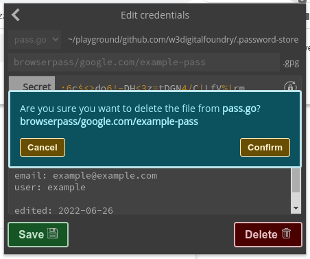
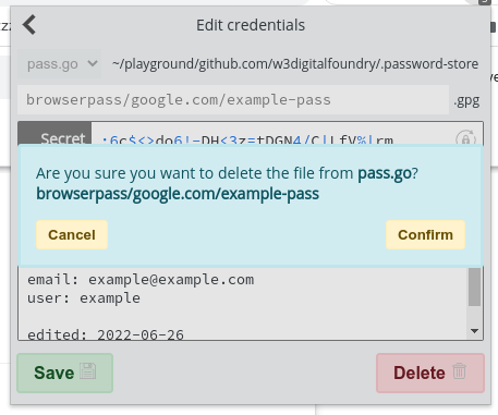
@erayd @maximbaz I've also replaced the deprecated confirm with a <dialog> element / component as requested.


@maximbaz @erayd be advised I've set the host capabilities version in my branches.
browserpass-extension (this pr)
# src/background.js
    settings.version = response.version;
    const EDIT_VERSION = 3 * 1000000 + 1 * 1000 + 0;

    // host capabilities
    settings.caps.save = settings.version >= EDIT_VERSION;
    settings.caps.delete = settings.version >= EDIT_VERSION;
    settings.caps.tree = settings.version >= EDIT_VERSION;
https://github.com/patgmiller/browserpass-native/tree/implement-tree-save-delete, which is simply Maxim's original but re-based onto the master branch of browserpass-native
# version/version.go
const major = 3
const minor = 1
const patch = 0

// Code version as integer
const Code = major*1000000 + minor*1000 + patch
@maximbaz @erayd While reviewing part of the native host application I realized the tree request was intended to list directories for a password store. I've thrown together a working rough draft of showing directories one level at a time. The tree and search results are like 95% done. I just need to make the UI nicer, include tab index and click event to append the selected directory to the file path. See attached.
@erayd it's been three weeks, have you had a chance to review the changes?
@patgmiller I'm midway through.
Awesome! I'm super excited about it 😄
@erayd @maximbaz I know Steve is doing his review right now, but while I was using it I felt like the tree browsing + filtering could use a little more help. So I added Home, End, PageUp and PageDown handlers for when the directory tree list has focus. Here is a demo of it.
@patgmiller I'm midway through.
@erayd well it's been a month since you were "midway through", another week and we'll be two months into your review without any activity, I just curious on some sort of progress.
If there were any corrections I could be making corrections while you're finishing your review.
@patgmiller I apologise for the slow progress on my end of this; I am very aware that I've been holding you up in a big way. I'll try to get some sort of significant and useful direction to you by the end of the weekend. Hopefully that will be in the form of a finished code review, or if not then I'll post what I have so far. I've overall been pretty happy with what I've seen, so hopefully you won't have to put up with too much more of my holding things up on this one before it's merged.
I'm still flirting with burnout here, which makes this whole thing much harder to push through than would ordinarily be the case. The problem with reviewing a changeset this large on a security project is that I can't keep it all (along with all its context) sufficiently in my head between sessions, or pick it back up quickly with my head in that state. I can't spend too long with it at once without ending up staring at the screen getting nowhere (usually after I've followed something several layers deep to remember how all the parts interact), and every time I sit down with this I have to get back up to speed with it first to ensure I don't miss bits or make silly mistakes after spending the previous week or so buried in other problems.
Once this PR is merged, and the stuff comes in smaller bites (that can be reviewed in one go), progress on this project should hopefully be a lot faster. The biggest issue with reviewing this particular PR is simply the size of it / the amount of stuff it touches - I simply don't have the time (or energy) to do something this large all at once without being sloppy about it, and given the sensitivity of data we handle, I don't want to miss something important.
@erayd I appreciate the clarification! I'm sorry for whatever items on your plate are contributing to your burnout and you're right, it wouldn't do at all to proceed in a sloppy manner given the security nature of the project. I'll make sure to keep that in mind, thanks so much.
I am working on this now. Will post what I have as soon as I put it down.
One other thought - some of the theming colours on the new additions seem a bit off (albeit that colours can be quite subjective, so it's possible that it might be only me who feels this way). I don't want it to hold up this PR for it, but would be good if we can maybe nitpick these a bit at some point after it's merged.
Thank you so much for your work on this, @patgmiller. Overall I'm really happy with what you've done here. Most of my nitpicks this time are just UI stuff, and the ones that aren't are still minor.
I reckon this is getting pretty close to merge-ready.
Cool, I'll have a look this week. Thank you so much!
One other thought - some of the theming colours on the new additions seem a bit off (albeit that colours can be quite subjective, so it's possible that it might be only me who feels this way). I don't want it to hold up this PR for it, but would be good if we can maybe nitpick these a bit at some point after it's merged.
I'll be honest, with the newer elements (save,delete buttons, modal dialogue, and notifications, etc) I only got them to where I thought the might be good enough to merge. I am not at all stuck on them, feel free to tweak away.
@patgmiller Sounds good. I'm happy for us to address any of the UI points I raised that aren't also a functional concern, after merging. We can nitpick over making it pretty later 🙂.