brave-ui
 brave-ui copied to clipboard
 brave
brave
create a text component
default text should be either a div or span with levels defined by the design spec.
if there's a case for labels, for example, this could be accomplished by the .withComponent syntax defined by styled-components
@cezaraugusto would you be able to share more info? Would be awesome if @ImmanuelSegol could grab this 😄
@cezaraugusto would you be able to share more info? Would be awesome if @ImmanuelSegol could grab this 😄
Would be happy to, I just need some more details.
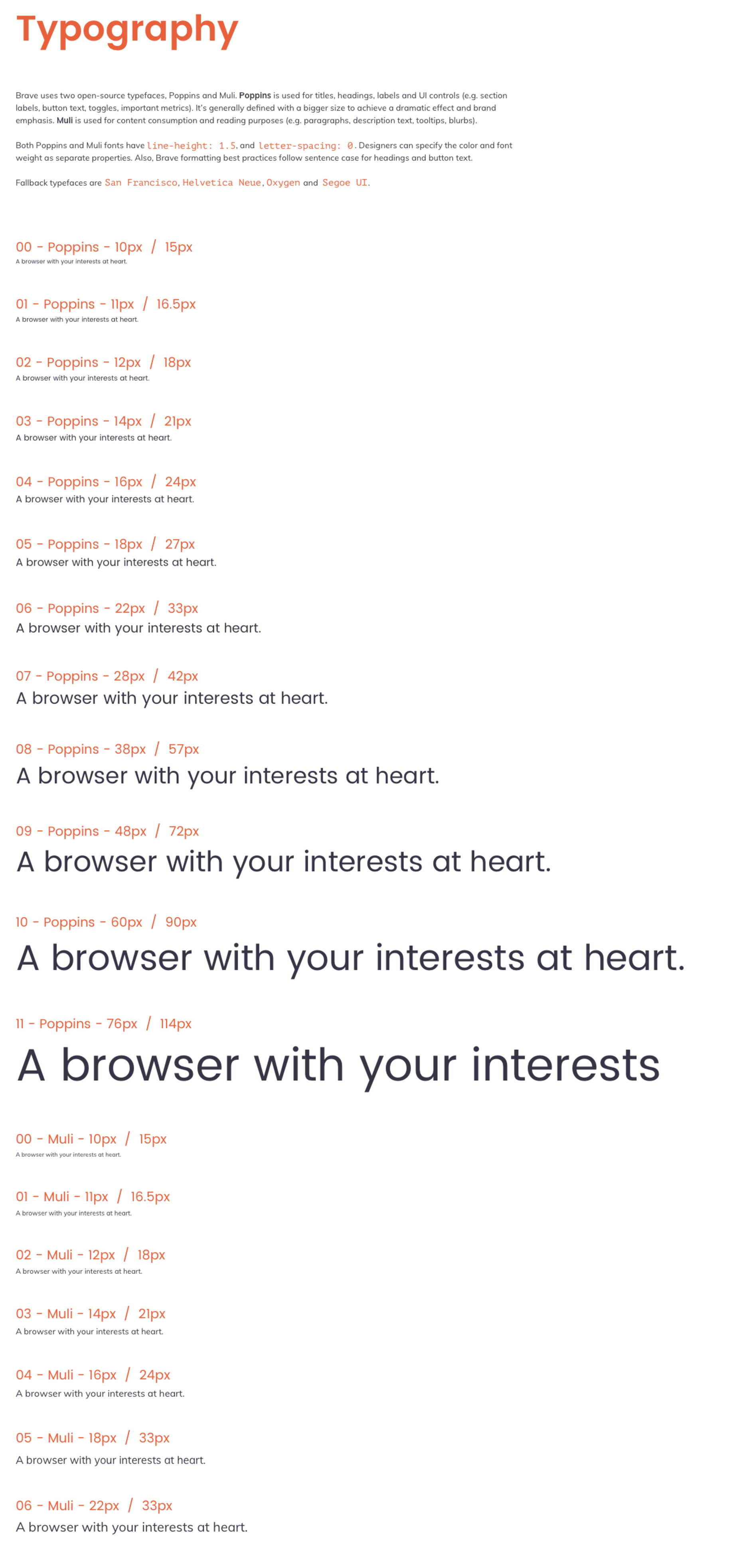
We have decided that we would Like a Text component that:
- Accepts a
sizeproperty, which is a string value from'00'to'12' - Accepts a
typeproperty, which is one of'display'or'body'
Both these properties will allow us to ascertain not only the font-family to use, but also the font-size and the line-height.
As part of this work, the TextHeading component should be changed to accept the size property that the Text components props, and in addition a level property, value from 1 to 6 which would be the semantic hierarchy of the heading. It should use the level property for the element type (h{1-6}) and pass the size property to the Text component, as well as the type of 'display'.
Now the problem with this spec is that it's defining the size scale decision in the component render function, instead of purely in the style.ts files. Props if someone can come up with an idea for this that preserves all style decisions in one place - the style.ts files.
Here are the sizes:
@cezaraugusto @petemill Specify status on request and in general on project. I am interested in the project and would like to contribute. Thank you in advance!