form-js
 form-js copied to clipboard
 bpmn-io
Support for custom elements
As a Developer I would like to have an option to add custom elements to palette in designer and also to viewer,
Describe the solution you'd like
Exporting a registry of elements which will allow to add new elements and it's implementations would be good option. Also you can think of providing web components for implementation.
For example I would like to implement an Upload component with some custom logic
Hi, is there a way to develop our own component and add it to the left panel (FORM ELEMENTS LIBRARY) ?
@nikku - I have a working prototype of custom elements (although very brutal and needs a lot of refactoring and test specs), let me know if this is what you envisioned.
added customFields and customPropertyPanelGroups options. And then added my File Input Field Type and Property Panels to the FormEditor and From options in the Playground.js I could have chose a simpler example, but I had this one done already.
https://github.com/dfulgham/form-js/tree/custom-elements-API
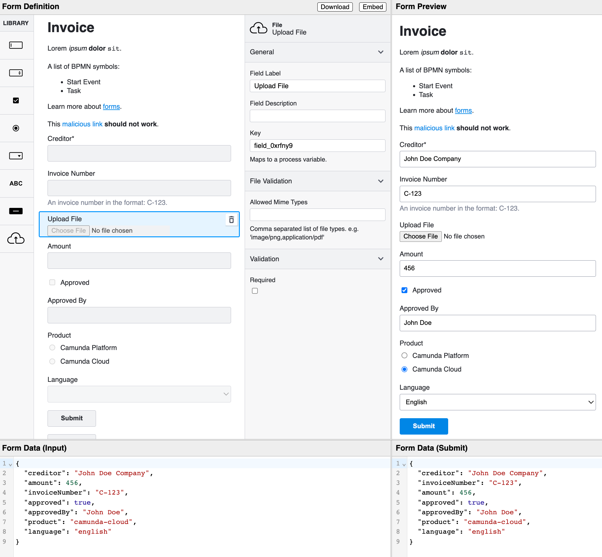
The Following two Objects make up a custom field type and property panels.
FileInput Custom Field Type:
const customFields = [{
  icon: () => {
    return (<svg id="file-icon" width="54px" height="54px" viewBox="0 0 54 54" xmlns="http://www.w3.org/2000/svg">
      <g transform="matrix(0.440697, 0, 0, 0.288703, -72.000198, -53.362686)" style="">
        <path d="M 261.968 260.403 C 260.414 260.403 258.876 260.629 257.367 261.077 C 256.679 232.991 241.391
        ...
        316.711 285.911 296.698 C 285.911 276.683 275.17 260.403 261.968 260.403 Z" stroke="none" fill="#000002" fill-
       rule="nonzero" />
      </g>
    </svg>);
  },

  label: 'File',
  type: 'FileInput',
  keyed: true,
  emptyValue: '',
  propertyPanelGroups: ['FileGeneral','FileProperties', 'validation'],
  create: (options = {}) => options,
  fieldRenderer: (props, FieldComponents, Form, Utils) => {
    const type = 'FileInput';

    const { formFieldClasses, prefixId } = Utils;
    const { Label, Description, Errors } = FieldComponents;

    const { disabled = false, field, value = '' } = props;

    const { description, id, label, validate = {} } = field;

    const { required } = validate;

    // eslint-disable-next-line react-hooks/rules-of-hooks
    const [errors, setError] = useState([]);


    const convertBase64 = (file) => {
      return new Promise((resolve, reject) => {
        const fileReader = new FileReader();
        fileReader.readAsDataURL(file);

        fileReader.onload = () => {
          resolve(fileReader.result);
        };

        fileReader.onerror = (error) => {
          reject(error);
        };
      });
    };

    const onChange = async ({ target }) => {
      const base64Value = await convertBase64(target.files[0]);
      props.onChange({
        field,
        value: base64Value
      });
      setError(_validate(base64Value));
    };

    const _validate = (value) => {
      const { allowedMimeTypes } = field;
      if (!allowedMimeTypes || allowedMimeTypes.length === 0) { return []; }
      const _allowed = allowedMimeTypes.split(',');
      const fileMime = value.split('data:')[1].split(';')[0];
      if (allowedMimeTypes) {
        return _allowed.includes(fileMime) ? [] : [`File type not allowed, must be one of: ${allowedMimeTypes}`];
      }
    };

    const onReset = () => {
      props.onChange({
        field,
        value: ''
      });
    };

    const onClick = () => {
      let newWindow = window.open('');
      newWindow.document.write(
        "<iframe width='100%' height='100%' src='" +
              value + "'></iframe>"
      );
    };

    const { formId } = Form._getState();

    if (disabled === true && value)
      return <div class={ formFieldClasses(type, errors) }>
        <Label id={ prefixId(id, formId) } label={ label } required={ required } />
        <a onClick={ onClick }><button type="secondary" class="fjs-button">View/Download</button></a>
        <Description description={ description } />
      </div>;

    return (
      <div class={ formFieldClasses(type, errors) }>
        <Label id={ prefixId(id, formId) } label={ label } required={ required } />

        <input
          class="fjs-input"
          disabled={ disabled }
          id={ prefixId(id, formId) }
          onInput={ onChange }
          onReset={ onReset }
          type="file"
          value={ value }
        />
        <Description description={ description } />
        <Errors errors={ errors } />
      </div>

    );
  }
}];
Custom Property Panels:
const customPropertyPanelGroups = [
  {
    name: 'FileGeneral',
    groupRenderer: (field, editField, Components, MinDash) => {
      const { Group, LabelEntry, DescriptionEntry,KeyEntry } = Components;
      const entries = [];
      entries.push(<LabelEntry editField={ editField } field={ field } />);

      entries.push(<DescriptionEntry editField={ editField } field={ field } />);

      entries.push(<KeyEntry editField={ editField } field={ field } />);

      return (
        <Group label="General">
          {
            entries.length ? entries : null
          }
        </Group>
      );
    }

  },
  {
    name: 'FileProperties',
    groupRenderer: (field, editField, Components, MinDash) => {
      const { id } = field;
      const { get } = MinDash;
      const { Group,TextInput } = Components;
      const path =['allowedMimeTypes'];

      // custom logic

      const onInput = (value) => {
        if (editField && path) {
          editField(field, path, value);
        }
      };

      return (
        <Group label="File Validation">
          <div class="fjs-properties-panel-entry">
            <TextInput
              id={ `${id}-allowedMimeTypes` }
              label="Allowed Mime Types"
              onInput={ onInput }
              value={ get(field,path) }
            />
            <div class="fjs-properties-panel-description">Comma separated list of file types. e.g. 'image/png,application/pdf'</div>
          </div>

        </Group>
      );
    }
  },];
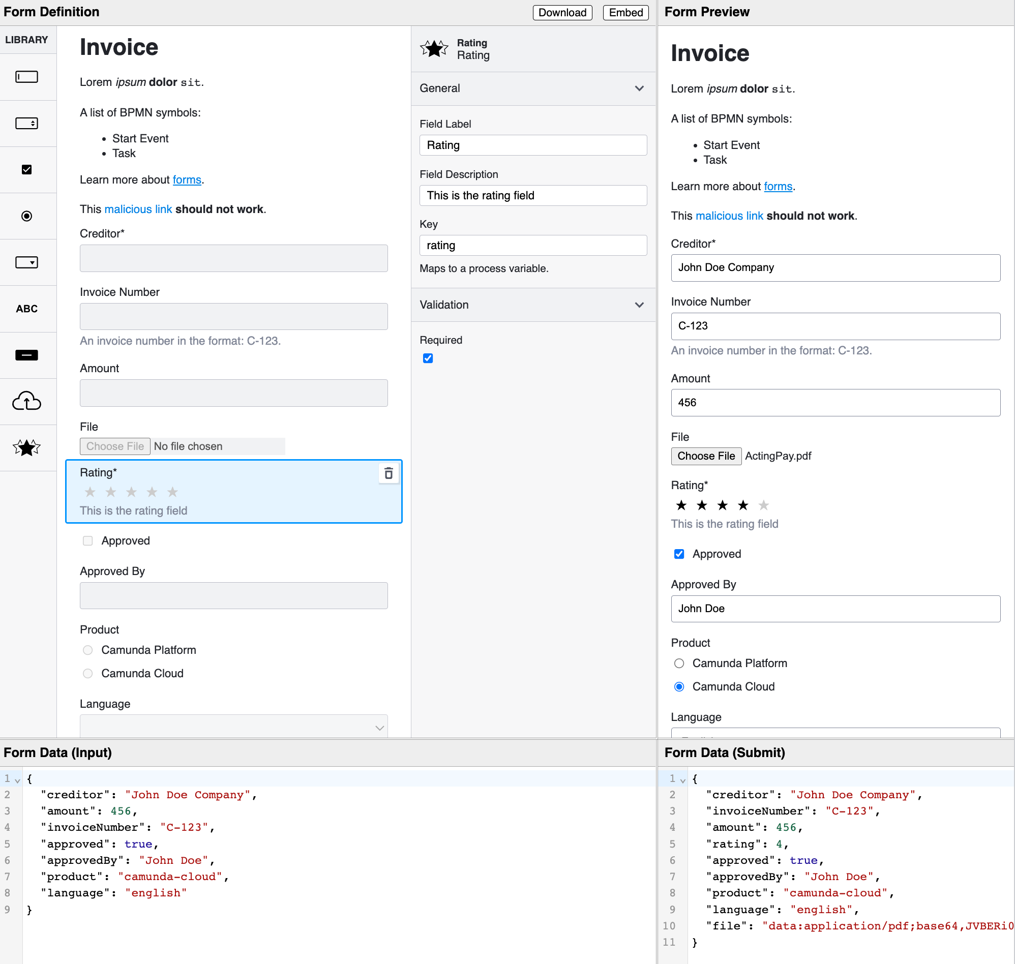
@dfulgham This is what I've envisioned.
Will check it out in detail in the next days.
But from what it looks like (quick overview) this is a great start towards a custom element API.
@nikku going to need a little help in getting the tests created and code coverage. Is there a way in the local environment to generate code coverage? I'm pretty new to lerna