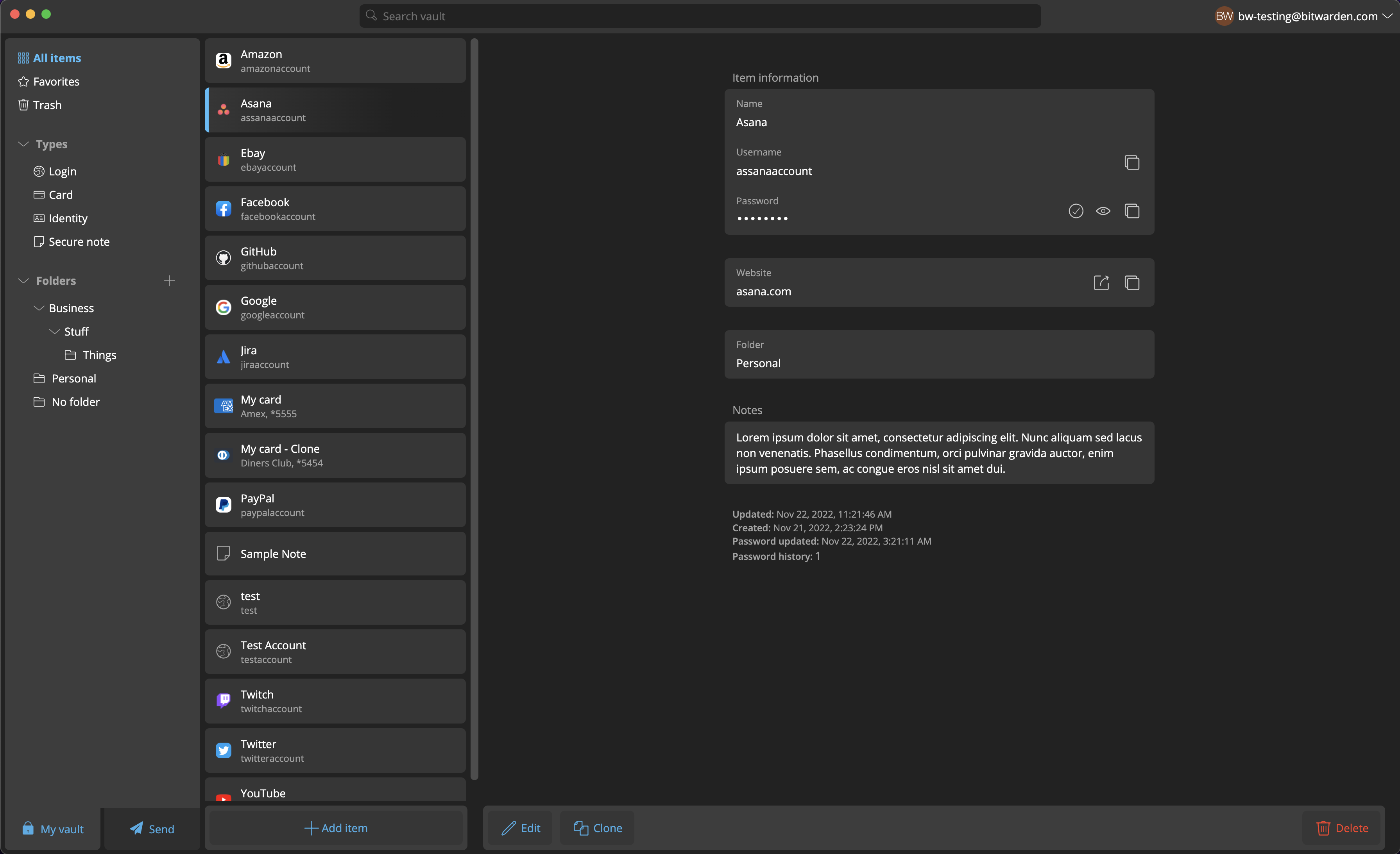
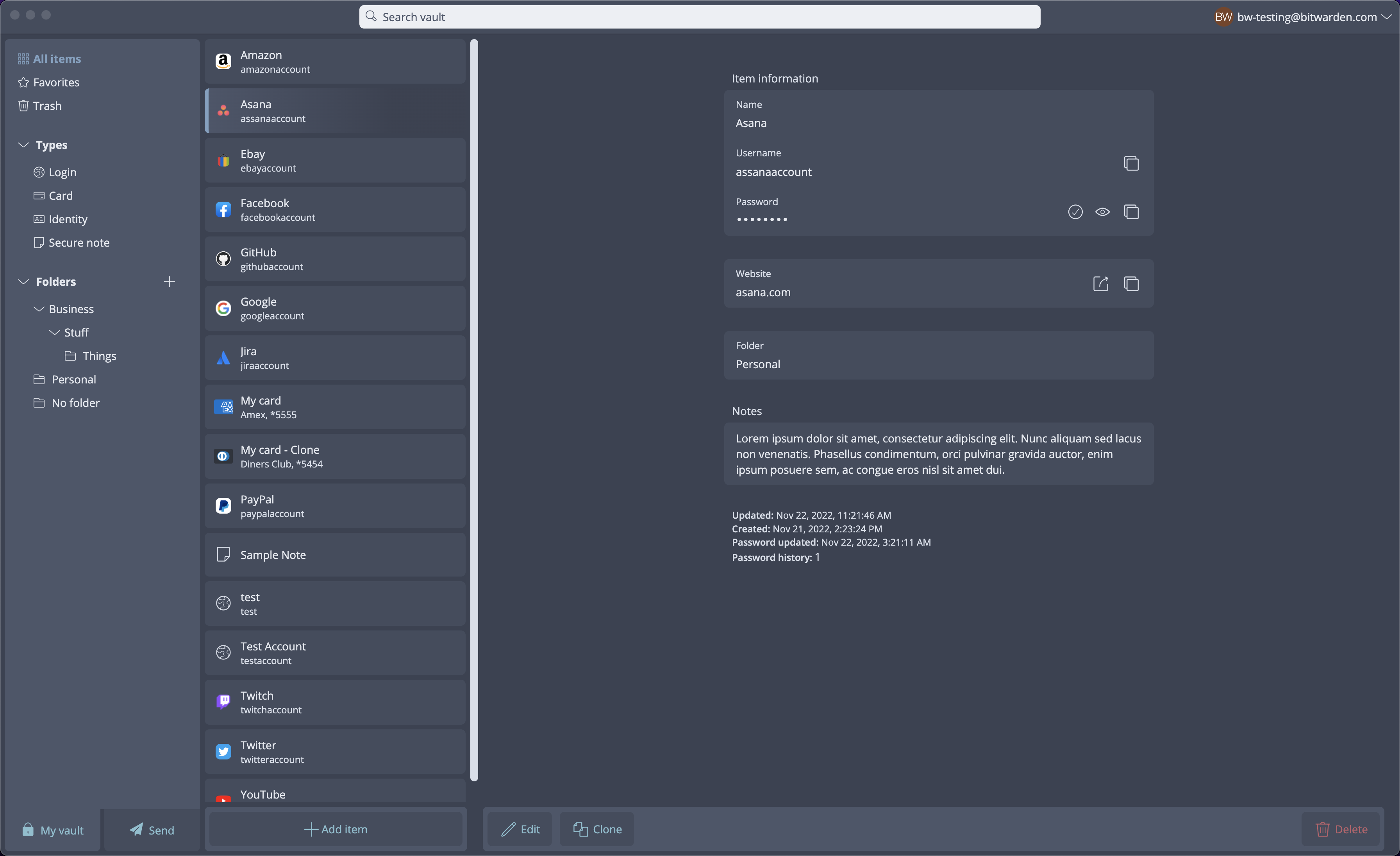
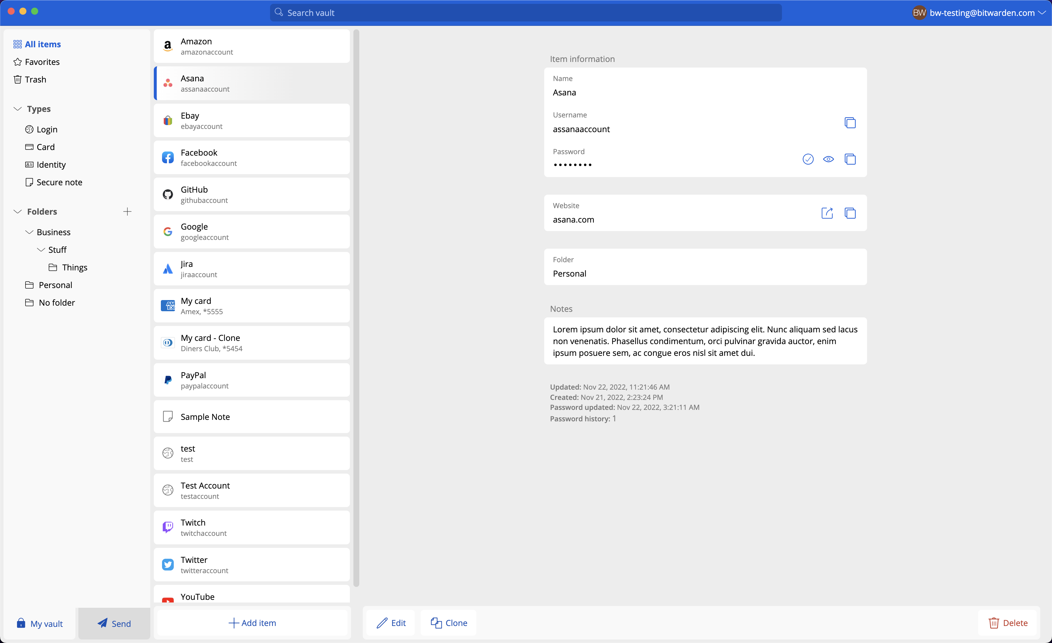
Desktop UI Refresh
Type of change
- [ ] Bug fix
- [ ] New feature development
- [x] Tech debt (refactoring, code cleanup, dependency upgrades, etc)
- [ ] Build/deploy pipeline (DevOps)
Objective
Desktop UI Refresh
Code changes
- file.ext: Description of what was changed and why
Screenshots
Before you submit
- Please add unit tests where it makes sense to do so (encouraged but not required)
- If this change requires a documentation update - notify the documentation team
- If this change has particular deployment requirements - notify the DevOps team
Liking the clean look on this so far. Hoping this will also filter through to the extension?
Liking the clean look on this so far. Hoping this will also filter through to the extension?
@patrickhlauke: Possibly... 😉 https://github.com/bitwarden/clients/pull/3842
@xIUPITERx
Isn't it planned to replace folders with tags?
That isn't part of this work. This is a UI refresh. Vault item tags ist still planned and on the roadmap
I was just surprised that the folder structure should also get a new design when it will soon be replaced anyway, but that's not so important.
I don't know if this is the place for discussion/suggestions, but can the Search box be automatically selected when the window opens, and clicking an information box (Username/Password/TOTP) copy, instead of having to click a smaller button, similar to 1Passwords functionality?
Currently the entire info box highlights like a button, but clicking it does nothing, instead having to click a button that has a less noticeable hover effect.
 Checkmarx One – Scan Summary & Details – f5e859f8-e5f7-41a1-a443-749aaf8204df
No New Or Fixed Issues Found
@differsthecat @DanHillesheim I've made some edits and updated the screenshots in the PR to reflect the changes. Notice two things:
- The empty states
- The margin on the footer sections
I removed the margin on the rightmost side (the Details column), but only reduced it slightly on the left side in order to maintain proper alignment within the List column. This seems to be the best solution that handles all three states of (1) empty, (2) items with no scrollbar, and (3) items with scrollbar.
If we were to completely remove that margin between the two footer sections, we would end up with some misalignment between the List items and the Add Item button, as seen in the screenshot below. Then again, maybe that misalignment is okay since the button is then aligned with the scrollbar?
Let me know what you think, or if you have any other ideas!
Adding hold to ensure design provides feedback first. And that we have a team championing this internally to ensure any regressions are handled appropriately, and it has long term support and ownership.
Closing this PR as Design would require additional UI updates to be made prior to merge, and this will divert our limited design, development, and QA resources from prioritized roadmap items.
Design has developed a UI strategy to modernize the Desktop application’s UI and make the interface more maintainable for Bitwarden through integration with the Bitwarden Component Library. This will be completed in a future company initiative.