[Discussion] Bitcoin Core logo
Wanted to open a discussion around the Bitcoin Core logo. Currently there is some inconsistencies in logo style / presentation as well as concerns around the currently used font. Having a more consistent logo assists with branding of Bitcoin Core as well as being important in preventing concerns over core 'controlling Bitcoin' as it will help it be seen as distinct from Bitcoin itself. I've also been doing some work around creating a Bitcoin Core design system of which branding will be a section covered, however I'll leave that for a separate discussion.
Icon + colorgraphy
In https://github.com/bitcoin-core/bitcoincore.org/tree/master/assets/images there exists a orange and black version, what would be considered the primary logo to to use to represent core?
I'd personally lean towards using the black version with some white (for dark backgrounds) and minimalist (no circle) iterations, both are shown below. The idea here is to have some branding distinction between Bitcoin Core and Bitcoin which the logo is a good way to achieve this. Why? Using the orange logo may confuse some people and think that Bitcoin Core IS Bitcoin - which is not the case. As mentioned above it is important for Bitcoin Core and Bitcoin to be distinct to prevent them being seen as the same entity. The original Bitcoin logo, in my view, should be used to symbolized the network itself not a product (such as the core GUI and related website bitcoincore.org) built on top of that network. Bitcoin core is currently the only product that uses the original logo as part of its branding (though some exceptions may apply such as bitcoin.org but this quite a different kind of entity to Bitcoin Core which ships tools users use).
One concern brought up by the Bitcoin Design community was this approach could make Bitcoin Core be seen as as a bitcoin fork, though I think this is unlikely. Many Bitcoin wallets exist with branding that could be confused as a fork, e.g. Blockstreams GreenWallet, but has not caused confusion from my understanding.
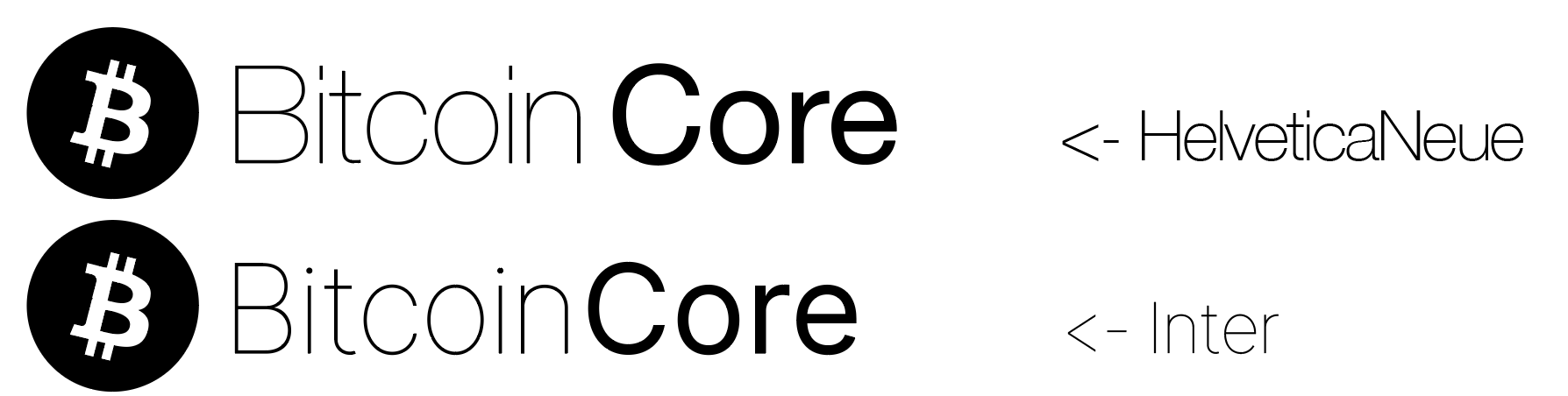
Font
The current logo uses Neue Helvetica font, which is a licensed font - It may be worth switching to a free open source font to avoid issues. I've included one example, inter, below but I will be exploring some more.

Here are some quick examples of a window in the GUI that could be changed for more consistent branding.
Launching GUI screen

Concept ACK on addressing inconsistencies.
what would be considered the primary logo to to use to represent core?
I think the black and white one is generally used today rather than the orange one. There would've been discussion at the time when this transition was made.
Neue Helvetica is a lightweight, minimalistic font right? I think the top one is closest to what I recognize as Core branding.

And by inter font you mean "Inter is a variable font family carefully crafted & designed for computer screens." Thanks search engine :)
@MarcoFalke recently made a PR to to make the logo black: https://github.com/bitcoin/bitcoin/pull/16571
In addition to avoiding bike-shedding, one objection was that we use different colors for the different networks (mainnet orange, testnet green, regtest, signet, etc). However that distinction could be achieved in other ways, and is mostly relevant for developers.
Apologies for the blasphemy but I can hardly see the difference between those two fonts, so if it keeps lawyers away, I'm fine with switching.
✓ Inter font or an open source alternative ✓ Black and white ✓ First two options with the circle around the Bitcoin logo
Are you using "Regular" Inter font for the Bitcoin part? If you wanted more differentiation between the Bitcoin and Core like there was with Neue Helvetica, you could try a lighter version.

In addition to avoiding bike-shedding, one objection was that we use different colors for the different networks (mainnet orange, testnet green, regtest, signet, etc). However that distinction could be achieved in other ways, and is mostly relevant for developers.
Could the black not just represent mainnet and keep green and blue for testnet and regtest. End users don't really need to be concerned with the net types and I'd assume devs wouldn't be over concerned with the color (as long as it was distinct from other nets). End users are, however, aware (albeit subconsciously sometimes) of branding consistency. Inconsistencies in branding can lead to confusion and cluttered feeling UIs. Bitcoin is a brand in and of itself, Bitcoin Core is distinct and should have a distinct brand to distinguish it.
Apologies for the blasphemy but I can hardly see the difference between those two fonts, so if it keeps lawyers away, I'm fine with switching.
I tried to keep it close to Helvetica, the change was primarily for the licensing issue. Would be worth exploring some other fonts though.
@AlexaAker Yes I did use regular, I like the thin style more for sure. It's closer to the original core logo as well.
Concept ACK on the black logo. I still think the logo is too big in the contrast to the information and the title (but that is orthogonal). I think black would replace the mainnet-orange.
We could still keep the green/blue for testnet/regtest (UX doesn’t matter that much there).
As for the font. I have mixed feelings (maybe because I originally designed the logo with the Helvetica font).
If we want to switch to that open source font, having a “thin” font face would make the logo more identical to the Helvetica one. It would probably be possible to add a such (with FontForge or so).
The mix between thin and bold give it a unique character.
A vote here in favor of keeping the different colors for testnet, regtest, and soon signet, which also has its own color in the implementation (PR #18267). When I have several GUIs open at once, the different coloring is really helpful.
I'd prefer using orange overall, but no problem if everyone likes black. To me it's almost more important that there is a consistency in how things are applied. So I hope the decisions made can also be implemented elsewhere. For example, on bitcoincore.org I see the orange symbol in the header and the black one in the footer. It also uses PT Sans for the site copy. The Bitcoin Core GUI user experience doesn't start with the desktop application, it starts with hearing that this exists and probably a journey either through bitcoin.org or bitcoincore.org to download and installation. All of those steps build on each other and form expectations and understanding. It would be great to review this whole journey and improve consistency based on what happens here.
The "Inter" font has a "thin" style with wich you get close to the Helvetica Look (manual kerning). No as pretty as the "Helvetica Neue" but it gets acceptable close IMO.
As for the font. I have mixed feelings (maybe because I originally designed the logo with the Helvetica font).
I also like Helvetica a lot, the change was primarily for the licensing concern. The thin inter font does look better I agree. We should explore a few other options as well before making a decision.
FWIW I've used Roboto Thin in https://github.com/bitcoin/bitcoin/pull/16883
Apache v2 licensed and I think it looks just a tiny bit better than Inter:

I would be interested in (somehow) getting feed back from color blind people. Is there advantages in recognizing Bitcoin (as a brand) if the logo is orange or black?
I like the idea of removing the gradients from the logo regardless of whether orange stays or goes.
We also need to consider print media when selecting the color (even for black). There should be RGB, CMYK and Grayscale versions made available in a "media pack".
Concept ACK on using a free font if the non-free font causes issues. Changing the color of the logo to black is fine by me as long as the chain icons and chain splash screen keep their colors. Also, it would be good to have a deterministic scripts to render/derive all logos, so that future changes (if needed) can be done easier.
I would be interested in (somehow) getting feed back from color blind people.
There are some tools online but I am not sure how reliable they are. Below I used https://logolab.app/lab to test color blindness for the different icons we use, it only tests for Deuteranomaly, Protanopia and Tritanopia though (A few other kinds exist). Blacks pretty much look the same for everyone so will it will be the most consistent for color blind users - another reason to stick with black imo.

Some observations - Tritanopia will likely see regtest and testnet the same color, protanopia may see testnet the same as orange, Deuteranomaly may see orange and testnet as similar in color.
What color is signet using? I couldn't find the details in the PR.
There should be RGB, CMYK and Grayscale versions made available in a "media pack".
This will be included in the design system I mentioned in the OP.
I believe the Bitcoin logo that appears on Launching GUI screen should remain orange.
It should be clear to the user - from a semiotic perspective - that this is a Bitcoin network client and not a "Bitcoin Core" network client.
I also believe the Bitcoin QT icon should remain orange, as it indicates you're running the Bitcoin network. About the "color blind", they see the orange equally all the time, as much as it looks awful to us, it's how they identify the Bitcoin network.
I understand your concern and this has been brought up before. However, no other wallets that connect to the Bitcoin network use the orange bitcoin logo as their branding point and users generally aren't confused as to if they are connecting to BTC or some fork clone network. When you launch electrum for example do you think "am I connecting to the electrum network or Bitcoin?" I would imagine not.
I see the orange logo as adding more confusion as as it makes people think Bitcoin Core and Bitcoin are the same entity which is not the case. The on-boarding wizard designs I have done also help clarify things further by clearly explaining that the core wallet is connecting to the Bitcoin Network.
The color blind discussion was more around the fact you can run the GUI in different network modes (mainnet, testnet, regtest and soon signet) and how the mainnet color should be clearly distinct from all the other net's. Though this is really only a concern for developers. Switching nets within the GUI will likely be possible eventually, with which then this become more of a concern for end users - https://github.com/bitcoin-core/gui/issues/78. If two nets look the same a user might think they are on mainnet but actually be on testnet and lose bitcoins by trying to send between networks. End users should not have to be aware of the various network types.
I think that is not a good idea not identifying the Bitcoin logo in the launching screen with the orange color, like us or not, this is how many users identify that they are connecting with the Bitcoin network, because if you know, other networks use the name of the "real Bitcoin" and they are using the Bitcoin logo but with another color, like green.
Also, I am not a developer, but I prepare material to educate new users, and being able to identify the networks with different colors is very helpful, so I think it's something that should remain.
The logo should remain orange. This change would inadvertantly play into efforts to create a false equivalence between Bitcoin and various fraudulent clones.
We now know through leaked emails that even the renaming of Bitcoin Core to that name was dishonestly driven by malicious intent-- the parties that pushed for the name change did so because they were intending to attempt to take over Bitcoin from the community and move it under their control, and they wanted to "other" the community project and disassociate it with Bitcoin. Going along with it was an error. It's water under the bridge now but there is no reason to continue being victimized by past wrongs and compounding a past error.
Personally, I like the black logo more as well. But I think we should discuss @bitcoinheiro @decentralizedb and @gmaxwell 's concerns more (there is also #100 where this discussion seems to be splitting).
I would like consistency (bitcoin.org uses orange; bitcoincore.org uses both; bitcoin repo uses black; bitcoin-core repo uses orange) but I definitely don't want the psyops and disinformation we went through with Segwit all over again.
Perhaps that means returning everything to the orange logo, or making the distinction that the orange logo stands for the network, and the black logo stands for the Core implementation (although, IIRC, 'making a distinction between the network and the implementation' was the exact reasoning the original parties gave for the renaming of Bitcoin Core).
Something else to think of - there are (unfortunately) probably a large percentage of users who install Core without reading release notes. They will probably be concerned/surprised when the logo changes upon opening.
@gmaxwell
The logo should remain orange. This change would inadvertently play into efforts to create a false equivalence between Bitcoin and various fraudulent clones.
Is it your desire that Bitcoin Core continue using the exact same logo to represent itself, or only that it use a logo that incorporates the current Bitcoin network logo? For example, here's a quick, ham-fisted alternative logo that shows a Bitcoin "core":

We now know through leaked emails that even the renaming of Bitcoin Core to that name was dishonestly driven by malicious intent
Interesting. Is that something the GitHub ToS allow you to link to? The only leaked emails I'm aware of were from Hearn to Nakamoto (one way); I just reviewed them and they only discuss Hearn and Andresen working up the courage to fork the software (which was their legitimate right). The emails neither say (nor do I infer) anything about the name change, which was six months old by the date of the final email.
Bitcoin branding is great already. Brand recognition is as good as it gets. Don't mess with that. That's the whole point. Let it be. Changes here are not what is needed.
We need improvements in UX within the software - better buttons, better UI, wizards. Would be great if talented people such as Bosch-0 could focus design efforts on that and not on changing the only part of the design that works already.
My 2 sats with marketing in mind. Brand is orange. Bitcoin logo stays. Work with that limitation and improve.
The logo should remain orange. This change would inadvertently play into efforts to create a false equivalence between Bitcoin and various fraudulent clones.
Remain orange where though? The Bitcoin Core black logo is still used in some places, are you saying these should be orange also to prevent this false equivalence? I see both logos being used across Bitcoin Core applications as long as the context of its placement makes sense. I'm not suggesting changing the Bitcoin logo - I think that should stay as it is indefinitely.
I understand your concerns but this is were we are now, Bitcoin Core is distinct from Bitcoin and we should make the best of it.
Bitcoin branding is great already ... Brand is orange. Bitcoin logo stays. Work with that limitation and improve.
This thread is focused on Bitcoin Core branding not Bitcoin - they are two distinct entities both with their own branding. Or do you think Bitcoin Core should just adopt the Bitcoin orange branding - maybe with a slight modification to make it distinct from Bitcoin? Thinking ahead Bitcoin Core may one day not be the only major software implementation for the BTC network - having distinct branding in this case makes sense.
Would be great if talented people such as Bosch-0 could focus design efforts on that and not on changing the only part of the design that works already.
These discussions may seem like bikeshedding to some but these are the kind of foundational design details need to be worked out prior to working on UI/UX. The logo inadvertently plays into how the rest of the design should look and feel - consistency is a key pillar in any good design. It would waste a lot of resources we don't have having to re-do designs if branding changed later.
My intention in making this thread was that the branding of Bitcoin Core is very unclear and inconsistent, which could be used by a malicious party to create this false equivalence gmaxwell mentioned. Having consistent branding also adds professionalism which for a project like Bitcoin Core, which essential powers a $246 billion dollar network, this matters a whole lot more than most would think. I also see having more professionalism as being useful in attracting more much needed support for the developers of this project.
It would be better to either go all in on an orange styled branding (I would recommend creating a slightly tweaked logo of the 'Bitcoin' logo for Bitcoin Core if going down this path) or the current black styling, rather then be in this middle ground were black is used someplace and orange in others.
I would prefer any solution that solves the inconsistencies we currently have, if we can get consensus around it.
https://github.com/bitcoin-core/gui/pull/140#issuecomment-737659873
@jonasschnelli - Since it is the about page - I thought using the web page logo might be useful. As it is now the aboutMessage body is set up for further development - I was thinking of adding a menu bar that would replace the hyperlinks (It will look better).
A note on color usage - keep in mind that most companies create specifications for full color - gray scale and black/white - for different purposes such as web design, print, what ever - As far as I'm concerned - there really isn't a debate - because we should have a specification and media resource files that fit print/web/etc use cases.
https://ori.hhs.gov/logo-specification-guide

The colored logo above is this the 'primary' logo that represents the brand. Are you saying we should have the orange as the primary and the black is just considered a black and white / greyscale version?
I still lean towards having the black logo to represent core to distinguish it from Bitcoin the network as other implementations may one day exist that work on the Bitcoin protocol. Though honestly I'd just prefer consistency.
As this issue has been open for a while now and there has been many suggestions and discussions with regards to how best to approach the branding of Core I would like to propose the below logo(s) of which I think takes majority of the concerns brought up into consideration.
Branding is important to have established before working on any major design changes so having this resolved would be great in order to get other GUI design work rolling.

The text has been changed from #FFFFFF to #4D4D4D - the same as the Bitcoin logo grey. This gives a much more softer, matte feeling which looks a lot cleaner and helps associated Core's logo more with Bitcoin outside of using the same B icon.
The open source font is inter for reasons explained in my original post. 'Bitcoin' is inter extra light and 'Core' is inter medium.
Although I originally suggested to stick with the black I feel majority of people want orange. The Bitcoin icon uses a slight gradient giving it a much more 'designed' feel. This gradient is also a subtle way to distinguish Core from the more static orange styling used in the Bitcoin logo. The icon's B is also not transparent as it was in the original files and now has a white fill as seen in the dark logo.
A grey scale would also be included as part of the branding package for various placements.
I think this is fine provided the chain icons and chain splash screen keep their different colors (as @MarcoFalke and I previously mentioned). My main regret is the accent on "Core" instead of "Bitcoin" even if it looks nice here.
ACK, dependant on getting more ACKs from more long term devs. This needs to be solved, and it addresses licensing issues, the inconsistencies, @gmaxwell security concerns, and allows for print/web versions. Hopefully this gets consensus, because it seems there are naming changes that want to be made as well (#140 ).
@Bosch-0 -
Can you make a version of the above using the Roboto font for comparison?
Also a variation with Bitcoin bold and Core thin as well? (varying weights based on aesthetics of coarse!)
Other variations may include:
- light gray text with dark gray background with orange logo
- light gray text with dark gray background with light gray logo
- dark gray text with light gray background with dark gray logo
- dark gray text with light gray background with orange logo ...you get the point :)
All with Bitcoin bold and Core thin...
Note - there have been comments stating that Bitcoin should be bold - to emphasize Bitcoin - and Core should be thin - to deemphasize Core.
Question about the "white" background - is it transparency or actually white? I believe the background should be transparency but the B in the medallion should be filled with white.
Additional discussions:
https://github.com/bitcoin-core/gui/pull/79
https://github.com/bitcoin-core/gui/pull/79#issuecomment-740382257
Roboto meets the licensing requirements - and offers the weights that you are currently using.
https://fonts.google.com/specimen/Roboto#standard-styles