Prevent distortion of images in blog cards
Fixes #420.
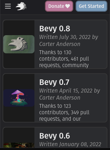
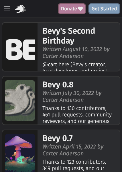
On mobile devices, the images were previously distorted. This PR enforces that the images always keep their original aspect ratio.
TBH it looks a bit weird, but probably better than before:
Actually, are you sure this works? I tried it locally and I don't see a change
Yeah I personally think cropping is worth experimenting with. The weirdness of scaling down that far is probably greater than the weirdness of cutting things off. Generally these images have "centered" composition / wouldn't suffer much from losing things in the periphery. Worth experimenting though. We should also experiment with adjusting the card ratios to give the images more room. That might make the method in this pr look a little better.
object-fit: cover on .centered-card-image looks good for images, but ugly when there is text (e.g. Bevy logo).
Btw, looks like these cards should be using min-height instead of height…
Yea, currently a lot is fixed height and overflow: hidden, so mobile users miss part of the context.
Alternative designs for the images I can think of:
- Hide the images on mobile (more boring, but more room for actual content)
- Put the images with ~80% width above the text (images can be bigger and content has full width, but you have to scroll a lot more)
- Make the images only next to the title and subtitle and the description can be below them (aspect ratio for images better, but we'd need different designs for mobile and desktop)
Maybe we could hide the "preview" text on mobile and use that extra room to preserve aspect ratio? That text isn't particularly important.
How about showing the text under the image?
You could set an break-point and switch to flex-direction: column.
It could look like this:
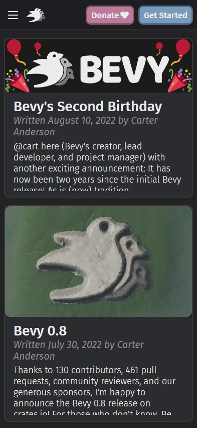
Text under the image looks nice, and I think makes more sense on mobile.
I think "text under image" is probably the way to go here. If anyone wants to pick that up, feel free!
I have a solution for this, although it'll take some time before I prepare a PR. There are other screens that use the .card class in somewhat different ways and I need to review those.
Anyway, issues that will be fixed:
- Fully responsive
- Image aspect ratio is respected in all the breakpoints
- 3 lines ellipsis via CSS instead of Zola, this way the ellipsed line is filled until the end
- When the title is multi-line it handles it gracefully (visible on phone-landscape)
🎥
- First element is the old version
- Second one is the new
https://user-images.githubusercontent.com/188612/222958921-20cae62d-b614-4dc5-9b1f-48033f9eb013.mp4