import formatting hard to parse mentally
With the current formatting output, it’s extremely hard to find the crucial information. Current output might look like this (minus the colors):
4. Austin Wintory - The Banner Saga (26.9%) (tracks, missing tracks, album, ...) (Digital Media, 2014, XW, Reference Recordings)
5. Austin Wintory - Monaco: What’s Yours Is Mine / The Gentleman’s Private Collection (25.3%) (missing tracks, tracks, album, ...) (Digital Media, 2013, XW)
# selection (default 1), Skip, Use as-is, as Tracks, Group albums,
Enter search, enter Id, aBort? s
/home/philip/Downloads/music/Austin Wintory - The Conformation (4 items)
Finding tags for album "Austin Wintory - The Conformation".
Candidates:
1. Austin Wintory - Monaco: The Gentleman’s Private Collection (28.7%) (missing tracks, tracks, album, ...) (CD, 2013, US, T-65b Records)
2. Austin Wintory - Monaco: The Gentleman’s Private Collection (28.7%) (missing tracks, tracks, album, ...) (Digital Media, 2013, XW)
3. Austin Wintory - The River Why (27.7%) (missing tracks, tracks, album) (2012)
4. Austin Wintory - The Banner Saga (19.1%) (missing tracks, tracks, album, ...) (Digital Media, 2014, XW, Reference Recordings)
5. Austin Wintory - Monaco: What’s Yours Is Mine / The Gentleman’s Private Collection (17.3%) (missing tracks, tracks, album, ...) (Digital Media, 2013, XW)
# selection (default 1), Skip, Use as-is, as Tracks, Group albums,
Enter search, enter Id, aBort?
I deliberately cut one output in half and used a terminal with half a screen’s width. The crucial information I need for a decision is:
- What record is this about
- What gets changed
- What can I do
Especially the first point is hard at the moment.
A few points to break it down
new entry
# selection (default 1), Skip, Use as-is, as Tracks, Group albums,
Enter search, enter Id, aBort? s
/home/philip/Downloads/music/Austin Wintory - The Conformation (4 items)
Finding tags for album "Austin Wintory - The Conformation".
A newline would greatly increase readability.
paths
/home/philip/Downloads/music/Austin Wintory - The Conformation (4 items)
Since you invoke the import with beets import <path>, it would make sense to use relative paths to reduce clutter (and overlong lines).
noise
Some chars are mostly noise after the first time:
Finding tags for album
Candidates:
Correcting tags from:
To:
URL:
Suggestion for reformatting
<previous entry>

./Austin Wintory - Monaco- What's Yours Is Mine (17 items)
    Austin Wintory - Monaco: What's Yours Is Mine
->  Austin Wintory - Monaco: What’s Yours Is Mine
 * What's Yours Is Mine          -> What’s Yours Is Mine
 * Prison life                   -> Prison Life
 * The Devil's Trick             -> The Devil’s Trick
 * Can't Resist (ft. Laura Vall) -> Can’t Resist (title)
http://musicbrainz.org/release/8bae12ae-945d-4f8c-866c-0892e5f31e15
(Similarity: 99.9%) (tracks) (CD, 2013, US, T-65b Records)

./Austin Wintory - Soul Fjord (8 items)
    Austin Wintory - Soul Fjord
    http://musicbrainz.org/release/a75abdad-57be-40bf-8464-ac5090225ff5
(Similarity: 100.0%) (Digital Media, 2014, XW)

./Austin Wintory - Spirit of the Cosmos (13 items)

---
1. Austin Wintory - Monaco: The Gentleman’s Private Collection (33.5%) (tracks, missing tracks, album, ...) (CD, 2013, US, T-65b Records)
2. Austin Wintory - Monaco: The Gentleman’s Private Collection (33.5%) (tracks, missing tracks, album, ...) (Digital Media, 2013, XW)
3. Austin Wintory - The River Why (31.5%) (tracks, missing tracks, album) (2012)
4. Austin Wintory - The Banner Saga (26.9%) (tracks, missing tracks, album, ...) (Digital Media, 2014, XW, Reference Recordings)
5. Austin Wintory - Monaco: What’s Yours Is Mine / The Gentleman’s Private Collection (25.3%) (missing tracks, tracks, album, ...) (Digital Media, 2013, XW)

---
# selection (default 1), Skip, Use as-is, as Tracks, Group albums,
Enter search, enter Id, aBort? s
I’m not entirely happy with the last one, the list should be clearly visible and the prompt is two lines.
Probably even the word Similarity should be taken out, the color-coded percentage is self-explaining.
A newline would greatly increase readability.
The current version does have a newline. Any chance you have an older version (I recall that at some point someone accidentally removed the newline temporarily)?
Since you invoke the import with beets import
, it would make sense to use relative paths to reduce clutter (and overlong lines).
Good idea! Although I'd caution that paths beginning like ./ could intuitively suggest that they are relative to the current working directory. So they should either actually be relative to cwd, or some other way should make it clear where paths are relative to.
Some chars are mostly noise after the first time:
Hmm; I definitely see your point. Stuff like "URL:" is rather obvious, but "Candidates:" can actually be helpful for new users. How would we balance this with obviousness for new users? A compact configuration switch? Some kind of an automatic timeout?
I think good use of symbols can immensely clarify the output, i.e. “symbols for ‘control commands’, words for content.
but "Candidates:" can actually be helpful for new users. How would we balance this with obviousness for new users?
If we need Candidates:, the prompt is probably not clear enough; but even now, # selection (default 1) already implies that you can select one of the above, right?
Although I'd caution that paths beginning like ./ could intuitively suggest that they are relative to the current working directory.
You’re right, then I propose just /. It intuitively stands for “root”—like for e.g. in websites—and it should be clear that it can’t mean the system root dir.
A leading / sounds quite reasonable.
Regarding Candidates:, I'd love to hear feedback from people who recently got started with the interface before we remove something like that. It could be that we could make the prompts even clearer!
A few thoughts on this since I started using Beets recently:
- I hardly noticed
Candidates, I'm fine with removing it. - The lack of distinct separation between the different phases of the import process (e.g. blank line between different directories) made seeing what was going on a bit hard. The
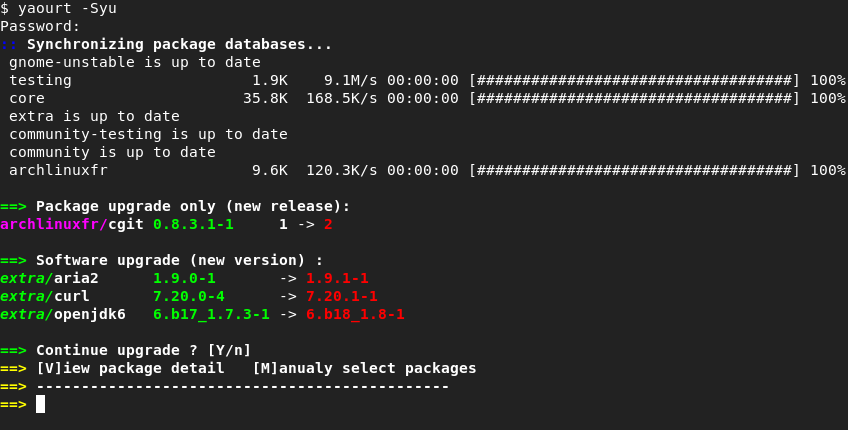
---marks are nice, why don't we use them for separating the list of tracks from the rest of the import process? - Or use the "bold white" ANSI color for important parts of the import process, e.g. imported directory and user prompts? For an example, look at Yaourt does, I've always found it really nice and clear:
Great point! I'd love to see a mockup that makes some decisions about what's most important to call out.
I accidentally started a new thread (#1643) with ideas to improve UI. Obviously it would be better to have it all in 1 thread. So, as sampsyo requested, I tried to summarize all the ideas and comments from both threads in the text below to have a good starting point. Please add and edit where needed.
Introduction
To improve the UI, below some proposed options/settings. These are focused on these general goals:
- customization: allowing different UI settings for different personal tastes and preferences
- good default settings
-
a clear UI that makes the crucial information needed to make a decision easy to find:
- What record is this about
- What gets changed
- What can I do [Profpatsch]
- facilitating the tagging process
Putting everything in curses would be awesome of course, but also a big change. So below some suggestions for the current CLI-UI.
Suggestions
standardization of output:
One of the issues with the UI, is that the information printed on screen necessary for making the necessary tagging decisions, is not consistent. This means that it is on different locations on the screen, with more or less lines printed, depending on the album. All this makes for a difficult experience, because the user's eyes have to search for the location of the info on the screen for each album.
- limit 'random' output lines coming in between the regular lines of info: next to the -v and -vv options maybe add extra levels such as -brief or -minimal that limit the output to the bare necessities, filtering out any extra errors/issues.
- Applying the same logic in plugins, for instance there is a print_ignored option in the copyartifacts plugin, put no option to have no output at all for this plugin, meaning the output of all copied log and cue files jumps in between the other lines. A '-q' or 'no output' option for plugins.
- having the option to put a 'clear screen' command in front of extra new album. This puts our starting point on top of the screen every time, greatly improving the usability. Issue might be that we can't see previous info anymore by scrolling up, but this might be solved by extending the log file with more logging levels (error, warning, info, verbose,...)
- Most of the interaction is asked of the user for Medium recommendations, assuming one has a already reasonably tagged library. Make sure the initial question is always asked with the same layout, so no display of possible corrections with the initial question (for instance with multicd's) or titles. Add a more info action with that information.
- print the line with actions on 1 line, not 2. so...
[A]pply, More candidates, Skip, Use as-is, as Tracks, Group albums,
Enter search, enter Id, aBort?
instead of...
[A]pply, More candidates, Skip, Use as-is, as Tracks, Group albums,
Enter search, enter Id, aBort?
making the UI easier to read / navigate
Some minor tweaks might make the UI easier to read and to find the necessary information.
- highlight the first line of every album tagging output, being the path. In effect, that's what states what is being processed, it is like the title of a chapter in a book, an therefor would greatly benefit from being easy to find. Now I often find myself in the situation of knowing what is being suggested but not what for. Not only that, the path of an album often contains information that can help identifying the correct release, such as the year and the media (web; cd, vinyl). The highlighting of the title can be done in many ways, or a combination of these, such as: indentation, larger font, bold , but mainly colors (see below). But I would definitely suggest to do this by default, even hardcode it if it is not easily feasible through options.
- Important parts of the import process can also be separated and highlighted, e.g. imported directory and user prompts, with the bold white" ANSI color. [fxthomas]
- More fields/items in the output that can be colored. Now we only have these: text_success, text_warning, text_error, text_highlight, text_highlight_minor, action_default and action. But to really optimize the UI (and being able to customize) we need more options, such as: title/path (see above), candidate, default text color, tagging, URL,....
- More and better use of indentation: a basic one would be to indent everything relating to the processing of one album, except the title. It would really help knowing what output belongs to which album. Further indentations could be the candidates, all corrections, multi-cd,...
- Add more hard returns / blank lines to differentiate what is on screen. For instance add a blank line when going from more candidates back to the actions menu.[Profpatsch] The --- marks are nice, why don't we use them for separating the list of tracks from the rest of the import process? [fxthomas]
- Change the default coloring. Although very logic, the green yellow and red color scheme is so harsh that they draw to much attention away from other important information. I'm still playing around with the options that are now available, and will do a recommendation later on. Of course, with more options / fields to color, this can be optimized even further (see above). Mind you, the goal is not turn the output in a Christmas tree, but to use coloring in such a way that it improves readability.
- Since you invoke the import with beets import
, it would make sense to use relative paths to reduce clutter (and overlong lines). [Profpatsch] A leading / sounds quite reasonable. [sampsyo] -
Reduce noise in output. Some chars are mostly noise after the first time.[Profpatsch] Removing too much information might get confusing for new users. A
compactconfiguration switch or some kind of an automatic timeout might help.[sampsyo]
Finding tags for album
Candidates:
Correcting tags from:
To:
URL:
Awesome; I'm glad this discussion is continuing. If you're interested, @ekjaker or anyone else, maybe you can put together a series of medium-sized changes along with fully fleshed-out designs so we can get going with the implementation of some improvements.
@sampsyo: I think it would be possible to make a list of changes from the list above, but I don't I don't really understand what you mean with "a series of medium-sized changes along with fully fleshed-out designs". Could you please elaborate? Apart from that, I assume describing it all correctly in text is going to be quite cumbersome. It is a UI after all which has a graphical inclination. I've been looking for mockup tools to make it more visual, but none of the usual mockup suspects seem to support CLI-environments, and word processing applications are the best either. Anyone any ideas for tools to easily make and adjust mockups for a CLI-environment?
Yes, that's more or less what I meant! Prototyping out a set of UI changes, preferably with a screenshot, will help make it clearer what we need to do.
I don't have a specific recommendation for a tool, but you could try just using an HTML page with a <pre> element, styled appropriately.
OK, this is going to be a long post. My apologies. I have been playing around with layouts a bit. As it is all (formatted) text anyways, I will post it as text here as well. This way, everyone can easily copy-paste it somewhere else and make adjustments for new proposals.
I started out with a folder that gave a medium recommendation, then chose m, chose 2, chose m again, chose 1 again and finally apply. This gives a view of a few common UI situations as well as a common workflow (for me a least).
First you can find the output of these steps as they are now in beets:
old layout
G:\REORG\test originele files - kopie\[Double Standard Records 04] Nicolas Jaar - Love You Gotta Lose Again [V0 WEB] (3 items)
Correcting tags from:
    Nicloas Jaar - Love You Gotta Lose You Again
To:
    Nicolas Jaar - Love You Gotta Lose Again EP
URL:
    http://musicbrainz.org/release/8e4ae230-51e1-436e-9f83-f5b7740f03d4
(Similarity: 89.9%) (artist, media, album) (Digital Media, 2010, XW, Double Standard Records)
 * Don't Believe The Hype -> Don't Believe the Hype
[A]pply, More candidates, Skip, Use as-is, as Tracks, Group albums,
Enter search, enter Id, aBort? m
Finding tags for album "Nicloas Jaar - Love You Gotta Lose You Again".
Candidates:
1. Nicolas Jaar - Love You Gotta Lose Again EP (89.9%) (artist, media, album) (Digital Media, 2010, XW, Double Standard Records)
2. Nicolas Jaar - Love You Gotta Lose Again EP (86.3%) (media, artist, album) (10" Vinyl, 2010, US, Double Standard Records)
3. Austin Catron - You Gotta (36.2%) (tracks, artist, album) (2006, US)
4. Elton John - You Gotta Love Someone (34.7%) (tracks, artist, album) (1990)
5. Peaches - Lose You (27.3%) (tracks, artist, album, ...) (12" Vinyl, 2009, GB, XL Recordings)
# selection (default 1), Skip, Use as-is, as Tracks, Group albums,
Enter search, enter Id, aBort? 2
Correcting tags from:
    Nicloas Jaar - Love You Gotta Lose You Again
To:
    Nicolas Jaar - Love You Gotta Lose Again EP
URL:
    http://musicbrainz.org/release/06bfde9f-378a-421e-8cd9-6791288c5696
(Similarity: 86.3%) (media, artist, album) (10" Vinyl, 2010, US, Double Standard Records)
 * Don't Believe The Hype -> Don't Believe the Hype
Apply, More candidates, Skip, Use as-is, as Tracks, Group albums,
Enter search, enter Id, aBort? m
Finding tags for album "Nicloas Jaar - Love You Gotta Lose You Again".
Candidates:
1. Nicolas Jaar - Love You Gotta Lose Again EP (89.9%) (artist, media, album) (Digital Media, 2010, XW, Double Standard Records)
2. Nicolas Jaar - Love You Gotta Lose Again EP (86.3%) (media, artist, album) (10" Vinyl, 2010, US, Double Standard Records)
3. Austin Catron - You Gotta (36.2%) (tracks, artist, album) (2006, US)
4. Elton John - You Gotta Love Someone (34.7%) (tracks, artist, album) (1990)
5. Peaches - Lose You (27.3%) (tracks, artist, album, ...) (12" Vinyl, 2009, GB, XL Recordings)
# selection (default 1), Skip, Use as-is, as Tracks, Group albums,
Enter search, enter Id, aBort? Copying artifact: White Denim - Last Day of Summer.cue
Copying artifact: White Denim - Last Day of Summer.log

Correcting tags from:
    Nicloas Jaar - Love You Gotta Lose You Again
To:
    Nicolas Jaar - Love You Gotta Lose Again EP
URL:
    http://musicbrainz.org/release/8e4ae230-51e1-436e-9f83-f5b7740f03d4
(Similarity: 89.9%) (artist, media, album) (Digital Media, 2010, XW, Double Standard Records)
 * Don't Believe The Hype -> Don't Believe the Hype
[A]pply, More candidates, Skip, Use as-is, as Tracks, Group albums,
Enter search, enter Id, aBort?
This album is already in the library!
Old: 3 items, FLAC, 773kbps, 12:18, 61.6 MB
New: 3 items, MP3, 244kbps, 12:18, 21.2 MB
[S]kip new, Keep both, Remove old? k
The proposed layout is below. After that I will give an explanation of the choices I made and possible points of improvement.
new layout
/[Double Standard Records 04] Nicolas Jaar - Love You Gotta Lose Again [V0 WEB]

    => (89.9%) Nicolas Jaar - Love You Gotta Lose Again EP
       (artist, media, album)
       (Digital Media, 2010, XW, Double Standard Records)

        ===> [a] apply
         [m] more candidates
         [s] skip
         [u] use as-is
         [t] as tracks
         [g] group albums
         [e] enter search
         [i] enter id
         [b] abort

    more candidates

    1. (89.9%) Nicolas Jaar - Love You Gotta Lose Again EP
           (artist, media, album)
           (Digital Media, 2010, XW, Double Standard Records)
    2. (86.3%) Nicolas Jaar - Love You Gotta Lose Again EP
           (media, artist, album)
           (10" Vinyl, 2010, US, Double Standard Records)
    3. (36.2%) Austin Catron - You Gotta
           (tracks, artist, album)
           (2006, US)
    4. (34.7%) Elton John - You Gotta Love Someone
           (tracks, artist, album)
           (1990)
    5. (27.3%) Peaches - Lose You
           (tracks, artist, album, ...)
           (12" Vinyl, 2009, GB, XL Recordings)

        ===> [#] selection (default 1)
         [s] skip
         [u] use as-is
         [t] as tracks
         [g] group albums
         [e] enter search
         [i] enter id
         [b] abort

       #2 selected


/[Double Standard Records 04] Nicolas Jaar - Love You Gotta Lose Again [V0 WEB]

    => (86.3%) Nicolas Jaar - Love You Gotta Lose Again EP
       (media, artist, album)
       (10" Vinyl, 2010, US, Double Standard Records)

    ===> [a] apply
         [m] more candidates
         [s] skip
         [u] use as-is
         [t] as tracks
         [g] group albums
         [e] enter search
         [i] enter id
         [b] abort

    more candidates

    1. (89.9%) Nicolas Jaar - Love You Gotta Lose Again EP
           (artist, media, album)
           (Digital Media, 2010, XW, Double Standard Records)
    2. (86.3%) Nicolas Jaar - Love You Gotta Lose Again EP
           (media, artist, album)
           (10" Vinyl, 2010, US, Double Standard Records)
    3. (36.2%) Austin Catron - You Gotta
           (tracks, artist, album)
           (2006, US)
    4. (34.7%) Elton John - You Gotta Love Someone
           (tracks, artist, album)
           (1990)
    5. (27.3%) Peaches - Lose You
           (tracks, artist, album, ...)
           (12" Vinyl, 2009, GB, XL Recordings)

        ===> [#] selection (default 1)
         [s] skip
         [u] use as-is
         [t] as tracks
         [g] group albums
         [e] enter search
         [i] enter id
         [b] abort

       #1 selected


/[Double Standard Records 04] Nicolas Jaar - Love You Gotta Lose Again [V0 WEB]

    => (89.9%) Nicolas Jaar - Love You Gotta Lose Again EP
       (artist, media, album)
       (Digital Media, 2010, XW, Double Standard Records)

        ===> [a] apply
         [m] more candidates
         [s] skip
         [u] use as-is
         [t] as tracks
         [g] group albums
         [e] enter search
         [i] enter id
         [b] abort

    applied

    => This album is already in the library!
       Old: 3 items, FLAC, 773kbps, 12:18, 61.6 MB
       New: 3 items, MP3, 244kbps, 12:18, 21.2 MB

    ===> [s] skip new
      [k] keep both
      [r] remove old

       keep both
First, it is important to notice that I didn't make use of color at this point. We can always add it later, but I feel a good layout should already work without it. The other choices I made are mainly the ones suggested in the summary in a previous post:
- removal of random lines interfering
- no display of possible corrections in the tags. If necessary this can be showed with an extra option.
- emphasis on the foldername, making it also the de facto title. Title has been shortened and is repeated when necessary so it is always available when having to make a choice.
- more blank space to better separate different steps in the process
- heavy use of indentation, with
=>to indicate a new step and===>to indicate a choice to be made - removal of unnecessary information (clutter)
- better overview of available choices (more on that later)
- shorter lines to reduce the chance of returns which mess up the output
- when an action has been chosen: show the action
Stuff I really like about the proposal (and suggest to keep)
- path as title
- indentation
- general 'flow' of the layout
- reduced clutter
Stuff I don't really like too much
- more lines than the original
The last remark can be greatly countered by summarizing the action options like so (for instance for the more candidates actions):
[#] [s] [u] [t] [g] [e] [i] [b]
This would give this:
new layout (shortened action options)
/[Double Standard Records 04] Nicolas Jaar - Love You Gotta Lose Again [V0 WEB]

    => (89.9%) Nicolas Jaar - Love You Gotta Lose Again EP
       (artist, media, album)
       (Digital Media, 2010, XW, Double Standard Records)

        ===> [a] [m] [s] [u] [t] [g] [e] [i] [b]

    more candidates

    1. (89.9%) Nicolas Jaar - Love You Gotta Lose Again EP
           (artist, media, album)
           (Digital Media, 2010, XW, Double Standard Records)
    2. (86.3%) Nicolas Jaar - Love You Gotta Lose Again EP
           (media, artist, album)
           (10" Vinyl, 2010, US, Double Standard Records)
    3. (36.2%) Austin Catron - You Gotta
           (tracks, artist, album)
           (2006, US)
    4. (34.7%) Elton John - You Gotta Love Someone
           (tracks, artist, album)
           (1990)
    5. (27.3%) Peaches - Lose You
           (tracks, artist, album, ...)
           (12" Vinyl, 2009, GB, XL Recordings)

        ===> [#] [s] [u] [t] [g] [e] [i] [b]

       #2 selected


/[Double Standard Records 04] Nicolas Jaar - Love You Gotta Lose Again [V0 WEB]

    => (86.3%) Nicolas Jaar - Love You Gotta Lose Again EP
       (media, artist, album)
       (10" Vinyl, 2010, US, Double Standard Records)

    ===> [a] [m] [s] [u] [t] [g] [e] [i] [b]

    more candidates

    1. (89.9%) Nicolas Jaar - Love You Gotta Lose Again EP
           (artist, media, album)
           (Digital Media, 2010, XW, Double Standard Records)
    2. (86.3%) Nicolas Jaar - Love You Gotta Lose Again EP
           (media, artist, album)
           (10" Vinyl, 2010, US, Double Standard Records)
    3. (36.2%) Austin Catron - You Gotta
           (tracks, artist, album)
           (2006, US)
    4. (34.7%) Elton John - You Gotta Love Someone
           (tracks, artist, album)
           (1990)
    5. (27.3%) Peaches - Lose You
           (tracks, artist, album, ...)
           (12" Vinyl, 2009, GB, XL Recordings)

        ===> [#] [s] [u] [t] [g] [e] [i] [b]

       #1 selected


/[Double Standard Records 04] Nicolas Jaar - Love You Gotta Lose Again [V0 WEB]

    => (89.9%) Nicolas Jaar - Love You Gotta Lose Again EP
       (artist, media, album)
       (Digital Media, 2010, XW, Double Standard Records)

    ===> [a] [m] [s] [u] [t] [g] [e] [i] [b]

    applied

    => This album is already in the library!
       Old: 3 items, FLAC, 773kbps, 12:18, 61.6 MB
       New: 3 items, MP3, 244kbps, 12:18, 21.2 MB

    ===> [s] [k] [r]

       keep both
Clearly, this shortens and simplifies the output greatly, making it shorter but still way easier to use than the original. And we're not even using color yet.
But for new users, this might make it more difficult to work with the actions. Although, to be honest, even with the full description, new users have to hit the manuals anyway to know what they actually do before being able to choose them. And once they've done that, I guess it won't be so difficult to know what each letter stands for. Or a new compact option might be created for a minimal output, as suggested before.
Other remarks:
- this proposal doesn't use anything more than basic asci characters. I still think that curses would be a better way of dealing with this. But it doesn't have to be an "or"-issue but maybe an "and"-one (in the long term)
- a clear screen every time before every reset to a new folder (at the start of processing a release or after selecting one of the more candidates) would also help a lot to improve visibility as it would position everything always to the same position on screen. But only as an option.
- this proposal assumes the layout is hard coded. For better customization, more fields available for coloring would also help a lot. People could create their own colorization, post the config together with a screenshot in the forum for inspiration, and we could even have a poll to pick the best one to make it the default.
That's it.As always, feel free to add or modify.
Ekjaker
So much better than my suggestion. A great idea to use identation! I think we don’t need to look out for 80‑char terminals in 2015.
Some small nitpicks
Old: 3 items, FLAC, 773kbps, 12:18, 61.6 MB
New: 3 items, MP3, 244kbps, 12:18, 21.2 MB
Comparisons like that should line up column-wise to make them easy to compare. For numbers like in the last column even the digits of the same magnitude should align and the same unit should always be used. (So no mixing kB and MB.)
(89.9%) Nicolas Jaar - Love You Gotta Lose Again EP
    (artist, media, album)
    (Digital Media, 2010, XW, Double Standard Records)
These blocks are hard to read. Probably a fat white for the title will trivially solve this problem. I would also align it like so:
(89.9%) Nicolas Jaar - Love You Gotta Lose Again EP
        (artist, media, album)
        (Digital Media, 2010, XW, Double Standard Records)
Awesome! Thanks for the initial designs. Here a few assorted thoughts:
- I like the idea for a prompt indicator a lot—it would be great to have some way to draw the user's attention to the place where they need to interact.
- I also am now more enthusiastic about the idea of an optional "compact" mode for advanced users. For example, I would make that mode simplify the prompts to just
[abcdef]:. That's clearly illegible to new users but is probably enough for people who have the options they know and like. - I like the idea of using indentation, especially with @Profpatsch's extensions. In some places, though, it is possible to go overboard with too much whitespace. Is there such a thing as "responsive design" for terminal interfaces? We could adjust the amount of whitespace based on the size of the terminal. (I'm an 80-column person, and I'd love for that scenario to stay minimal and adjust with available real estate.)
thx for the feedback. In response:
- I agree with @Profpatsch on both suggestions. Aligning similar info is always a great idea. Or it might be done automatically, as suggested in #116.
- In fact, the second suggestion was already in my design but got lost in the copy paste. Apparently, there is more stuff that got shifted. I'll do a rerun to correct it (see below).
- Also like the @sampsyo suggestions. I'm also always for choice. So a
compactmode: definitely, if that is an option. - I had the same feeling about there being a lot of whitespace, but every time I tried to make it more compact by eliminating some whitespace, It quickly lost its overview. Even more, in the copy-paste issue mentioned above, the indentation increased. See below for the layout as it was originally intended.
- Responsive design seems a great idea. Is there a way to read the size of a terminal interface? If so, we could make a few designs each being used depending on the screen size.
With the initial post, I forgot to mention a few things...
- I removed the URL completely as well as the album tags at the beginning, because honestly I don't use them and they seemed like dead weight. But that is a personal opinion. Because nobody said anything about it, can I assume that you guys feel the same about it?
Correcting tags from:
    Nicloas Jaar - Love You Gotta Lose You Again
To:
    Nicolas Jaar - Love You Gotta Lose Again EP
URL:
    http://musicbrainz.org/release/8e4ae230-51e1-436e-9f83-f5b7740f03d4
- As you might have noticed, I also removed some lines that randomly interfered in the output. These all originated from plugins (mainly copyartifacts). Ofcourse this assumes there is an option in the plugins to turn of output completely.
- With the request for more separate fields where we can assign coloring to, I forgot to mention that it would also be great if we had the option to display the field or not. Something like this:
ui:
   color: yes
   URL: green, no
   path: yellow, yes
The compact mode could even tie into this. The default new-user layout would have everything turned on, while the compact is one with more none-essential fields turned off. This can even be expanded to several options. Instead of just having a 'yes' or 'no' option, we could make it a 'full', 'compact', or 'no' option for every single ui-element. This obviously would give everyone a lot more customization options, would be fairly simple to use in the config, allows the use of full presets (copy the whole UI section into the config) and scales nicely with possible new fields added in the future not requiring a full UI-overhaul. But of course, again this might be a lot of work to implement. The development could be done in stages though, with every stage immediately adding functionality: first defining more fields (immediately usable for coloring), then adding the display 'yes' 'no' option, and finally adding compact modes. But I guess I'm getting ahead of myself. Maybe for now better to stick to one general UI -overhaul and leave the customization for later. :-)
New layout (compact): corrected
Below you can find the corrected layout as it was intended, with some minor adjustments added (see below).
/[Double Standard Records 04] Nicolas Jaar - Love You Gotta Lose Again [V0 WEB]

       => (89.9%) Nicolas Jaar - Love You Gotta Lose Again EP
                  (artist, media, album)
                  (Digital Media, 2010, XW, Double Standard Records)

       ===> [amsutgeib]:    more candidates

       1. (89.9%) Nicolas Jaar - Love You Gotta Lose Again EP
                  (artist, media, album)
                  (Digital Media, 2010, XW, Double Standard Records)
       2. (86.3%) Nicolas Jaar - Love You Gotta Lose Again EP
                  (media, artist, album)
                  (10" Vinyl, 2010, US, Double Standard Records)
       3. (36.2%) Austin Catron - You Gotta
                  (tracks, artist, album)
                  (2006, US)
       4. (34.7%) Elton John - You Gotta Love Someone
                  (tracks, artist, album)
                  (1990)
       5. (27.3%) Peaches - Lose You
                  (tracks, artist, album, ...)
                  (12" Vinyl, 2009, GB, XL Recordings)

       ===> [#sutgeib]:     #2

/[Double Standard Records 04] Nicolas Jaar - Love You Gotta Lose Again [V0 WEB]

       => (86.3%) Nicolas Jaar - Love You Gotta Lose Again EP
                  (media, artist, album)
                  (10" Vinyl, 2010, US, Double Standard Records)

       ===> [amsutgeib]:    more candidates

       1. (89.9%) Nicolas Jaar - Love You Gotta Lose Again EP
                  (artist, media, album)
                  (Digital Media, 2010, XW, Double Standard Records)
       2. (86.3%) Nicolas Jaar - Love You Gotta Lose Again EP
                  (media, artist, album)
                  (10" Vinyl, 2010, US, Double Standard Records)
       3. (36.2%) Austin Catron - You Gotta
                  (tracks, artist, album)
                  (2006, US)
       4. (34.7%) Elton John - You Gotta Love Someone
                  (tracks, artist, album)
                  (1990)
       5. (27.3%) Peaches - Lose You
                  (tracks, artist, album, ...)
                  (12" Vinyl, 2009, GB, XL Recordings)

       ===> [#sutgeib]:     #1

/[Double Standard Records 04] Nicolas Jaar - Love You Gotta Lose Again [V0 WEB]

       => (89.9%) Nicolas Jaar - Love You Gotta Lose Again EP
                  (artist, media, album)
                  (Digital Media, 2010, XW, Double Standard Records)

       ===> [amsutgeib]:    applied

       => This album is already in the library!
            Old: 3 items,  FLAC, 773kbps, 12:18, 61.6 MB
            New: 3 items, MP3, 244kbps, 12:18, 21.2 MB

       ===> [skr]:          keep both
Adjustments:
- replaced
===> [a] [m] [s] [u] [t] [g] [e] [i] [b]with===> [amsutgeib]:, as suggested by @sampsyo - moved the action choice from below the action options to after the action options, compacting 2 lines more with every choice, like so:
       ===> [amsutgeib]:

       more candidates
instead of...
===> [amsutgeib]:
more candidates
- Tried to align the duplicate choice, but wasn't able to because of unavailability of tabs and the incorrect alignment of letters, but this should be doable in a terminal interface.
- Still not sure what I prefer. This...
       => (89.9%) Nicolas Jaar - Love You Gotta Lose Again EP
                  (artist, media, album)
                  (Digital Media, 2010, XW, Double Standard Records)

       ===> [amsutgeib]:    more candidates
or this...
       => (89.9%) Nicolas Jaar - Love You Gotta Lose Again EP
                  (artist, media, album)
                  (Digital Media, 2010, XW, Double Standard Records)

                  ===> [amsutgeib]:    more candidates
Can't wait to actually try this new layout! It does really look like a major improvement. So what do you guys think?
Can't wait to actually try this new layout! It does really look like a major improvement. So what do you guys think?
It is indeed. Can’t wait.
Still not sure what I prefer. This...
All for the second option. I quite often find myself missing the prompts because they don’t stand out enough. I’d tend towards making the ===> bright yellow/magenta/green, too.
I removed the URL completely as well as the album tags at the beginning, because honestly I don't use them and they seemed like dead weight.
I actually use the URLs quite a lot (because I’m a Musicbrainz geek), but they add heavy clutter. So I opt for a [+] show Musicbrainz info prompt option, which prints more information about a release. Possibly even for the muiltiple release view, but with a diff (that would minimize visits to musicbrainz).
The default new-user layout would have everything turned on, while the compact is one with more none-essential fields turned off.
I’m a quite strong advocate of the “less config options are better, if possible none” movement, because every config option includes a new code path into a program, which can be fatal if it appears high in the decision tree.
How about making the short version the only one, but changing each prompt to [amsutgeib+] [?] where ? expands to
         [a] apply: description
         [m] more candidates: description
         [s] skip: description
         [u] use as-is: …
         [t] as tracks
         [g] group albums
         [e] enter search
         [i] enter id
         [b] abort
         [+] more detail

for more help see `man beets`
The colors should also be fix, because there are only 8*2; if a user direly needs to change e.g yellow to green, he can always patch the source.
Now we’re down to path on/off, which can be set to on and voilà, no additional complexity. :)
All for the second option. I quite often find myself missing the prompts because they don’t stand out enough. I’d tend towards making the ===> bright yellow/magenta/green, too.
Don't know whether the second option is actually easier to spot in a screen full of text. I do recognize the issue with sometimes not being able to find the prompt. That's why I added the big ===>. Color will help too, but only as a plan b. Using color from the get-go to solve layout issues seems like a bad design principle.
Speaking of color, I'm all for using color for easier readability, but there are some issues to take into consideration:
- color draws attention: which means everything without it loses it. If for instance you would color only the prompts, it would become more difficult to keep an eye on the full flow of the output.
- color is very personal. What one person might think is perfect, will be very annoying to another. Personally, I really don't like the default settings as they are implemented right now. I find the red green and yellow way to harsh. But I'm sure others will think it is perfect. So I think it is quite dangerous hard coding color without having the option to change it to personal preference. And only allowing this in the source code, might be ok for me, but excludes 90% of all other none-coders in using it. Of course, as a none-coder, I can't judge whether it is a good idea or not for the stability of the code.
- so I kinda prefer the way it is now: having the option turn on/of color and being able to adjust specific settings.
Love the [+] show Musicbrainz info. We could also use this to display corrections in tags. Often, this is none-essential information that clutters up the interface.
Also love the [amsutgeib+] [?]. Great solution for the beginner versus experienced user dilemma.
The colors should also be fix, because there are only 8*2; if a user direly needs to change e.g yellow to green, he can always patch the source.
Now we’re down to path on/off, which can be set to on and voilà, no additional complexity. :)
Don't really understand the 8*2 and what you mean with the path-thing though.
color is very personal. What one person might think is perfect, will be very annoying to another. Don't really understand the 8*2
Ah, I see. In modern terminals (read: 1970) there are 8 colors (white, cyan, magenta, blue, yellow, green, red, black) and each in two variations (dark and bright), leading to 16 colors in total. It’s essentially a color palette. So as a user you can still pick your favourite variants of colors (in your terminal config).
So as a programmer you basically only have to think about how humans perceive certain hues, e.g. red as a warning, yellow as attention seeking, green/cyan as accents. Or something along these lines.
and what you mean with the path-thing though.
I was referring to the options:
ui:
   color: yes
   URL: green, no
   path: yellow, yes
If color is fix, the URL is in [+] and the path is always displayed, the ui config looks like this:
:)
Is there a way to read the size of a terminal interface?
Yes! In fact, we already use this to decide when to break the track title difference display. https://github.com/sampsyo/beets/blob/master/beets/ui/init.py#L539
I removed the URL completely as well as the album tags at the beginning, because honestly I don't use them and they seemed like dead weight.
Well, we need to be careful here. For example, the URL was added in response to specific user requests—you can search in the issues and commit history for the origin story. I would argue for, by default, keeping all the same information visible unless it's obviously useless; then, we can address separately the question of (optionally?) hiding some of it. (That would be your following point: this stuff should be configurable at a fine grain.)
Good job with the mockups!
my 2 cents :
- use (common) unicode char when appropriate instead of ascii drawing eg ➙ rather than ==> . Or is there compatibilities issues with some old terminals (or Windows) that don't fancy unicode i'm not aware of?
- use linebreaks as a way to structure the output, like one before each path
- I like the "responsive" reference of @sampsyo , I usually use beet in small terminal windows and would prefer a compact output, light on the whitespaces
So my version would be like
/[Double Standard Records 04] Nicolas Jaar - Love You Gotta Lose Again [V0 WEB]
   ✓ (89.9%) Nicolas Jaar - Love You Gotta Lose Again EP
              (artist, media, album)
              (Digital Media, 2010, XW, Double Standard Records)
   ➙ [amsutgeib?]:    more candidates
   1. (89.9%) Nicolas Jaar - Love You Gotta Lose Again EP
              (artist, media, album)
              (Digital Media, 2010, XW, Double Standard Records)
   2. (86.3%) Nicolas Jaar - Love You Gotta Lose Again EP
              (media, artist, album)
              (10" Vinyl, 2010, US, Double Standard Records)
   3. (36.2%) Austin Catron - You Gotta
              (tracks, artist, album)
              (2006, US)
   4. (34.7%) Elton John - You Gotta Love Someone
              (tracks, artist, album)
              (1990)
   5. (27.3%) Peaches - Lose You
              (tracks, artist, album, ...)
              (12" Vinyl, 2009, GB, XL Recordings)
   ➙ [#sutgeib?]:     #2

/[Double Standard Records 04] Nicolas Jaar - Love You Gotta Lose Again [V0 WEB]
@Profpatsch. OK, I think I get it. thanks for the explanation. Just two minor remarks:
So as a programmer you basically only have to think about how humans perceive certain hues, e.g. red as a warning, yellow as attention seeking, green/cyan as accents. Or something along these lines.
Problem with this is that the way it is now might be perfectly logical, it is intuitively counterproductive. Red is the alert color (or in beets the default text_error color), which means we humans tend to give this our immediate attention. Only in beets it means the release with the lowest rating is going to get the most attention, while the better ones will get yellow, so lower attention, hence intuitively counterproductive. I understand now (again, thx for the explanation) users can change this in their terminal, but this will mess up the logic for other apps used in the same terminal.
If color is fix, the URL is in [+] and the path is always displayed, the ui config looks like this:
:)
Always cool to have less config. Especially a blank one :) Only thing is that I was using path and URL only as an example. There are other fields as well that might benefit an on/off switch, such as the the initial album tags, tag corrections, or possible future ones. Ofcourse these might be covered within the [+] or other more info options.
And this brings me to the final @sampsyo remark. I guess the thing that needs to be decided is how to deal with the more or less information issue. To summarize the options, I think this is what's been put on the table for now:
- a general
compactmode for advanced users, with less options - defining more fields to enable/disable, even full/compact/disable and set specific colors. Might also lead to the
compactmode as a group of settings. - an interactive interface with a
[+]for the URL and a[?]to display the action options - just leave everything in it, but reorganize to make it more clear
I guess the way to get actual results fastest would be to start with 4, and then decide on 1, 2 or 3 (with 1 maybe being a global thing of 2). Personally I really like the granular configuration option, but the elegance of 2 really kicks ass too.
As for 4: here's a mockup, with the action options pushed to the right (as @Profpatsch preferred) and the URL added. I put the URL between brackets to keep the design consistent with the two above lines (warnings and release), and I moved it to after the release because the URL tends to be the longest line and this way it doesn't mess up the overview to much. Or in other words: it looks less cluttered, prettier. ;-)
New layout (compact): including URL, actions to the right
/[Double Standard Records 04] Nicolas Jaar - Love You Gotta Lose Again [V0 WEB]

       => (89.9%) Nicolas Jaar - Love You Gotta Lose Again EP
                  (artist, media, album)
                  (Digital Media, 2010, XW, Double Standard Records)
                  (http://musicbrainz.org/release/8e4ae230-51e1-436e-9f83-f5b7740f03d4)

                  ===> [amsutgeib]:    more candidates

       1. (89.9%) Nicolas Jaar - Love You Gotta Lose Again EP
                  (artist, media, album)
                  (Digital Media, 2010, XW, Double Standard Records)
       2. (86.3%) Nicolas Jaar - Love You Gotta Lose Again EP
                  (media, artist, album)
                  (10" Vinyl, 2010, US, Double Standard Records)
       3. (36.2%) Austin Catron - You Gotta
                  (tracks, artist, album)
                  (2006, US)
       4. (34.7%) Elton John - You Gotta Love Someone
                  (tracks, artist, album)
                  (1990)
       5. (27.3%) Peaches - Lose You
                  (tracks, artist, album, ...)
                  (12" Vinyl, 2009, GB, XL Recordings)

                  ===> [#sutgeib]:     #2

/[Double Standard Records 04] Nicolas Jaar - Love You Gotta Lose Again [V0 WEB]

       => (86.3%) Nicolas Jaar - Love You Gotta Lose Again EP
                  (media, artist, album)
                  (10" Vinyl, 2010, US, Double Standard Records)
                  (http://musicbrainz.org/release/06bfde9f-378a-421e-8cd9-6791288c5696)

                  ===> [amsutgeib]:    more candidates

       1. (89.9%) Nicolas Jaar - Love You Gotta Lose Again EP
                  (artist, media, album)
                  (Digital Media, 2010, XW, Double Standard Records)
       2. (86.3%) Nicolas Jaar - Love You Gotta Lose Again EP
                  (media, artist, album)
                  (10" Vinyl, 2010, US, Double Standard Records)
       3. (36.2%) Austin Catron - You Gotta
                  (tracks, artist, album)
                  (2006, US)
       4. (34.7%) Elton John - You Gotta Love Someone
                  (tracks, artist, album)
                  (1990)
       5. (27.3%) Peaches - Lose You
                  (tracks, artist, album, ...)
                  (12" Vinyl, 2009, GB, XL Recordings)

                  ===> [#sutgeib]:     #1

/[Double Standard Records 04] Nicolas Jaar - Love You Gotta Lose Again [V0 WEB]

       => (89.9%) Nicolas Jaar - Love You Gotta Lose Again EP
                  (artist, media, album)
                  (Digital Media, 2010, XW, Double Standard Records)
                  (http://musicbrainz.org/release/8e4ae230-51e1-436e-9f83-f5b7740f03d4)

                  ===> [amsutgeib]:    applied

       => This album is already in the library!
            Old: 3 items, FLAC, 773kbps, 12:18, 61.6 MB
            New: 3 items, MP3, 244kbps, 12:18, 21.2 MB

                  ===> [skr]:          keep both
edit: @Kraymer. Missed your post wile typing mine. Like your mockup with the far fewer linebreaks. Makes it way more compact, but, in my eyes, also a little less clear.
To compare, below the same mockup, but with proposals by @Kraymer incorporated.
New layout (compact): including URL, actions to the right and fewer linebreaks
/[Double Standard Records 04] Nicolas Jaar - Love You Gotta Lose Again [V0 WEB]
       ✓  (89.9%) Nicolas Jaar - Love You Gotta Lose Again EP
                  (artist, media, album)
                  (Digital Media, 2010, XW, Double Standard Records)
                  (http://musicbrainz.org/release/8e4ae230-51e1-436e-9f83-f5b7740f03d4)
               ➙ [amsutgeib]:    more candidates
       1. (89.9%) Nicolas Jaar - Love You Gotta Lose Again EP
                  (artist, media, album)
                  (Digital Media, 2010, XW, Double Standard Records)
       2. (86.3%) Nicolas Jaar - Love You Gotta Lose Again EP
                  (media, artist, album)
                  (10" Vinyl, 2010, US, Double Standard Records)
       3. (36.2%) Austin Catron - You Gotta
                  (tracks, artist, album)
                  (2006, US)
       4. (34.7%) Elton John - You Gotta Love Someone
                  (tracks, artist, album)
                  (1990)
       5. (27.3%) Peaches - Lose You
                  (tracks, artist, album, ...)
                  (12" Vinyl, 2009, GB, XL Recordings)
               ➙ [#sutgeib]:     #2

/[Double Standard Records 04] Nicolas Jaar - Love You Gotta Lose Again [V0 WEB]
       ✓  (86.3%) Nicolas Jaar - Love You Gotta Lose Again EP
                  (media, artist, album)
                  (10" Vinyl, 2010, US, Double Standard Records)
                  (http://musicbrainz.org/release/06bfde9f-378a-421e-8cd9-6791288c5696)
               ➙ [amsutgeib]:    more candidates
       1. (89.9%) Nicolas Jaar - Love You Gotta Lose Again EP
                  (artist, media, album)
                  (Digital Media, 2010, XW, Double Standard Records)
       2. (86.3%) Nicolas Jaar - Love You Gotta Lose Again EP
                  (media, artist, album)
                  (10" Vinyl, 2010, US, Double Standard Records)
       3. (36.2%) Austin Catron - You Gotta
                  (tracks, artist, album)
                  (2006, US)
       4. (34.7%) Elton John - You Gotta Love Someone
                  (tracks, artist, album)
                  (1990)
       5. (27.3%) Peaches - Lose You
                  (tracks, artist, album, ...)
                  (12" Vinyl, 2009, GB, XL Recordings)
               ➙ [#sutgeib]:     #1

/[Double Standard Records 04] Nicolas Jaar - Love You Gotta Lose Again [V0 WEB]
       ✓  (89.9%) Nicolas Jaar - Love You Gotta Lose Again EP
                  (artist, media, album)
                  (Digital Media, 2010, XW, Double Standard Records)
                  (http://musicbrainz.org/release/8e4ae230-51e1-436e-9f83-f5b7740f03d4)
               ➙ [amsutgeib]:    applied
       ✓   This album is already in the library!
            Old: 3 items, FLAC, 773kbps, 12:18, 61.6 MB
            New: 3 items, MP3, 244kbps, 12:18, 21.2 MB
               ➙ [skr]:          keep both
@Kraymer has a good point, maybe an indentation of 3 or 4 spaces instead of 7 might make more sense (it keeps the lines shorter).
Although I’m of the firm opinion that there should be one linebreak after each user input, otherwise one loses one’s reference point.
new mockup as @Profpatsch proposed based on @Kraymer suggestions: 4 spaces instead of 7, linebreak after each userinput and aligned information with duplicates (as requested earlier).
/[Double Standard Records 04] Nicolas Jaar - Love You Gotta Lose Again [V0 WEB]
    ✓  (89.9%) Nicolas Jaar - Love You Gotta Lose Again EP
               (artist, media, album)
               (Digital Media, 2010, XW, Double Standard Records)
               (http://musicbrainz.org/release/8e4ae230-51e1-436e-9f83-f5b7740f03d4)
            ➙ [amsutgeib]:    more candidates

    1. (89.9%) Nicolas Jaar - Love You Gotta Lose Again EP
               (artist, media, album)
               (Digital Media, 2010, XW, Double Standard Records)
    2. (86.3%) Nicolas Jaar - Love You Gotta Lose Again EP
               (media, artist, album)
               (10" Vinyl, 2010, US, Double Standard Records)
    3. (36.2%) Austin Catron - You Gotta
               (tracks, artist, album)
               (2006, US)
    4. (34.7%) Elton John - You Gotta Love Someone
               (tracks, artist, album)
               (1990)
    5. (27.3%) Peaches - Lose You
               (tracks, artist, album, ...)
               (12" Vinyl, 2009, GB, XL Recordings)
            ➙ [#sutgeib]:     #2

/[Double Standard Records 04] Nicolas Jaar - Love You Gotta Lose Again [V0 WEB]
    ✓  (86.3%) Nicolas Jaar - Love You Gotta Lose Again EP
               (media, artist, album)
               (10" Vinyl, 2010, US, Double Standard Records)
               (http://musicbrainz.org/release/06bfde9f-378a-421e-8cd9-6791288c5696)
            ➙ [amsutgeib]:    more candidates
    1. (89.9%) Nicolas Jaar - Love You Gotta Lose Again EP
               (artist, media, album)
               (Digital Media, 2010, XW, Double Standard Records)
    2. (86.3%) Nicolas Jaar - Love You Gotta Lose Again EP
               (media, artist, album)
               (10" Vinyl, 2010, US, Double Standard Records)
    3. (36.2%) Austin Catron - You Gotta
               (tracks, artist, album)
               (2006, US)
    4. (34.7%) Elton John - You Gotta Love Someone
               (tracks, artist, album)
               (1990)
    5. (27.3%) Peaches - Lose You
               (tracks, artist, album, ...)
               (12" Vinyl, 2009, GB, XL Recordings)
            ➙ [#sutgeib]:     #1

/[Double Standard Records 04] Nicolas Jaar - Love You Gotta Lose Again [V0 WEB]
    ✓  (89.9%) Nicolas Jaar - Love You Gotta Lose Again EP
               (artist, media, album)
               (Digital Media, 2010, XW, Double Standard Records)
               (http://musicbrainz.org/release/8e4ae230-51e1-436e-9f83-f5b7740f03d4)
            ➙ [amsutgeib]:    applied

    ✓   This album is already in the library!
         Old: 3 items, FLAC, 773kbps, 12:18, 61.6 MB
         New: 3 items, MP3,  244kbps, 12:18, 21.2 MB
            ➙ [skr]:          keep both
Awesome! Thank you for continuing to iterate. Here are just a couple more thoughts:
- I find it a little distracting that the prompts are indented. From experience with other CLI apps, I tend to expect prompts to look as much as possible like a shell prompt: on the left, a string of compact text followed by some prompty character like
%$>?. Having them indented so far makes them look less like prompts to me. Does that make sense at all? - One thing I'm noticing is missing in these mockups is the track listing. You mentioned that above, of course—but at some point, we need to think about how that would integrate too.
2 questions: why all these parentheses? is it written somewhere in the docs what this line "artist, media, album " means? or can you just explain it to me
/[Double Standard Records 04] Nicolas Jaar - Love You Gotta Lose Again [V0 WEB]
  ✓ 89.9% Nicolas Jaar - Love You Gotta Lose Again EP
          artist, media, album
          Digital Media, 2010, XW, Double Standard Records
          http://musicbrainz.org/release/8e4ae230-51e1-436e-9f83-f5b7740f03d4
➙ [amsutgeib]:    applied
Those are the distance components. They were added some time ago by @mrmachine to give an idea about why some a match is "good" or "bad". The list artist, media, album means that those fields differ between your tags and MusicBrainz.
@sampsyo:
- I do get the prompt thing expecting it to be on the left. Problem is that if we remove the indentation on it, it will remove the logical indentation of tagging every separate release. As it is now, no indentation lines mark the beginning of a new tagging process, or at least refresh of one that can be treated as a new one. It makes it easy to separate one from another. The
===>``or➙` are there to help find the prompt more easily within the tagging of one prompt. Because everything is nicely aligned, and the arrow sticks out to the left of that alignment, it should be easy to spot. But I'll make a new mock-up with the prompt without indentation to get a visual idea. I might be completely wrong of course. In the end, the only way to really evaluate a new UI is going to be using it and viewing how it helps with the workflow, which is what it's all about in the end. Visual mock-ups can only help so much. - about the filename correction. Absolutely right of course. I left them out of the mock-ups because I feel they can really mess up the layout (sometimes,with big multi-cd's, there's so many of them that I can't even scroll back up to the foldername anymore) and are not necessary to make a proper evaluation most of the time. But they should be viewable when needed. Could the same
[+]@profpatsch proposed earlier be used for this? If we don't make it optional, it is going to keep messing up everything, no matter how it is designed, only by the sheer size of it (and the unpredictability of its # of lines).
@Kraymer:
- the parentheses in the proposals are actually a leftover from the UI as it is now:
(Similarity: 89.9%) (artist, media, album) (Digital Media, 2010, XW, Double Standard Records)But you're absolutely right, in the current layout proposal we can probably just ditch them.
new proposal: no parentheses for extra info, prompt without indentation
/[Double Standard Records 04] Nicolas Jaar - Love You Gotta Lose Again [V0 WEB]
    ✓  (89.9%) Nicolas Jaar - Love You Gotta Lose Again EP
               artist, media, album
               Digital Media, 2010, XW, Double Standard Records
               http://musicbrainz.org/release/8e4ae230-51e1-436e-9f83-f5b7740f03d4
➙ [amsutgeib]:    more candidates

    1. (89.9%) Nicolas Jaar - Love You Gotta Lose Again EP
               artist, media, album
               Digital Media, 2010, XW, Double Standard Records
    2. (86.3%) Nicolas Jaar - Love You Gotta Lose Again EP
               media, artist, album
              10" Vinyl, 2010, US, Double Standard Records
    3. (36.2%) Austin Catron - You Gotta
               tracks, artist, album
               2006, US
    4. (34.7%) Elton John - You Gotta Love Someone
               tracks, artist, album
               1990
    5. (27.3%) Peaches - Lose You
               tracks, artist, album, ...
               12" Vinyl, 2009, GB, XL Recordings
➙ [#sutgeib]:     #2

/[Double Standard Records 04] Nicolas Jaar - Love You Gotta Lose Again [V0 WEB]
    ✓  (86.3%) Nicolas Jaar - Love You Gotta Lose Again EP
               media, artist, album
               10" Vinyl, 2010, US, Double Standard Records
               http://musicbrainz.org/release/06bfde9f-378a-421e-8cd9-6791288c5696
➙ [amsutgeib]:    more candidates
    1. (89.9%) Nicolas Jaar - Love You Gotta Lose Again EP
               artist, media, album
               Digital Media, 2010, XW, Double Standard Records
    2. (86.3%) Nicolas Jaar - Love You Gotta Lose Again EP
               media, artist, album
               10" Vinyl, 2010, US, Double Standard Records
    3. (36.2%) Austin Catron - You Gotta
               tracks, artist, album
               2006, US
    4. (34.7%) Elton John - You Gotta Love Someone
               tracks, artist, album
               1990
    5. (27.3%) Peaches - Lose You
               tracks, artist, album, ...
               12" Vinyl, 2009, GB, XL Recordings
➙ [#sutgeib]:     #1

/[Double Standard Records 04] Nicolas Jaar - Love You Gotta Lose Again [V0 WEB]
    ✓  (89.9%) Nicolas Jaar - Love You Gotta Lose Again EP
               artist, media, album
               Digital Media, 2010, XW, Double Standard Records
               http://musicbrainz.org/release/8e4ae230-51e1-436e-9f83-f5b7740f03d4
➙ [amsutgeib]:    applied

    ✓   This album is already in the library!
         Old: 3 items, FLAC, 773kbps, 12:18, 61.6 MB
         New: 3 items, MP3,  244kbps, 12:18, 21.2 MB
            ➙ [skr]:          keep both
Personally, I like this one less. The parentheses, although left there by accident, did seem to serve a fuction of separating the release name from the additional information. Now it feels like we're going back to blocks of text, making it difficult to find separate parts in it. I also tried removing the parenthesis from the match percentage, but that immediately dropped legibility tremendously, so I kept those. It looks like at least that part really benefits from using them. But of course, other characters might work as well.
@sampsyo
I've been going through my testfolder, tagging everything till I found one with changes in the tags that actually needed input. although most of the releases did have changes in the tags, they were all highly recommended and therefor went through without the need for input. What I'm trying to say is that in such cases, as it is a match that got automatically accepted, it doesn't really help with the decision process to display them, as there is no decision to take. On the other hand, as there is no decision to take, it doesn't interfere with it either. So I guess it doesn't really make a difference.
The one release I did find with changed tags and the need for input is this one. Fortunately it is one with only 2 tracks with changed tags. You can find 2 mockups below, building on previous ones. The first without a [+]option, the second with. Basically what both do is indent the tracks to align them with the rest of the layout, using the * to make them stand out.
no parentheses for extra info, prompt without indentation, tracks with changed tags added.
\[2012] Lion (V0) (4 items)
    ✓  (86.2%) Harmonic 313 - Lion
               source, year, media
               Discogs, File, 2012, UK, Warp Records
               https://www.discogs.com/Harmonic-313-Lion/release/4090135
             * Lion (feat. Rikodan) -> Lion (Feat. Rikodan)
             * Lion (feat. Fox)     -> Lion (Feat. Fox)
➙ [amsutgeib]:    applied
no parentheses for extra info, prompt without indentation,compact mode with [+]-option
\[2012] Lion (V0) (4 items)
    ✓  (86.2%) Harmonic 313 - Lion
               source, year, media
               Discogs, File, 2012, UK, Warp Records
➙ [amsutgeib+]:   more info

\[2012] Lion (V0) (4 items)
    ✓  (86.2%) Harmonic 313 - Lion
               source, year, media
               Discogs, File, 2012, UK, Warp Records
               https://www.discogs.com/Harmonic-313-Lion/release/4090135
             * Lion (feat. Rikodan) -> Lion (Feat. Rikodan)
             * Lion (feat. Fox)     -> Lion (Feat. Fox)
➙ [amsutgeib]:    applied
The parentheses, although left there by accident, did seem to serve a fuction of separating the release name from the additional information.
I agree. The title has to stand out some way, be it with a bold font or because it looks different from the rest.
tagging everything till I found one with changes in the tags that actually needed input.
You can use the -t (timid) flag for that.
The first without a [+]option, the second with.
Don’t you need the change information in any case in order to decide whether to apply or not?
Actually my idea for [+] was that it could be used to display musicbrainz information about a track/release (the link and information that isn’t displayed as of yet, but helps with the decision).