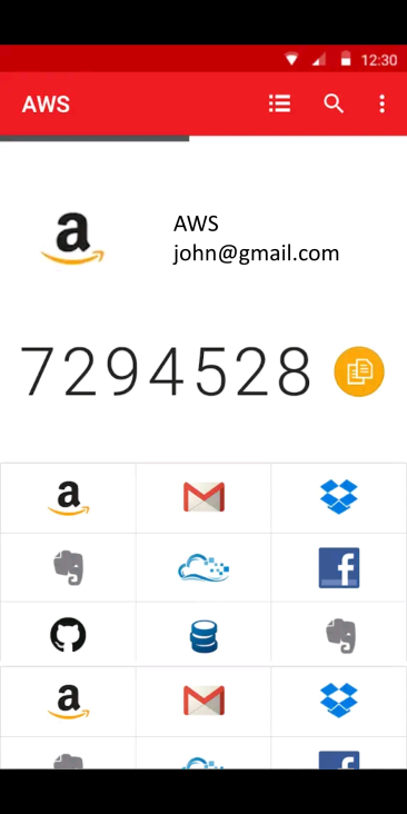
Aegis
 Aegis copied to clipboard
Grid view layout
Could you share some examples or create some mockups of how you would expect a grid view layout to look (and function) in Aegis?

Personally I love the grid view idea. Imo to "see all account in one screen", it's even better to (optionally) hide code issuer and account name until the icon is tapped.
Here's a mockup:
Developers may not like this per comment in #413 by @michaelschattgen on Jul 4, 2020
We also don't want our users to rely on the icons since future code changes might change the way Aegis sorts the entries for example.
The drawback I have with the first screenshot (disclaimer: I use that app currently) is that the grid space is locked to the bottom half limiting the total icons on display. My opinion would be to HIDE the token and show ONLY the grid until a user clicks on one, and that would open a row below it with the pin (unless not enough space remains below, so instead place above and shift the icons above it upwards.) I altered the above screenshot to try to demonstrate
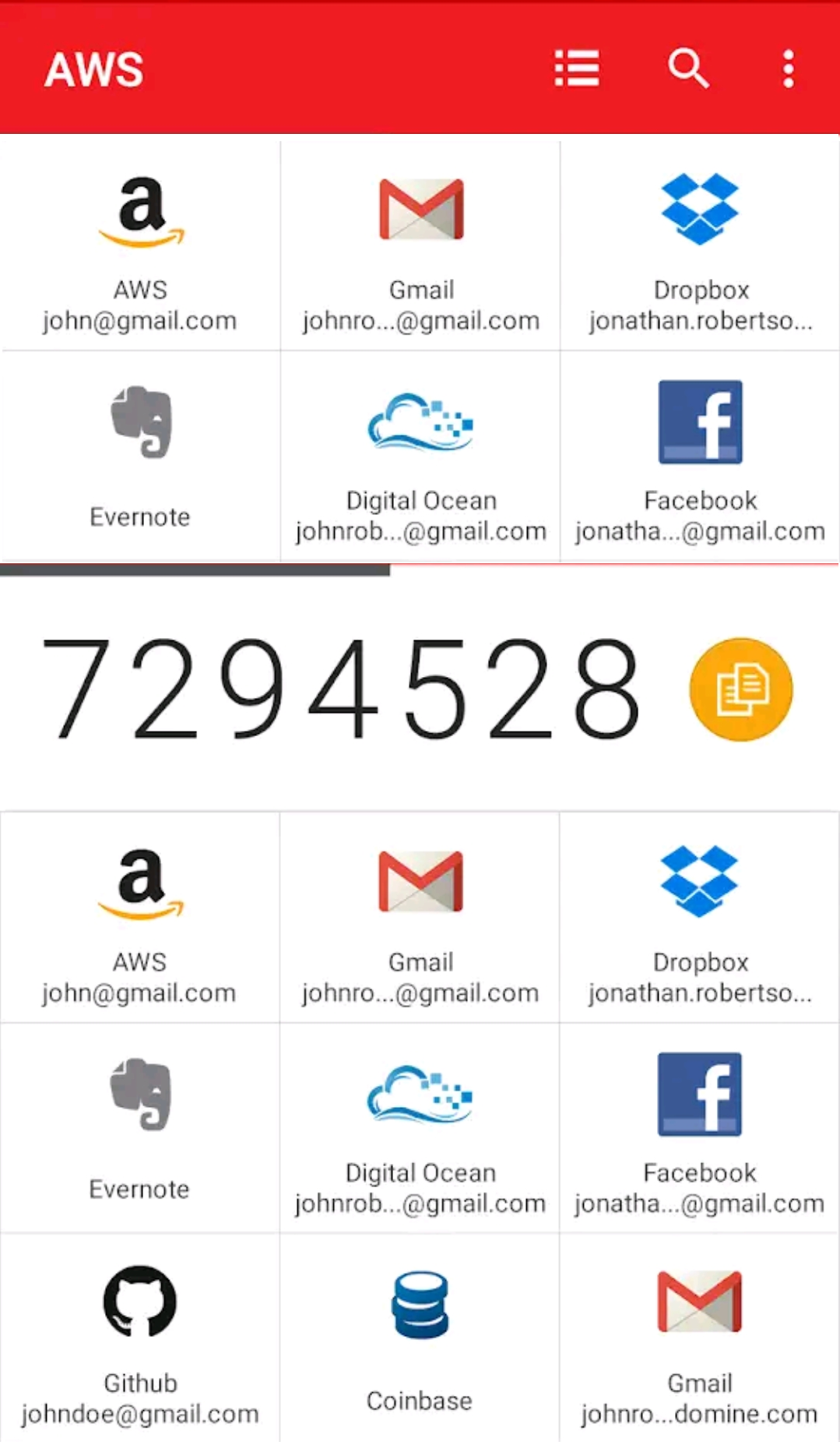
An indicator of the current selected would complete the UX.
@Hacker437, what's "the current Aegis look" that you don't want to lose? List view would remain the default afaik, and grid view would be an additional option to minimize scrolling for people with many accounts.
I currently use Authy when I came across this alternative. I had this issue when trying to understand the meaning of "Includes many view modes" on the play store but couldn't find any screenshots of anything but list.
@alexbakker Your opinion
So, we're not big fans of the grid layout for 2FA apps. But since there seems to be more interest in this than we expected, we silently accepted this proposal a couple of months ago. Meaning that we think having this as an optional layout would be fine.
If someone comes up with a good design for this and submits a PR that implements it, we'd be happy to review it. This is likely to be pretty challenging though, as there's already a lot of functionality in the entry list view.
I too would prefer an optional grid mode, however I think for it to better fit the Aegis principles mentioned in #413, it should be closer to a double column list, mainly for larger displays (perhaps more columns could be added on especially large displays, such as 30+" displays on ChromeOS, Android TV, or Windows 11 (or even something like Waydroid or Anbox on Linux).
From what I see on my device, the 'compact' view only really uses half the width of my display so I would simply go with a compact view in 2 columns. The only trade-off would be to truncate longer names...