Sarasa-Gothic icon indicating copy to clipboard operation
Sarasa-Gothic copied to clipboard

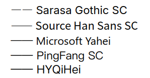
更纱黑体 SC 的 em dash (U+2014) 连用长度不足以连续

Open sommio opened this issue 1 year ago • 4 comments

不少中文正文字体的 em dash (U+2014) 长度在连用时 —— 都足以看起来连续,更纱黑体 SC 是否也可如此?

hhhxeEP3lpMKVLG4.png

sommio avatar Nov 11 '23 08:11 sommio

This issue is stale because it has been open 60 days with no activity. Remove stale label or comment or this will be closed in 15 days.

github-actions[bot] avatar Jan 11 '24 00:01 github-actions[bot]

本人认为中文编程字体将破折号不连续显示并无不妥。破折号视觉上不连续的特性应该在必要的时候得以保留。

yoonhakcher avatar Jan 15 '24 03:01 yoonhakcher

本人认为中文编程字体将破折号不连续显示并无不妥。破折号视觉上不连续的特性应该在必要的时候得以保留。

Mono 和 Gothic 不一样。

像 Mono 这种等宽的版本才能叫「编程字体」。Gothic 只是普通的显示字体,不是特别为「编程」打造的,所以按规范来说破折号是不分段的。

hunderlinehh avatar Jan 15 '24 05:01 hunderlinehh

和思源黑体一致就很好,思源黑体对破折号的处理是出了名的好(使用连字特性替换成U+2E3A TWO EM DASH) Source Han Sans SC Sarasa Gothic SC

mike-unk avatar Feb 04 '24 03:02 mike-unk

Using a long glyph is... problematic anyway. Maybe we could do something more CALT-like...

be5invis avatar Mar 17 '24 04:03 be5invis