Iosevka
 Iosevka copied to clipboard
Handwriting variant for s and r letters
- [x] The requested variant shape does not go too far away from Iosevka's design.
- [x] The requested variant does not conflict with any characters in Unicode that Iosevka currently supports.
- [x] Some other monospace/programming fonts supported the requested variant. Provide images below.
I really like the italic style of the Victor Mono font, especially the design of the letters "s" and "r". It would be wonderful to have these variants available in Iosevka 😻
Here's a quick draft proposal.
- On the first line is Victor Mono's example in italics with my proposal in transparency
- On the second line, just my one proposal
- On the third line, my proposal with the letters of the standard Iosevka font in transparency
Note: the glyph U+030A (combination ring above) was my inspiration for the loop.
Note 2: I didn't draw the letter r, but you have the idea ;)

source: https://rubjo.github.io/victor-mono/
This looks fun but its style is considered far away from existing style. Move to Research.

FWIW, Ellograph CF Italic is quite cursive all the way through:

 This probably isn't particularly strong evidence for pasting two cursive forms into an otherwise more traditional italic font, though, but make of it what you will.
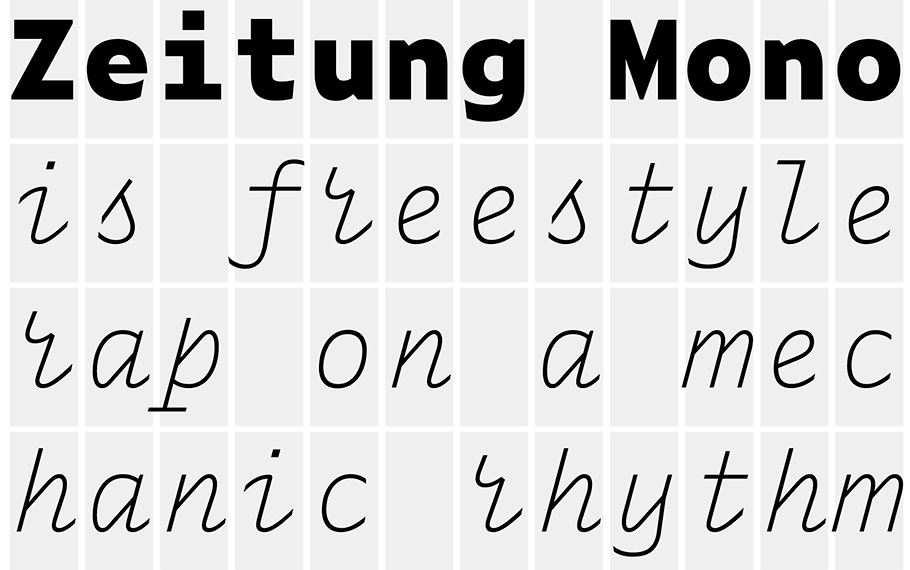
What about taking the cursive forms from Zeitung Mono (italic) for r and s but without loops. The s looks more like a deformed uppercase J, the r kind of resembles an ε (epsilon) when you look at it from the lower right, so to differentiate it from an n.

It blends in with the other forms somewhat well...
 I drew an idea based on that last one. Not a big fan of the letterform of the ⟨r⟩, from my opinionated recognizability standpoint.
I really appreciate the way the s character is realized in Zeitung mono. And the r in Zeitung is surprisingly appealing. I could hate it but somehow I don't and I even like it. It could be the case that it does not sit well in all words. Its shape may be odd next to some letters.
@kauesena True I agree. The r kind of looks wonky, to be frank.
I like the cursive s though.
I think Cyrillic ч also should refer to this thread, since its handwriting variant are similar to Latin r
 Examples in handwritten fonts:

Operator Mono uses cursive l, r, and s.
Can we also add a cursive-style 'f' seen in Operator Mono, Dank Mono and Victor Mono?
Can we also add a cursive-style 'f' seen in Operator Mono, Dank Mono and Victor Mono?
FWIW, Microsoft’s Cascadia Mono also uses cursive ⟨f⟩.
It might be worth mentioning that there is a Unicode LATIN SMALL LETTER SCRIPT R character (U+AB4B), ꭋ, since Unicode 13.0
Can we have italic fonts to use cursive variant of r,s,f,l,b,e,y from victor mono italic variant?
e.g.