Add a ligature for grouping digits of numeric literals to improve readability
In Rust language, underscores can be inserted in numeric literals to improve readability, e.g. 1_000 is the same as 1000, and 0.000_001 is the same as 0.000001.
But most of the other programming languages doesn't have this feature.
It would be very interesting if a ligature could improve the reading of large numbers.
You want 1000 to be transformed into something like 1_000?
This may significantly change the text metrics, which doesn't look like a good idea...
Are there any existing fonts doing this?
No. It's not a good idea to add a fake char. :)
It should consider:
- Maintaining text metrics
- Fitting chars in text grid
- There are many things to explore to acomplish this, like:
- Horizontal, vertical, placement
- Rotation, Size, weight, shape, italics, etc...
- Dashes, underline, ...
I did some sketches testing some possibilities:

- Original Iosevka SS08
- Changed horizontal placement
- Changed vertical placement
- Rotated in two directions
- Reduced Height
- Rotated in one direction
- Growing Weight
- Growing Weight by 3
- Even/odd weight by 3
Option 2 is quite interesting IMHO.
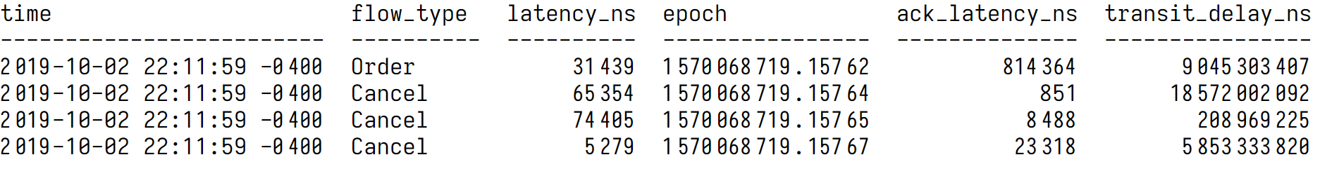
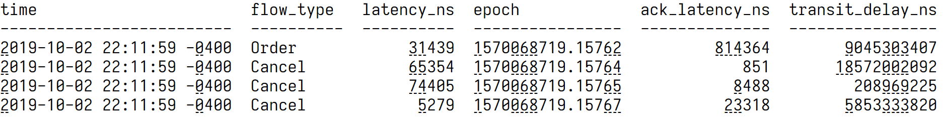
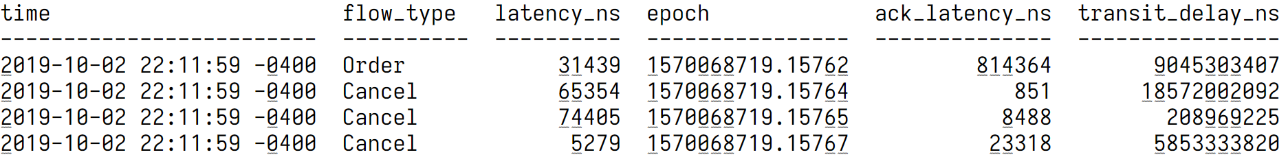
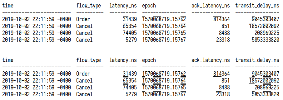
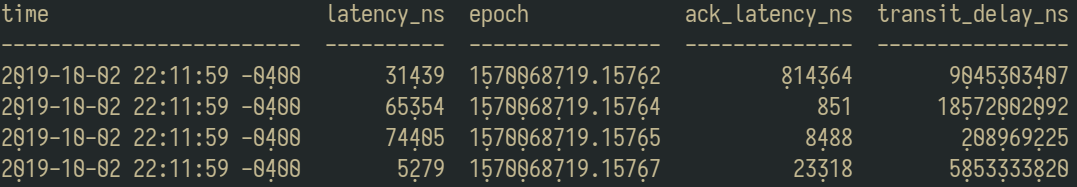
This is how grouping digits look like. Note the “851” on line 3, looks very outstanding.
But, using an underline looks... acceptable.
An interesting answer to this may be striped underline:
The accented digits look like this
2 019 looks weird. Is is possible to apply this only to group of 5 or more digits?
@vipcom:
- Wonderful post! Thanks.
- I did'nt known Numderline before.
- But I'm relieved now because it's not just me that has trouble with a lot of digits.
@alexeyten:
- I agreed that 2020-03-20 22:11:59 0400 looks weird.
- Using apostrophe or somenthing "softer" with grouping looks interesting.
@be5invis:
- That was quick! :+1: ! Impressive.
- It's possible that underlining with a continuous line spanning the 3 digits will look better?
- It's possible that applying grouping to numbers with more the 2 digits could fix the case of the "851" looking oustanding?
- I'm thinking now that using underlining, grouping, bolding/weighting, apostrophes will the a matter of personal preference, used context and the size used. It's possible that people ask a knob for adjusting same way as the shape of L I A G... :smile:. And probably there are many more creative ways of improving this.
- The commit 19e7a1a is the stripped underline in the picture above? It will go to some release? :thinking:
@juarezr I plan to release the current implementation, or apostrophe implementation to 3.0.0-rc4. Though, it will be a separate featue tag THND.
@juarezr Make the shape adjustable will massively impact the footprint (GID and file size). Do you know that Iosevka already had > 6000 glyphs?
@be5invis:
- Great!
- I'll wait by rc4 release for testing in my workstation.
- I can't see good reasons for justifying a big footprint impact. Any of theses solutions in this topic will improve a lot and tackle most of the readability troubles.
Thanks
@juarezr @alexeyten
Apostrophes doesn't quite work :(
Underline is currently the best option so far...

If underline is connected...

@be5invis:
- Maybe apostrophes for the calc because of the huge size of the digits in the display. And this is not always the case in IDE text.
- The connected version of underline looks quite good to me. It's transmit better the idea of grouping thousands IMHO.
- The unique issue that bothers me it the 2019 but I could live with this pretty well.
- I was looking at Numderline again and have some new impressions:
- Underline works well in fluid text that could be the case of source code.
- Bolding and Gr_oup_ing would work better in tables by creating a columnar text effect.
- With underlining the columnar effect is weaker.
- Bolding can cause some interference in the form of some noise that can distract the text reading.
- Grouping seems to be the middle term. But it can cause some artifacts like 851 above and the last group tending to form a new number. Probably would need some fix for these isssues but it pleases me.
- I did a sketch trying to evolve and explore further using overline was not convinced about the result:
There is something that I can help exploring with this issue? Or maybe you conclude that it's good enough?
I think the underlining is pretty good, though I will float one other idea: what about underlining every third digit -- the "hundreds" place -- alone, rather than entire groups? In other words, the first character of each triplet. Maybe only in the case that there are more than 3 digits (any overflow from a single triplet):
For anyone else playing with this in Zsh, this may help:
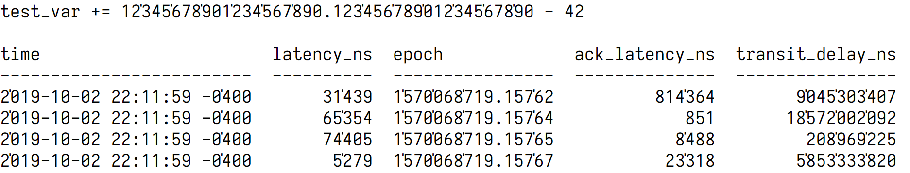
print -P "time latency_ns epoch ack_latency_ns transit_delay_ns\n------------------------- ---------- ---------------- -------------- ----------------\n2%U0%u19-10-02 22:11:59 -0%U4%u00 31%U4%u39 1%U5%u70%U0%u68%U7%u19.%U1%u57%U6%u2 %U8%u14%U3%u64 9%U0%u45%U3%u03%U4%u07\n2%U0%u19-10-02 22:11:59 -0%U4%u00 65%U3%u54 1%U5%u70%U0%u68%U7%u19.%U1%u57%U6%u4 851 18%U5%u72%U0%u02%U0%u92\n2%U0%u19-10-02 22:11:59 -0%U4%u00 74%U4%u05 1%U5%u70%U0%u68%U7%u19.%U1%u57%U6%u5 8%U4%u88 %U2%u08%U9%u69%U2%u25\n2%U0%u19-10-02 22:11:59 -0%U4%u00 5%U2%u79 1%U5%u70%U0%u68%U7%u19.%U1%u57%U6%u7 23%U3%u18 5%U8%u53%U3%u33%U8%u20"
EDIT: One more example screenshot, comparing underlining each group-start-char (when >1 group), left, vs alternating-entire-groups, right:
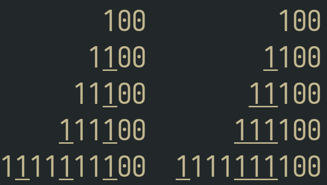
print -aC 2 -P ' 100' ' 100' ' 1%U1%u00' ' %U1%u100' ' 11%U1%u00' ' %U11%u100' ' %U1%u11%U1%u00' ' %U111%u100' '1%U1%u11%U1%u11%U1%u00' '%U1%u111%U111%u100'
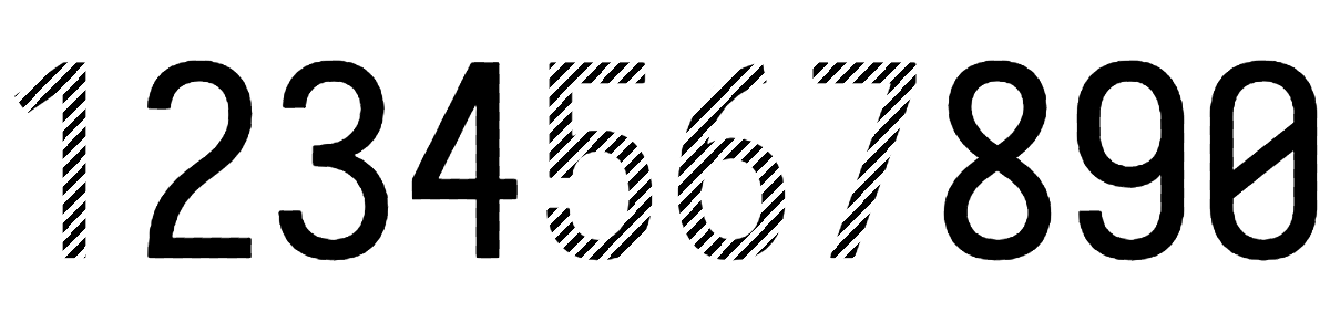
Another form supported in some engines/fonts is Old Style Numerals:
 Also I've found some information for digit grouping here and in open type feature onum.
Also a blog post on Open Type exploration
Also I've found some information for digit grouping here and in open type feature onum.
Also a blog post on Open Type exploration
I've enabled Old Style Numerals in font config by:
- Creating a config file at
~/.config/fontconfig/fonts.conf - Enabling
onumfontfeature for Iosevka in as the example bellow.
<?xml version="1.0" encoding="UTF-8"?>
<!DOCTYPE fontconfig SYSTEM "fonts.dtd">
<fontconfig>
  <description>Enable thousand separator for iosekva font</description>

  <match target="font">
    <test name="family" compare="eq" ignore-blanks="true">
      <string>Iosevka</string>
    </test>
    <edit name="fontfeatures" mode="append">
<!--      <string>THND on</string> -->
      <string>onum on</string>
    </edit>
  </match>
</fontconfig>
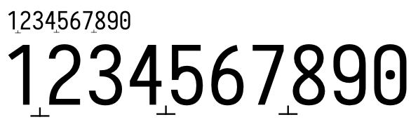
And the result is a bit strange:
It worked in a simple editor like SciTe but not for Intellij or Visual Studio code. Anyone knows why?
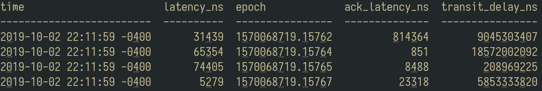
Is the space implementation really that bad? Despite "851" sticking out I think it's the most readable. Maybe if like @alexeyten suggested that it's only applied on strings over 5 numbers long it could look OK?
An interesting answer to this may be striped underline:
I like the idea of stripes, but underlining adds noise. How about striped numbers?
I see the following problems with the suggested options:
- Inserting existing characters is confusing because they're not really there
- Adding decoration such as underlines etc. could potentially also be confusing since editors/terminals might do that too
How about some decoration that doesn't really exist as a character?
 (sorry for the bad mockup)
Another alternative symbol would be ▴
My perceived issue with underlining is that it looks "too long". If it would be possible to leave it connected, but make it start a little later/end a little earlier (~10..15% off the edge of character grid), it may look better.
In my opinion the best one is still the grouping. ~~Perhaps it could only activate on numbers with 5 digits or more? That would avoid the weird look for time/date formats.~~ (already suggested)
Yet more thoughts:
- something like a tie or undertie or "combining double breve below" or "combining double inverted breve" ? https://en.wikipedia.org/wiki/Tie_(typography)
- dots (rather than lines) below characters
This is how grouping digits look like. Note the “851” on line 3, looks very outstanding.
But, using an underline looks... acceptable.
In my opinion, the space solution is the best I've seen. But it should only activate when there are 5 or more digits.
@AlsoScratch In my opinion, the space solution is the best I've seen. But it should only activate when there are 5 or more digits.
However it will make inconsistency between long numbers and short numbers. See the ack_latency_ns column.
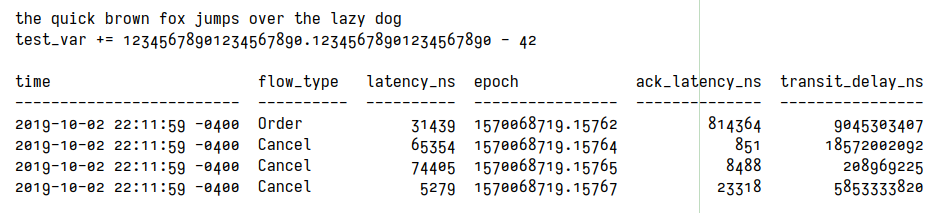
Here's what it would look like with dots underneath, and only on the first digit of each triple, in numbers with more than three digits. And this time I'm excluding the first digit after the floating point. I used combining dot below.
print -P "time latency_ns epoch ack_latency_ns transit_delay_ns\n------------------------- ---------- ---------------- -------------- ----------------\n20̣19-10-02 22:11:59 -04̣00 314̣39 15̣700̣687̣19.1576̣2 8̣143̣64 90̣453̣034̣07\n20̣19-10-02 22:11:59 -04̣00 653̣54 15̣700̣687̣19.1576̣4 851 185̣720̣020̣92\n20̣19-10-02 22:11:59 -04̣00 744̣05 15̣700̣687̣19.1576̣5 84̣88 2̣089̣692̣25\n20̣19-10-02 22:11:59 -04̣00 52̣79 15̣700̣687̣19.1576̣7 233̣18 58̣533̣338̣20"
Some other "combining diacritics" may be worth looking at, like combining dot above (0̇), combining dot above right (0͘), etc.
What about some minor vertical-only squishing or stretching (moving the bottom up or top down, keeping the other in place, keeping the usual shape width)? This could either be done at the hundreds, hundred-thousands, etc. places, or inversely at the tens and ones, ten thousands and one thousands, etc. places.
Teeny-tiny commas (like the apostrophes except on the bottom) or spacing look by far the best, to me. The dotted underlines are clever and work to help group the numbers, but are unfamiliar and require a little retraining. Commas are probably simpler, too, since you only have to keep track of three possible positions instead of six.
According to official standards, space is the desired symbol for digit grouping while the decimal point is a dot or comma. I feel that apostrophes are semi-acceptable for digit grouping.
Source: Resolution 10 of the 22nd CGPM (2003)
declares that the symbol for the decimal marker shall be either the point on the line or the comma on the line,
reaffirms that "Numbers may be divided in groups of three in order to facilitate reading; neither dots nor commas are ever inserted in the spaces between groups", as stated in Resolution 7 of the 9th CGPM, 1948.
Space looked great, but it's a little complex to add in and you have to deal with digits shifting when you typed them (Or maybe there are better ways to do them). Commas looked awesome, but hey, @be5invis has an artist's integrity to their art to uphold. Even though I use periods for decimal points, I bet a really small dot could be used for digit grouping without any real confusion for a decimal point. Or use a novel marking, as was suggested above by @eproxus, and in Iosevka style, you could probably make the choice of symbol selectable. Apostrophes... look okay, and the group digits by a dividing symbol instead of by ligating vincula (which takes getting used to), but they're not in the place we're trained to look for the grouping symbol.
I'm still in favor of something in the place where the comma would go, if not a comma, unless spacing is acceptable with whatever issues it might have. In terms of actual appearance, spacing is probably the best-looking, to my highly inexpert eye.
Anything that looks like a normal character will get confusing and be mistaken for actual characters that are not there. Another argument against this is localization (e.g. dots and commas as decimal and thousand separators are sometimes reversed in some locales).
Visually I think diacritics only adds more noise and does not make it clearer, which is the goal here.
In my previous exploration I noticed that:
- Maybe there isn't a unique approach that fits all contexts for number readability, IMHO:
- approaches like
underliningimprove the readability more when the numbers are mixed in paragraphs or in phrases of text. - approaches like
groupingdigits by spacing improve the readability more when the numbers are displayed in columns, tables or are aligned vertically.
- approaches like
- Some approaches help specific cases, but don't looks acceptable on the general case.
- inserting
fakecommas, dots adds confusion because some languages and regional settings use them in different meaning compared with English language. For instance, in Portuguese commas are decimal separators and dot's are thousand separators. - approaches like
markingthe separation with apostrophe, marks or dashes bring add a lot of visual "noise" when reading text phrases or paragraphs. - approaches like
bolding/weighting make the numbers look very outstanding in fluid text like paragraphs and this becomes a annoying distraction that disturb reading. - using
groupingdigits by spacing works well and looks quite better than other approaches, but has some issues like the inconsistency of 3 digits numbers. Maybe somebody can find a good solution for this.
- inserting
- @be5invis already developed
underliningin Iosevka on 19e7a1a and it's available underTHNDfeature since v3.0.0-rc-4.- From the approaches tried in this issue (#453) and in the Numderline,
underlininglooks like the one with less problems overall. - However, I'm still missing a little optimization for skipping numbers with 4 digits.
- But for some people
groupingstill is the best looking solution.
- From the approaches tried in this issue (#453) and in the Numderline,
@be5invis marked this issue as Research. So maybe somebody can find an approach that overcomes most of the deficiencies:
- must not attract the eyes while reading other words in a text, paragraph or fluid text.
- must not add visual noise that hamper the mental translation of digits in a number.
- must not look very outstanding from other words, and text for not disturbing the reading.
- must work great with vertical columns of numbers, like tables, notebooks.
- must look similar between a few digits and many digits numbers.
- must work well for small font sizes.
- must not conflict with language differences or regional settings.
It's hard to find a perfect solution for all this cases because a solution like this applies to sets of digits and whole text instead of just a single character or ligature. But maybe somebody could have a good idea. There are also many unexplored approaches like stretching, coloring, italics, positioning that can be explored or combined.
I would love to see a improved grouping by spacing with the 0-3 digit size incoerence fixed. :smiley:
I'm using the THND feature in my text editors for a while and it really improves big numbers reading.
Small apostrophe-like mark worked well for me so far personally. The eye gets trained real fast, and it's not that intrusive even if you accidentally get it in the 4-digit years.
Wondering if an alternative similar to old style figures like in #397 can work for improving readability of numbers with many digits. :thinking:
How about a teeny uptick at the rightmost end of the grey line being used now?
Wrote a little script that takes a font file and creates fake-comma digits and makes lookups that do digit-grouping lookups, and have been ruthlessly violating assorted fonts to see how they look with it. I'm starting to come around to the "apostrophe" camp, actually. Spacing looks good... or it can look good, but might not be enough in some settings (I experimented with GPOS tables to do spacing instead of marks). It probably should be a pretty significant shift to make sure everyone can see it, but I think the problem with spacing is that it makes the digits jump around when you're typing them in. That could be fine, or it could be really disconcerting. The underlining method performs the needed function (I can see how many powers of a thousand), but don't look "normal" to me. The upper part of the glyphs seem to be less congested than the bottom, somehow, and a mark up there (not necessarily resembling an apostrophe, but something) did not feel as strange as one might think.
This is really so much a matter of personal preference, and it isn't that we'll never find something everybody likes, but we also are unlikely ever to find something which nobody hates!
I wish it were easier to specify opentype features for more programs. I can tweak my fontconfig but sometimes I just want to see it "for now", and even then there are some apps that don't seem to deal with them right. The fontconfig docs imply that I ought to be able to set a font to Iosevka:ss04 or something, with a colon, but practically nothing honors that.
At this time, my preferred solution would be increasing the height of hundreds digits. Without seeing them, I don't know if extending only upward or only downward would be better. This has the advantages:
- widths unchanged, for alignments
- no added marks, for clarity and compatibility
- modifies fewer characters than changing entire triplets
- "big" numbers (hundreds place) are literally big
- no confusion with italics/bold/oblique
That's a cool idea, I hadn't thought of it. But I just tried it out (not on Iosevka) and at least my first attempt was hideous. Maybe others will do better. (Keep the size the same but raise the digit slightly? Probably still hideous.)
I did notice that some fonts with emojis support can specify distinct colors or each glyph/char.
Then I was wondering about the viability and the suitability of using colors for improving the reading of numbers with many digits.
Some possibilities popped into my head:
- Using progressive/gradual colors/tones separating groups of digits
- Using distinctive colors/tones focusing on the most significant part of the digits of the number
- Using colors/tones for removing the distractions that arise from the digits that are less important (like fading)
- Using colors/tones to highlight other symbols used in numbers than 0-9 like:
- negative (
-) - exponential, exponent
- money (
$) - separators (comma, pt)
- negative (
- Combining colors/tones with weight, width, height, spacing
Crazy idea?