PythonEditor
 PythonEditor copied to clipboard
Save button is confusing
Kids tend to see both the 'Download' and the 'Save' button and wonder which one they should use (and adults tend to be even more confused)
I think it would be good to be more explicit about the difference and make the 'save' feature to generate a python file slightly less on the 'fast path'. Here's a super-quick mockup to show intent.

@jaustin do you still have any suggestions for this? We should take it in consideration for the next UX task.
Recent changes to the UI/UX on the Beta version have caused confusion.
We have to use the Beta version because of ongoing instructor education using the Flash feature (which only exists in Beta). A class we held for teachers last week exposed their confusion about the current combined Load/Save button functionality.
Our instructor who taught the course suggested "...separating Save-As from the Load button since users are initially confused about the difference between modules saved on the microbit and *.py files saved on their local drive."
It seems there's an effort to rethink and consolidate functionality, but we're confused as to why there's a need to do so. The Load and Save buttons used to be separate (now are combined) and a Save As function seems to be missing or is an unintuitive process.
Have I missed the issue discussing these changes and the intended direction?
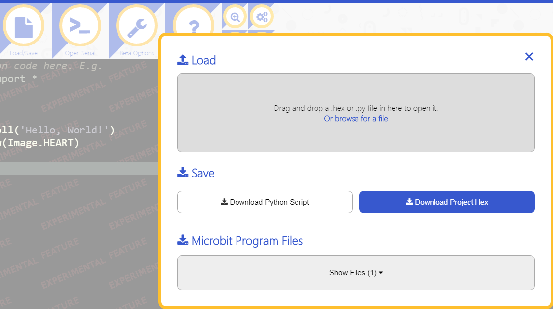
As it is currently, there's a lot of information on the Load/Save overlay, and when someone simply wants to just save their current code (a very common task), it's hard for them to figure out how to do it and once realized, takes more than one mouse click to achieve.
Perhaps it would be better to re-separate Load and Save functionality and instead put a Save button next to the Script Name field.

@PropGit thanks for the feedback here!
I've got a couple of followup questions
- What are people aiming to do when they use the 'save' button?
- What date did you run the workshop? The screenshot you posted is from a very recent update and I'm not sure it would have been there during your workshop - we've made it easier to download the py file in that revision as a result of similar feedback about it being too many steps.
As a bit more context: we're trying to encourage use of the 'hex' file as the main way to save a project because it will also contain the files a user has added. The 'py' file alone isn't enough to seamlessly recreate a project. The move to make the 'py' export a bit less prevalent is an attempt to ensure people don't think they've 'saved' their work without also saving the modules they need to make a program run.
Alongside the fact that we're always pushed for space in order to be able to present a consistent set of buttons at a range of screen sizes, we felt it was right to prioritise the presentation of webUSB and move the 'load/save/export' to single button. We're always struggling with the balance between 'wall of buttons' and 'simple interface that can do lots of things' so keen to understand how this change is affecting users.
@jaustin - you're welcome.
Item 1: People are trying to save their on-screen source as a .py file, or trying to save said source as a new name of their choice (for safe-keeping to come back to after they make changes to the current on-screen source).
Item 2: the workshop was 7/25 and 7/26. Definitely things were changing in that timeframe; the Load and Save buttons were already a combined Load/Save button, but the overlay that appeared then only had a Download Hex button (as far as I can tell). It had changed by the time I screenshotted and documented it in the post above.
As a bit more context: we're trying to encourage use of the 'hex' file as the main way to save a project because it will also contain the files a user has added. The 'py' file alone isn't enough to seamlessly recreate a project. The move to make the 'py' export a bit less prevalent is an attempt to ensure people don't think they've 'saved' their work without also saving the modules they need to make a program run.
Okay, that sounds like an excellent idea and one we can get behind and will need to re-educate ourselves to internally.
Alongside the fact that we're always pushed for space in order to be able to present a consistent set of buttons at a range of screen sizes, we felt it was right to prioritise the presentation of webUSB and move the 'load/save/export' to single button. We're always struggling with the balance between 'wall of buttons' and 'simple interface that can do lots of things' so keen to understand how this change is affecting users.
Understood.
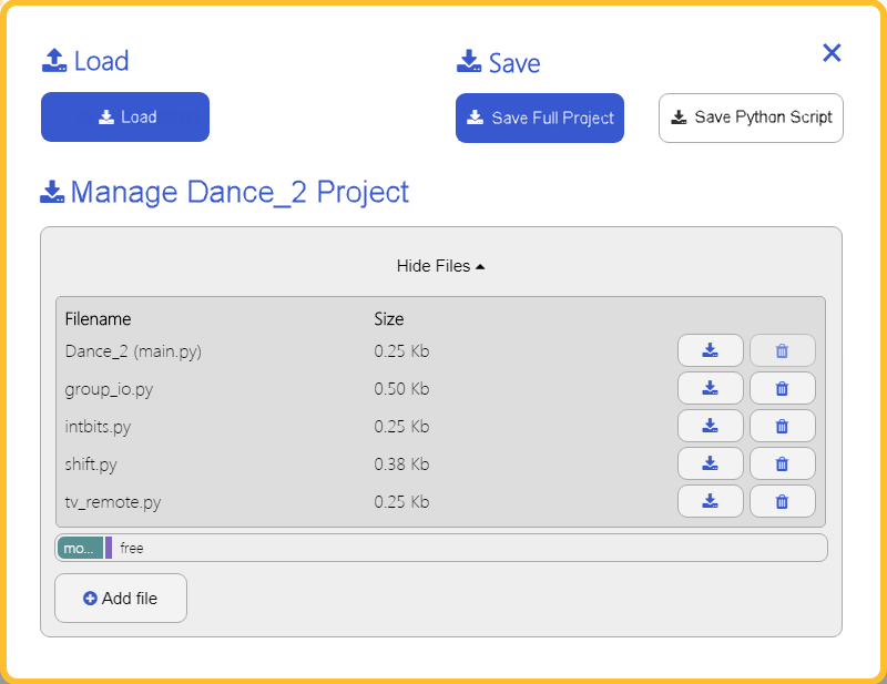
Idea: Just a quick thought (may come up with other ideas later), based on all this, I think the sections of the overlay should be grouped differently and buttons arranged differently for emphasis and to match the order of the text on the button. Maybe like this:

And generalize the file type (to simplify user thought) by changing the button names (and wording used anywhere) to "Save Full Project" and "Save Top Source"; where the first saves as a .hex (including everything) and the latter saves only their on-screen Python source as a .py file.
Also, how about changing "Microbit Program Files" to "Manage <project_name> Project" since "Load" and "Save" are commands/actions and what that section allows you to do is perform actions with regards to the whole project (as well as visualize what's included, of course), plus, it's a bit misleading as it is because it implies that it's showing exactly what's on the attached micro:bit (yet that's only true after at least one recent download has occurred and before they've made changes to this section).
And perhaps an option can be added to the editor such that something like holding the ALT key down visually changes the Load/Save button to just a Save button, so that ALT+Save click saves the current project (modules and top-level source combined in a .hex file) without opening any dialog at all. A two-handed, but single-step operation to perform a quick save.
I should have also mentioned ideas for the icons.
Load and Save are fine, but maybe
-
Manage Project:
 --or--

-
Save Full Project:

-
Save Top Source:

Two other enhancement ideas. I found these while using the new system in real cases.
- Can the entire Load/Save overlay be a drop target? I find that when I'm adding modules to my project, I naturally drag and drop right over the project area, which causes the browser to want to navigate away and show the raw file.
- This would allow the Load area to shrink in size significantly, maybe just down to the height of the text.
- When adding modules on the Load/Save overlay, can the toast (browser info message) appear without hiding the overlay? If one has multiple modules to add, it's really annoying to have to keep opening the Load/Save overlay again after a drag and drop.
Here's a poorly rendered mock up showing vertical space savings (even with a lot of modules added to the project) and includes some label changes (but did not use proper icons). This is assuming the entire overlay is the drop target, similar to how Google Photos has active controls on-screen but the entire display is a drop target.