react-native-circular-progress
 react-native-circular-progress copied to clipboard
 bartgryszko
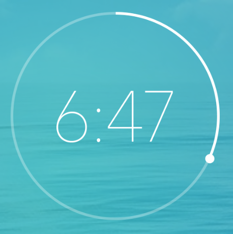
Circular progress with small circle
You can modify the source code.
Reference: #38 Added strokeCap, capWidth and capColor option
CircularProgress.js
import React from 'react';
import PropTypes from 'prop-types';
import { View, ViewPropTypes, Platform, ART } from 'react-native';
const { Surface, Shape, Path, Group } = ART;
import MetricsPath from 'art/metrics/path';

export default class CircularProgress extends React.Component {

  circlePath(cx, cy, r, startDegree, endDegree) {

    let p = Path();
    p.path.push(0, cx + r, cy);
    p.path.push(4, cx, cy, r, startDegree * Math.PI / 180, endDegree * Math.PI / 180, 1);
    return p;
  }

  extractFill(fill) {
    return Math.min(100, Math.max(0, fill));
  }

  render() {
    const { size, width, backgroundWidth, tintColor, backgroundColor, style, rotation, linecap, capColor, capWidth, children, circleRadian } = this.props;
    const borderWidth = capWidth > width ? capWidth : width;
    const radius = (size - borderWidth) / 2;
    const center = size / 2;
    const backgroundPath = this.circlePath(center, center, radius, 0, circleRadian);


    const fill = this.extractFill(this.props.fill);
    const circlePath = this.circlePath(center, center, radius, 0, circleRadian * fill / 100);

    const radian = Math.PI * circleRadian * fill / (50 * 360);
    const capX = radius * Math.cos(radian) + center;
    const capY = radius * Math.sin(radian) + center;

    return (
      <View style={style}>
        <Surface
          width={size}
          height={size}>
          <Group rotation={rotation - 90 - circleRadian / 2} originX={center} originY={center}>
            <Shape d={backgroundPath}
              stroke={backgroundColor}
              strokeCap={linecap}
              strokeWidth={backgroundWidth != null ? backgroundWidth : width} />
            <Shape d={circlePath}
              stroke={tintColor}
              strokeWidth={width}
              strokeCap={linecap} />
            <Shape d={this.circlePath(capX, capY, capWidth / 4, 0, 360)}
              stroke={capColor}
              strokeWidth={capWidth / 2} />
          </Group>
        </Surface>
        {
          children && children(fill)
          // children
        }
      </View>
    )
  }
}

CircularProgress.propTypes = {
  style: ViewPropTypes.style,
  size: PropTypes.number.isRequired,
  fill: PropTypes.number.isRequired,
  width: PropTypes.number.isRequired,
  backgroundWidth: PropTypes.number,
  tintColor: PropTypes.string,
  backgroundColor: PropTypes.string,
  rotation: PropTypes.number,
  linecap: PropTypes.string,
  capColor: PropTypes.string,
  capWidth: PropTypes.string,
  children: PropTypes.func,
  circleRadian: PropTypes.number,
}

CircularProgress.defaultProps = {
  tintColor: 'black',
  backgroundColor: '#e4e4e4',
  rotation: 0,
  linecap: 'butt',
  capColor: 'black',
  capWidth: 0,
  circleRadian: 360
}
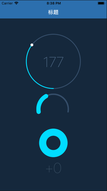
Usage
circleRadianThe radian of Circular progresscapColorThe color of small circlecapWidthThe width of small circle
<AnimatedCircularProgress
  size={150}
  width={2}
  fill={50}
  tintColor="#00e0ff"
  linecap='round'
  capWidth={6}   <--
  capColor={'#fff'}  <--
  circleRadian={200}
  onAnimationComplete={() => console.log('onAnimationComplete')}
  backgroundColor="#3d5875" />
 Text doesn't stay inside the circle when using this
<AnimatedCircularProgress size={140} width={12.5} backgroundWidth={10} fill={60} tintColor="#FE485A" backgroundColor="#FF9BA5" rotation={0} friction={1} linecap='round' capWidth="5"> { (fill) => ( <Text>123</Text> ) } </AnimatedCircularProgress>
@teddyteh Use the original chunk of CircularProgress.js after the Surface closing tag: {children && <View style={{ position: 'absolute', left: width, top: width, width: offset, height: offset, borderRadius: offset / 2, alignItems: 'center', justifyContent: 'center' }}
{children(fill)}</View> }
Also, add in render function the offset variable declaration:
const offset = size - (width * 2);
can you post a working code as i am facing issue (i also wan to achive exactly same )and very confused with this??