android-ActionSheet
 android-ActionSheet copied to clipboard
 baoyongzhang
iOS UIActionSheet for Android
ActionSheet

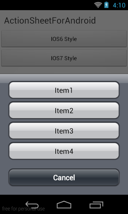
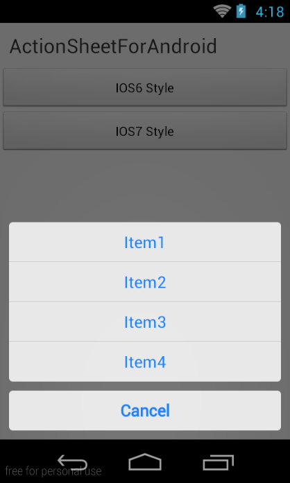
This is like iOS UIActionSheet component, has iOS6 and iOS7 style, support custom style, background, button image, text color and spacing etc.
Usage
Add dependency
dependencies {
    compile 'com.baoyz.actionsheet:library:1.1.7'
}
Create ActionSheet and show
ActionSheet.createBuilder(this, getSupportFragmentManager())
				.setCancelButtonTitle("Cancel")
				.setOtherButtonTitles("Item1", "Item2", "Item3", "Item4")
				.setCancelableOnTouchOutside(true)
				.setListener(this).show();
Methods
setCancelButtonTitle()Cancel button title, (String)setOtherButtonTitles()Item buttons title,(String[])setCancelableOnTouchOutside()Touch outside to close, (boolean)setListener()set a Listener to listen eventshow()Show ActionSheet, returnActionSheetObject,calldismiss()method ofActionSheetto close.
Listen event
implementing ActionSheetListener interface.
onOtherButtonClick()Click item event,indexis item index.onDismiss()Dismiss event.
   	@Override
	public void onOtherButtonClick(ActionSheet actionSheet, int index) {
		Toast.makeText(getApplicationContext(), "click item index = " + index,
				0).show();
	}

	@Override
	public void onDismiss(ActionSheet actionSheet, boolean isCancle) {
		Toast.makeText(getApplicationContext(), "dismissed isCancle = " + isCancle, 0).show();
	}
Style
Default style is bad,ActionSheet has iOS6 and iOS7 style,you can configure the theme.
<!-- Application theme. -->
    <style name="AppTheme" parent="AppBaseTheme">
        <item name="actionSheetStyle">@style/ActionSheetStyleiOS6</item>
        or
        <item name="actionSheetStyle">@style/ActionSheetStyleiOS7</item>
    </style>
You can custom style, can refer to ActionSheetStyleiOS6/ActionSheetStyleiOS7 writing.
 <!-- iOS7 Style -->
 <style name="ActionSheetStyleiOS7">
        <item name="actionSheetBackground">@android:color/transparent</item>
        <item name="cancelButtonBackground">@drawable/slt_as_ios7_cancel_bt</item>
        <item name="otherButtonTopBackground">@drawable/slt_as_ios7_other_bt_top</item>
        <item name="otherButtonMiddleBackground">@drawable/slt_as_ios7_other_bt_middle</item>
        <item name="otherButtonBottomBackground">@drawable/slt_as_ios7_other_bt_bottom</item>
        <item name="otherButtonSingleBackground">@drawable/slt_as_ios7_other_bt_single</item>
        <item name="cancelButtonTextColor">#1E82FF</item>
        <item name="otherButtonTextColor">#1E82FF</item>
        <item name="actionSheetPadding">10dp</item>
        <item name="otherButtonSpacing">0dp</item>
        <item name="cancelButtonMarginTop">10dp</item>
        <item name="actionSheetTextSize">12sp</item>
    </style>
Style attributes
actionSheetBackgroundcancelButtonBackgroundotherButtonTopBackgroundotherButtonMiddleBackgroundotherButtonBottomBackgroundotherButtonSingleBackgroundcancelButtonTextColorotherButtonTextColoractionSheetPaddingotherButtonSpacingcancelButtonMarginTopactionSheetTextSize
 baoyongzhang