backdrop-issues
 backdrop-issues copied to clipboard
Messages placement on homepage is not great
Description of the bug
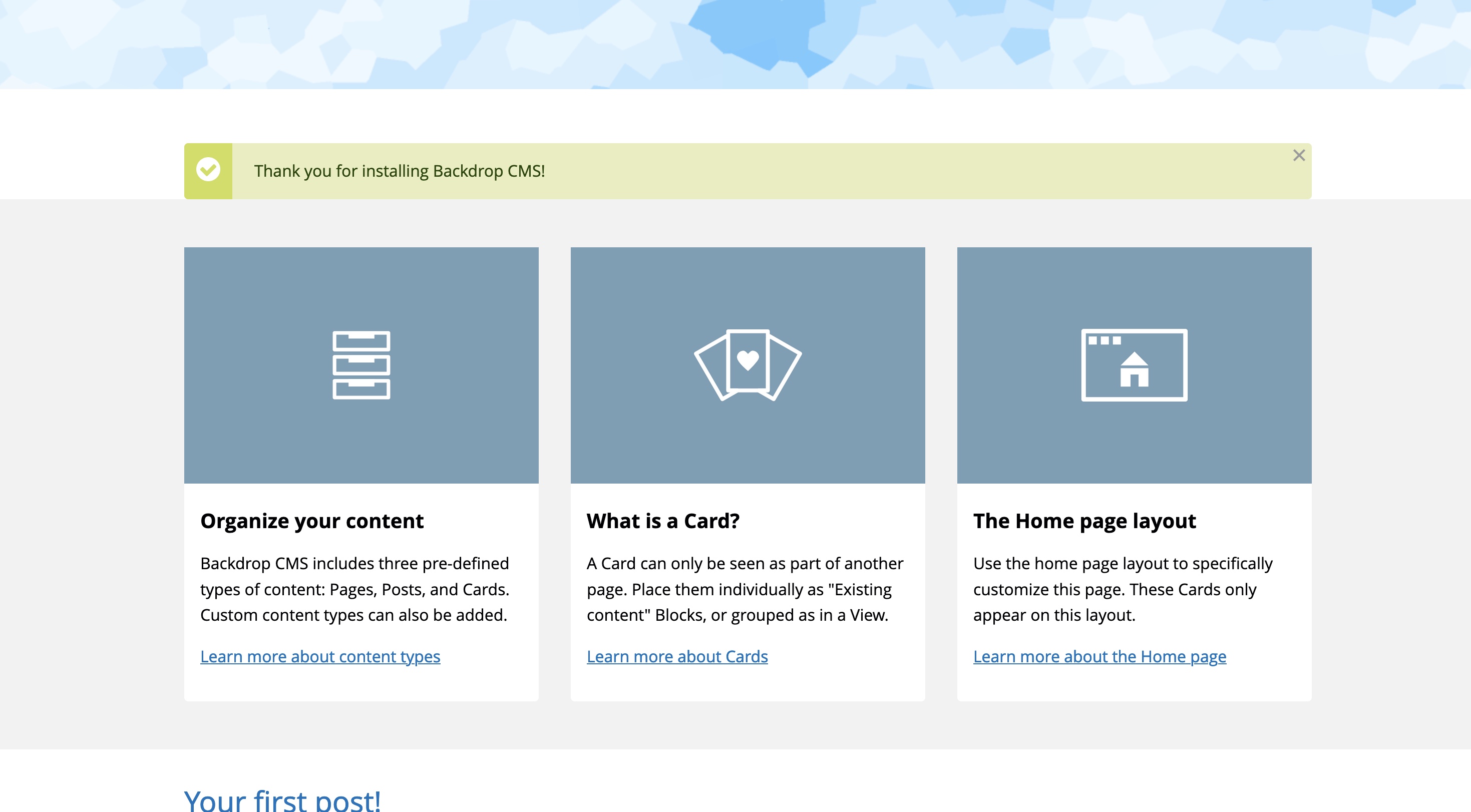
I was testing out the preview release and I think we can do better on the placement of the messages on the homepage:

I think it would be better below the cards, and with a bit of padding between it and the grey background. That way the first view doesn't have a strange white gap between the header and the cards.
Yeah, I've been thinking about this too. I'm just not sure about what the best alternative is yet. However, I agree that the current situation is kinda ugly.
I think it would be better below the cards ...
On smartphones and on many tablets messages wouldn't be visible at first sight, if they were below the cards.
Let's try to keep the messages (more or less) at their place and to remove the white gap. Maybe style the messages block with position: absolute? Something like this:
.front .block-system-messages {
  position: absolute;
  top: 22rem;
  right: 0;
  left: 0;
  z-index: 2;
}
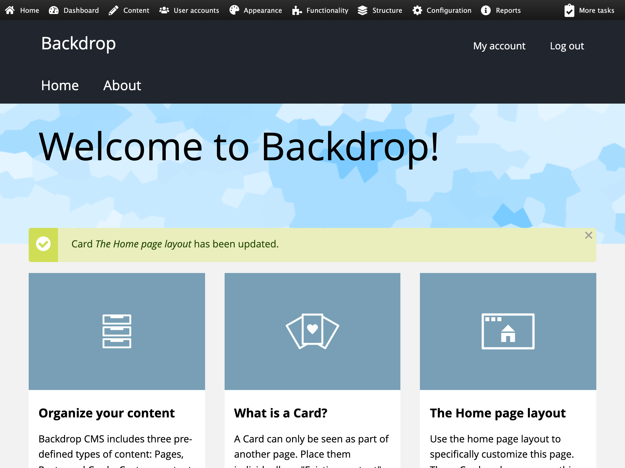
The example could certainly be improved, e.g. the top value should be adapted for phones (and / or expressed by percentage). Here's however a screenshot to illustrate the idea:

Oh, I think I found an issue I could work on and would love to see get fixed. This one has been bothering me for a long time (since we added the cards). Now that it has been brought up again in https://github.com/backdrop/backdrop-issues/issues/6074, I think it's time to fix it.
It's not a good first look for Backdrop. I'll try to submit a PR for this soon, but please - someone go ahead and beat me to it. I'd volunteer to advocate for this, but it it's not a new feature, so it really doesn't need an advocate.
This issue came up again in #6220, reported by @alanmels. Now it's really time to fix it, I guess! @stpaultim Are you still up to work on it?
Messing around a bit I considered a few approaches:
- Rearranging so the status messages are above the hero, but I don't think that helped anything
- Position absolute (like @olafgrabienski suggested), but in practice that can open up some other issues
I think the most straightforward way to address this would be a small design adjustment to remove the gray bg behind the cards, and using a drop shadow to distinguish the cards from the white bg. I think it's the least disruptive and straightforward solution.
I'm so happy we're working on this issue - it bothers me so much with every install!
Unfortunately, we can't change any front-end CSS in any way that would affect existing Backdrop sites -- understanding that most backdrop sites that are running today have already fixed this problem, and if we fix it differently than they do, we're going to break those live sites 😱
We've been struggling with this problem since the very beginning of Backdrop, and have a few ideas about how we can fix CSS for new sites without breaking existing sites. @wesruv I'd love to have your opinion on the current "leading" idea in Add support for supplemental CSS selectors
Just throwing out ideas here. Add a checkbox (or set of checkboxes?) to the Basis theme:
[ ] Use Basis2024 settings
When updating from old sites, default is unchecked. When installing new sites, default is checked. People with existing sites will have nothing break, but they can try out the new settings if they're curious.
In a couple of years, we can add another checkbox for "Use Basis2027 settings".
Here is the "Meta" issue for deciding upon the best strategy for css improvements. https://github.com/backdrop/backdrop-issues/issues/4167
I agree that this issue is really annoying and highly visible and it would be great to get it fixed.
@bugfolder I believe that was discussed already in the other issues, but I'd recommend giving them a read-through and adding similar ideas there. Let's not distract too much from the solution for messages, being determined here :)
Yes, i see the other issue from @stpaultim now.
Back to @wesruv's suggestion: Looking at the screenshot, I like the design adjustment to remove the gray background and using a drop shadow instead. What do others think?
PS: I wanted to test the PR to see how the page looks without messages, but there isn't a sandbox site.
@olafgrabienski The sandbox is working for me now.
In addition to the issue about making changes to CSS raised by @jenlampton, this would only solve the problem with Basis, right out of the box. It doesn't solve the problem for other themes or other configurations.
Having said that, I think it would be OK to just solve this for Basis out of the box for now. The most important problem for me, is fixing the appearance of the first thing anyone sees when they load Backdrop. If this does not work in other themes or after config changes, the "Page Messages" block can be moved or the Nice Messages (https://backdropcms.org/project/nicemessages) contrib module can be installed.
So the solution by @olafgrabienski would be more flexible, but I understand that Wes anticipates other issues. Wes's solution would be fine by me, for now, if we can do it in a backward compatible way.
Thanks @stpaultim! I was able to have a look at the page without messages now. Here's a screenshot:
Looks good, in my opinion. Maybe the cards block could need some more top padding, though, e.g. 3rem instead of 1rem.
Screenshot 3rem padding-top: