[UX] System updates form: Merge the manual updates section into the main updates table
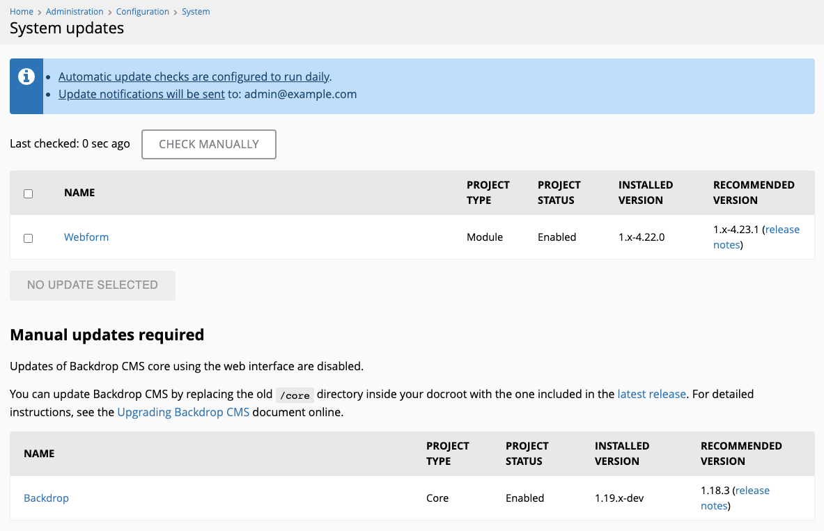
The form under admin/config/system/updates seems too busy when the "Manual updates" option is disabled, having two sections/tables, and some help text in between:
How about something like this instead?:

So basically:
- merge the manual updates section (only core really) with the main tableselect
- have the checkbox(es) for projects that require manual updates either be disabled/locked, or remove them completely
- indicate which projects require manual update via a suffix in their title
- add a more/less toggle link (same as those used in the modules listing and the status report page), which reveals manual update info
PR up for review: https://github.com/backdrop/backdrop/pull/3621
PS: I've cleaned up some bits of the code that we still assuming that we have separate sections for enabled/disabled modules - we now have a dedicated "Project status" column in the tableselect for that.
I think this is an improvement, but I have some suggestions for improved text. I'll do the code review first.
Hm. Actually, this may need more work than we can do before the 1.19.0 release.
In the world of Backdrop updates, we already use the word "Manual" to mean something else:

In the settings form (see screenshot) "Manual" means that someone can click a button in the Backdrop UI and the files on disk will be replaced for them.
In the PR for this issue, the word "manual" is used to mean that someone will need to go into their filesystem, and replace files themselves. I think it will be confusing to use the same word for those two different actions. The second action requires that someone has ssh or ftp access to their code. It's a whole different level of access to a site.
In the world of Backdrop updates, we already use the word "Manual" to mean something else.
@jenlampton do you mind moving the discussion for this in #5089 instead? I feel that it might get really long 😅
...considering that:
- we can fix the terminology independently in the follow-up #5089 (pre-existing issue - not introduced here)
- the PR here does not change existing text/terminology, just improves the UI by merging two tables into one + hides the lengthy help text inside a more/less toggle within the table
Can we then please not block this UI improvement over the terminology clarification?
I like this suggestion. When there are several updates the core manual update can get lost further down the page. With this approach and the absence of a checkbox and the additional more text it brings the information for quickly to attention. Since the update settings have been set to not self-update, it's good to quickly see if a new update is available.
Thanks for testing @izmeez 🙏🏼 ...setting this to NW, to work on the issue you discovered in the PR.
FTR, here's the issue for the benefit of others in this thread:
I like this idea and the PR is working in that I can launch the tugboat instance and sign in. However, since it is using the development branch on the update report there is no update needed and the manual update required with drop down more text is not displayed. I will have to apply a patch to to test against an older version. If I press on within tugboat to install system updates, it doesn't tell me I can't instead it goes ahead and then hits an error:
Plus, it invites me to continue and we all know this is going to lead nowhere, so why are we going down this path. I thought before with PR on the dev branch I thought I had seen a message that updates were disabled and had to be done manually. I'll have to sort that out in my mind.
However, since it is using the development branch on the update report there is no update needed and the manual update required with drop down more text is not displayed.
Yeah, that won't be able to be tested on the PR sandbox - you'll need to test that on your local. ...although, we could manually set BACKDROP_VERSION in bootstrap.inc to 1.26.0 or older, which would trigger the UI changes that need to be reviewed/tested here, and then make a note for our core committers to revert that change before they merge this.
edit: I've filed #6279 in order to explore ways to mock the backdrop core version, but only within the context of PR sandboxes
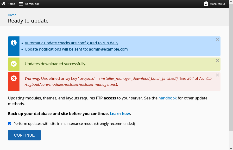
For reference to the current situation (w/o the changes in this PR), here's what the expected result is:
Although I don't find the UX for the above ideal, that's what we have in place (so if we want to improve that, it'd need to be a separate issue I believe). Anyway, when you click "Continue", this is what you should get (core/authorize.php):
Whereas with the current PR, clicking the "Continue" button does absolutely nothing (and that's what needs to be fixed).
...also, this PR introduces custom JS for the more/less toggle, which we don't need if #5090 gets merged. If this change here gets merged first, we'll need to update the PR over in #5090 to remove the custom JS we are introducing here, and instead use a more/less toggle based on a <details> element.