cosmos
 cosmos copied to clipboard
 auth0
auth0
RFC - overrides prop
This RFC (request for comments) is to introduce a way for applications to override styles of a cosmos component
Problem statement
Cosmos takes care of the design of a component, ideally an application using cosmos should not modify the component's styles.
Sometimes, a new design is slightly different from existing components.
Example: The team has to build a search input but it does not exist yet.
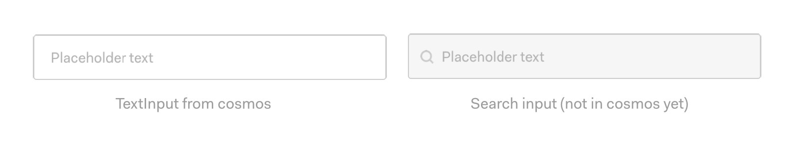
Person A: This new component does not exist, I should start with an html input and build it locally.
Person B: This looks almost like TextInput from cosmos, I should take that and change some styles.
I don't blame Person B, sounds like an effective approach.
const InputSearch = styled(TextInput)`
  background-color: #f6f6f6;
`;
(real code from auth0/manhattan)
This is a good example of overriding a cosmos component, here's another example:
const TitleGroup = styled.div`
  display: flex;
  align-items: center;
  p {
    font-size: 13px
  }
`;
(roughly the same code from auth0/manhattan, modified for creating a relevant example)
The interesting thing from the above code sample is the p is coming from cosmos! This is also an override with a similar purpose. Cosmos does not support small text size in paragraph (yet?) and the design requires it.
But, why do we allow overrides at all?
That's a great question.
If we could review all the design mockups and pull requests, there would be no need of overrides. But, with the speed and number of teams we aim to support, we will never be ahead of the teams in terms of components.
However, we should be able to spot patterns and bring those into the system if needed.
There are also cases, where the team is building something on an old non-system design instead of a new design that uses cosmos (again, manhattan is the example)
We need to accept that overrides solve a purpose and they will exist. If we look at them periodically, we would be able to pick feature requests for cosmos or find bugs/inconsistency in the design.
Note: This proposal is not for margins, see #1059 for that.
Okay, seems like we already have a way of overriding then?
Yeah, kind of. There a few problems with the current/adhoc approach:
-
Difficult to track
To be able to absorb or request changes, we should be able to track overrides.
const InputSearch = styled(TextInput)`
  background-color: #f6f6f6;
`;
It's not easy to distinguish occurrences of
styled(CosmosComponent)from local uses ofstyled(without implementing some babel-parser magic) -
Not-future proof
const TitleGroup = styled.div`
  display: flex;
  align-items: center;
  p { /* output of a cosmos component! */
    font-size: 13px;
  }
`;
This kind of override depends on the output of the cosmos components which will change overtime. Example: We use a
spaninstead ofp. This will break the override.A similar example of this would be a project that does not use styled (like marketing sites) and does the same override in a stylus file, making it even more difficult to track.
-
Lack of validation messages
Using
styled(component)bypasses the component API and thus we can't add any validation messages.Example of validation message:
const InputSearch = styled(TextInput)`
  background-color: #f6f6f6;
  height: 50px;
`;

Suggestion: Found value #f6f6f6 for background-color, this value is not in the design color tokens. You might want to use a token instead. Closest color token found: `colors.backgrounds.light`

Suggestion: Found value 50px for TextInput, that's a non-standard value for height, you might want to use `size` prop instead.
You can imagine the warnings for spacing, font-size, etc.
The idea is not to police 👮, we assume the developer had a valid use case. The idea is to give suggestions on how it be modified for consistency. These are suggestions for the developer and system team, not error messages.
Proposal: Acknowledging the overrides and creating a more explicit API for overrides.
Syntax:
<TextInput overrides={{ backgroundColor: '#f6f6f6' }}/>

<TitleGroup>
  <Heading size={2}>Title</Heading>
  <Paragraph overrides={{ fontSize: '13px' }}>....</Paragraph>
</TitleGroup>
There's not a lot of nuance in the API, but it solves most of the above problems:
-
Easier to track (and fix)
-
Encourages folks to add the style directly on the component instead of adding them to a wrapper
-
We can add validations (as shown above)
-
Importable test suite - The API encourages localising overrides to the component, which enables us to copy it into a cosmos test case without needed context about the component
-
(optional) As we learn more about the usage and patterns, we can create a component specific whitelist of properties. Example, we never want anyone to override
font-familyon any component. We support the option to addbackgroundto an TextInput but notheight.
Using margin:
It would be natural to add margins with this API as well
<TextInput overrides={{ backgroundColor: '#f6f6f6' }}/>
We have another proposal (#1059) for the margin prop.
For me, overrides have a temporary connotation to them. Overrides should be reviewed periodically and removed by changing the design or adding that functionality to cosmos. Margins on the other hand are a positioning feature that is permanent.
So, it might make sense to keep them separate.
The developer experience could be annoying though. Example:
<Heading overrides={{ backgroundColor: colors.gray, marginBottom: spacing.large }}/>

Warning: `overrides` does not support margin properties, please use the `margin` prop

<Heading overrides={{ backgroundColor: colors.gray}} margin={{ bottom: spacing.large }}/>

🤔
I'm not sure if we should merge them for a nicer API. That's an open question at this point.
I really like this idea, it makes overwrites more maintainable and controllable.
Here is an idea, since we are dropping support for IE11 the gates to CSS variables are open. We can design the variable system so that global variables are tokens but component variables are CSS variables consuming the global tokens.
Therefore a user will have granular control over the value of the properties defined within the component.
This wouldn't allow adding more properties, just change the ones we have in place.
Changing the value of CSS variables seems to be a little less damaging because the user is not adding more CSS.
We can also easily control what's open and what not by defining a hardcoded value or a variable when we write CSS.
On the other hand sometimes, when they really need to add CSS they can use the overwrites.
Now, if both approaches can live together, and it might be a burthen for the user to keep track of 2 different ways to overwrite a component.
Here is an example of how it might look like:
1- First we create the global tokens:
/* Sets global value in a token so we can share it with designers */
global.spacer.xl: 3rem;
2- We consume global tokens into global variables:
/* Sets global value in a token so we can share it with designers */
:root {
  --global--spacer--xl: ${global.spacer.xl};
}
3- We consume the global variable into a component variable
Box.Element = styled.div`
  --Box--Header--PaddingTop: var(--global--spacer--xl);
`

Box.Header = styled.div`
  padding-top: var(--Box--Header--PaddingTop);
`
Syntax
Global tokens: global.concept.modifier
Global variable: --global--concept--modifier
Component variable: --Block--Element--Modifier--Propierty
What do you think?
What do you think?
I'd like to skip allowing folks to modify with css variables in v1
@auth0/design-system All in favor, say Aye.
If you have doubts/questions/complaints, this is the time to bring them up.
If possible I'd like to have css vars on v1.
Why do we use tokens?
1- To have variables 2- To build a bridge between sketch and code.
CSS variables are a native, dependency-free way to solve 1 and with the architecture I am suggesting we would be solving 2.
The only reason for using token is supporting IE11. Since this is not the case then there is no reason why not to use them.
The implementation of tokens or variables would take the exact same amount of time and effort, but if we go tokens we would be introducing another breaking change on v2.
Apart from that css vars allow us to have way better control over the system. For example, a dark mode with css variable would be 10 lines of CSS, while with hardcoded tokens it'll be a complicated and heavier logic.
I'd like to skip allowing folks to modify with css variables in v1
How about keeping that to ourselves, we can and probably should avoid promoting changes. But as you described on top people do them anyway. What do you think?
Also... backward compatibility!
I've been thinking on how to keep backward compatibility with the variables we have today, so we don't completely break peoples implementation and we can release this before v1. Here is my idea:
1. Global tokens
First we create the global tokens:
/* Sets global value in a token so we can share it with designers */
global.spacer.xl: 3rem;
2a. Global variables
We consume global tokens into global variables:
/* Sets global value in a token so we can share it with designers */
:root {
  --global--spacer--xl: ${global.spacer.xl};
}
2b. old tokens
Old token values are informed by global tokes.
spacer.xl: global.spacer.xl;
3 Local variables.
We consume the global variable into a component variable
Box.Element = styled.div`
  --Box--Header--PaddingTop: var(--global--spacer--xl);
`

Box.Header = styled.div`
  padding-top: var(--Box--Header--PaddingTop);
`