website
 website copied to clipboard
feat: add dashboard on the website
Description
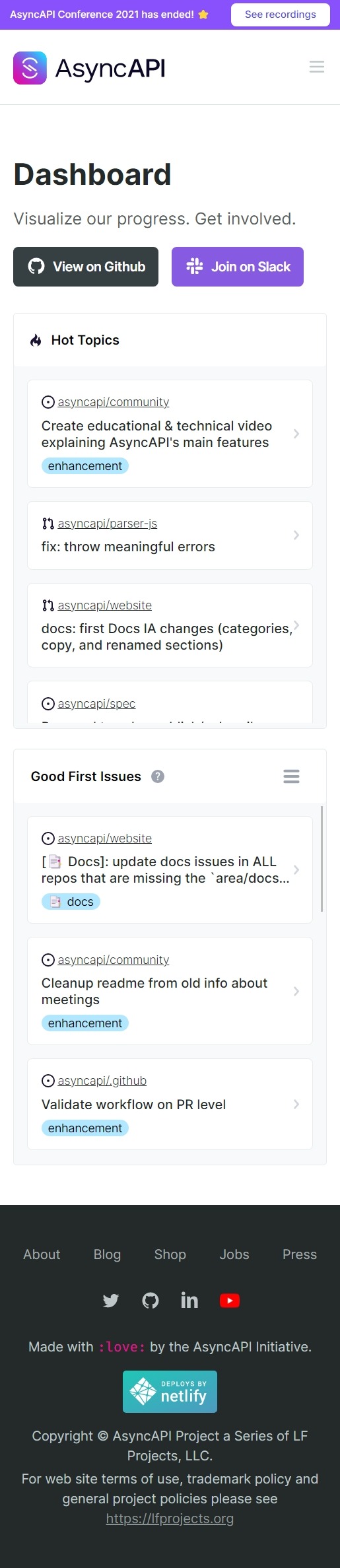
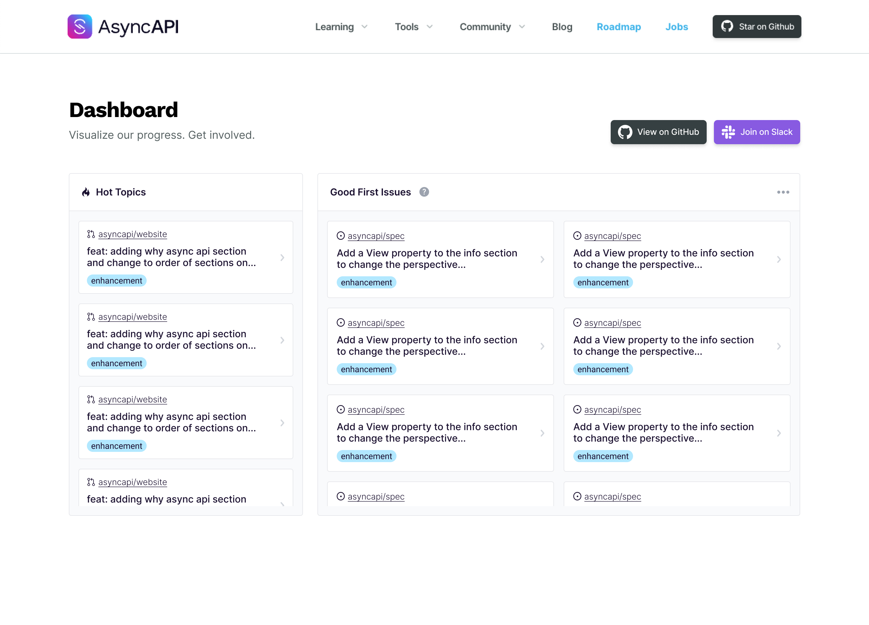
- This PR is supposed to initiate the Dashboard. Dashboard is a place where you go to start your contribution journey or have a clear picture of the organization.
- Hot Topics are Topics that had the most interactions in the past month.
Related issue(s) Resolves #385
Deploy Preview for asyncapi-website ready!
Built without sensitive environment variables
| Name | Link |
|---|---|
| Latest commit | 6c7c4458b2e833a6c87c35268d10a16e3bd89922 |
| Latest deploy log | https://app.netlify.com/sites/asyncapi-website/deploys/635b930eef091c0008622ec6 |
| Deploy Preview | https://deploy-preview-514--asyncapi-website.netlify.app |
| Preview on mobile | Toggle QR Code...Use your smartphone camera to open QR code link. |
To edit notification comments on pull requests, go to your Netlify site settings.
@fmvilas @derberg It recently came to my attention that GitHub HAS a feature for showing issues that is almost similar to the thing that I am working on.
https://github.com/issues?page=1&q=is%3Aopen+org%3Aasyncapi+sort%3Aupdated-desc+label%3A%22good+first+issue%22
Now the only unique thing about the Dashboard would be the Hot Topics. Now the question is, should we add good first issues to the website? what would be the benefits? would be great to have your input.
@KhudaDad414 it is all about discoverability. You know that this feature was always there but nobody knew about it, so it is not the best feature to count on. It is only nice temporary solution. You dashboard will be much better because:
- will be next to other dashboards, easy to find and link too
- you can easily filter by repos
- you can easily filter by areas
We should not count on users, like that they know about our "areas" or that they know how to modify GH dashboard to see only issues from one repo. So yeah, don't get demotivated, it is still worth to work on imho
@KhudaDad414 there's an error building the website.
It has been resolved. 🦖
@derberg I see what you mean. I will try to make some changes here and there to see how it will look. But design isn't my strong suit.
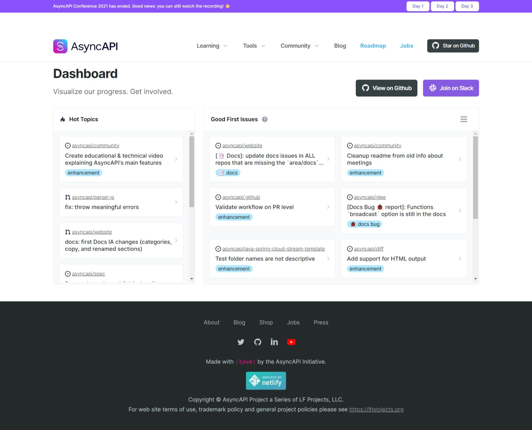
@derberg tried to make it more polished and make it follow the asyncapi website personality, would love to have your feedback :)
@KhudaDad414 tbh I'm really bad at visuals. Better to involve @mcturco 😄
I'm more interested in how to get there to this view? where will be a button/link to get to it. Another item under Community nav item?
Sorry about the delay here 😄 For some reason, I can't see the issues/PRs listed on the netlify link. Am I missing something? Should I just fork this and run locally to review?
@KhudaDad414 I do remember providing you a wireframe as to how I thought the layout could look (this was before UI) but I am noticing that the layout/filtering functionality is set up a little bit different than how I laid it out. Was that intentional? Here is the prototype again: https://www.figma.com/proto/WKOxyb4VQ9D1QcRd7y7OfU/Wireframes?page-id=1%3A17&node-id=43%3A165&viewport=391%2C48%2C0.37&scaling=min-zoom&starting-point-node-id=43%3A165
If we are wanting to use this functionality, I could go ahead and apply the UI to this wireframe. I agree with @derberg that the current UI doesn't match the current styles of the website.
@mcturco you do not see it on PR preview due to security reasons, netlify blocks access to GitHub token when it runs code from a PR (so nobody can easily console.log it and take it). So you need to test locally by passing your private GH token
I am noticing that the layout/filtering functionality is set up a little bit different than how I laid it out. Was that intentional?
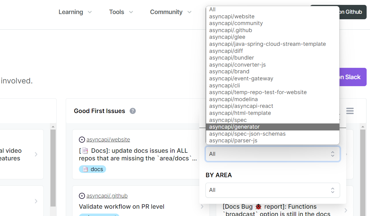
since we only have two options for filtering (complexity has been reconsidered) I thought it is overkill to have an overflow menu for two filters so I put them in the main layout. If you think having an overflow menu is better, then let's do it. :smiley:
@mcturco the new wireframe looks dope, just one thing, I am not sure if we should have the Issue/PR number in the lists since it doesn't provide any meaningful information to the user? I can be wrong though.
@KhudaDad414
since we only have two options for filtering (complexity has been reconsidered)
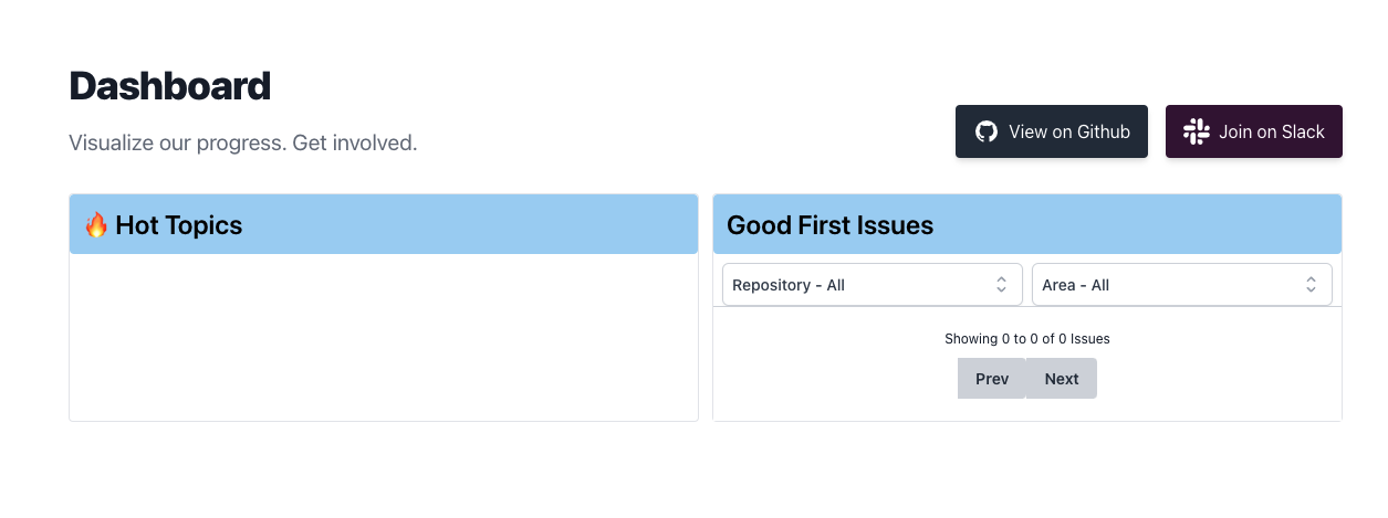
Gotcha, so we have removed the complexity and now its just by repo and by area. The only thought I have about "area" (and this might be just me because I am not a dev in this workspace) is that it seems a little confusing what that option actually is filtering by. Not sure if the options plan to change sometime in the near future, but some of them seem maybe "off" like it could mean several things.
For example, when I click the docs filter, if I am a first-timer at AsyncAPI, I am going to automatically assume that this is an issue regarding the documentation of the spec itself (the one on the website) not with the visual docs on the schema, something I may not know as an AsyncAPI newb.
I guess what I am trying to say is maybe we should be more specific when labelling the areas. How are the areas being assigned currently?
I am not sure if we should have the Issue/PR number in the lists since it doesn't provide any meaningful information to the user
That's fine, you might be right that it could be unnecessary for someone coming from the website looking for an issue to work on. After they find an issue, most of their journey will be on GH anyways. We can remove that!
I started working on the UI, but yeah I think we need to figure out the best way to sort the issues by area, because right now it is a little bit confusing IMO.
@mcturco
I am not exactly sure how we can improve the situation here. Besides, a maintainer can always be more specific by adding extra labels to the issue and it will appear in the Dashboard. for example a maintainer can add spec label to an issue that has area/docs to be more specific? open to suggestions here.
the areas we have now are something that cover most common areas we can see in all repos. If over time we see more areas needs to be added or some needs to be replace with different ones, we definitely need to do that. I personally am not a fan of adding areas that we "might" think are there, this is for example why we have only few programming languages.
if area is docs and I see on the list that it is in diff library, why would I assume it is about spec documentation? If docs are about spec, it will be in spec repo, right?
Hey @derberg @KhudaDad414
Totally forgot that I started working on a UI but then never shared it and then got too busy working on other things haha
Here is a preview of that UI:
I know it is a little bit different than the layout that is in the preview right now, but I feel like this layout might make it easier for users to navigate through issues and PRs
Here is the Figma link: https://www.figma.com/file/WKOxyb4VQ9D1QcRd7y7OfU/?node-id=43%3A165 You should be able to view the design specs (spacing, colors, font sizes, etc) as long as you log in with google, but if you are having a hard time with that let me know and I can see if I can set aside some time to write a spec sheet.
⚡️ Lighthouse report for the changes in this PR:
| Category | Score |
|---|---|
| 🔴 Performance | 48 |
| 🟠 Accessibility | 88 |
| 🟠 Best practices | 83 |
| 🟢 SEO | 90 |
| 🔴 PWA | 30 |
Lighthouse ran on https://deploy-preview-514--asyncapi-website.netlify.app/
@mcturco I have applied the design, except the dropdown component which I used the website's default. Would be great to have some feedback.
This pull request has been automatically marked as stale because it has not had recent activity :sleeping:
It will be closed in 120 days if no further activity occurs. To unstale this pull request, add a comment with detailed explanation.
There can be many reasons why some specific pull request has no activity. The most probable cause is lack of time, not lack of interest. AsyncAPI Initiative is a Linux Foundation project not owned by a single for-profit company. It is a community-driven initiative ruled under open governance model.
Let us figure out together how to push this pull request forward. Connect with us through one of many communication channels we established here.
Thank you for your patience :heart:
@mcturco @derberg @fmvilas this PR is ready to be merged. please let me know if there is anything that needs updating.
@derberg it couldn't be more clear. I have flixed it 😆 . A review would be appreciated. 🙇