react-artboard
 react-artboard copied to clipboard
 ascorbic
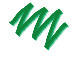
A realistic paint component
react-artboard
A freeform sketching component for React. Try the demo

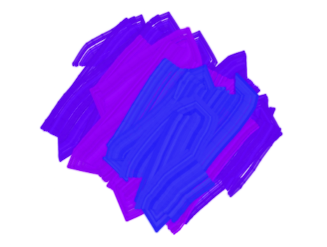
react-artboard includes an Artboard component and several tools, including a
realistic paintbrush, a marker pen and airbrush, as well as the abstract shading
tool. Tools are implemented as custom hooks, so you can add your own brushes and
other tools.
- react-artboard
- Installation
- Usage
- API
Artboard- Props
- Paintbrush
- Options
- Shading
- Options
- Watercolor
- Options
- Marker pen
- Options
- Airbrush
- Options
- Custom brushes
- History
- Sources
Installation
npm install react-artboard
Usage
For a full usage example, see this file. The simplest usage of the component is like this:
import React from "react";
import { useBrush, Artboard } from "react-artboard";
export function App() {
  const brush = useBrush({ color: "#663399", strokeWidth: 40 });

  return <Artboard tool={brush} style={{ width: 800, height: 600 }} />;
}
You probably want to allow users to change the colors and size of the brush.
Here is an example that uses native color and range inputs:
import React, { useState } from "react";
import { useBrush, Artboard } from "react-artboard";
export function App() {
  const [color, setColor] = useState("#993366");
  const [strokeWidth, setStrokeWidth] = useState(40);
  const brush = useBrush({ color, strokeWidth });

  return (
    <main>
      <div>
        <input
          type="color"
          value={color}
          onInput={(evt) => setColor(evt.currentTarget.value)}
        />
        <input
          type="range"
          min={5}
          max={50}
          value={strokeWidth}
          onInput={(evt) => setStrokeWidth(parseInt(evt.currentTarget.value))}
        />
      </div>
      <Artboard tool={brush} style={{ width: 800, height: 600 }} />
    </main>
  );
}
You could use a custom component instead of these inputs if you want more control over them, as long as they return a number for the brush size and a string for the color.
If you want to export your creations or clear the canvas, you can use the ref like this:
import React, { useState } from "react";
import { useBrush, Artboard } from "react-artboard";
export function App() {
  const [color, setColor] = useState("#993366");
  const [strokeWidth, setStrokeWidth] = useState(40);
  const brush = useBrush({ color, strokeWidth });

  const [artboardRef, setArtboardRef] = useState();

  return (
    <main>
      <div>
        <button onClick={() => artboardRef?.download()}>Download</button>
        <button onClick={() => artboardRef?.clear()}>Clear</button>
        <input
          type="color"
          value={color}
          onInput={(evt) => setColor(evt.currentTarget.value)}
        />
        <input
          type="range"
          min={5}
          max={50}
          value={strokeWidth}
          onInput={(evt) => setStrokeWidth(parseInt(evt.currentTarget.value))}
        />
      </div>
      <Artboard tool={brush} style={{ width: 800, height: 600 }} />
    </main>
  );
}
API
Artboard
Props
-
toolThis is the tool returned by the
useBrush()hook. You can also implement your own tools and pass them in here. -
refThis accepts a callback that will be passed a ref that you can use to make the following calls:
-
download:(filename: string, type: string) => voidDownloads the canvas as an image. You can pass in a filename (default "image.png"), and a mimetype (default "image/png"). If you pass an unsupported type it will fallback to PNG.
-
getImageAsDataUri:(type: string) => string | undefinedReturns the image as a data URI, which can be displayed in an
<img>tag for example. -
clear:() => voidClears the image
-
context:CanvasRenderingContext2D | null | undefinedCanvas rendering context
-
-
onStartStroke:(point: Point) => voidCallback at the start of a stroke
-
onContinueStroke:(point: Point) => voidCallback at the continuing of a stroke
-
onEndStroke:() => voidCallback at the end of a stroke
Paintbrush
useBrush(options)
Options
colorA CSS string color.strokeWidthThe width of the brush
Shading
useShadingBrush()
This tools is inspired by some blog posts, exploring the use of "neighbour point" sketching. It gives a fun, unusual effect that is similar to pencil shading. It is highly configurable, giving quite different effects according to the different parameters.
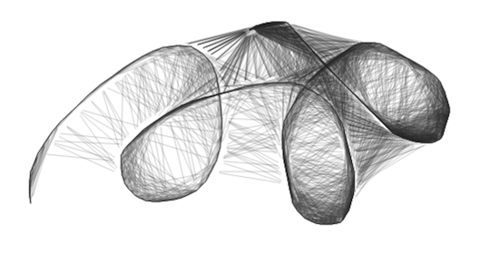
Options
colorA CSS string color. Default:#000000spreadFactorThe length of the connecting line. A value of1means it exactly joins the two points, while0.5only covers half the distance. A value above1gives a "fur" effect as the line extends beyond the points. Default: 0.9distanceThresholdHow near the point needs to be to join, in pixels. Default: 50neighbourStrokeWidthWidth of the stroke joining the points. Default: 1neighbourColorColor of the line joining the points. Default:colorvalue with 0.2 alpha
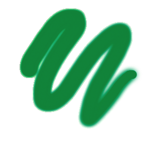
Watercolor
useWatercolor(options)
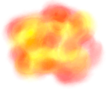
Options
colorA CSS string color.strokeWidthThe width of the brush
Marker pen
useMarker(options)
Options
colorA CSS string color.strokeWidthThe width of the brush
Airbrush
useAirbrush(options)
Options
colorA CSS string color.strokeWidthThe width of the brush
Custom brushes
See the source for useBrush to see how to create a brush. It must return an
object, with the following optional callbacks:
startStroke?:(point: Point, context: CanvasRenderingContext2D) => voidcontinueStroke?:(point: Point, context: CanvasRenderingContext2D) => voidendStroke?:(context: CanvasRenderingContext2D) => voidcursor?:stringA CSS-compatible string for the cursor to display. You can use thecircleCursor()helper to display a resizable circle for the cursor
History
The useHistory() hook allows undo/redo functionality. Pass it a size value
to limit the size of the history stack. It returns and object with the
following:
history: TheHistoryobject. Pass this to theArtboard.undo(): Reverts the image to the previous state.redo(): Move forward in history, if available.canUndo: History is available to undocanRedo: History is available to redo
Sources
These posts gave inspiration, particularly for the shading tool.
Inspiration for the watercolor tool:
 ascorbic