react-native-material-dialogs
 react-native-material-dialogs copied to clipboard
 arjunkomath
Material Design Dialogs for React Native
React Native Material Dialogs (Android)
Material Design Dialogs for React Native


Install
Install the npm module.
npm i react-native-material-dialogs
Plugin Installation (Android - Manual)
- In your android/settings.gradle file, make the following additions:
include ':react-native-material-dialogs'
project(':react-native-material-dialogs').projectDir = new File(rootProject.projectDir, '../node_modules/react-native-material-dialogs')
- In your android/build.gradle file, add the a maven repository:
...
repositories {
    ...
    maven { url "https://jitpack.io" }
}
- In your android/app/build.gradle file, add the a compile-time dependency:
...
dependencies {
    ...
    compile project(':react-native-material-dialogs')
}
- Next, you need to change the MainActivity of your app.
import com.arjunkomath.react.MaterialDialogPackage; // <--- Add This

...
/**
     * A list of packages used by the app. If the app uses additional views
     * or modules besides the default ones, add more packages here.
     */
    @Override
    protected List<ReactPackage> getPackages() {
        return Arrays.<ReactPackage>asList(
            new MainReactPackage(),
                new MaterialDialogPackage(this) // "this" is very important!
        );
    }
And, you're done!
Usage
import MaterialDialog from 'react-native-material-dialogs';
There are two types of dialogs:
Dialog with one feedback
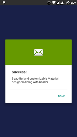
MaterialDialog.show('Yaaay!!', 'Success', 'done', MaterialDialog.SUCCESS,
      () => {
        console.log('asd');
      });
Parameters:
MaterialDialog.show( <Title> , <Description>, <Button text>, <Type>, <Callback>);
Dialog with two feedbacks
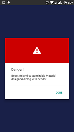
MaterialDialog.showWithCancel('Danger!', 'Are you sure?', 'YES', 'NO', MaterialDialog.DANGER,
      () => {
        console.log('yes');
      },
      () => {
        console.log('no');
      });
Parameters:
MaterialDialog.show( <Title> , <Description>, <Positive Button text>, <Negative Button text>, <Type>, <Callback Positive>, <Callback Negative>);
Title, Description and Button text are of type String. While Type is a constant. There are four types:
MaterialDialog.SUCCESS
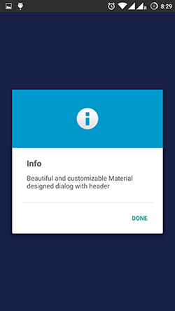
MaterialDialog.INFO
MaterialDialog.WARNING
MaterialDialog.DANGER
Example
import React, { Component } from 'react';
 import {
  AppRegistry,
  StyleSheet,
  Text,
  View,
  TouchableOpacity
} from 'react-native';

import MaterialDialog from 'react-native-material-dialogs';

class dialog_test extends Component {

  press() {
    MaterialDialog.show('Yaaay!!', 'Success', 'done', MaterialDialog.SUCCESS,
      () => {
        console.log('done');
      });
  }

  render() {
    return (
      <View style={styles.container}>
      <TouchableOpacity onPress={this.press}>
      <Text style={styles.welcome}>
      Press me to see dialog!
      </Text>
      </TouchableOpacity>
      </View>
      );
  }
}

const styles = StyleSheet.create({
  container: {
    flex: 1,
    justifyContent: 'center',
    alignItems: 'center',
    backgroundColor: '#F5FCFF',
  },
  welcome: {
    fontSize: 20,
    textAlign: 'center',
    margin: 10,
  }
});

AppRegistry.registerComponent('dialog_test', () => dialog_test);
:two_hearts: Thanks
About Author
Built with <3 by Arjun Komath / [email protected]
 arjunkomath