ui
 ui copied to clipboard
 aragon
Field: add inline mode

Modify existing Field to support inlining multiple Fields together with their labels.
The default Field should also be inline-block, to allow for multiple non-inlined Fields to live beside each other.
@bpierre I think we have a few cases of these inline Fields now, but we've mainly been overriding some css to make it happen? Is it something we could provide easily as a prop (just changing the internal positioning) or would it be better to leave the positioning to the parent?
Yes, we are achieving it case by case at the moment, using CSS when needed. I think it might be time to think a bit about how we want to use Field. Also /cc @dizzypaty @owisixseven because we probably want to have this component defined in aragonDS.
Features
Field was initially thought as a component that would more or less do the following:
- Insert a
<label>element, so we can focus the inner field from it. This is the most problematic part at the moment (see below). - Styling: layout + color + text style. The layout is only supporting the vertical mode at the moment.
- Display an error / warning / info related to the field. We now have a “* required” appearing if the field is required, but nothing to handle errors yet.
Layout modes
I could identify four ways we are currently using it:
Vertical
This is the only supported mode for now:
Group
This is to label multiple horizontal fields at once:
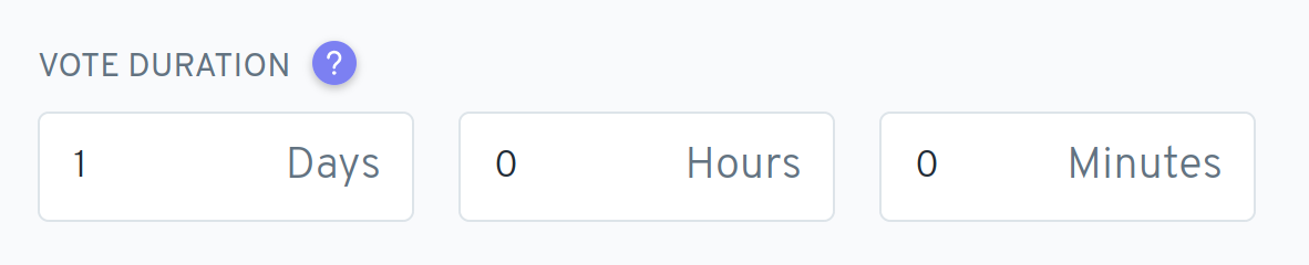
Note that in this example, we also have an inner label inside of every field, which might also use <label>.
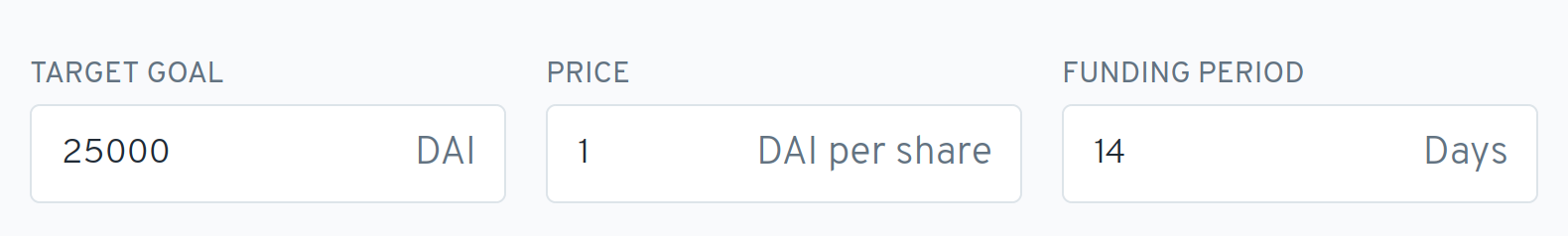
Horizontal
This is similar to the group mode, except that each field is having its own label:
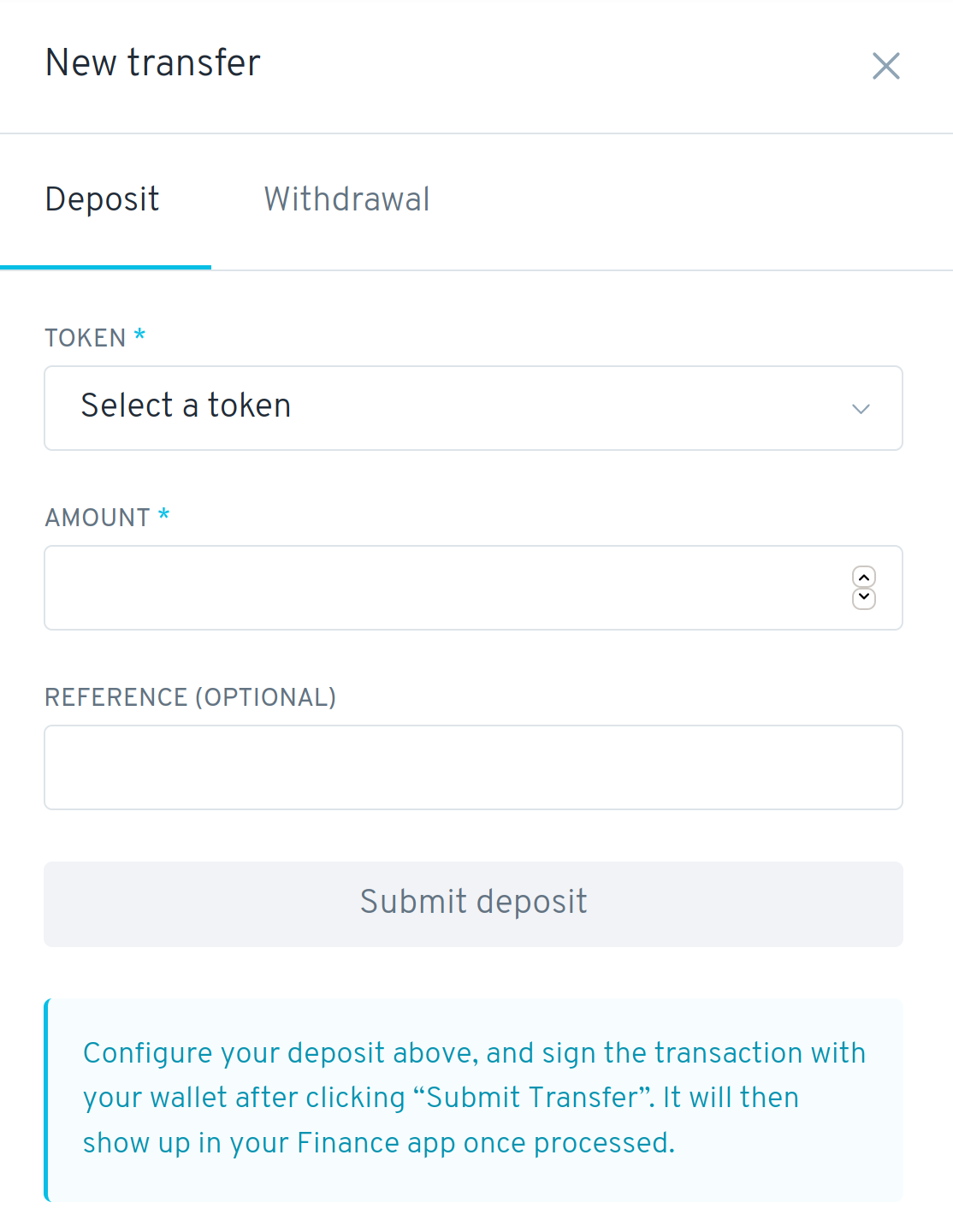
Inline
Similar to the horizontal mode, but the layout is fully horizontal:
Current issues
Layout
The different modes are not easy to achieve, and usually require some extra CSS on the parent or the Field itself.
A solution could be to provide a FieldGroup component, that would provide different modes to achieve the “Group”, “Horizontal” and “Inline” types of layout we currently have:
<FieldGroup mode="group" label="Vote duration">
  <TextInput />
  <TextInput />
</FieldGroup>
<FieldGroup mode="horizontal">
  <Field label="Target goal">
    <TextInput />
  </Field>
  <Field label="Price">
    <TextInput />
  </Field>
</FieldGroup>
<FieldGroup mode="inline">
  <Field label="Holder">
    <DropDown />
  </Field>
  <Field label="Token">
    <DropDown />
  </Field>
</FieldGroup>
Errors
We haven’t completely defined how errors should be displayed in forms, and they are handled case by case at the moment. It could be nice to start thinking about how the different display modes could (or should) represent errors.
Automatic insertion of the <label> element
Inserting the <label> element automatically has been an issue in some cases, where we don’t want <Field /> to behave this way, or when the structure is more complex than one element.
For example, it is now very common to have a <Help /> component inside the label, but we want the <label> element to target the inner field, rather than the Help button.
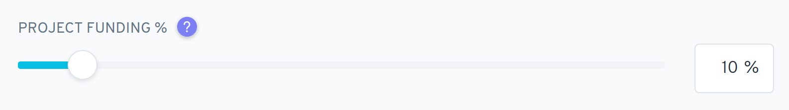
We also have fields combining a Slider with a text input, in which case we want the <label> to target the <TextInput /> rather than the <Slider /> component.
It is now possible to get an ID by using a render prop, which can be used to link the element of our choice to the <label>:
<Field label="My field">
  {id => (
    <>
      <TextInput />
      <TextInput id={id} /> // receives <label> focus
      <TextInput />
    </>
  )}
</Field>
But one thing I really don’t like with the current API is how we handle the use of Help:
<Field
  label={
    <>
      My field
      <Help /> // The <label> will enable this instead of the TextInput
    </>
  }
>
  <TextInput />
</Field>
I think the API feels clunky for such a common case, and more importantly it’s broken by default: clicking on the <label> element activates the first form element it finds, which is the <Help /> button in this case (rather than the text input).
Using Help requires to use the render prop at the moment:
<Field
  label={
    <>
      My field
      <Help /> // The <label> will enable this instead of the TextInput
    </>
  }
>
  {id => (
    <TextInput id={id} />
  )}
</Field>
A solution to avoid the render prop would be to always generate an ID, and set it on the for attribute on the <label>. We would then pass it either to the render prop (as we currently do), or through Inside (it optionally accepts data) to the first component that can be activated by the label. “activable” components could include TextInput, SearchInput, DropDown.
But there is another issue: the asterisk used to indicate required fields gets inserted after the entire label, which means that it would get displayed after the <Help />, rather than right after the text itself. To solve this, and make the API a bit nicer, we could provide a new prop that can be used for the contextual help or something else.
The final API could look like this:
<Field
  label="My field"
  adornment={<Help />}
>
  <Slider />
  <TextInput /> // TextInput would get activated, as Slider wouldn’t be “activable”
</Field>
And for the sake of extensibility, we could also provide an easy way to disable the <label> insertion altogether:
<Field label="My field" as="div">
  <TextInput />
</Field>
Let me know what you think!
Thanks for laying all of this out @bpierre!
I do agree we may want to start having some layout helpers like FormGroup to better handle all of these cases, and wasn't previously conscious of the difference between the Group, Horizontal, and Inline modes.
And the adornment API also makes sense, uses consistent terminology with the TextInput's adornment, and was what I was thinking when I read that the Help component was getting selected to help us move it out of the <label>'s children.
For the Slider, how would we disable it from being selected? I would like to keep the "magic" of the auto-selecting label if we could, otherwise it may get tricky to manage if multiple competing inputs wanted to hold the label id.