Histogram Chart does not apply groupby /dimension grouping to the generated query
A clear and concise description of what the bug is.
How to reproduce the bug
- Go to charts
- select any dataset and click on histogram
- provide a dimention and also a metric
- See the query generated
Expected results
a histogram of the grouped data should be seen
Actual results
"Aggregate functions can't co-exist without GROUP BY clause\n" query does not have a group by clause in it
Screenshots
If applicable, add screenshots to help explain your problem.
Environment
master branch
(please complete the following information):
- browser type and version: chrome ,Version 109.0.5414.120 (Official Build) (64-bit)
- superset version: master branch
- python version: super set python version (unchanged)
- node.js version:
node -vsuper set node version (unchanged) - any feature flags active:
Checklist
Make sure to follow these steps before submitting your issue - thank you!
- [x] I have checked the superset logs for python stacktraces and included it here as text if there are any.
- [x] I have reproduced the issue with at least the latest released version of superset.
- [x] I have checked the issue tracker for the same issue and I haven't found one similar.
Additional context
Add any other context about the problem here.
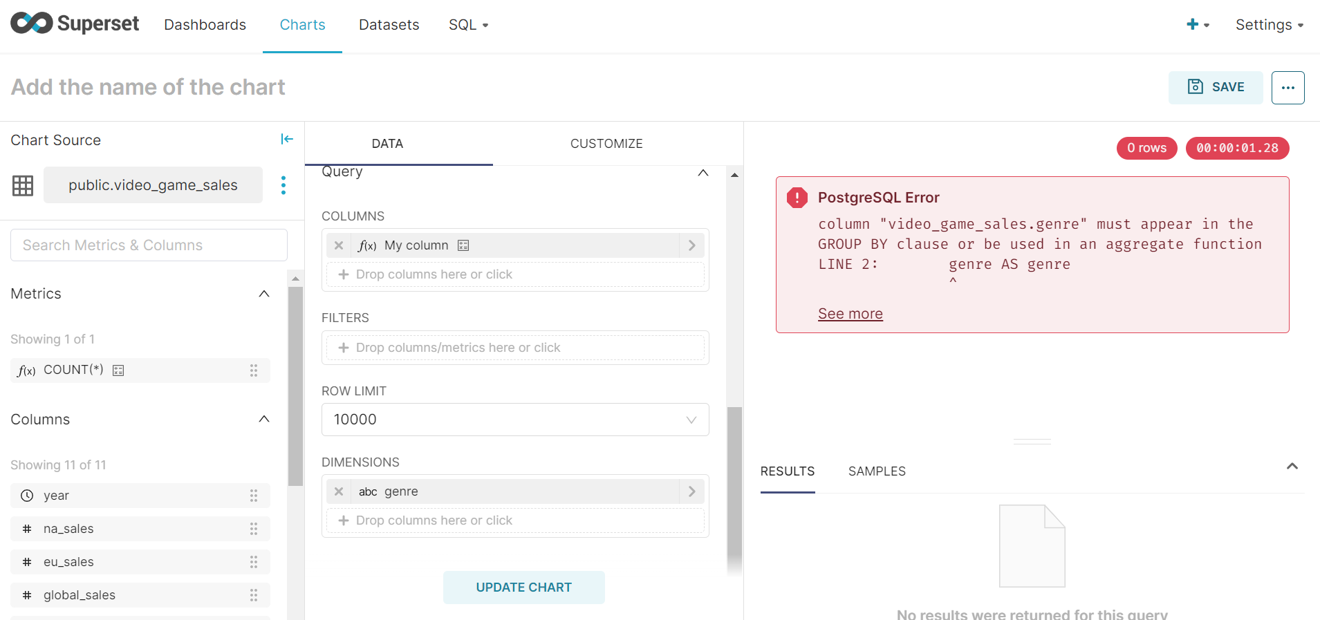
I checked in the code as well the group by is set to none https://github.com/apache/superset/blob/0fa421271e874e456ae71f7aca4c71130176332d/superset/viz.py#L1755 Any help would be great
This is probably still an issue in Superset 3.x, if anyone can confirm. This is also certainly not the only histogram bug. We need a new (preferably ECharts based) histogram plugin. If anyone wants to take that on, please feel free!
As of 10/05/2024 on Superset 3.1.12, this issue still exists. Too bad that such an important viz cannot work properly. As a matter of a fact, no example in the stock app has a field in "Dimensions", thus I guess they know about it... As a workaround, use the "Bar Chart (legacy)" - which is deprecated but works. Can I add a gentle request to the community @mistercrunch to have a look on this ?
I won't deep dive here, but this histogram was designed to be client-side, so it should not GROUPBY or have aggregate expressions like COUNT. So the issue is that COUNT shouldn't be there more than thinking that a GROUP BY clause is missing.
Unrelated, but the challenge here is establishing the proper ranges and doing server-side computation where percentiles-related functions are different from a database engine to the next.
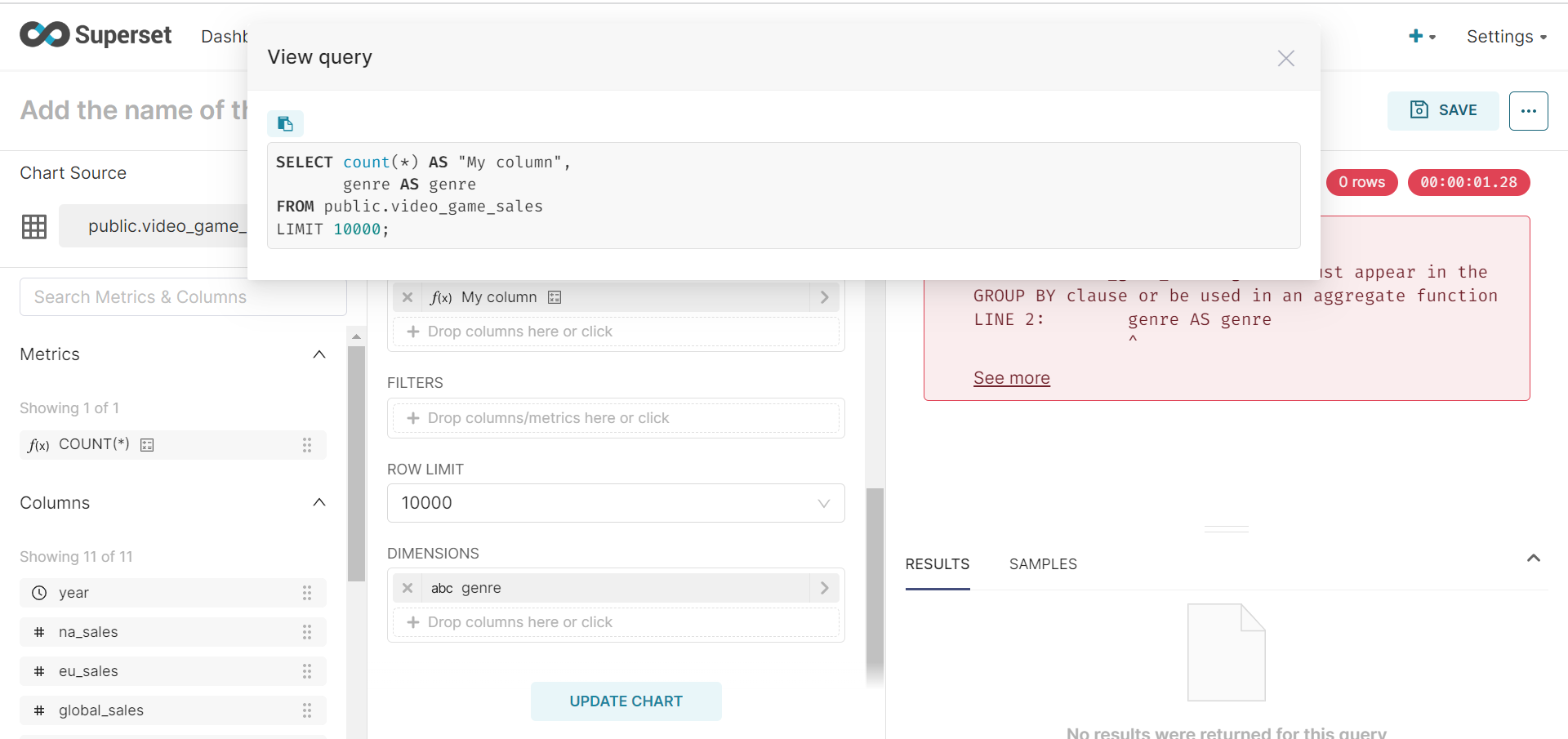
Oh, did you just write COUNT(*) in your column definition? This doesn't support metrics or aggregate expressions, just normal expressions
That must be it. For legacy, I'll write how I think this visualization should be redesigned to push the compute server side.
First it should have 2 modes of operations, dynamic and static:
- dynamic: runs a first phase query on the numeric column to figure out its min/max
- static: user sets the bounds (upper/lower) used, allowing to truncate either side of the distribution
Once we have min/max and the "number of bins", it's easy to define a bin_number dimension based on simple math.
As to how to use this one as is, when you're dealing with 10k+ rows, it can get heavy on the client, so it's good to do some random sampling, which depends on your database engine but usually there's a decent way to do this, and ~10k row usually is representative enough of your distribution.
FWIW, I'm going to make a proposal to kill the histogram in 5.0. I think the binning should be done server side to reduce work on the client side. You can get a better picture of the data this way, and it'll be easier to leverage ECharts since the result would be more or less a repurposed bar chart.
Here's an example query using PostgreSQL that generates 10K rows of random fruit transactions (insert your table here instead), and bucketizes them into equal width bins to make a histogram rollup that's trivial for frontend parsing/plotting:
WITH generated_data AS (
    SELECT
        s.id,
        (random() * 1000)::int AS dollars_spent,
        NOW() - interval '1 year' + (random() * (NOW() - (NOW() - interval '1 year'))) AS transaction_date,
        CASE
            WHEN floor(random() * 4) = 0 THEN 'apple'
            WHEN floor(random() * 4) = 1 THEN 'banana'
            WHEN floor(random() * 4) = 2 THEN 'orange'
            ELSE 'grapes'
        END AS fruit
    FROM
        generate_series(1, 10000) AS s(id)
),
bounds AS (
    SELECT
        MIN(dollars_spent) AS min_spent,
        MAX(dollars_spent) AS max_spent
    FROM
        generated_data
),
range AS (
    SELECT
        min_spent,
        max_spent,
        (max_spent - min_spent) / 5.0 AS interval_length
    FROM
        bounds
),
buckets AS (
    SELECT
        min_spent + (interval_length * (n - 1)) AS bucket_min,
        min_spent + (interval_length * n) AS bucket_max,
        n AS bucket
    FROM
        range,
        generate_series(1, 5) AS n
)
SELECT
    b.bucket,
    -- b.bucket_min,
    -- b.bucket_max,
    CONCAT(b.bucket_min::int, ' to ', b.bucket_max::int) AS transaction_range,
    COUNT(gd.id) AS transaction_count,
    gd.fruit
FROM
    buckets b
LEFT JOIN
    generated_data gd
ON
    gd.dollars_spent >= b.bucket_min AND gd.dollars_spent < b.bucket_max
GROUP BY
    b.bucket, b.bucket_min, b.bucket_max, gd.fruit
ORDER BY
    b.bucket, gd.fruit;
Then you can use the ECharts bar chart, and add your dimensions, and it works just fine:
https://github.com/apache/superset/pull/28652 will close this issue by clearly defining that only non-aggregated columns are supported.