echarts
 echarts copied to clipboard
Start/End tick label are incorrect for the Bar chart.
Version
5.1.2
Reproduction link
https://codesandbox.io/s/bar-chart-tick-label-eqzh7?file=/src/barChartData.js
Steps to reproduce
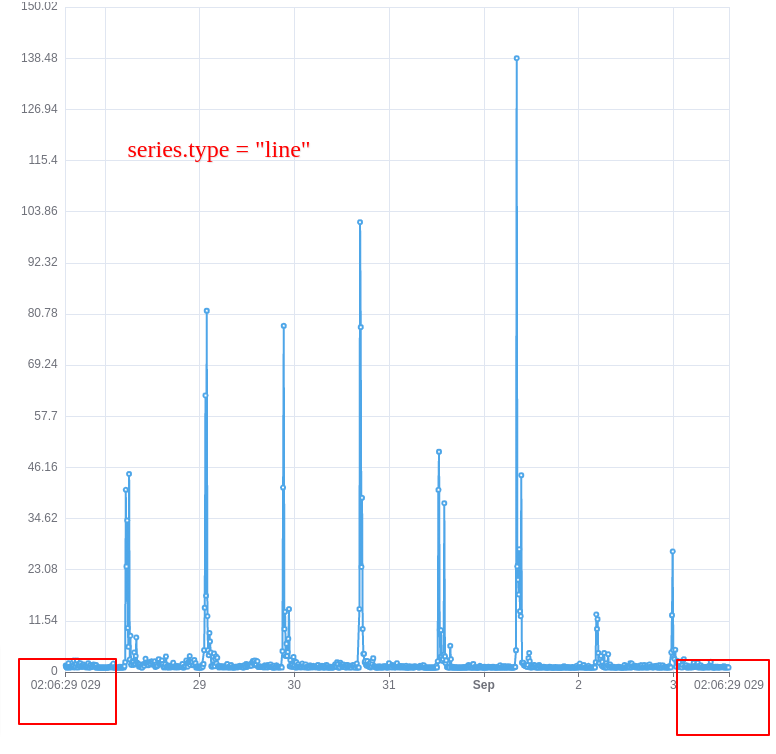
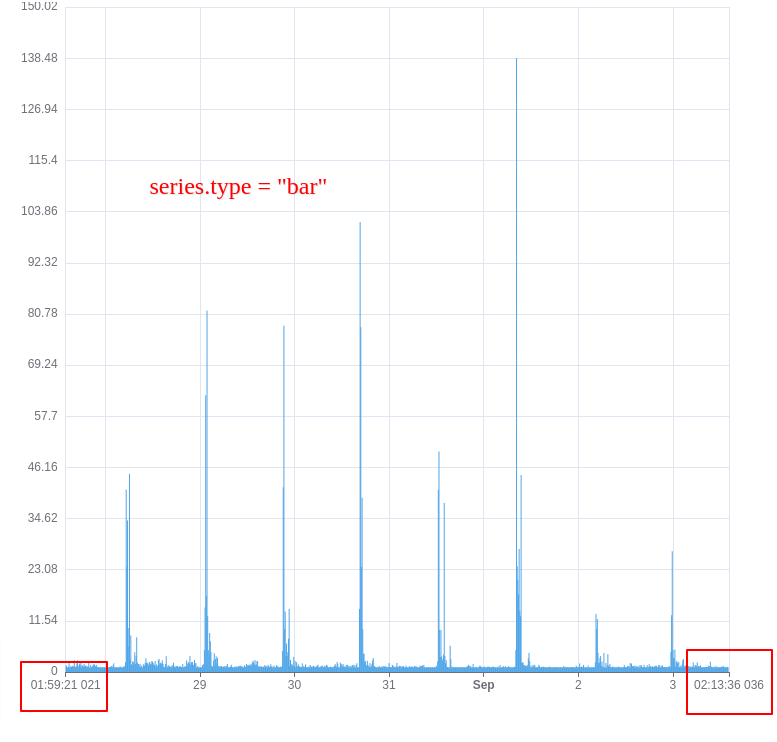
Created a time series graph with line and bar visualization. With the line chart, the xAxis tick labels are correct, as in as per the max/min and the data provided. But for the bar chart, the start/end labels are not correct.
In the sandbox link provided, try changing the series.tyle to "line", you'll see the correct time label in the chart.
What is expected?
The min/max axis label should be the same for the bar and the line chart with the same data and options.
What is actually happening?
The min/max labels are not correct when the type is "bar".
Hi! We've received your issue and please be patient to get responded. 🎉 The average response time is expected to be within one day for weekdays.
In the meanwhile, please make sure that it contains a minimum reproducible demo and necessary images to illustrate. Otherwise, our committers will ask you to do so.
A minimum reproducible demo should contain as little data and components as possible but can still illustrate your problem. This is the best way for us to reproduce it and solve the problem faster.
You may also check out the API and chart option to get the answer.
If you don't get helped for a long time (over a week) or have an urgent question to ask, you may also send an email to [email protected]. Please attach the issue link if it's a technical question.
If you are interested in the project, you may also subscribe to our mailing list.
Have a nice day! 🍵
I tried with 5.2.0 as well. The issue seems to be still present. https://codesandbox.io/s/bar-chart-tick-label-v5-2-0-slsgo?file=/src/barChartData.js:41261-41264
@plainheart Thanks. In the meantime, is there a way we could handle this via any other property? any suggestions
Seems it's by design. We add an extra margin for the bar chart on the time axis so it won't exceed the axis.
Related issues: #6728 #4862
Related code: https://github.com/apache/echarts/blob/master/src/coord/axisHelper.ts#L81
But I suppose it should be configurable. Or a better solution in the feature is to keep the min/max tick not change. Only add an extra margin on the axis line.
@pissang Yeah. A configurable option would be helpful. Is there a way around this atm?
@shishiranshuman I'm afraid the only way is change the bar series to line series. Or changing time axis to category axis
@pissang @Ovilia Any updates on this issue? It's a very common use case. There should be some solution.
I believe this issue is still open? Or is the behaviour configurable now, @pissang ?