choc-autocomplete
 choc-autocomplete copied to clipboard
 anubra266
AutocompleteList hidden by AccordionPanel
I'm using the latest version of this library and this is happening.
// Structure
// TagInputAutocomplete renders the autocomplete fields with creeatable
.... really big form ...
<AccordionPanel>
<VStack spacing={4} alignItems="flex-start">
<TagInputAutocomplete
name={`jobs.${index}.jobSkills`}
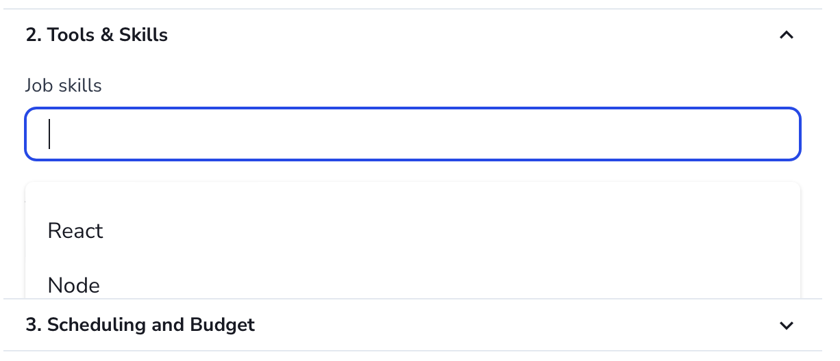
label="Job skills"
mappedValues={['react', 'node', 'typescript']}
/>
<TagInputAutocomplete
name={`jobs.${index}.jobTools`}
label="Job tools"
mappedValues={[]}
/>
</VStack>
</AccordionPanel>
...
TaginputAutocomplete
import { FormControl, FormLabel } from '@chakra-ui/react'
import {
  AutoComplete,
  AutoCompleteCreatable,
  AutoCompleteInput,
  AutoCompleteItem,
  AutoCompleteList,
  AutoCompleteTag
} from '@choc-ui/chakra-autocomplete'
import { NextPage } from 'next'
import { Controller, FieldPath, useFormContext } from 'react-hook-form'
import { TNewProjectFormData } from '../newProjectForm.zod'

type Props = {
  name: FieldPath<TNewProjectFormData>
  label: string
  mappedValues: string[]
}

const SkillsTagInput: NextPage<Props> = ({ name, label, mappedValues }) => {
  const { control } = useFormContext<TNewProjectFormData>()

  return (
    <Controller
      name={name}
      control={control}
      render={({ field }) => (
        <FormControl>
          <FormLabel htmlFor={field.name}>{label}</FormLabel>

          <AutoComplete openOnFocus multiple creatable onChange={field.onChange}>
            <AutoCompleteInput ref={field.ref} id={field.name}>
              {({ tags }) =>
                tags.map((tag, tid) => (
                  <AutoCompleteTag key={tid} label={tag.label} onRemove={tag.onRemove} />
                ))
              }
            </AutoCompleteInput>

            {mappedValues.length > 0 && (
              <AutoCompleteList>
                {mappedValues.map((value, cid) => (
                  <AutoCompleteItem
                    key={`option-${cid}`}
                    value={value}
                    textTransform="capitalize"
                    _selected={{ bg: 'whiteAlpha.50' }}
                    _focus={{ bg: 'whiteAlpha.100' }}
                  >
                    {value}
                  </AutoCompleteItem>
                ))}
              </AutoCompleteList>
            )}
            <AutoCompleteCreatable />
          </AutoComplete>
        </FormControl>
      )}
    />
  )
}

export default SkillsTagInput
Rendered form
Any suggestion or correction on the component structure will be helpful.
Feature Request
Add an usePortal prop, similar to chakra-dayzed-datepicker
As seen the calendar component hides anything behind it by using the usePortal prop
@AlvaroAquijeDiaz #147 Though I decided to rebuild https://codesandbox.io/s/autocomplete-mp5yex It'll be agnostic and easier to maintain. But still can't promise it'll be ready soon. 🙏🏿
@anubra266 that looks really nice. Another feature could be to support List placement, ability to put the list on top or bottom of the input.
I was able to get around this by manually implementing a portal, then conditionally rendering the element within the panel based on whether or not it was expanded!
const accordionItemRef = useRef();

return (
  <Accordion allowToggle>
    <AccordionItem>whatever</AccordionItem>
    <AccordionItem ref={accordionItemRef}>
      {({ isExpanded }) => (
        <Fragment>
          <h2>
            <AccordionButton>
              <Box flex="1" fontSize="18px" fontWeight="bold" textAlign="left">
                Accordion Item
              </Box>
              <AccordionIcon />
            </AccordionButton>
          </h2>
          <AccordionPanel>
            <Portal containerRef={accordionItemRef}>
              {isExpanded && <>{/* dropdown goes here */}</>}
            </Portal>
          </AccordionPanel>
        </Fragment>
      )}
    </AccordionItem>
  </Accordion>
);
I just had a very similar issue with Tabs... when I used isLazy it immediately began functioning again and the list started rendering once more. No idea why, but figured that might be meaningful to add the conversation.