 ant-design
Plan about Ant Design V5
2 years ago, we've released antd v4 which bring the compact & dark theme and performance improvement. And now, it's time to plan for the furture version v5.
Motivation
For real world, it exist many web app which need more flexible design style. As design system, we should consider the balance of restraint and freedom. We don't hope developer to modify too much on the detail style which may easily break on the minor version update with DOM structure adjust. It should be more safety to edit on the design token instead. And also part of style calculated by less not fully provided on the default.less file also makes it hard to modify globally. Thus, we want to remove all the hard code style on each components and makes it all controlled by design token.
And same time, we notice that micro-frontends brings development efficiency but same time exists style scope resolution is costly. It means when development mix multiple version of antd in same page will face the style conflict. We want to resolve this on antd side.
Plan
Here is the plan that we want to apply on next major version:
New Design System
In next major version. We want to make the design as an agile, simple enterprise-grade product. It can help more businesses to quickly build their own design systems, while maintaining the consistency and high efficiency of the underlying infrastructure. We will:
- Upgrade the default theme style to generate more abstract but powerful design token
- Provides more user friendly interface to ensure developer can using antd design token to create their own components
- Connect with Kitchen to provide a seamless design experience
CSS IN JS
We will use cssinjs to replace current less resolution. Less works well in the past years. It's very powerful style compile tool. But weak on the dynamic theme & micro-frontend situation. In Ant Design Pro, we using online less compiler to realize the dynamic theme effect but not recommend to use on the production env. It's little sticky. After replacement, it will reduce the time on compile phase and support the tree-shaking on client side. No need to install babel-plugin-import anymore. Usage of it is similar with current css variable resolution which is no need to config webpack:
<ConfigProvider theme={{ primaryColor: 'red' }}>
  <MyApp />
</ConfigProvider>
You can still use current antd className which we will also provided in v5.After alpha release, we will follow up to upgrade Ant Design Pro with cssinjs version.
React 18
React 18 rc version is out. It's predictable the concurrent mode is coming. We will list all the un-compatible components and fix one by one. It's in the plan but we can not promise much on this since React 18 is still on the way. We will:
- Remove all
findDOMNodedirectly call in code. (but still provide fallback if passed node is not ref-fable) - Check all render-time props calculation conflict.
- Test coverage of concurrent mode.
Drop IE support
Since modern browsers comes years, it's a good time to think about this. For antd v4, we rise the version support to IE 11. And it will be to Edge instead in next major version. In this way, we can use some fashion style and reduce the code size for the compatible content. If you have the requirement of IE 11 support, you can still use v4 instead.
Replace Moment.js
We've notice that Moment is in maintain mode. As v4, we do not want to makes a breaking change on minor version. But it can be done in v5. In v4, we've provided the way to replace moment. And in next major version, Day.JS will be the default lib in antd. You can still use the same way as v4 to replace back if you want to.
API Upgrade
And in recent years, many developer also using antd in LowCode case. Most components works well on this but some popup components like Modal, Tooltip, Popover, etc. can hardly configure. We will provide related components to makes it easy to use on LowCode.
Also, we have some legacy props definition which increase the memory cost (like Cascader searchValue, onSearch ,showSearch, etc). We may clean up these props and make more unique. And for some API which export the ReactNode (like TreeSelect onSelect) will be replaced with data option instead. Since much components is replaced with Hooks version, there is no more exist node instance.
Compatible Package
Like v3 to v4, we will also provides the compatible package for user easy move to latest version. It will provide all the components with HOC version to make sure API alignment. And also provide the v4 theme, which is default implement on the compatible package. We hope the give warning when developer using the legacy interface and help to migrate to v5. And also, it's better to use codemod tool to upgrade directly.
import { TreeSelect } from 'antd';

// To

import { TreeSelect } from '@ant-design/compatible-v4';
What's in experimental tag version?
I guess you've already notice that antd release v5 experimental tag version. It's not ready for production use yet. Our designers is still working on v5 design. This version is used for validating our new design token algorithm flexibility and CSS-in-JS availability. It still need long time testing and we will come in furture if we are real ready : )
To ensure our design token is enough flexible, we will continue adjust design token modal with desinger and find more possibility. So before major release, current token modal is not stable and we do not promise it will be the same as final design.
Summarize
During the time developing, nothing changed. We will keep maintain v4 and add new feature on it. At same time, we will fork v5 branch for the research of cssinjs solution and other attempt. You can view it on the github.
Task list here.
Have a nice day. Ant Design loves you : )
Move from enzyme to React Testing Library? https://dev.to/piotrstaniow/time-to-say-goodbye-enzyme-js-348c
css in js 不用 styled-components 吗?造新轮子么? https://github.com/ant-design/cssinjs
css in js 不用 styled-components 吗?造新轮子么? https://github.com/ant-design/cssinjs
封装的现成的代码:https://github.com/ant-design/cssinjs/pull/1
As research of emotion.js, its strong cssinjs resolution. To enable light-way migration purpose, we use
stylis@emotion/hash@emotion/unitlessand mix them with component specific library.
修改样子的方式能提供好的解决方法吗?现在都是在浏览器中找到对应的节点,css类名,然后进行覆盖修改。总感觉这样很麻烦,有什么好的方式来支持自定义样式吗?
Cascader Load Options Lazily should add provided prop to allow not trigger onChange if have children leaf . Hope that gets fixed in an upcoming version :)))
Please follow their works and Ant Design should same to be: https://rsuitejs.com/components/cascader/#async-data
Make components more accessible? I would like to offer help as we rely on that aspect
Make components more accessible? I would like to offer help as we rely on that aspect
Pls feel free to PR. It's no need to wait v5 : )
So in v5, we can:
- Get rid of
less.javascriptEnabled - https://github.com/ant-design/ant-design/issues/11097
- https://github.com/ant-design/ant-design/issues/9363
Right?
Please also consider DateTimePicker without little OK button that need to confirm - check something like react-datepicker, there is no OK confirm to select the datetime here. Cheers antd team ! this project is really amazing!
Improvements to existing components that don't introduce any breaking changes don't have to wait for v5.
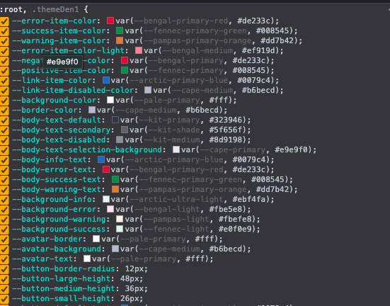
Just a thought, Why not just use CSS variables. Create a file that can be referenced like --button-primary-background: var(--arctic-primary, #4b46c2); then this mapping file can be switched out or provided by the consumer. I would suggest mapping the names to the component element instead of a color name. this way theme's can be switched out just by changing the parent classname and the project will then consume the new mapping file variables
Similar to the screenshot below
V5 Modal 能否加上以下feature:1.增加上下左右等8个方法的大小伸缩 2.可自由拖动 3.关闭按钮旁边增加全屏放大按钮 4.也可以双击Modal的标题栏切换全屏和退出全屏
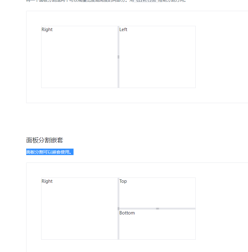
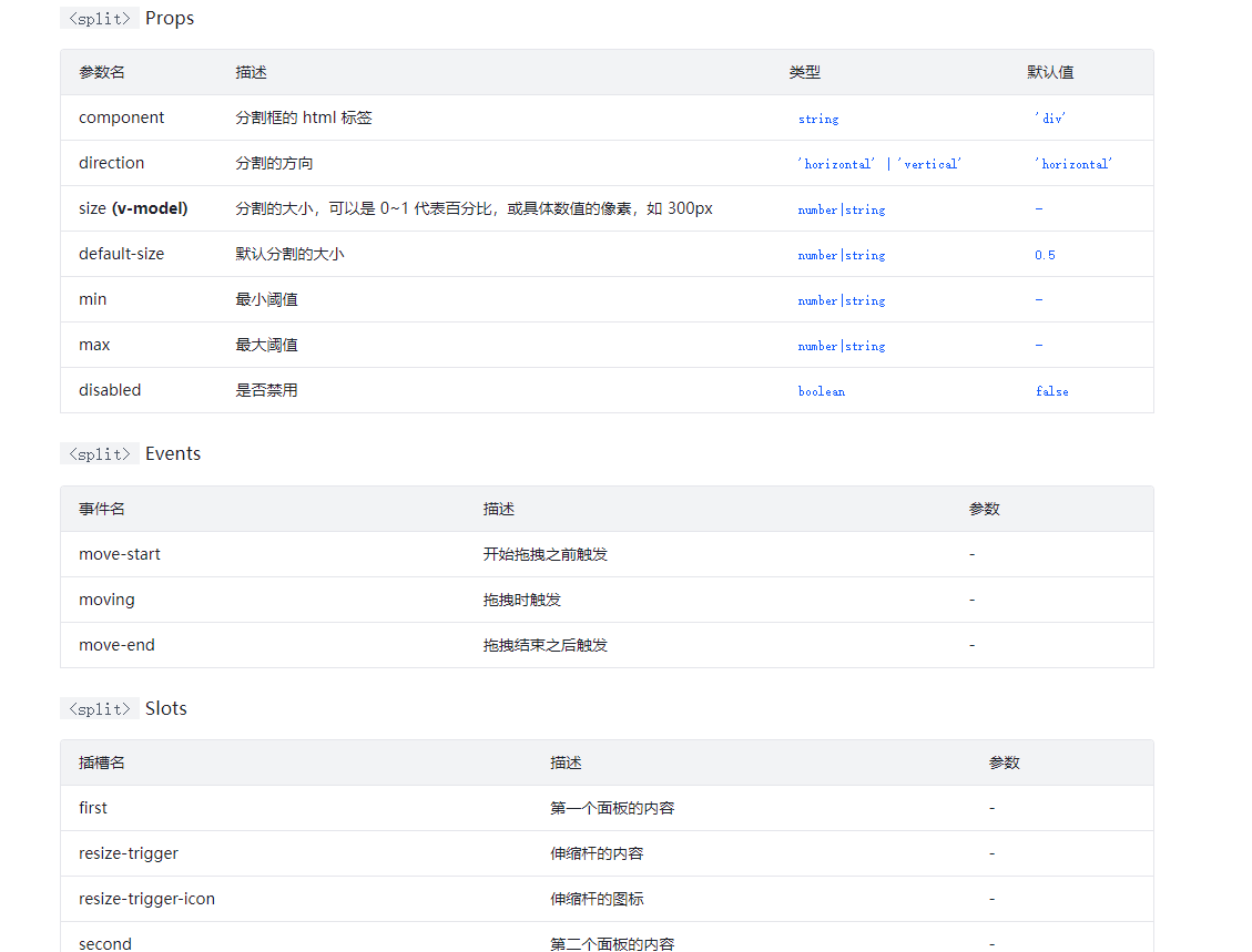
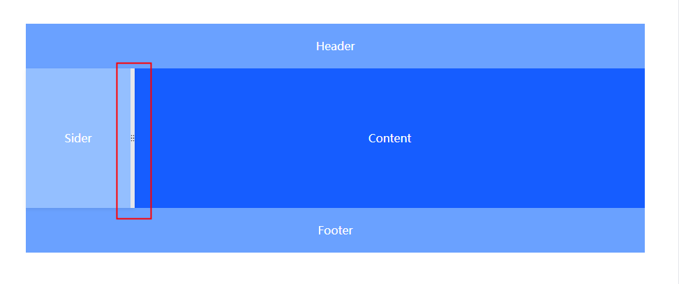
Expect to increase the split split component
将一个面板分割成两个可以调整宽度或高度的两部分。用direction控制分割方向。面板分割可以嵌套使用。
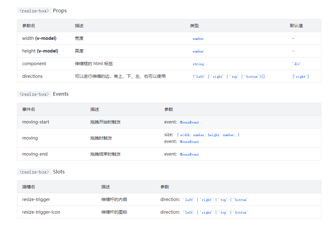
Expect to add telescopic frame components
ResizeBox 伸缩框组件的基础使用。通过设置 directions,可以指定四条边中的哪几条边可以进行伸缩。可Layout 组件中集成了 ResizeBox 组件,可以在 Layout 中使用可伸缩的侧边栏。
Yes, please consider refactoring without any global styling, or at least make the global styles more modular and easily excluded. Though it's technically possible to configure webpack to exclude the global stylesheet, I've found that some components like DatePicker don't even function without it. These global styles make antd very difficult or impossible to use in microfrontends.
The upgrade process from v3 to v4 was fantastic. Temporary compatibility packages were provided to allow developers to upgrade to v4 while still using v3 code so we could upgrade older codebases over time (especially forms). Would love to see such care taken again when considering migrating from v4 to v5.
I would love to see Masked Input to avoid using third party components which often stop being supported after a while (like https://github.com/sanniassin/react-input-mask)
Now that the styling is being reworked, perhaps we should also consider the following.
- fluid typescale for more responsive texts.
- CSS @layer-compatible styling to make it much easier to override antd styles.
- container-based media queries, in addition to the viewport-based queries that the Grid component uses.
Some information for css @layer
maybe this plugin will help:https://github.com/csstools/postcss-plugins/pull/244
My little wish is to fix this long lasting issue I've created a long time ago https://github.com/ant-design/ant-design/issues/29907 Judging by the number of reactions to post and comments, I'm not the only one. There seems to be issues when swapping to dayjs and mixing ant/lib and es imports. Judging by the plan list, it looks like this is being considered! Will that fix this issue?
Plus making dayjs the default is promising :+1:
Also I would like to propose to stop using Chinese language in GitHub as it makes reading issues much harder for the rest of the world :) :+1: The main issue is when using search. When searched by English phrases, issues in Chinese won't pop up and those might have some answers.
I wish we could have this proposal implemented: https://github.com/ant-design/ant-design/issues/25993 (Ability to check if a form is valid without having to display the errors/feedback)
V5 Modal 能否加上以下feature:1.增加上下左右等8个方法的大小伸缩 2.可自由拖动 3.关闭按钮旁边增加全屏放大按钮 4.也可以双击Modal的标题栏切换全屏和退出全屏
自己扩展一个呀
V5 Modal 能否加上以下feature:1.增加上下左右等8个方法的大小伸缩 2.可自由拖动 3.关闭按钮旁边增加全屏放大按钮 4.也可以双击Modal的标题栏切换全屏和退出全屏
自己扩展一个呀
自己扩展当然可以,但为啥不能原生支持呢?对于Modal组件来说这个需求应该很基础吧
Droping moment.js is a very nice improvement!
It could be really nice to have DatePicker, Calendar and other "date related" input to use a standart Date object as a value, and output a standart Date object.
The inputs would become library agnostic, and this would fix a lot of compatibility issues with projects using other libraries than Dayjs.
What do you think?
That would be awesome !
It could be really nice to have DatePicker, Calendar and other "date related" input to use a standart Date object as a value, and output a standart Date object.
Dealing with native date is very hard. I think currently dayjs is the way go. Soon temporal (currently in stage 3) will become the standard, making all date libraries obsolete.
Indeed, but the datePicker doesn't have to handle the timezone anyway. It just displays the given date that has to be shifted the correct amount of time according the timezone. Which is what momentjs returns when doing a momentDate.toDate();.
I think it's up to the person integrating the input to handle the timezone as the input does not have any option to set the timezone of the date. If the user select the time "10:16", that's what will be outputed regardless of the timezone. I might be wrong, but I couldn't find anything about timezone on the DatePicker documentation. It does not prevent Ant from using dayjs internally to deal with the date and time, I'm just pointing out the input/output values.
Postpone this kind of change until Temporal comes out, means we'll have to deal with dayjs until ant v6, at least.
When would it be available? Is there any timeline?
Currently V4 has a lot of issues with less. I hope antd can ditch it asap. Otherwise, mantine seems to be a cool alternative too, it's just that is components are not as many as antd
I think on V5 we should also think about making most of the components to be responsible on smaller screens, support from 1366x768 to 1920x1080. Some components even when you set the size to 'small' still take to much of the screen on width aspects. Even more if the aspect ratio is different from screen to screen. Most of the cases the table is the hardest component to deal with that. Also height on the table shouldnt be controlled by the "scroll" prop like it is now.
Any discussions on this points are fair and I would like to hear your's ideas aswell.
Thanks team.
@balboFK Interesting thoughts. Indeed it can be interesting to have a better support for small screens.
Also, I'd be glad to try to propose some pull requests, but I would like to know first if it worth it or not. Is there an other way to do something like an "official" proposition (before doing the pull request) ?
Hello @Eliepse, thanks for the reply! I think we might need to talk with @afc163 or @zombieJ to get some clearence on that. But any pull requests that makes the library better as a whole would be interesting and IMO worth doing.
On our implementation of Antd today we have some hooks and some media querys to handle font-size, component sizes like "small | medium | large", and table height, it works for different screens sizes and had been quite helpful. I would be happy to share some of them if it helps you with anything you might be thinking on.
@balboFK I agree with your points there. I've been using Antd for a while now and wish it has better support for mobile devices. Antd looks really awesome on desktop & mobile but couple of components are harder to use in mobile browser, I mainly noticed for dropdowns and selects.
While browser's native select dropdown doesn't look very good aesthetically. Perhaps we can provide the option to use it as a component similar to MUI? https://mui.com/material-ui/react-select/#native-select
Or something like a "hybrid" select approach that changes to native select on small devices. It'll improve the usability while using the same component for desktop and mobile. https://css-tricks.com/striking-a-balance-between-native-and-custom-select-elements/#aa-building-a-hybrid-select
I've done some update in internal component like rc-trigger to support responsive requirement. But it's still a very early work.
But yes, improve responsive experience is in our plan. We will do this part when most mainly tasks finished.
I hope Spin and Skeleton wrappers could have built-in React 18 Suspense feature.
Is there an ETA for this release? With React 18 out it would be amazing to implement it in our products, unfortunately antd is quite a big blocker in that regard. If antd v5 is a long way away it would be good if we could introduce React 18 antd compatibility some other way, perhaps it could be part of a minor release instead? Curious what other suggestions people have
it would be good if we could introduce React 18 antd compatibility some other way, perhaps it could be part of a minor release instead
If you look at recent PR related to to React18 compatibility, you can see they target master branch (v4) and not next branch (v5) See for instance : https://github.com/ant-design/ant-design/pull/35030 https://github.com/ant-design/ant-design/pull/34937 https://github.com/ant-design/ant-design/pull/34787
They are likely to land in 4.20
Please add an OnScroll event in table when long table header data, so that we can hide the column with OnScroll event.
虽然版本升级是一件令人期待的事情,但是每次小版本升级都回导致各种小问题,部分组件都不能向前兼容,排查起来又相当困难。主版本不说,次版本升级能不能保持向前兼容(api和UI样式)。不得不说,要不是有很大一部分产品用了antd,还不如使用element来得稳定
The ability to set the timezone globally for all the dates would be a great feature. For example, you set the timezone to "America/New_York" and all the dates inputed by a user would be treated as inputed from that timezone, regardless of where they are currently. Many applications require this feature and currently they is no elegant way of doing this.
强列建议支持Table虚拟表格功能!
<Table virtualized columns={columns} dataSource={data} />
What about plans to improve accessibility? There are a number of outstanding issues around forms, etc.
Do you guys plan to add something like https://github.com/eBay/nice-modal-react for modal? Also support for tailwind css
Is there a potential to use BEM naming conventions for styles: http://getbem.com/naming/
希望Table组件能提供一个Prop - transformCellText,当列数据取得的值是null/undefined时,渲染这个文本,比如很多时候我们取得的数据字段是空的,则会展示一个横杠-,如果没有统一配置,我们就需要给每一个这样的列都设置一个render: (value) => value ?? "-",稍微有点繁琐。
希望
Table组件能提供一个Prop-transformCellText,当列数据取得的值是null/undefined时,渲染这个文本,比如很多时候我们取得的数据字段是空的,则会展示一个横杠-,如果没有统一配置,我们就需要给每一个这样的列都设置一个render: (value) => value ?? "-",稍微有点繁琐。
HOC 封装一下 columns
Is there a potential to use BEM naming conventions for styles: http://getbem.com/naming/
Not in plan yet : )
Any plans to enhance table , such as columns resize, cell edit
Simply use DetailsList from FluentUI should be just work.
One of my suggestion is to remove any z-index usage to avoid any problem. It's a bad and legacy practice. All popup-liked components should be append to offset parent (commonly to root) by using createPortal().
我的一个建议是移除任何使用到的 z-index,以避免任何可能的问题。因为这是个历史性糟糕的实践。所有需要类似弹出层的组件都应该使用 createPortal() 方法挂载到相对偏移父节点(通常是根节点)。
Ok, @zombieJ I am still facing this issue. Select dropdown is not working with React 18, I think some portal elements are facing this issue, like even date filters.
![github-actions[bot] avatar](https://avatars.githubusercontent.com/in/15368?v=4 "Published by a pub.dev verified publisher")
I think we should target something of a more controllable selection API for the Table component, and also make possible to select a row by clicking on the 2 default methods that are already shipped with Antd Table. I dont see a real reason to not be able to select a row by clicking only on the "radio" or the "checkbox" methods. A good idea would also be to make table keyboard friendly, we have an issue on this but it was closed.
Edit: Also on the context of talking about table, I think we should also try to make table virtualiazed out from the bat, i saw a lot of complaints on how the example of virtualization has to much code that is not dealing with the virtualization itself and some of it seems like is very old design and way of implementing the virtualization. I think we can look at what RSuite Table does, as it seems to work very well and ships a very simple Api.
Any plan to support theme switching, e.g. switching between dark and light mode?
We have worked with AntD for a long time now. Its an amazing library. So happy to see we're moving into CSSinJS for dynamic themes. <3
希望 Ant Design Pro V6 使用 Vite + Redux 或者 MobX,不要再捆绑umi、dva了。
或者也推出一个模板。
这个估计你想多了。
- Base WebComponent to support Cross-Framework
- One component one package to support Minimal incremental upgrade
- Full DesignToken to support custom theme all
- CssInJs to support coexistence of multiple versions for one component
- Add BEM className to support style custom by users
有个比较好奇的问题,类似 tailwindcss 的原子化 CSS 框架使用范围应该会越来越广,我目前会结合 antd v4 + tailwindcss / windicss 开发,目前发现的冲突有 svg 图标 vertical-align 以及全局重置样式上的一些冲突,这种只能开发者自己解决吗?
有个比较好奇的问题,类似 tailwindcss 的原子化 CSS 框架使用范围应该会越来越广,我目前会结合 antd v4 + tailwindcss / windicss 开发,目前发现的冲突有 svg 图标 vertical-align 以及全局重置样式上的一些冲突,这种只能开发者自己解决吗?
 corePlugins: {
    preflight: false,
  }
tailwind 有个配置preflight可以默认不重置全局样式
Please don't use css in js but rather css modules with less! Css in js is nightmare! Also it would require a rewrite of lot of app styles as many depend on the less variables. They are awesome as you can re-use them and stay consistent with the theme. That's just not possible with css in js and you force every app to use css in js. Also it means that every component specific styles like hiding controls on InputNumber will not work anymore and have to be rewritten somehow if even possible with the future css in js solution.
And please introduce an english only policy for code, comments and communications in github
Maybe CSSinJS can be configurable in a way classnames are not hashed or so. I agree that customization over CSS override is an important thing to keep. I use it a regularly.
Being able to optionally use the Constraint Validation API for form validations would be nice to have. At this point, I think the current way of presenting form field errors provides a better UX than the constraint validation API in browsers, but sometimes a native feel might just be preferable and more accessible.
I do really like the new CSS variables. Less is great, that would be better to use Cssinjs. But the thing is cssinjs will require more code
https://github.com/callstack/linaria is by far the best css-in-js implementation as it has zero runtime. Super fast and also more powerful in other ways.
Can we make adapters for DatePicker instead of dayjs or monentjs?
Like MUI DatePicker, they have different adapters for different date libs.
Also, if antd only support one date lib. It will be hard for developers to refactor the old code. (momentjs -> dayjs)
cc @MadCcc