components
 components copied to clipboard
 angular
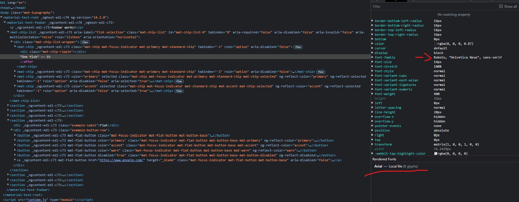
bug(mat-chips): Chips doesn't respect material theme typography
Is this a regression?
- [ ] Yes, this behavior used to work in the previous version
The previous version in which this bug was not present was
No response
Description
Theme created like this:
// Custom Theming for Angular Material
// For more information: https://material.angular.io/guide/theming
@use '@angular/material' as mat;

$atomic-typography-config: mat.define-typography-config(
  $font-family: 'Nunito Sans, sans-serif',
  $display-4: mat.define-typography-level(112px, 112px, 300),
  $display-3: mat.define-typography-level(56px, 56px, 400),
  $display-2: mat.define-typography-level(45px, 48px, 400),
  $display-1: mat.define-typography-level(34px, 40px, 400),
  $headline: mat.define-typography-level(24px, 32px, 700),
  $title: mat.define-typography-level(20px, 28px, 600),
  $subheading-2: mat.define-typography-level(18px, 24px, 600),
  $subheading-1: mat.define-typography-level(16px, 20px, 600),
  $body-2: mat.define-typography-level(14px, 24px, 400),
  $body-1: mat.define-typography-level(14px, 20px, 400),
  $caption: mat.define-typography-level(12px, 20px, 400),
  $button: mat.define-typography-level(16px, 32px, 500),
  // Line-height must be unit-less fraction of the font-size.
  $input: mat.define-typography-level(16px, 1.25, 400),
);


// Plus imports for other components in your app.

// Include the common styles for Angular Material. We include this here so that you only
// have to load a single css file for Angular Material in your app.
// Be sure that you only ever include this mixin once!
@include mat.core();

// Define the palettes for your theme using the Material Design palettes available in palette.scss
// (imported above). For each palette, you can optionally specify a default, lighter, and darker
// hue. Available color palettes: https://material.io/design/color/
$test-primary: mat.define-palette(mat.$indigo-palette);
$test-accent: mat.define-palette(mat.$pink-palette, A200, A100, A400);

// The warn palette is optional (defaults to red).
$test-warn: mat.define-palette(mat.$red-palette);

// Create the theme object. A theme consists of configurations for individual
// theming systems such as "color" or "typography".
$test-theme: mat.define-light-theme((
  color: (
    primary: $test-primary,
    accent: $test-accent,
    warn: $test-warn,
  ),
  typography: $atomic-typography-config,
));

// Include theme styles for core and each component used in your app.
// Alternatively, you can import and @include the theme mixins for each component
// that you are using.
@include mat.all-component-themes($test-theme);
When inspected buttons follow typography but chips does not.
Reproduction
Simple scaffolded demo is on my github: https://github.com/GeorgeKnap/mat-chips-typography
Expected Behavior
chips follow typography
Actual Behavior
chips does not follow typography
Environment
- Angular: 14.2.0
- CDK/Material: 14.2.0
- Browser(s): Chrome
- Operating System (e.g. Windows, macOS, Ubuntu): Windows 11
FYI it "works" when I pass the typography config into mat.core mixin like
@include mat.core($atomic-typography-config);
however, What if I want to have two themes with different typographies? I still believe the code in my example should work but does not.
This issue has been automatically locked due to inactivity. Please file a new issue if you are encountering a similar or related problem.
Read more about our automatic conversation locking policy.
This action has been performed automatically by a bot.
![angular-automatic-lock-bot[bot] avatar](https://avatars.githubusercontent.com/in/40213?v=4 "Published by a pub.dev verified publisher")