nordic.nvim
 nordic.nvim copied to clipboard
Feature Request: support for aerial.nvim plugin
Please consider adding support for Neovim plugin aerial.nvim. Its highlight groups are documented here.
Looks like the default styles for this plugin are linked to the default nvim ones, so it should be supported here out of the box :thinking:
Edit I might have misunderstood. Maybe that's purely an example that was linked there ?
Does something look incorrect ?
Maybe you could try https://github.com/andersevenrud/nordic.nvim/pull/80 ?
I've added basic support for colors based on their highlight definitions, but might not be what you're looking for.
So some feedback would be appreciated.
Sorry, I should've provided more information. It seems that by default aerial doesn't really have highlighting (at least when viewed with Nordic color scheme). So I thought it would be nice to apply some colors from the Nordic palette to at least some elements of Aerial interface.
I tried #80 and it indeed adds some colors. Please see before/after picture below (left - before, right - after):
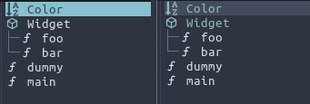
While this is much better (especially the AerialLine style for selected row), maybe it's also worth having different color applied to icons (groups like Aerial*Icon)?
While this is much better (especially the AerialLine style for selected row), maybe it's also worth having different color applied to icons (groups like Aerial*Icon)?
So that the text and icon does not match colors ?
What would you suggest then ? Because I've tuned the text to match the icons :)
So that the text and icon does not match colors ?
Yes, that's what I meant. I think having icons to be different color from text will provide some nice visual accent. It may also be beneficial if the icons themselves have different color to provide some visual context (e.g. AerialClassIcon is different from AerialFunctionIcon), but I understand that it would require more work and is also easy to overdo.
Here's an example of Aerial itself from the video in their readme:
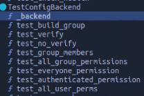
And this is from symbols-outline.nvim, which is a similar plugin:

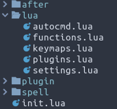
nvim-tree also has different color for icons and text (this is it with Nordic theme):
Unfortunately, due to protanomaly I cannot suggest you specific colors to use. If I could, I would've just made a PR :)
It looks to me like all of these examples use the same style. White text + Colored Icon.
I'm a bit worried that having different colors will make things visually confusing and sort of "candy like". I'm leaning towards just doing either:
- Colored Icon + White text (out of the box behavior)
- Colored icon + Same colored text (behavior in PR)
and adjust just simply change the choice of colors to a custom one instead of using the linked highlight references in Aerial.
I agree, having way too many colors could make it more stimulating and distracting.
I personally prefer the first approach (colored icon + white text). I think it will better match how other plugins (like nvim-tree or Telescope) look with Nordic theme. But of course the choice is up to you.
I could not get back to this the day I mentioned in the PR, but it's in now with some minor adjustments :sweat_smile:
I went for the first option as discussed, but I dunno if I made the right choices of colors.
Feel free to re-open the issue if you have some opinions on this!