govuk-design-system-backlog
 govuk-design-system-backlog copied to clipboard
Header
Use this issue to discuss the header component in the GOV.UK Design System.
What
Header for GOV.UK, including full-width, departmental, internal and service variants.
Why
Site headers are used on all web pages. There's also a need for consistent headers for departmental and internal services.
Anything else
- Top bar in DWP design patterns
- Service header in Home Office design system
- Site header discussion on Dropbox Paper
Related patterns
- #96 Site footer
There is a weird issue I am seeing with this component. govuk-header__logo is set to 33.33% width and govuk-header__content is set as 66.66%. For some reason this will sometimes cause the service name to move to the next line - looks like browsers will sometimes round both values up. I get the same result in safari, firefox & chrome on osx.
Works fine in the example but not with my implementation. Remove the 66% on govuk-header__content or set it to 66% and it's fine. It may be better to drop the 66.66% to ensure it works under all circumstances?
Hi, thanks for getting in touch. In our browser testing we haven't seen that issue and can't replicate it. Without a live example I'm afraid we won't be able to investigate and I'd be cautious about introducing magic numbers.
@pds2208 in addition to what @igloosi said, if you are able to put together an example that demonstrates the issue with reproducible steps please raise an issue on https://github.com/alphagov/govuk-frontend/issues 😄
Thanks again :)
Ah, found it and can reproduce it. What a weird issue...
Open your test page here in Chrome: https://design-system.service.gov.uk/components/header/with-service-name/index.html
Inspect element. To the left of: govuk-header__container govuk-width-container on the three dots right click and 'edit as HTML'
Go down to this line:
</div><div class="govuk-header__content">
Move the second opening div <div class=... to a new line and click on the page. Boom!
Will raise an issue.
yes, those divs have no space around to for inline-block to respect widths see https://css-tricks.com/fighting-the-space-between-inline-block-elements/ there are various ways to combat white-space in such instances. we have gone for no space. negative margin might not work in font size is changed and one last option is to use font: 0 on parent can add font-sizes to children.
The issue here is that a reformat in an html editor will result in a rendering issue. That can't be right.
Weirdly yes it does - Elements using inline-block will actually add white space from the HTML editor! I used to deal with this by putting a comment between the lines so it thinks there is no space and you can still put it on a new line.
</div><!--
--><div class="govuk-header__content">
The example here:
https://design-system.service.gov.uk/components/header/ under 'header with service name'
will result in the service name being put on a new line....That's where I copied my code from and subsequently spent ages trying to find out what was wrong...
@pds2208 sorry this is super frustrating, it looks like when we output the HTML examples we 'pretty print' them, which tries to make the markup look tidier. Which has resulted in the issue you're seeing.
If you want to raise an issue on https://github.com/alphagov/govuk-frontend/issues we'll get this sorted, if not I'll do this for you :)
Issue raised and fixed in my code :) Must remember to switch off the auto reformat before commit in IntelliJ....
Capturing https://github.com/alphagov/govuk-frontend/issues/972 here - the extra space in the header on certain tablet breakpoint is something we should explore fixing but there is no straightforward way to do this because:
- it's possible that we should be recommending services to have the "GOV.UK" text as part of the service name as in the Design System header (linking to https://www.gov.uk/ from a service domain might not be helpful to users)
- many services have search and various navigation in the header
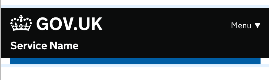
It's a small thing, but we (Digital Marketplace) just noticed that the header example in Design System is slightly different to the header used for the Design System; the service name ("Design System" in this case) is in a different place.
In the header used, the service name is right next to the GOV.UK badge, and a lighter font. In the example header, the service name is in the middle of the header, and in a bold font.
As there isn't any specific guidance on where the service name should be in the header does mean that the example is not definitive?
Many HMRC services do not use the navigation but do have a 'Sign out' link on the right hand side of the header.
Desktop

Mobile

This would be a good thing to include in the documentation and code, assuming this would help other government departments too.
This could also be part of #95.
@lfdebrux Hi Laurence, apologies for the the delay in responding to this.
The header in the Design System is to be used by services. The service name is in bold, centred within the header and has independent links to both the first page of the service and the GOV.UK home page

The header used by the Design System is the header designed for GOV.UK products. It's currently in use on GOV.UK Service Manual, GOV.UK Service Toolkit, GOV.UK Notify, GOV.UK Pay, GOV.UK Verify, GOV.UK PaaS and Registers product pages. This has the product name directly next to GOV.UK and they are grouped together as one link that takes you to the product home page.

This design was initiated for the Government as a Platform products just under two years ago. It might be that it would be the better option for Digital Marketplace too.

It would be great to have some padding between the ‘Menu’ link and the service name on the header seen on small screens. Having them butt up so close I think reduces readability.
@murfious
It would be great to have some padding between the ‘Menu’ link and the service name on the header seen on small screens. Having them butt up so close I think reduces readability.
I think this might be the design from one of the old codebases. The current version in GOV.UK Frontend / Design System has the Menu button on the same line as GOV.UK, not the service name for this reason
The header currently collapses nav links in to a menu on mobile (which is very nice) - but for my service the breakpoint it collapses at is var larger than necessary - our tablet users could get our full nav but right now they're not.
It looks like the breakpoint is defined here. Would it be possible to allow this width to be overridden?
On reviewing the header https://design-system.service.gov.uk/components/header/default/index.html# in NVDA for Windows the png
Header – Example – GOV.UK Design System document visited link Unlabelled graphic To get missing image descriptions, open the context menu. GOV.UK
To make NVDA ignore the
Would it be possible in a future update the ability to change the SVG of the crown? At CH we don't use the crown for our services and there is no simple way to swap it out using Nunjucks
On reviewing the header https://design-system.service.gov.uk/components/header/default/index.html# in NVDA for Windows the png is declared as "Unlabelled graphic" (text from NVDA text viewer below)
Header – Example – GOV.UK Design System document visited link Unlabelled graphic To get missing image descriptions, open the context menu. GOV.UK
To make NVDA ignore the tag I'd suggest giving the a role="presentation" too as the same role attribute in the tag doesn't seem to carry through.
@DavidMcClelland-uxm thanks for flagging this – I've raised an issue over in the GOV.UK Frontend repo to track this. If you want to stay updated, you can subscribe to notifications for the issue.
Would it be possible in a future update the ability to change the SVG of the crown? At CH we don't use the crown for our services and there is no simple way to swap it out using Nunjucks
@mgearon-ch I've raised an issue over in the GOV.UK Frontend repo to track this. If you want to stay updated, you can subscribe to notifications for the issue.
Sharing an example of how my service's header looks:

This is adapted from the HMCTS header with primary navigation combined with the Design System header pattern.
Implementation details:
- The header is persistent across all pages when signed in.
- When you're within one of the main site areas (cases / businesses / products / your team) we highlight that as the active category
- If you're in another area (T&Cs, guidance, etc), we don't highlight a category.
- They all collapse in to a single menu on mobile.
- We're using the 'product name' option of the existing header as our service has a noun based name not verb based name.
- Following HMCTS' example, we use a white bar to indicate the active category, not change in text colour.
Overall I'd say this has tested very well. Our users seem to be able to use it well. Have not tested the mobile implementation (our user base does not tend to use mobiles) and I am wary of the collapsing.
Our previous nav looked like this:

This nav was not persistent and was only shown when on a top level page. It was using the HMCTS Sub navigation pattern.
We previously relied heavily on back links and breadcrumbs for navigation. However some pages in our service could be very nested, making it very awkward to move between cases. The the revised header with persistent nav has made escaping much easier.
I was initially hesitant to include the nav links within the black bar vs outside of them. However we plan to have secondary nav outside of the black bar related to individual cases. In this case it makes sense for the black bar to be 'global things' and stuff below it to be related to the case you're on.
Mobile closed:

Mobile open:

During a signup journey (logged-out user state), the service name in the "Header with service name" component is clickable and by default returns the user to the start of the signup journey and clears their entered signup data. Our team are interested in what scenarios would this behaviour would be useful for the user?
This is an example (below) of how the header looks in our service.

The first iteration did not have any navigation.
User research showed users needed navigation so a later iteration (below) had navigation links in the black header. Unfortunately, we found that users did not see the links there.

We looked at other services including the Agent services account (many of our users are agents) and integrated an existing design with the navigation below the black header.
Implementation details:
- the header is consistent across all pages
- when you're within one of the sections it is highlighted as an active category
Users have found this iteration much easier to use and it has tested well.
It would be good if the menu collapsing could be disabled / smarter. My service has a single item in that bit of the header, so collapsing it just puts it a further click away. I wonder if it could not collapse if there's just a single item. I'd guess we can probably hack the html to do it in the short term.
Desktop:

Mobile:


I just wanted to add to this discussion to say that we also have found that users often do not see this header navigation on our service. We are working on the "Drive in a Clean Air Zone" service and we used this pattern whilst designing our check multiple vehicles service which is for business users to create an account. During our beta research found we found around 35% of a sample of 115 users did not see the navigation at all and this has been a recurring finding in just over a years worth of research. We have recently been testing a pattern with the navigation below the black header similar to HMRC's personal tax account header and have found this to be much more successful with our users. Although this does seem to be presenting us with some challenges for implementation for a mobile with JavaScript turned off.
Hello! As part of discussions for the header component in the NHS digital service manual community backlog, it appears the examples and guidance for the GOV.UK Design System header component may be out of date when compared with the latest header which is live on GOV.UK
Hi @henocookie 👋 The header on the GOV.UK website (www.gov.uk) is different to what's in the GOV.UK Design System. At the moment we don't have plans to update the header in the Design System as the navigation links exposed in the GOV.UK header are there to expose GOV.UKs information architecture to users and that's not necessarily useful information to those completing services. Services often have their own navigational elements (log in/out) etc which that design doesn't account for.
For info. The service for 'Tax free childcare' has 'Sign out' on the right but below the header.

I don't know why that design was chosen. I'm showing it here just for information, not as a recommendation.