govuk-design-system-backlog
 govuk-design-system-backlog copied to clipboard
 alphagov
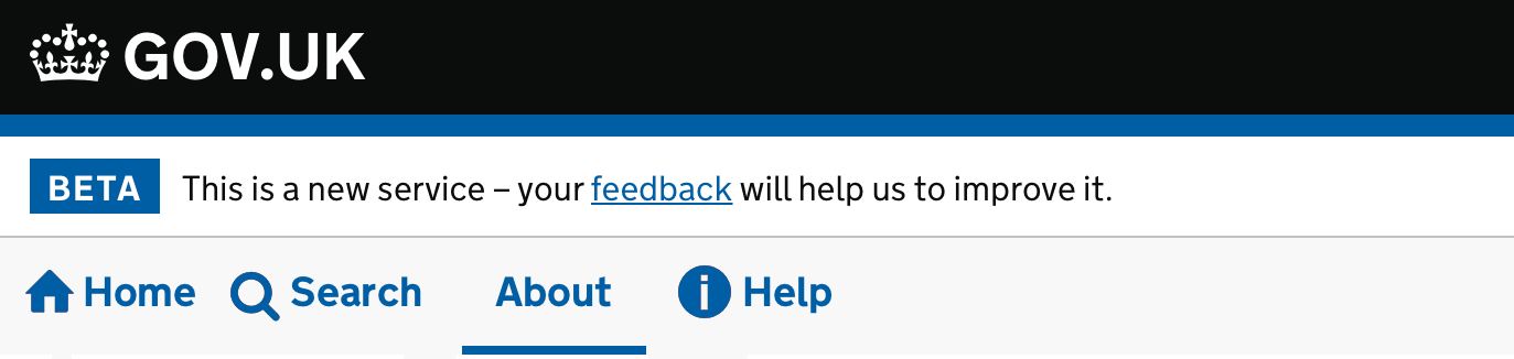
Service navigation
What
Help users navigate sections in your service.
Why
Services that use this pattern:
- gov.uk/government
- GOV.UK Notify Admin
- GOV.UK Pay Admin
Anything else
- Home Office has an example of Sub-navigation links: Home Office design system
- HMRC removed and labeled "not a thing" to their example of Navigation: HMRC design system
- Digital Market Place Frontend toolkit has a component for previous/next navigation
Related items:
As discussed with some designers in the past xgov design system workshop, this pattern could just be general 'Navigation' which has different applications (Primary, secondary, account navigation, content list, etc.) @timpaul @joelanman thoughts?
Yeah, I think we could have a general 'Navigation' pattern, but we might need to also make some more specific navigation components to go with it.
Related to site header (https://github.com/alphagov/govuk-design-system-backlog/issues/97), which frequently contains navigation elements
please consider whether there is value in supporting optional icons next to key navigation items for a site, e.g. "Search, Home, Help"
@joelanman we have an internal system at the Home Office, that was originally not using govuk styles, but now does. We have a bespoke nav that includes icons. This isn't exactly how it looks but I have done a mockup of the kind of thing I mean:
the icons above are from the home office design system https://home-office-digital-patterns.herokuapp.com/components/icons
We care currently designing an application that provides a number of services/forms/reports. The end user can be required to re-visit and make edit/additions to these services/forms/reports - so all need to be available after sumbission. Additionally there may be a number of different user settings that require administration. Finally we also require a section that provides secure messaging and uploading. We were hoping create a navigation system with both a primary and secondary navigation - similar to that provided here: https://design-system.service.gov.uk/components/ . After some investigation we have been advised that this pattern is not recommended for service. Are there any navigation patterns that can be used that are similar
Just wanted to share some feedback for vertical navs and what we learnt on a service we are working on at the moment. We've gone with a vertical as horizontal tabs didn't work well with the content we have and users completely missed them.
We looked at vertical tabs, and tried link lists but they didn't work well with users. So we adapted the vertical nav thats in the design system. This worked really well with our uses and we have created a pattern for it in our design system. It worked well with screen readers and users with assistive tech. We had one user who said they were very surprised it was easy to navigate the pages.
Using tags for the counts, with some hidden descriptive text also helped with screenreaders, similar to the "Change" link in the CYA/Summary pattern.

This is something we have recently been looking at DfE, we have gone through https://github.com/alphagov/govuk-design-system-backlog/issues/151 for reference to try and get something consistent with other top navigation bars.
I think the only thing really to highlight is the sign out link on the right.

We’ve chosen to prioritise ‘Navigation’ as one of our Upcoming components and patterns.
If you’d like to help, join the GitHub discussion page for Navigation. We’ve created it to make it easier for the community to discuss issues and options.
We've just added some guidance on how to 'share findings about your users' with us 📝. This will help us learn more about how your users navigate within your service.
Hi folks, for anyone who missed or wants a recap of our Navigation: help us define our next component kick off workshop, on 18 April 2024, we've posted a summary to the discussion thread Navigation - related research and resources #3661
GOV.UK Design System working group review
Representatives from the GOV.UK Design System working group reviewed a 'navigation’ contribution in April 2024.
Four of the members in the group agreed that the component met the criteria for a useful and unique contribution to the Design System. One member disagreed that the contribution met the criteria.
The working group also made the following recommendations.
Scope of the contribution
There was a range of feedback on the scope of the component and how it relates to other components in the Design System.
The main themes were that:
- Navigation needs to be more than an extension to the header component
- End users need to have a consistent (not necessarily uniform) experience across GOV.UK pages
- Services need to know how flexible the Navigation contribution will be, and understand (as early as possible) how future versions of GOV.UK Frontend will affect them
Guidance
- Restructure guidance based upon our decisions on how many components/patterns it should be
- Help teams understand other headers in GOV.UK and when and why to use ours
Design
- Explore how to show a greater visual distinction between a service name with and without a link
- Revisit the impact of reducing space within the header, service name and navigation proposals
- Investigate organisation switchers and location of Phase banner in relation to service name and navigation
- Investigate whether or not the main navigation takes a vertical position instead of horizontal beneath the header
- Consider One Login Header users that may not operate a service, for example, GOV.UK email notifications
- Consider colour contrast and font weight of Navigation elements
Code
- Explore the feasibility of ‘slots’ to insert additional html and whether we should keep all these slots full width