govuk-design-system-backlog
 govuk-design-system-backlog copied to clipboard
Table
I think it’s worth supporting a "sortable tables" pattern, whereby users can click on a column heading to re-sort the table by that column (and click again to reverse). This is useful for enabling people to quickly discover the maximum and minimum values.
This should also be discoverable, which can be achieved by making the the column header blue, with icons for sorted ascending, descending or not sorted.
Here’s an example from a live service: https://www.ethnicity-facts-figures.service.gov.uk/crime-justice-and-the-law/courts-sentencing-and-tribunals/sentences-and-custody/latest
Thanks Frankie, sortable tables is definitely something services have needed in the past.
The GOV.UK Performance site has some examples of sortable tables
@LJWatson has also worked on accessible sortable tables:
- Code here: https://github.com/LJWatson/sortable-tables
- Demo here: https://ljwatson.github.io/sortable-tables/
@timpaul nice, I should get around to publishing the code we use too. We had to support the additional complexity of tables with rowgroups (multiple <tbody> elements), eg https://www.ethnicity-facts-figures.service.gov.uk/crime-justice-and-the-law/policing/stop-and-search/latest (where the sort first sorts on the row group value, then sub-sorts on the values within that group).
One key thing we found is that whilst some patterns only contain an arrow icon on the currently-sorted column, this can lead to user confusion as the other column headers can be mis-interpreted as links (to pages explaining the column heading), and is also less discoverable. Adding a double-arrow (one pointing up, other other pointing down) helps avoid this.
Everyone seems to have their own understanding of when to use a table. A clear definition of tabular data would be great.
I've made an initial release of our sortable table code here: https://github.com/frankieroberto/sortable-table – I've not done a review of how it compares with @LJWatson's code yet, but I expect it's fairly similar.
This improvement is about making table data work well for small screens and screen-readers.
Our tables are not optimised for small screens. They do not show all data, instead information flows out of view.
We can make changes to the UI to make it respond and show the data in a stack but when we do this the context of the data is lost unless we do more work.
Also for non-sighted users or for people using screen-readers table context is lost, as the ‘headings’ for data is at the top of a table. If the table is long or complex, referring back to these headers is a difficult task.
In the WRLS team we have done some UI work to optimise tables for mobile and small screens. We present the ‘stacked’ single column data with associated labels so that context is always present. On bigger screens we hide these labels but they are still then available for screen-readers.
Here is a link to a bug we have around tables not working for small screens https://eaflood.atlassian.net/browse/WATER-1089
And a summery of related notes taken from a visit to the Digital Accessibility Centre in Neath where we showed the WRLS project to users with specific access needs and we saw and heard from them that our table data was not meeting a good standard of accessibility.
https://drive.google.com/open?id=1mAxzHq4Sz2YWBYPoblMnsPCls7uRFWJ9HoiqsAFK5I4
To achieve these flexible tables we made them using
Examples of the flexible table UI are here: https://water-resource-licensing.herokuapp.com/v18/patterns/tables user: Water resource licensing service pass: abstraction
I think it'd be worth adding an example of a table with html inside the cells.
Took me experimenting with swapping the nunjucks text: to html: to work out how to do it.
{{ govukTable({
  caption: "Text and Links",
  firstCellIsHeader: true,
  head: [
    {
      text: "Text"
    },
    {
      text: "Link"
    }
  ],
  rows: [
    [
      {
        text: "Example text"
      },
      {
        html: "<a href='#'>Example link</a>"
      }
    ]
  ]
}) }}
Currently tables expand automatically to full width. This creates problems for screen magnifier users (for example using Zoomtext). Where there is a significant amount of space between columns it can be difficult to keep track of relationships between the data cell and the row header. For example in the design system it shows:
 Zoomed in at a fairly modest level of magnification it could look like:
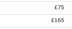 and this means the user may have to do significant amounts of horizontal scrolling to establish relationships. The row borders are obviously a help, but it would be much better if the gaps were closed up.
Locking columns into view (or sticky columns) are not advisable as users using screen magnifiers can be blocked from viewing data columns by the locked column. This can be a common problem in large spreadsheets. I haven't seen too many tables online with locked or sticky columns, but it is definitely something to be aware of.
Freezing rows (sticky header rows) are ok to use, but are not exempt from this problem.
If a column has no data in it then it should be removed.
This helps with accessibility as it reduces the need for (further) horizontal scrolling if a user is using a screen magnifier.
Australian Design System chat regarding tables... https://community.digital.gov.au/t/table/92/20
I think there's definitely a case for 'sticky' header columns, as well as header rows (which are more common), especially for very large tables and specialist users.
That said, they're not yet easy to implement without some complex javascript.
For an example of where this does work, see Google Sheets, which has this as an option.
I just added a comment to an accessibility checklist, but I think it belongs here:
Tables should only be as wide as the content within them (not 100% wide). Tables that are wider than they need to be make it difficult scan the rows, especially when magnified.
One gap with the table component is how they work on smaller screens. At the moment the table's width breaks the layout like this:

There are a number of options to consider such as:
(1) In the case of two or three column tables we could decide to use the “Check your answers” pattern that actually uses a <dl>
(2) To give the table container its own horizontal scroll bar with appropriate signifiers that this behaviour exists such as a fade out effect on the side.
(3) Using CSS to change the layout on small screens so that table headings are repeated for every row as described in Responsive table layouts
And for each of these options there maybe various usability and accessibility implications.
I'm not sure there is one size fits all but at the moment, a pretty major component of the Design System is lacking an opinion for a fairly common scenario.
@adamsilver Have a look at https://responsive-tables.herokuapp.com/tables/transactions for a way of doing 3. This was done by @Fenwick17 in a service with a 4 or 5 column table of financial data. Code is available at https://github.com/Fenwick17/responsive-tables
@stevenaproctor that's really helpful—what usability/accessibility testing has it had so far? (I see that there are some ticks against some screen readers.)
I notice that the inline headers are hidden using aria. One situation here which might be worth exploring is sighted screen reader users. In this case, the user sees a header for every row but doesn't hear it which might be disorientating.
@adamsilver I think there are visuallyhidden <span>s that solve this problem. @Fenwick17 knows more than me.
An example with horizontal scrolling on the table for smaller screens: https://www.compare-school-performance.service.gov.uk/schools-by-type?step=default&table=schools®ion=all-england&for=secondary&basedon=Attainment%208%20by%20subject%20group&show=All%20pupils
@adamsilver When you navigate to a cell such as '1 January 2017' It will be read out as 'Date, 1st January 2017'. So a sighted screen reader user will see a header on the left, as well as it being read out as they navigate the table. So they will hear the appropriate header for that piece of data.

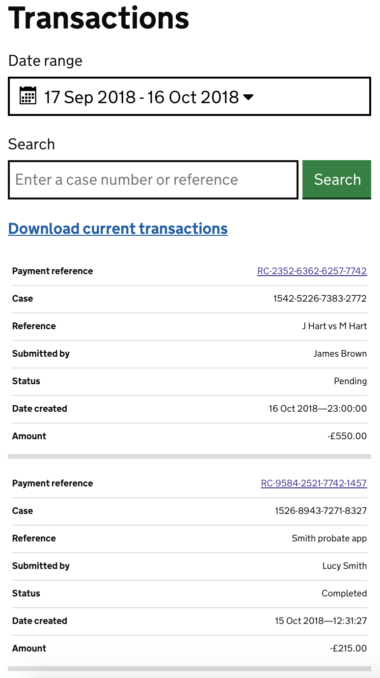
Hi @stevenaproctor thanks for the responsive tables link above looks ace, images are an example of how myself and @adamsilver have mocked this up on a project we are working on, something very similar and for financial data where a user is looking for a particular item in a table this works well labelling every column header next to the row data. I'll take a look at using the code from above.
But as previously said for users looking to compare data across a table another option might be better.
Article with some useful information and examples
https://www.smashingmagazine.com/2019/01/table-design-patterns-web/#top
The table component doesn't handle really long strings of text with no spaces very well.

@colinrotherham raised a pr for the summary list component two weeks ago to address this on that component - I wonder if a similar thing would be suitable here too.
I don't receive alerts for the summary list component, so missed that. It's a shame they didn't make it opt-in for email addresses and URLs, because apart from unrealistic test data, those are the few situations this applies to. It's not worth applying the break-word property in blanket fashion because of how the unnecessary breaking of words in standard cases hinders readability: https://jsfiddle.net/lee_kowalkowski/efvb7uxm/3/
@leekowalkowski-hmrc perhaps an opt-in class that can be applied as needed then?
Edit - I wonder if js will be the way it has to happen - we won't always know in advance if a field will have really long text.
Example: My service collects a fair amount of paragraphs of text in textareas. Users may include urls in these paragraphs of text. So I'd be minded to try to break those urls. I obviously don't want the case from your example above where a paragraph of text breaks in the middle of regular words.
Actually no, standards have improved, it's overflow-wrap we need: https://jsfiddle.net/lee_kowalkowski/efvb7uxm/6/
I've now suggested the summary list fix be reverted (#1211).
Hopefully we can come up with a better fix (js or otherwise) that can replace it.
To record the original GOV.UK design decision to remove the zebra striping:
We saw in user research that users were inferring that the background colours meant something ie there was a grouping that was important that was not mentioned anywhere. There are also more contrast issues to worry about. Doing row by row interactive highlights makes more sense (but of course doesn’t help on mobile).
There's a broken link on this page where says "Use this issue to discuss this component in the GOV.UK Design System.". Can somebody update it?
Over the past 6 months, the HMRC Classic Services teams in Manchester and Telford have been undertaking a UI refresh of the services they maintain to be in line with the GOV.UK Design System, within the PAYE Expenses and Benefits service, one use case if to view a table of Employees of an organisation that are available for adding expenses and benefits.
Example:

The table is sortable by column, but as there is no pattern for this in the design system, links within the table header row have been used to select the column to be sorted on. This causes confusion when it comes to accessibility and screen readers, so a standard accessible pattern would be useful.
I have found an accessible example from Deque University code examples that may be a good starting point: https://dequeuniversity.com/library/aria/tables/sf-table-sortable