govuk-design-system-backlog
 govuk-design-system-backlog copied to clipboard
 alphagov
Error message
Now that the error messages we present use a simpler more instructional language, I think we are relying slightly more on the visual presentation of the error message to help the user understand that they have 'done something wrong'.
Thinking specifically about the way that a screen-reader user would encounter an error message:
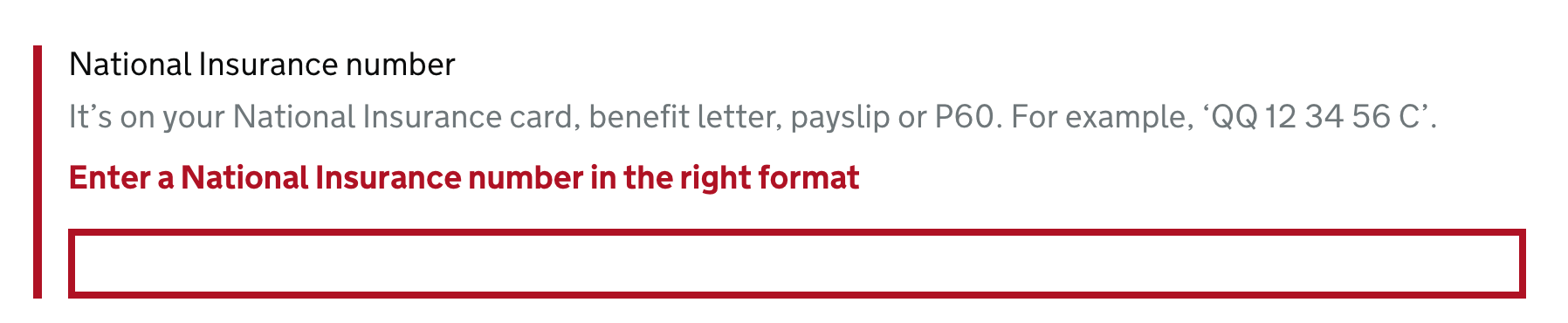
National Insurance number, text field. It’s on your National Insurance card, benefit letter, payslip or P60. For example, ‘QQ 12 34 56 C’. Enter a National Insurance number in the right format. You are currently inside a text field. To enter text in this field, type.
I don't think it's entirely clear that "Enter a National Insurance number in the right format" is being included here as an error - because the red and bold visual presentation is missing. We (hopefully) have the error summary at the top of the page, but I wonder if it is also worth adding a visually hidden "Error:" prefix to the error message:
National Insurance number, text field. It’s on your National Insurance card, benefit letter, payslip or P60. For example, ‘QQ 12 34 56 C’. Error: Enter a National Insurance number in the right format. You are currently inside a text field. To enter text in this field, type.
Thoughts?
@36degrees I think this is a good idea because there is no guarantee that people will hear the message twice or remember it from the first time if they do.
I will have a chat with our accessibility champion and get their opinion too.
@36degrees Our accessibility champion thinks it would be beneficial, especially for fields with hint text where what is read out is more verbose.
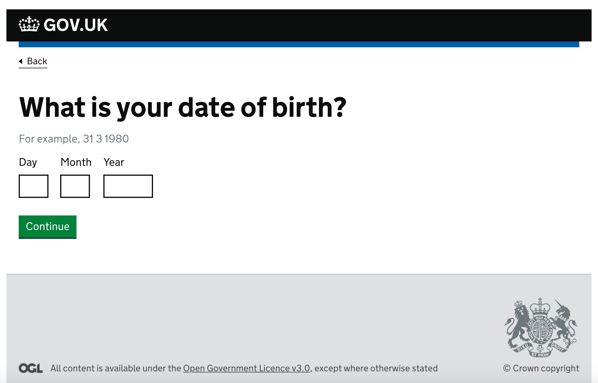
A quick question, the guidance says "if the error relates to specific text fields within the question, give these a red border as well". Should this apply to date fields too? In the example, these do not have red borders but they are text fields. What do you think?
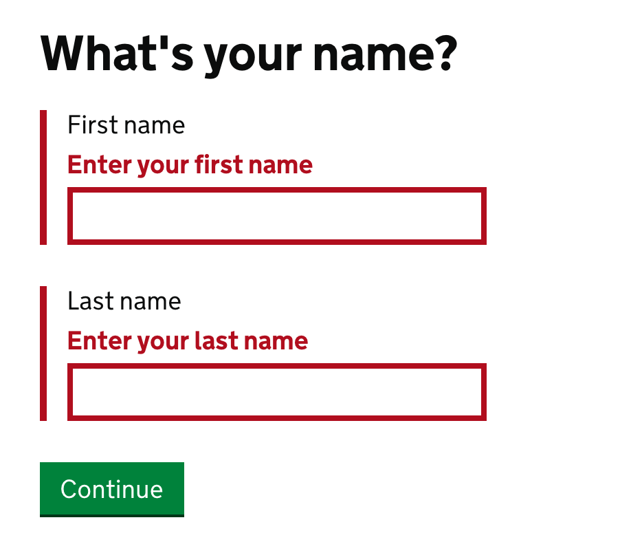
I noticed on the error states, the labels aren't bold anymore. What led you to do this?
Before: https://govuk-elements.herokuapp.com/errors/

After: https://design-system.service.gov.uk/components/error-message/
@maya
UPDATED TO CLARIFY
Our default label is regular weight because the same label component is shared by text inputs, radio and checkbox items.
One thing we noticed (when building the new Design System) when looking at existing services was that many of our users were bolding their label, this was mainly because they were mixing content on the same page. For example this Passport details example below has a label + a text input and a fieldset grouping 3 inputs with separate labels.
In this scenario the questions themselves need the same hierarchy, so the label and legend are bolder and larger than the labels contained within the fieldset

We've made it easier to style labels and legends in a way that works for the questions you're asking.
For example:

Because we also have the "One thing per page" approach often our legends or labels are actually the page heading, which is large and bold.
You can read about our options for labels, legends and headings here - https://design-system.service.gov.uk/get-started/labels-legends-headings/
Another factor that because this original guidance was a little buried it was rarely implimented, here's an example of an error from a service:
Because of all of the above, when we looked at the error states we didn't move the bold label style across to the new system because in many cases the label would already be bold and we considered the combination of the bold error message itself, border style and the error summary (https://design-system.service.gov.uk/components/error-summary/) to be enough.
Working group review session
A proposal to add error message templates was reviewed by a panel of designers from GDS, HMRC, DWP, DEFRA and Home Office on the 16 August 2018.
The panel agreed that the pattern should be published in the GOV.UK Design System and also made the following recommendations.
- add information to the research section about where the pattern has been used successfully
- make sure the the error message examples are reflected in the coded examples
- provide example errors for file upload and select components
- provide example questions for the radio and checkboxes components
- find out if users have been confused by the ‘enter a real date of birth’ message
- make the link from the error messages documentation more prominent
- remind users that they should always test their error messages
Suggested addition - only display one error message at time.
Write your validation script so it displays error messages in a logical order, eg
if (field is blank) {then display "you must answer this question" error message} else if (value doesn't meet validation rules) {then display "must meet these criteria" error message} etc
If you need to tell the user about more than one error in a single field, show a single error message telling the user to do the thing that's most likely to fix the error.
Relates to a discussion on the x-gov content Slack.
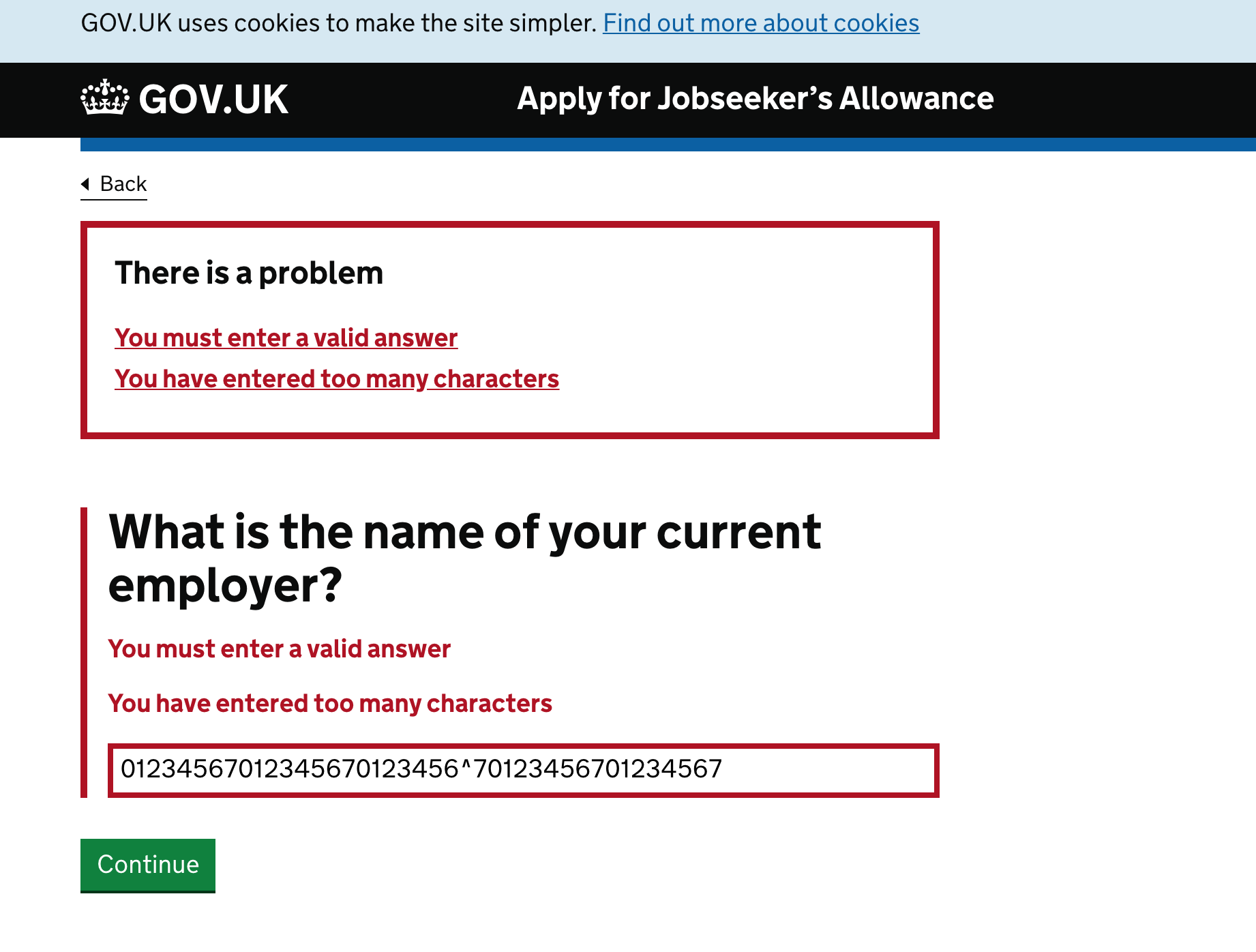
I have an example of a field with multiple errors. This one is an edge case though as there will be a maxlength on the input but that can be removed.
@gazjoy maxlengths can cause problems for people when they are pasting something in a text input or textarea. It is better to make the input as flexible as possible and allow longer entries and then provide an error.
I agree with @StephenGill's approach to only show one at a time. Validate the field in a priority order then show the error that is triggered first.
Hello all, could someone explain to me why it's not recommended to display an error message as soon as a user moves away from a field? Thanks a lot
"Only display an error when someone tries to move to the next part of the service. Do not show error when they move away from a field"
@jfhector
You always have to validate when someone tries to move to the next part of a service because validation when someone moves away from a field relies on JavaScript and it can be easily bypassed.
Validating when someone moves away from a field can disrupt and overwhelm some people because it gives them too many things to focus on. It also breaks the natural browsing behaviour of filling in a form.
This kind of validation is less effective for screen reader and screen magnifier users too who may not see the errors because of where they appear.
Does this help?
"Do not show error messages ...when they move away from a field" https://design-system.service.gov.uk/components/error-message/
Please can you include a reason why you recommend this on this page? Especially if there are any WCAG or device-specific accessibility issues caused.
I don't personally need to be convinced, but there's a risk of other readers' ignoring this advice unless you include some reasoning.
It's very common in React to validate on blur - the 2 most common libraries for handling forms in React are Formik and Final Form. For both of these, the 2 main field validation examples these libraries provide does validation once a field has been deemed 'touched' i.e. the user has blurred a field but not submitted
Formik - https://codesandbox.io/s/q8yRqQMp Final Form - https://codesandbox.io/s/yk1zx56y5j
@penx Research by Luke Wroblewski (https://alistapart.com/article/inline-validation-in-web-forms) and Baymard Institute (https://baymard.com/blog/inline-form-validation) on whether to display live inline errors found that they help users fill in a form more quickly and accurately, lead to more satisfaction and reduce the number of eye fixations.
The best time to show the errors was when they leave the field, not when they try and submit the form.
If you read the comments there are some criticisms of the research. I worry about what "22 average users" means.
Client-side, real-time validation has never been recommended for government services. I know there was a chat about it in the mailing list 5 years ago about it. There was concern that even if it was done well it could affect usability and distract users, especially those with lower digital skills. I am not sure there was any research done with users.
Mentioned that my response on slack could be of interest here...
Fundamental psychological principle behind the advice and evidence that instant error messaging causes higher task failure is the idea that you have an input mode and edit mode.
So, you have a "I'm thinking about what I know and writing that" mode and a "I'm checking this against criteria" mode.
Instant messaging about errors interrupts a common pattern or mode which is to fill everything in first "I'll answer what I know"
Every field or submission then becomes a possible interruption from one mode to another.
Also, in most implementations the messaging isn't smart enough and often shouts at the user that they are wrong half way through a submission.
The safest way to separate the input and checking modes is with a page of inputs and after submission, clear advice on what to correct.
Two papers that support this with the first with 77 users and the second builds on that with another 90
https://www.researchgate.net/publication/221054469_Online_Form_Validation_Don't_Show_Errors_Right_Away
https://www.researchgate.net/publication/220054837_Usable_error_message_presentation_in_the_World_Wide_Web_Do_not_show_errors_right_away
I think some of the benefits mentioned in the Luke Wroblewski and Baymard posts are also covered by One thing per page. For example easily finding the error, and being 'fresh' in the context of the error.
It also covers some cases where there are specific reasons to have realtime validation - for example username (which may be taken) and passwords (which may not meet requirements).
Realtime validation relies on JavaScript, so recommending it in all cases would open up new risks around progressive enhancement and accessibility, for questionable value.
You always need server-side validation anyway, as you can't rely on client-side validation.
I also question Luke's research. What was the “A” in the AB test.
Did the form have clear labels? Clear hint text? When submitted was there a server-side round trip? i.e. you can validate on submit without a round trip. Was an error summary shown (as per the guides in the design system) with links to each field? Were the error messages well written?
Like Joe said, there are other ways (like with one thing per page) that help users with the problems mentioned in the original article.
As part of returns for our service we let people enter meter readings if the meter readings only increment.
When readings have dropped we ask people to check their readings but as an extra piece of help we want to say: “If your meter has reset please give us calculated volumes” - which is in a different part of the flow. I am suggesting that we have an additional link in the error message to direct people to the volumes flow. I wonder, has anyone had experience of doing this?
Hi All,
I appreciate this is more to do with wording than the component itself. We've got some email address validation in our application, and naturally would like to be consistent. We're following the format for the error message found here: https://design-system.service.gov.uk/patterns/email-addresses/ However the wording on that page for an invalid format doesn't seem natural when read/spoken, it's currently:
Enter an email address in the correct format, like [email protected]
We'd rather something more along the lines of the following: Enter an email address in the correct format, for example [email protected] or Enter an email address in the format [email protected]
All the given messages use this "like, <example>" format, however everywhere on the design-system.services.gov.uk site whenever an example is given it uses "for example".
I'm wondering if the there is a reason it's like this? Maybe it's just us who find it sounds strange.
Thanks
What you say seems reasonable. I was going to suggest a change to the wording on that page and now you raised it, I'll mention it here. The term "correct" is being used here to mean "matches the code requirements" which is a different thing. There are plenty of examples (I can give some if you ask) where a format regarded as 'correct' to a human is rejected by a computer. This is bad enough and it's worse if the computer then tells the human they're wrong.
What is the thoughts on including dynamic text within an error message?
Let's say we have a page where we capture a person's name ("John Smith"). Then on the next page, we ask for their NI number. If they don't enter one, we could say "Enter a National Insurance number" as the error message - but, could we instead say "Enter John Smith's National Insurance number"?
In other words, should we use dynamic text in error messages as it may benefit some users (e.g. those using screenreaders)?
My team recently ran some research and tested this component with a user with a visual impairment. When the user didn't put in matching passwords the error message offset the second password box to the right so it didn't align with the first one. They said this meant they struggled to see the second box and took a couple of attempts to put in their password. They also mentioned that the colours used were hard for them to see.
Quotes from the user below:
“That was tricky for me, I mistyped for the 2nd time!”
“Its difficult to see when the 2nd password box is not inline with the one above”
“The error message is orange and I can’t see green because of convergent vision”
Heya @LauraYoung258 , thanks for the feedback.
They said this meant they struggled to see the second box and took a couple of attempts to put in their password.
Is it possible to share a screenshot of what the user was seeing at this point? Could you give more detail why you think the offset made it hard for them to enter their password?
“The error message is orange and I can’t see green because of convergent vision”
Can you elaborate on this feedback please, the ability to see green does not seem to be related to the red error message.
Having convergent vision means your eyes can be blurry so it being offset to the side rather than being inline made it hard for the user to know if the box was seen as off-set due to their convergent vision or because it was actually off-set. I don't think the colours caused the issue but it was an additional comment that they can't see the colours which would indicate that it is an error message.

I'm aware you're questioning the offset but it's prompted me to ask: What would happen if the 'Confirm password' field didn't exist? A quick web search reveals some people saying the pros aren't worth the cons.
Spoke to @LauraYoung258 who has said we can have a listen to the audio from the session if we want, we'll chat about this as a team in our weekly triage session. I think personally I'd like to understand more about convergent vision to see if there's an opportunity to make this better. Thanks a lot for the extra information.
Is there an issue open for the content of the messages for common fieldheads? For example, I currently have 4 different ways of displaying an error message when a user has tried to bypass 'Gender' (ignoring the whole Sex vs Gender thing for now) and whilst I completely understand the mechanism for displaying messages, it's the content we're struggling with more. I'm looking to create a list of all our fields and providing the relevant messages when they have either been missed completely or have been entered in an invalid format, so that they are consistent across our product. There are issues at the moment with multiple BA's and Dev Teams all working on different pieces of the same product, things get changes slightly and I'd really like to tie up all the loose ends with something central (I don't want much! :D)
There's some guidance on writing error messages here: https://design-system.service.gov.uk/components/error-message/
And some more general guidance on writing for user interfaces here: https://www.gov.uk/service-manual/design/writing-for-user-interfaces
A developer from the National Archives asked on Slack about the built-in browser validation (sometimes called HTML 5 validation) that's triggered by using the required attribute on form fields, and whether that was preferred to GOV.UK Design System-style error messages.
Although there isn't any advice (that I can find) in the Design System that suggests using the required attribute, the date input includes the pattern attribute, which also triggers built-in browser validation.
Adding novalidate to the <form> tag prevents browsers from using their built-in validation. Has there been any discussion about possibly recommending this in the Design System documentation?
Edit: @StephenGill has opened a pull request including a new "Validation" pattern page that documents the novalidate attribute.
Further to some of the above conversations: a user in research who didn't have convergent vision took several tries to input the password confirmation after it had been offset to the right by the error message styling.
See https://github.com/alphagov/govuk-frontend/issues/1768
Right now we don't have enough evidence that this is an issue for users as we haven't seen it reported before. However we'd be interested to hear if anyone sees this issue coming up in research.
There's an inconsistency, some error message examples use a comma:
- Enter an email address in the correct format, like [email protected]
- Enter a telephone number, like 01632 960 001, 07700 900 982 or +44 0808 157 0192
The example in bank details one does not:
- Enter a valid sort code like 309430
Also the following message is ambiguous although it is possible to think it through to guess the intended meaning. It could be showing an example of (a) what not to do or (b) what to do.
- How much you earn a week must not include pence, like 123 or 156
These are not big issues but should be easy to solve with changes to content.